HiPP Organic Baby Snacks Packaging
Topics
Details
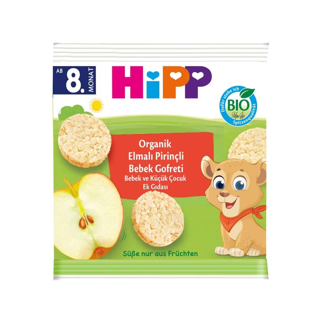
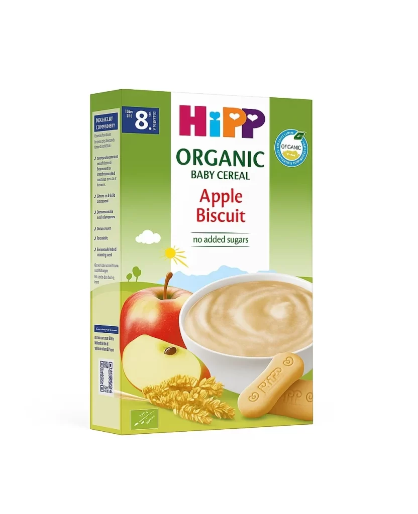
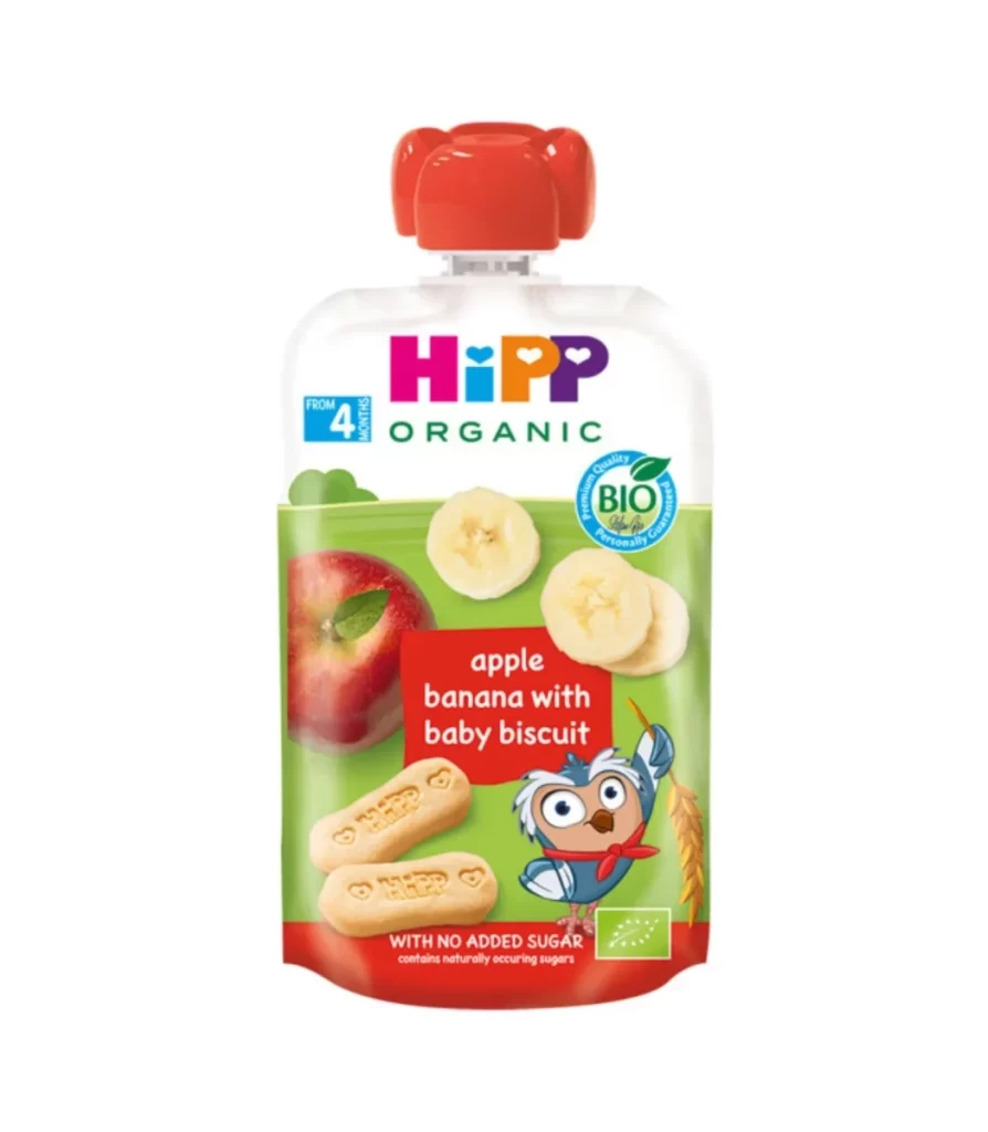
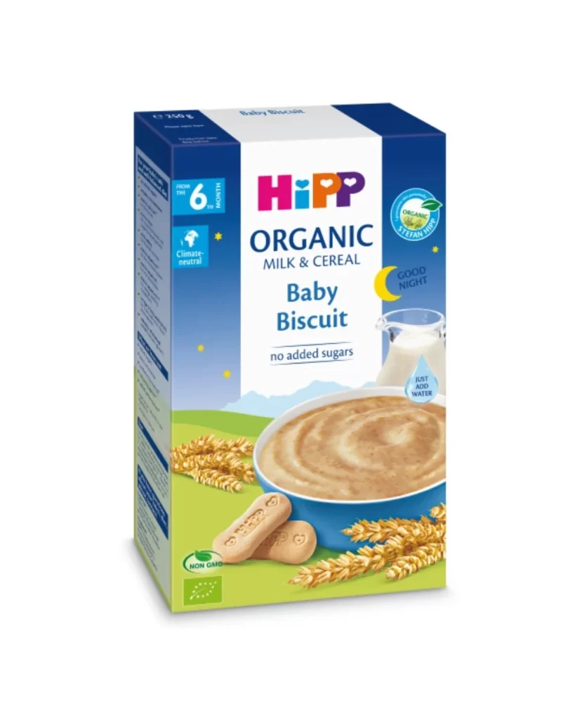
A rectangular cardboard box for HiPP Organic Baby Biscuits features a cheerful, illustrative aesthetic with a vibrant green meadow background on its front face. An anthropomorphic tiger in red shorts holds an oversized biscuit on the left side, while two actual biscuits embossed with the brand name rest near golden wheat stalks to the right. The top left corner displays a blue '6 months' badge, and the packaging sits on a white surface.
Visual interest is generated through the juxtaposition of flat vector illustration with realistic product photography. The typography utilizes a soft, rounded sans-serif font for ‘Baby Biscuits’ within a warm orange banner, ensuring legibility while maintaining a friendly tone. A circular green ‘BIO’ seal on the upper right reinforces the organic nature of the product through established certification iconography.
Brand strategists might analyze this layout to understand how mascots are utilized to build trust in infant nutrition markets. Packaging engineers could study the structural composition of the side panel text placement for retail shelving efficiency. Illustrators may reference the specific color palette of grassy greens and sunny yellows to evoke natural freshness in their own work.