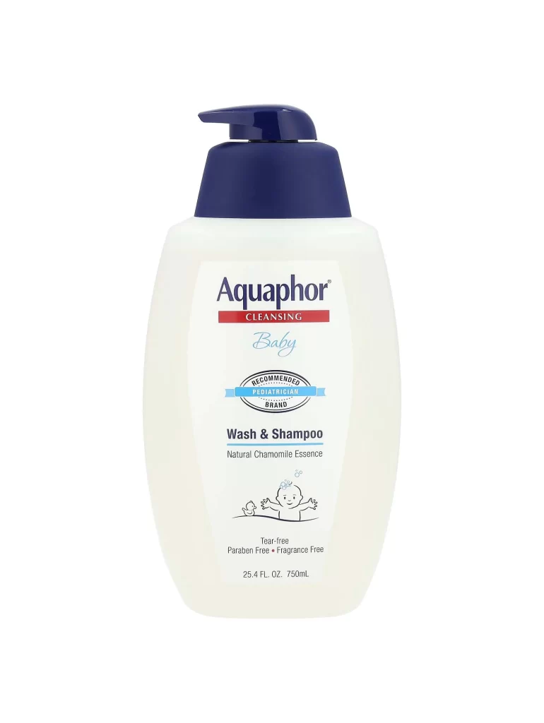
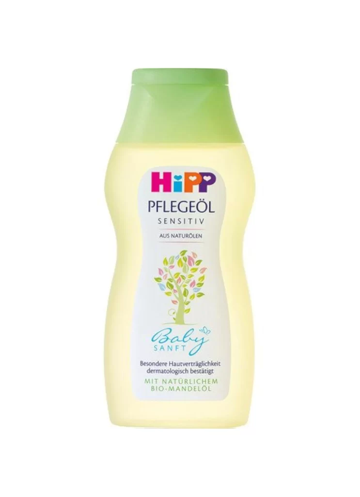
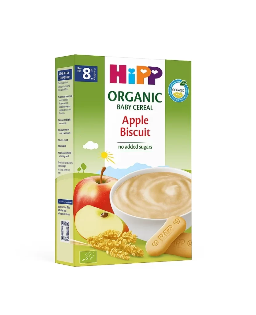
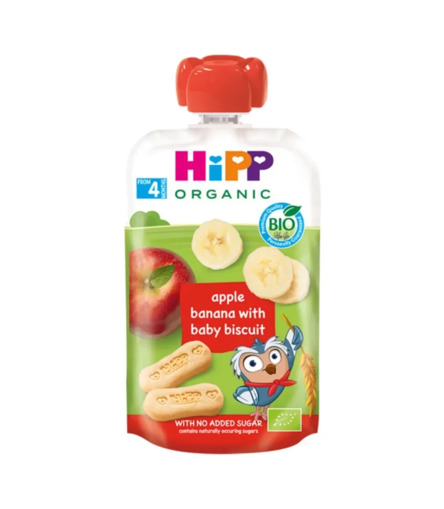
HiPP Kinder Shampoo Sensitiv Baby Shampoo Packaging
Topics
Details
A contoured white plastic bottle with a soft green flip-cap serves as the central subject, featuring the HiPP logo in vibrant magenta and purple above the dark blue sans-serif text 'KINDER SHAMPOO SENSITIV'. Below the product name, a friendly cartoon horse wearing a pink scarf and holding a brush appears alongside the 'Baby SANFT' script, all set against a clean white background.
Visual interest comes from the playful juxtaposition of clinical cleanliness and child-friendly illustration. The curved silhouette of the container suggests an ergonomic grip for parents, while the pastel green cap provides a fresh, organic contrast to the stark white body. Typography varies significantly between the bold, blocky brand name and the flowing, handwritten-style script used for the product line, creating a clear visual hierarchy that guides the eye downward.
Packaging designers studying the baby care market will find this useful for analyzing how established brands balance medical trust with emotional appeal. Marketing teams could reference the specific color palette and character placement when developing campaigns for sensitive-skin products. Additionally, 3D artists modeling consumer goods might utilize the lighting and shadow details to understand how to render translucent plastic materials effectively.