HiPP Sensitiv yellow Pflegel Packaging
Topics
Details
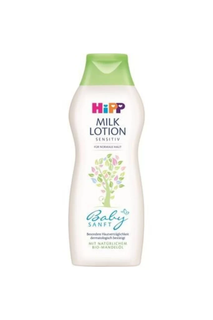
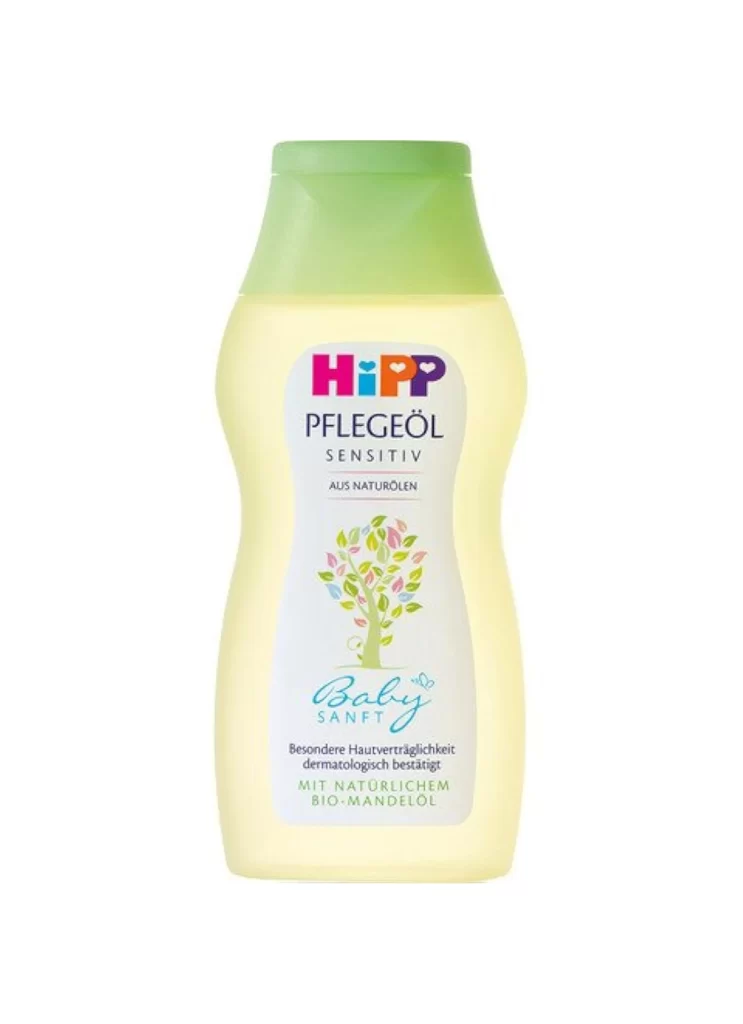
A translucent yellow bottle of HiPP Baby Sanft Pflegeöl features an ergonomic, contoured silhouette topped with a matte green flip-cap, containing a liquid with a pale, buttery hue. The white front label displays the brand's multicolored logo above the product name 'PFLEGEÖL SENSITIV' and 'AUS NATURÖLEN', positioned above a colorful tree illustration and the blue 'Baby Sanft' script. Additional text notes dermatological testing and natural organic almond oil content, all presented in direct frontal view on a white background.
Visual distinction arises from the harmonious interplay between the organic, curved form factor and the clinical clarity of the typography. The soft yellow tint of the plastic suggests gentle, natural ingredients, while the green cap provides a fresh, eco-conscious accent that complements the botanical motif. Subtle gradients across the bottle’s surface catch the light, emphasizing the smooth texture and premium quality of the packaging design.
Product photographers might study this composition to understand how neutral backgrounds enhance color accuracy for consumer goods. Packaging engineers could analyze the ergonomic proportions to inform future designs for baby care containers. Marketing teams may reference this layout when developing visual guidelines for organic or sensitive-skin product lines requiring a trustworthy aesthetic.