HiPP Familien Bad Sensitiv Baby Bath Packaging
Topics
Details
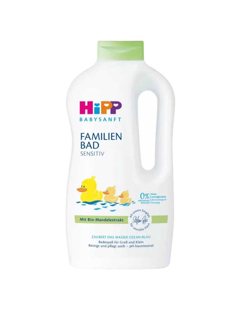
A large, opaque white plastic bottle with an integrated side handle and a soft pastel green flip-top cap stands on a white surface. Bold magenta and teal typography spells out the HiPP brand name above the dark blue 'FAMILIEN BAD SENSITIV' text, while a horizontal green band across the lower third of the label holds the words 'Mit Bio-Mandextrakt' alongside an illustration of three yellow rubber ducks floating on blue water.
Visual hierarchy on this packaging relies heavily on the contrast between the clinical white background and the vibrant, child-friendly accents. The inclusion of the duck illustration immediately signals the product’s purpose for infants, while the ‘0%’ badge and organic certification stamp provide a sense of medical-grade safety and natural purity. Such a layout effectively balances commercial branding with reassuring informational elements, making it a prime example of trust-building in personal care marketing.
Product photographers might utilize this composition to study how studio lighting eliminates distracting shadows on curved plastic surfaces. Brand strategists could analyze the specific placement of eco-certifications to understand how to communicate sustainability without cluttering the primary message. Furthermore, 3D modelers looking to recreate consumer goods will find the subtle gradients on the handle and cap useful for understanding material rendering in a digital environment.