HiPP HA Combiotik Baby Formula Packaging
Topics
Details
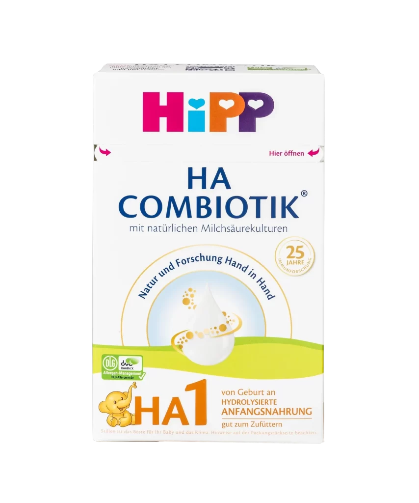
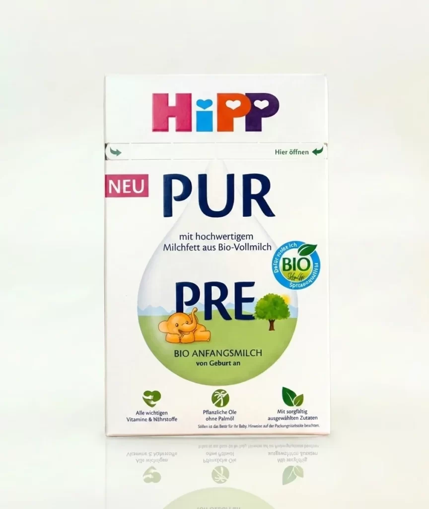
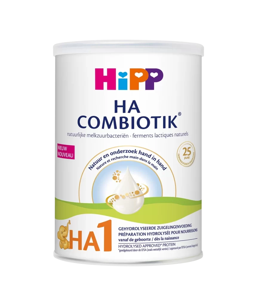
Bold magenta, cyan, and orange letters form the playful HiPP logo at the top of the vertical white carton, with deep navy blue text announcing 'HA COMBIOTIK' and green subtext detailing prebiotic and probiotic benefits below. A central graphic of a translucent milk drop surrounded by golden particles sits within a light blue circular field, framed by a curved golden banner bearing Polish text about nature-inspired science. The lower portion features an orange 'HA1' designation next to a small yellow elephant illustration, with additional product information printed in orange on a green gradient band.
Visual interest is driven by the strategic use of high-contrast primary colors against the clinical white packaging, which creates immediate shelf appeal for parents. The circular badge celebrating 25 years of experience and the organic certification mark in the corner add layers of trust and authority to the layout. Furthermore, the integration of the Polish language text and the specific ‘Polska Apteka’ watermark suggests a localized market approach that balances international branding with regional accessibility.
Packaging designers studying infant nutrition products would find this layout useful for analyzing how to organize complex nutritional information without cluttering the visual field. Marketing teams could also utilize this reference to understand how to effectively combine mascots with scientific claims to build consumer confidence. Additionally, brand strategists might examine the color psychology used here to see how vibrant hues are employed to soften the medical nature of hypoallergenic formulas.