Vitamin C Beverage Promo
Topics
Details
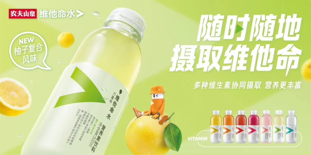
A single clear bottle dominates the frame of this Nongfu Spring’s Weitaming Shui (Vitamin Water) features a large, clear bottle of the new pomelo-flavored variant as the central focal point. Set against a vibrant lime-green background, the composition includes a stylized orange mascot sitting on a whole pomelo fruit alongside sliced citrus elements and water droplets. Prominent white Chinese characters on the right declare ‘Take in vitamins anytime, anywhere,’ while smaller text highlights the collaborative intake of multiple vitamins and displays a row of six different product flavor variations at the bottom right.
Visual hierarchy is established through bold, dynamic typography where the main slogan utilizes large, slightly italicized sans-serif characters with internal color gradients to create depth and movement. The color palette leverages high-contrast complementary tones, pairing the energetic green backdrop with crisp whites and the golden-yellow accents of the citrus fruits to evoke freshness and vitality. Photographic realism of the beverage bottle is balanced with the playful, minimalist illustration style of the brand mascot, creating an approachable yet professional aesthetic that guides the viewer’s eye from the product hero to the key messaging and finally to the full product line showcase.
Advertising professionals frequently reference this layout when studying effective use of negative space and product-centric compositions in beverage marketing campaigns. Packaging designers often examine the label integration and color-coding system used across the flavor variants shown in the product lineup. Marketing students utilize this case study to analyze how established brands introduce new flavors while maintaining consistent visual identity systems across different media touchpoints.