Sixpoint Brewery Resin green ale Packaging
Topics
Details
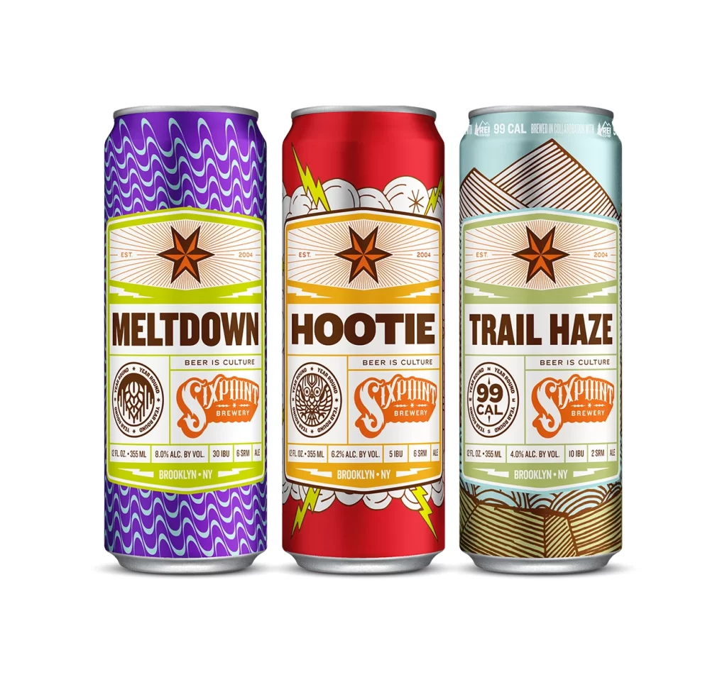
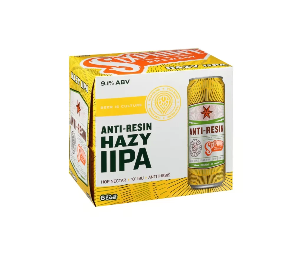
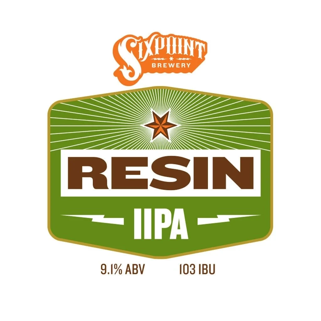
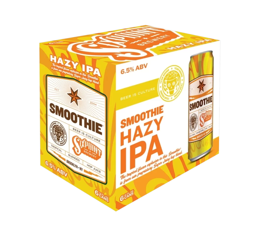
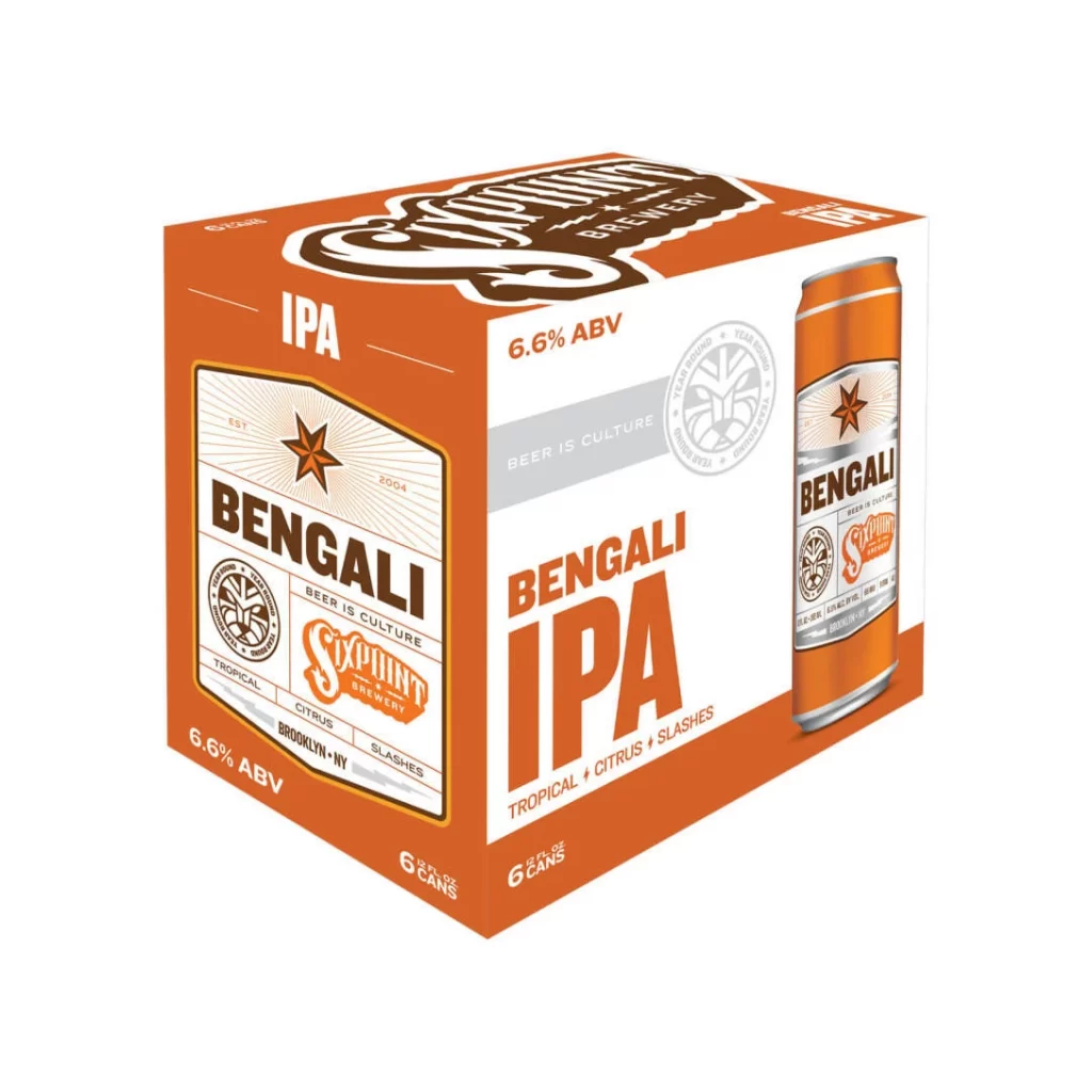
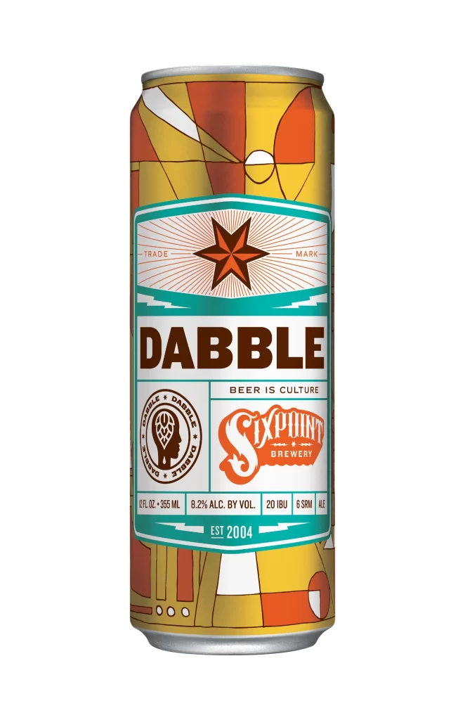
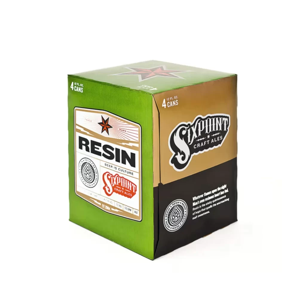
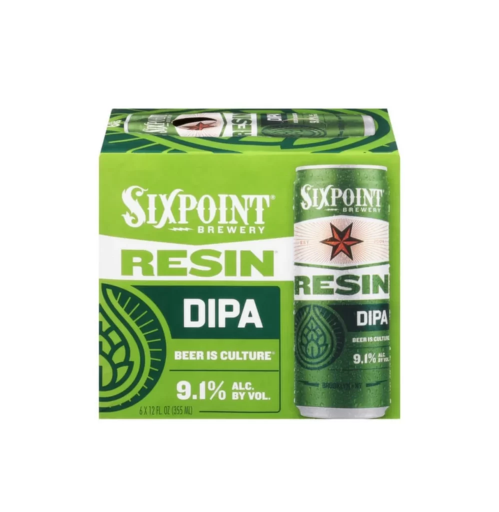
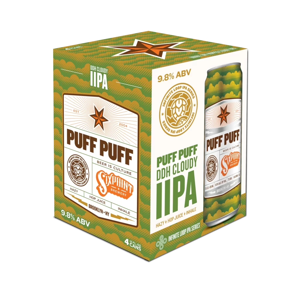
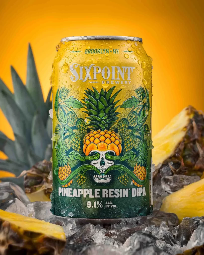
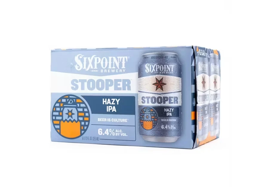
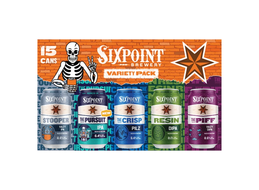
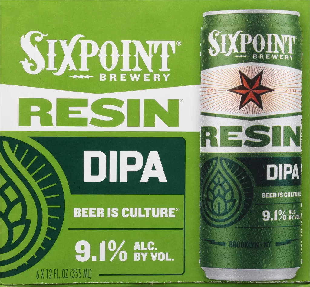
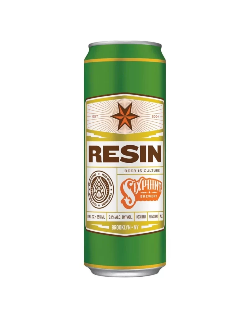
A forest green aluminum can stands centered against a stark white background, illuminated by even, shadowless studio lighting that highlights every surface detail. The packaging features a complex label system with a cream-colored central panel, accented by golden yellow horizontal bands and a prominent rust-orange five-pointed star at the top. Bold brown sans-serif lettering spells 'RESIN' across the middle, while the Sixpoint Brewery logo appears in a matching orange script to the right of a circular hop emblem. Technical specifications including '9.1% ALC. BY VOL.', '103 IBU', and 'BROOKLYN • NY' line the bottom edge in small black type.
Visual hierarchy plays a crucial role here, with the oversized typography demanding immediate attention before guiding the eye toward the intricate secondary graphics and brewing data. The color palette creates an earthy, organic feel that contrasts sharply with the industrial metal substrate, suggesting a product that balances raw craftsmanship with modern production standards. Radiating lines behind the starburst motif add subtle dynamism to the otherwise rectangular composition, preventing the layout from feeling too rigid or static.
Brand identity specialists might study this example when developing beverage packaging systems that require clear information architecture without sacrificing aesthetic appeal. Illustrators working on vintage-inspired labels could reference the specific way traditional badge elements integrate with contemporary typographic choices. Production managers evaluating print finishes for cylindrical containers would benefit from examining how the metallic gold accents interact with the matte green base coat under controlled lighting conditions.