Sixpoint Brewery Bengali IPA Beer Label Packaging
Topics
Details
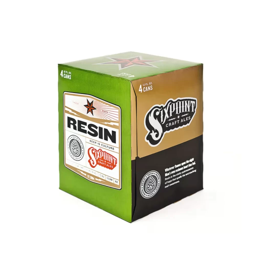
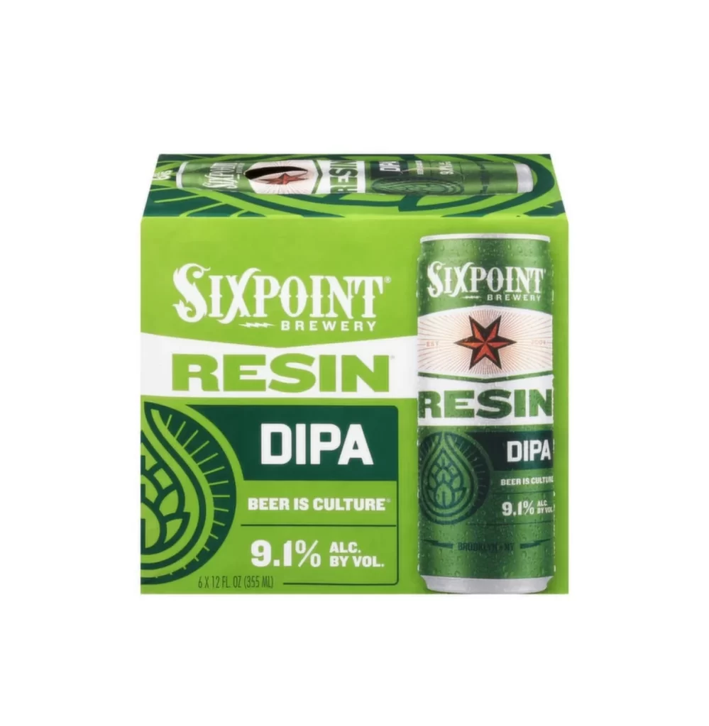
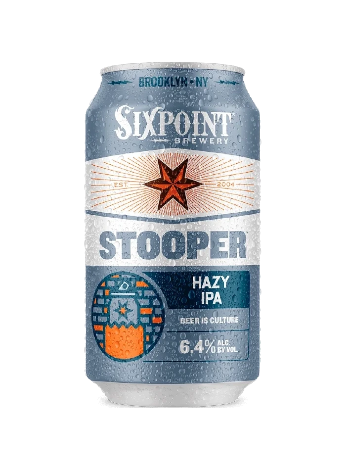
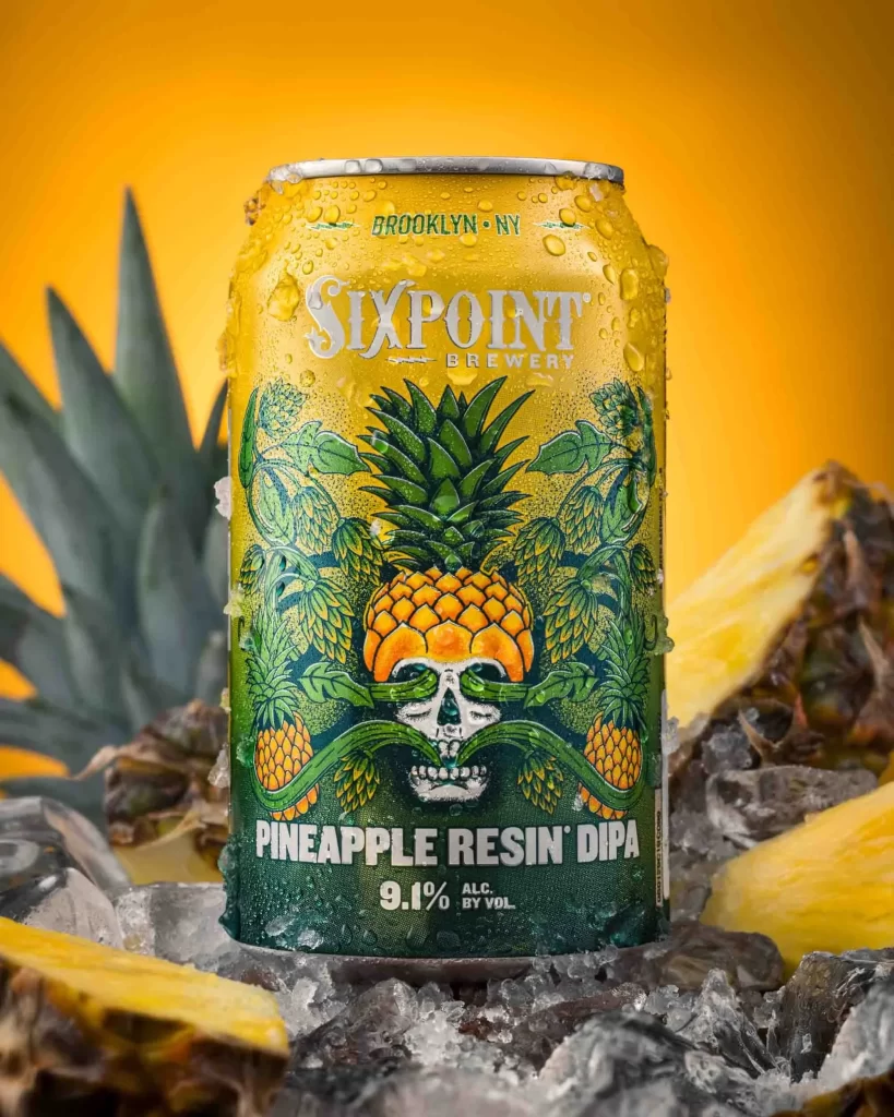
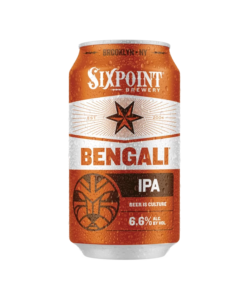
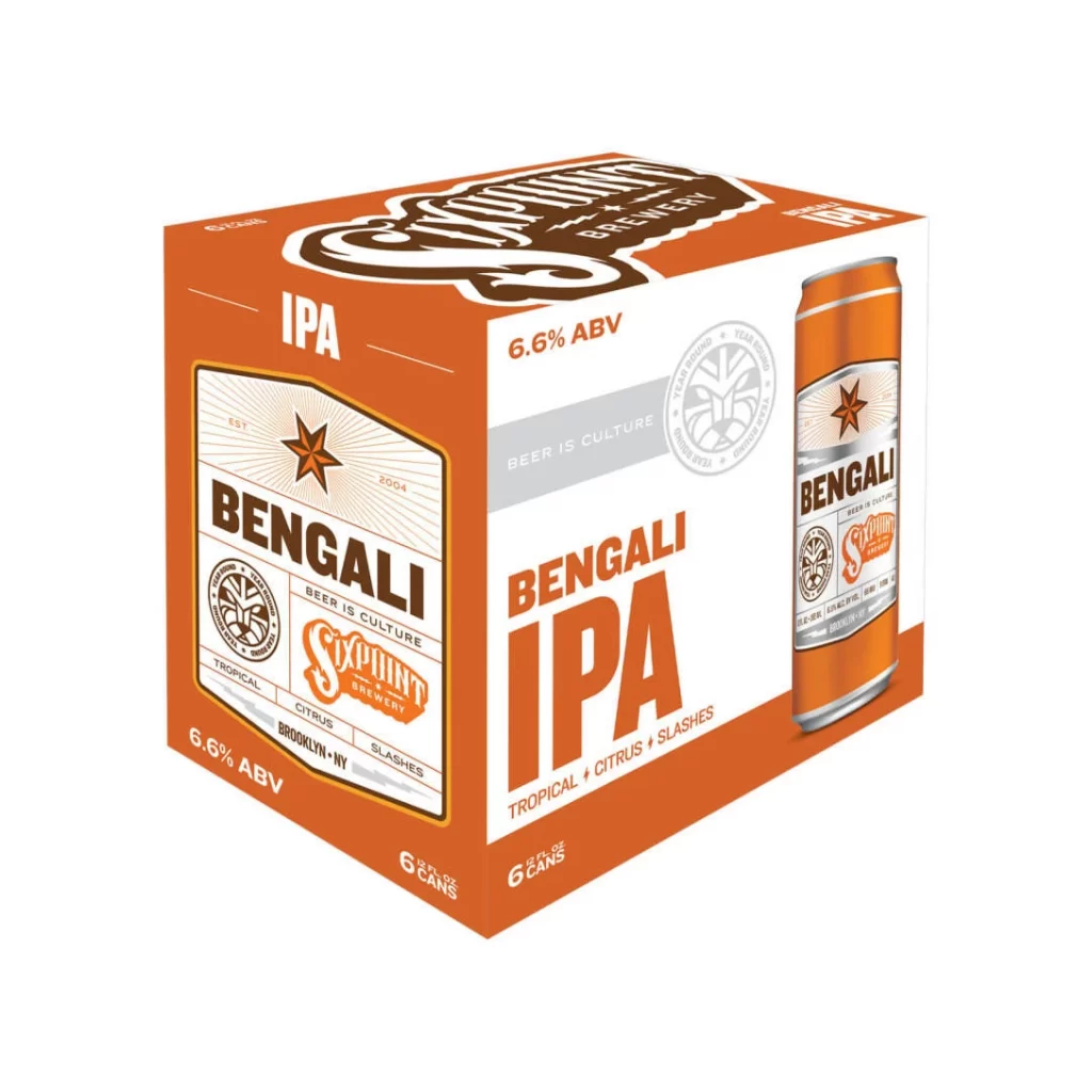
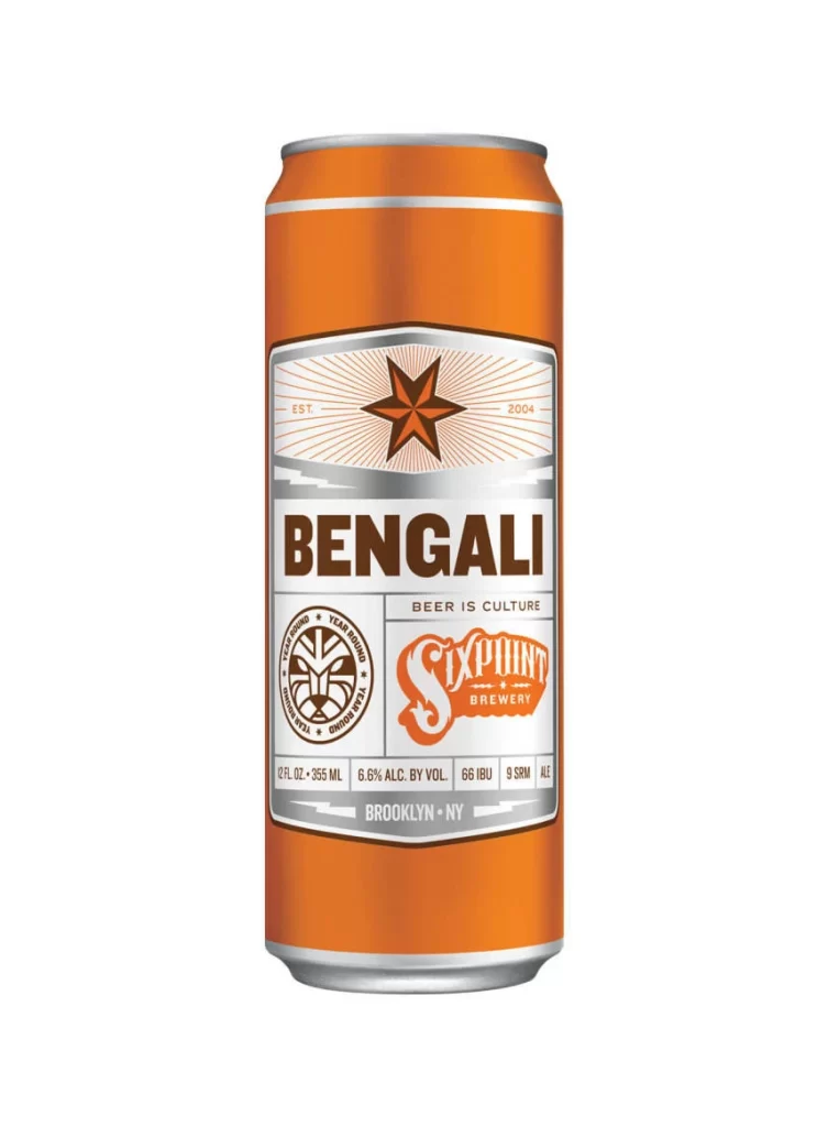
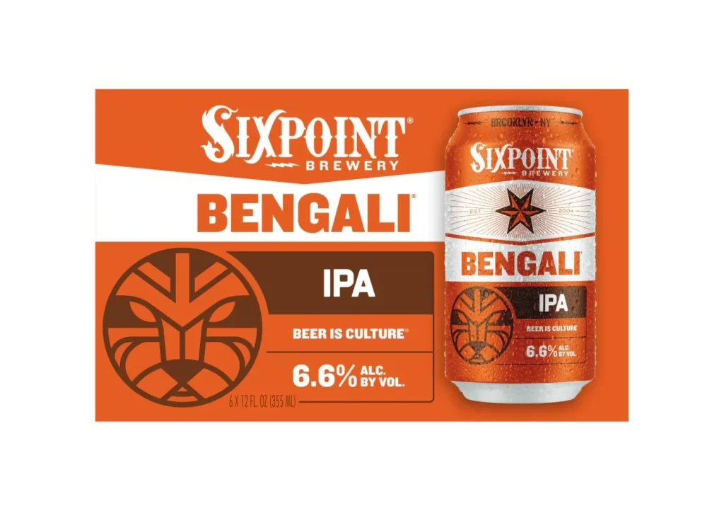
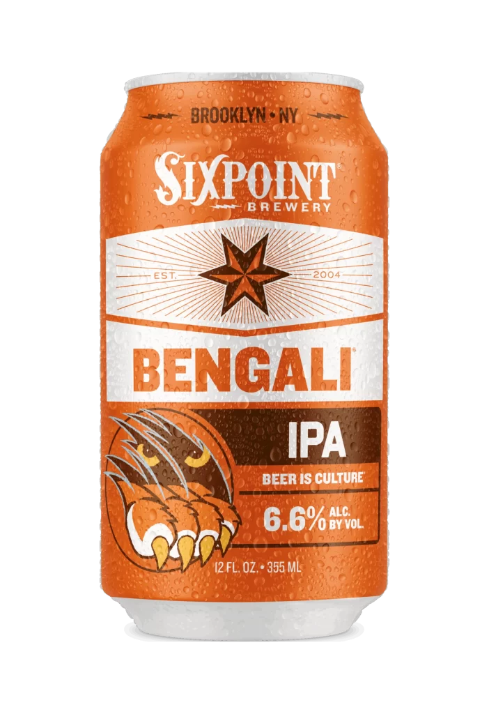
A vibrant orange aluminum can dominates the frame, its surface textured with fine condensation droplets that catch the light against a stark white background. The composition centers the cylindrical vessel, showcasing a layered typographic hierarchy that begins with 'BROOKLYN • NY' in dark lettering at the top rim. Below, 'SIXPOINT BREWERY' appears in a white serif font, followed by a cream-colored banner containing a geometric starburst and the founding year 2004. Bold orange block letters spell out 'BENGALI' across a white band, while the lower third features an aggressive tiger claw illustration alongside 'IPA' and '6.6% ALC.' specifications within a dark brown rectangular field.
Visual tension emerges from the juxtaposition of organic condensation patterns against rigid industrial geometry, particularly where the radial sunburst lines intersect with the wet metallic surface. The color palette relies on high-contrast complementary tones—warm terracotta and burnt sienna against cool white and deep espresso—creating immediate shelf presence through chromatic intensity. Typography functions as structural architecture here, with varying weights establishing clear information zones while the illustrative element introduces primal energy that balances the otherwise orderly grid-based layout.
Brand strategists analyzing craft beer market positioning would examine this artifact to understand how regional identity markers integrate with product categorization signals. Packaging engineers might study the material interaction between printed graphics and moisture accumulation to inform future substrate selections for refrigerated beverage containers. Illustrators developing mascot systems could reference the stylized feline anatomy to explore how simplified forms convey aggression without sacrificing legibility at small scales.