Sixpoint Brewery Bengali orange IPA Packaging
Topics
Details
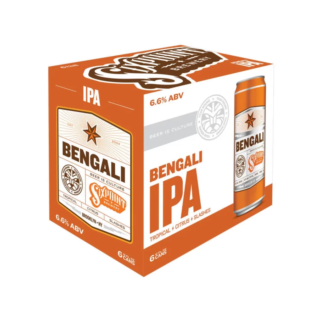
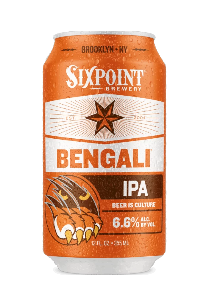
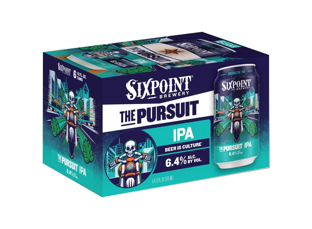
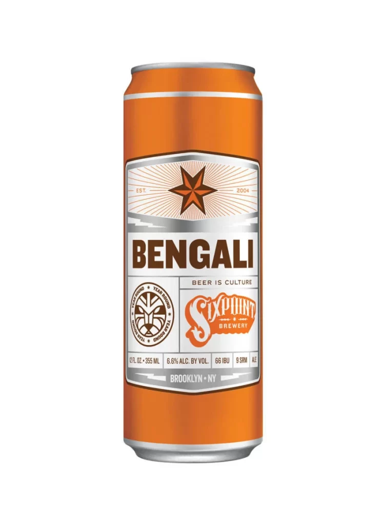
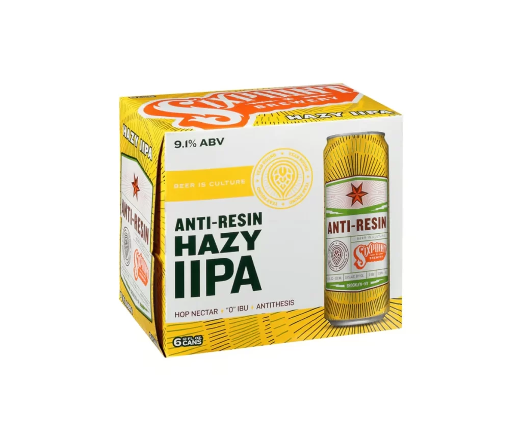
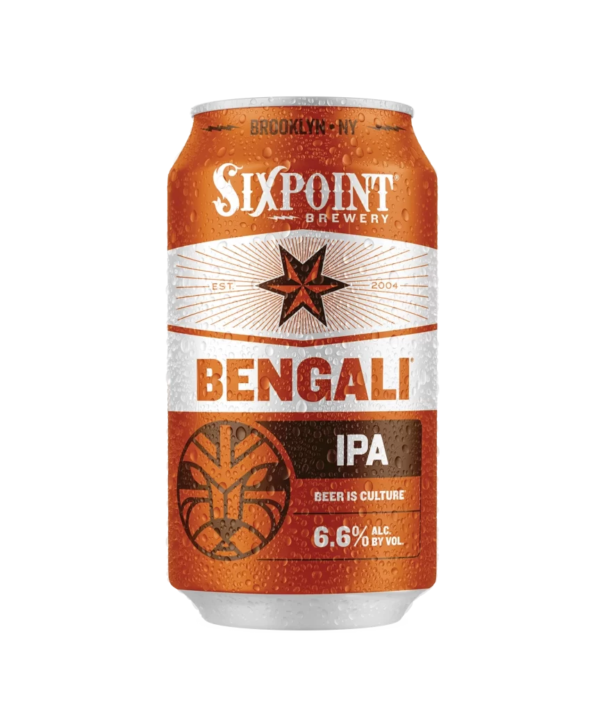
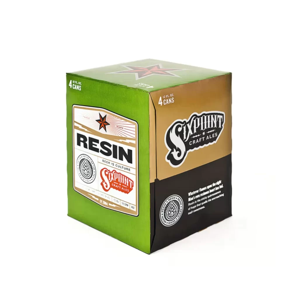
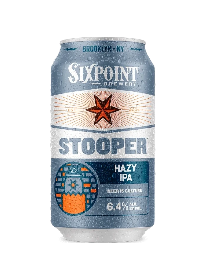
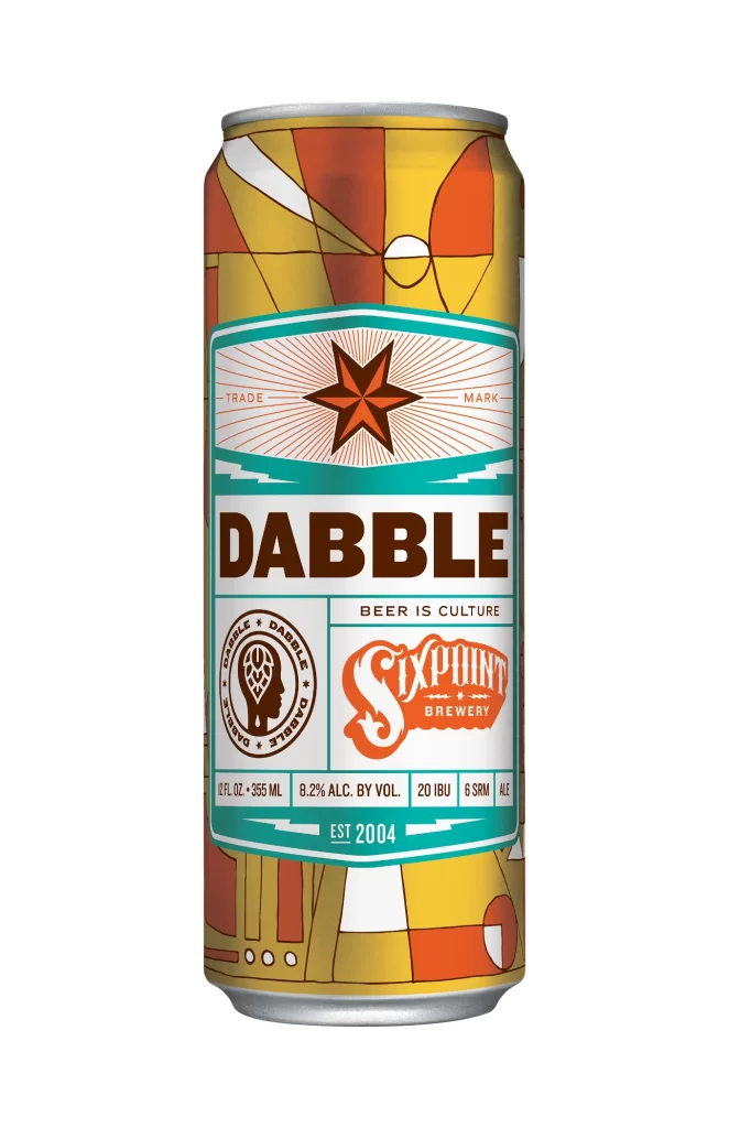
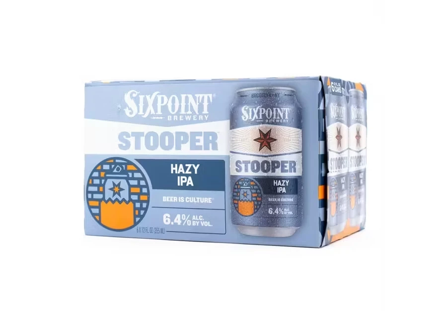
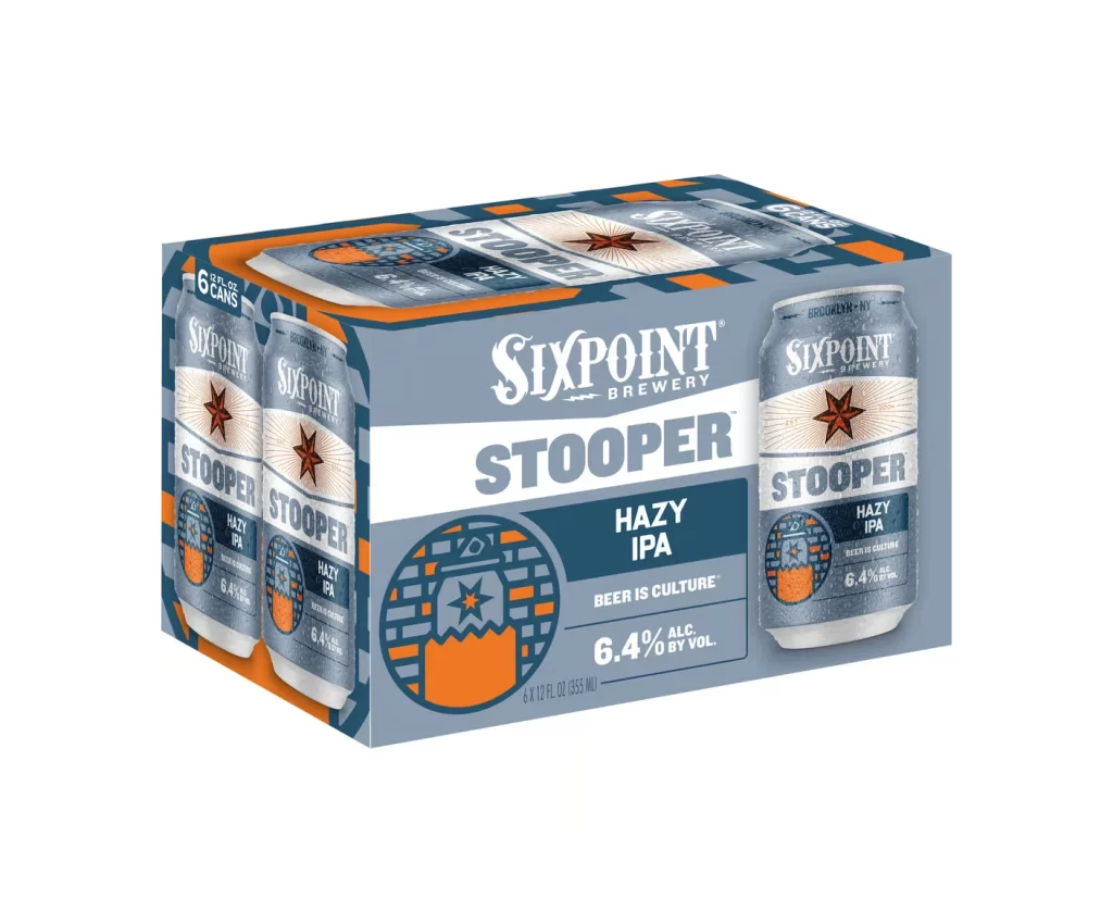
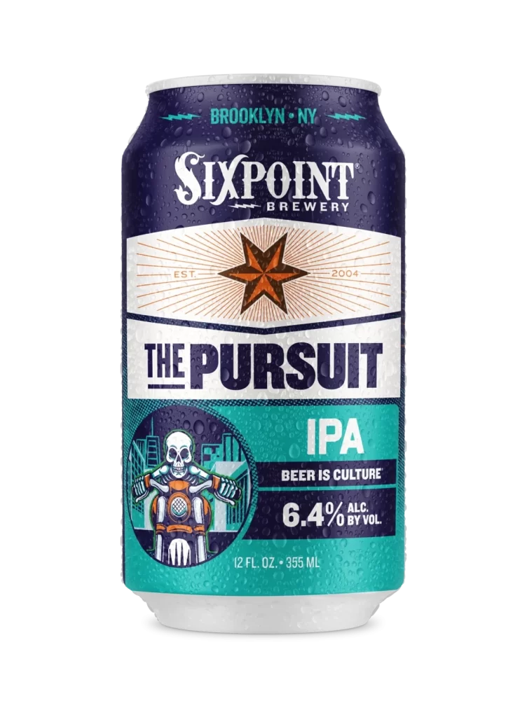
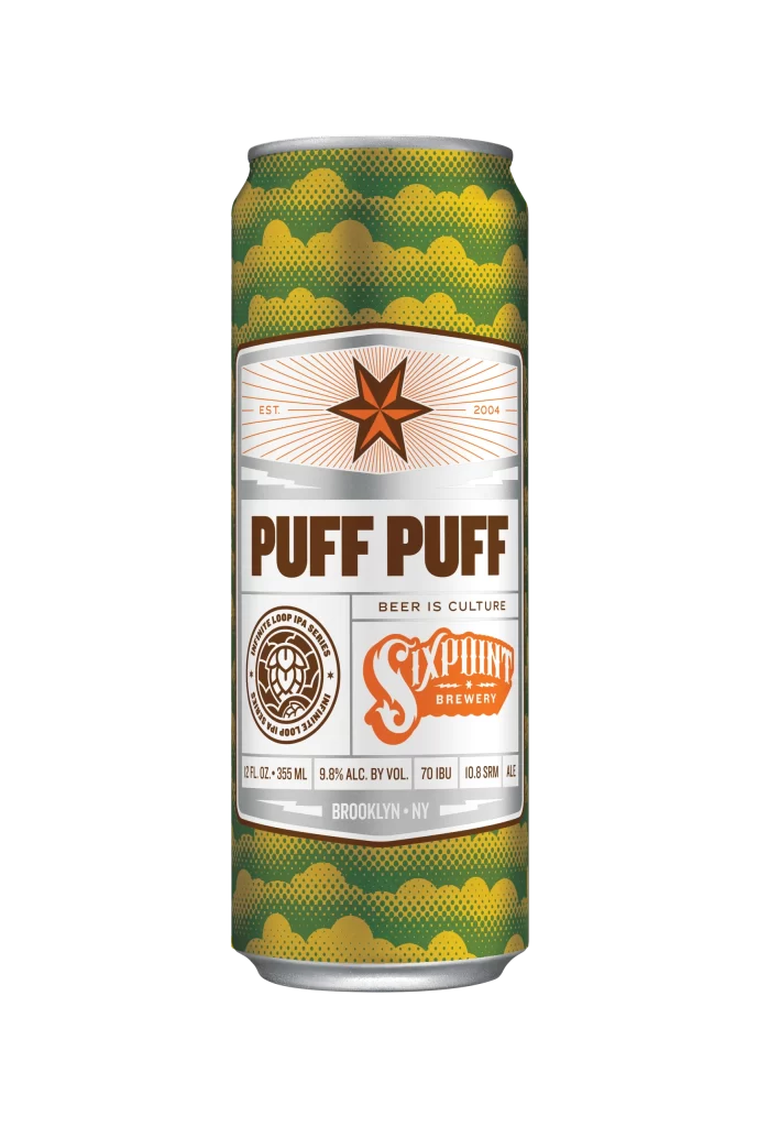
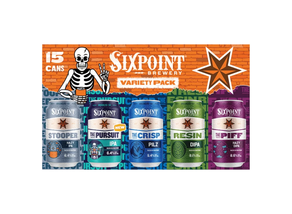
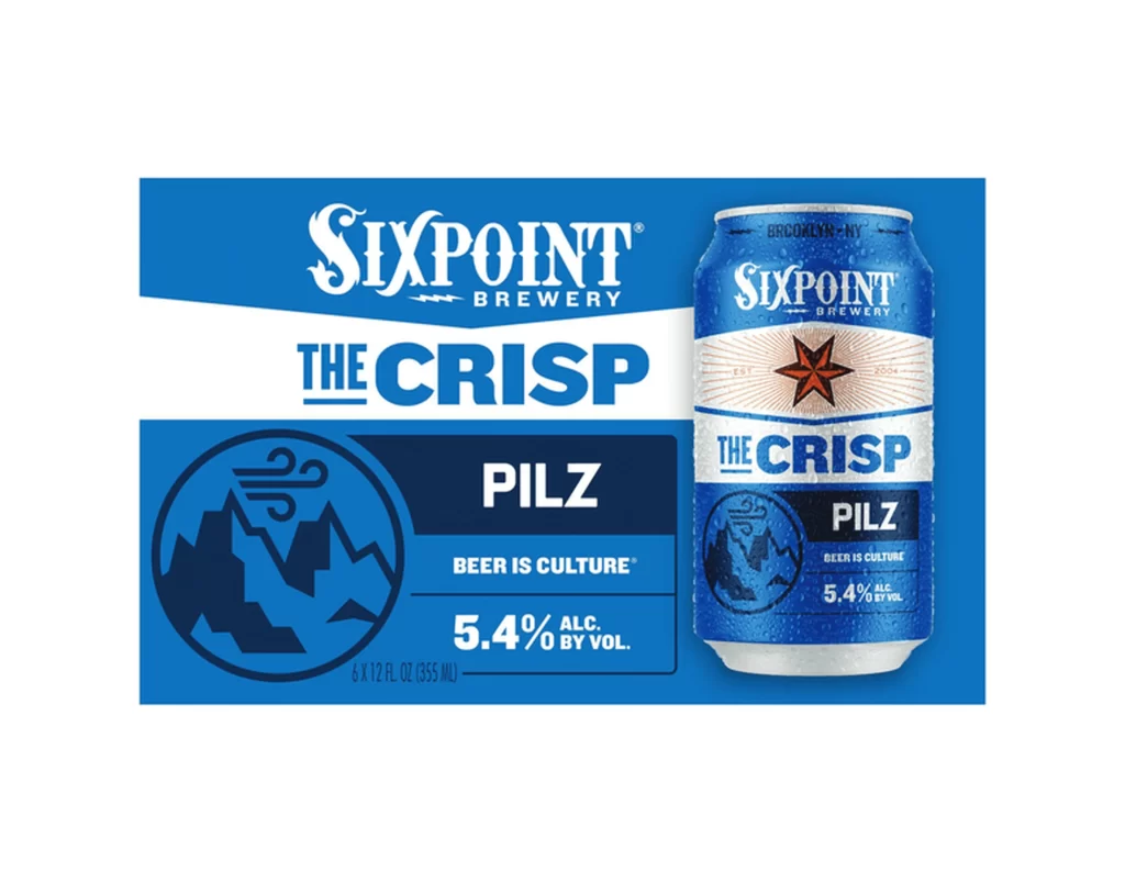
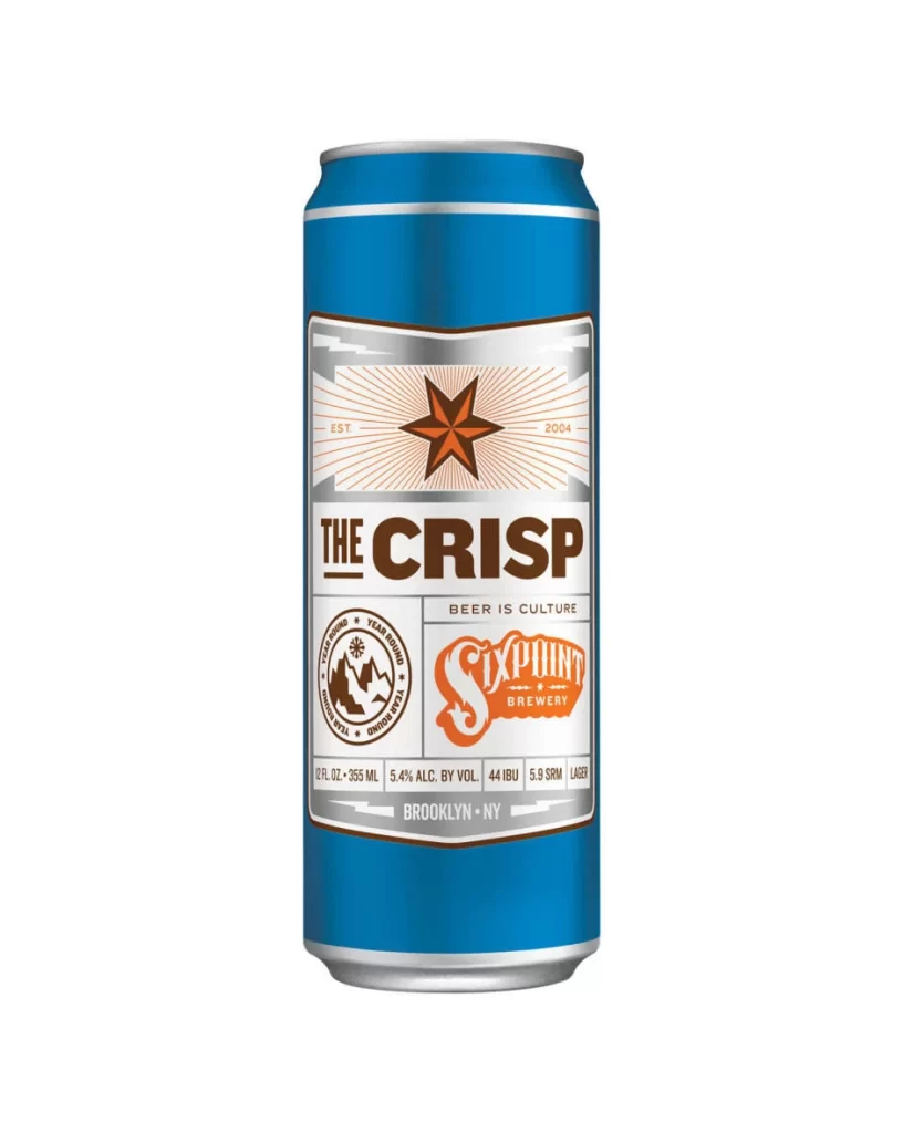
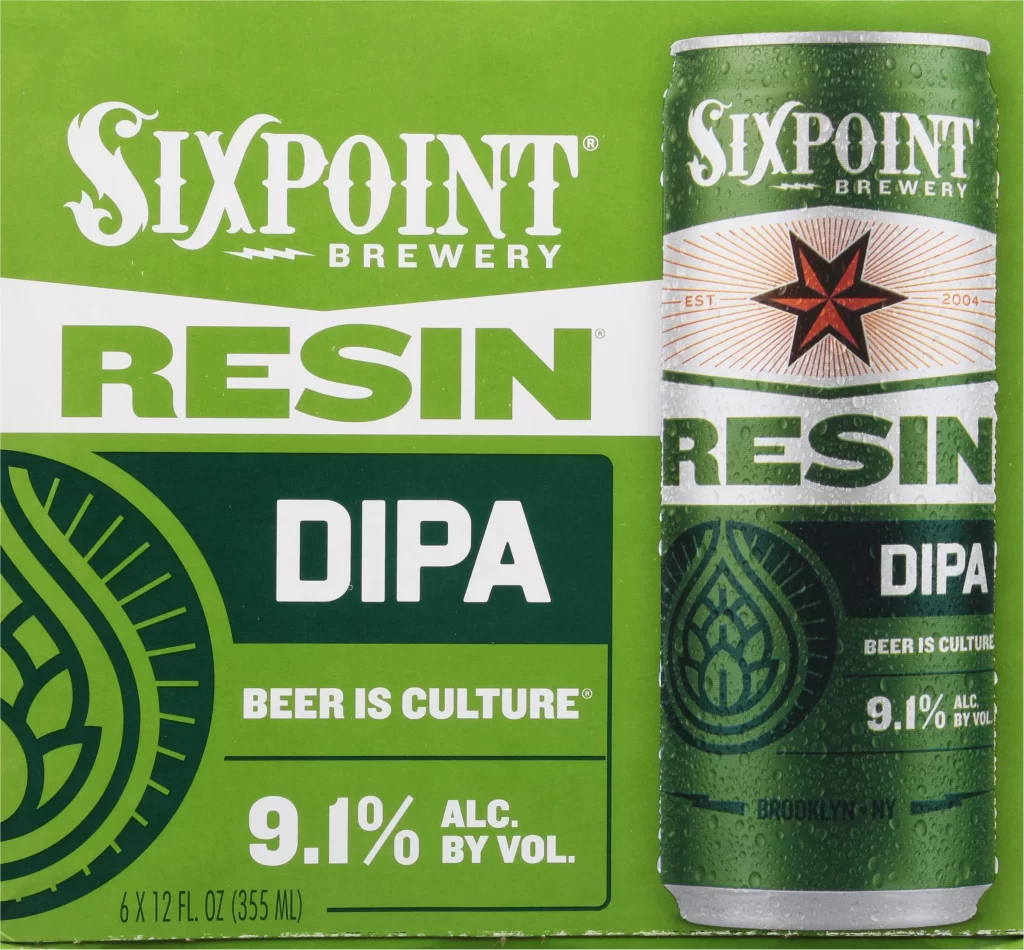
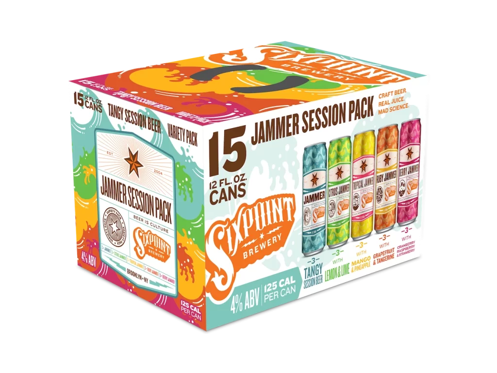
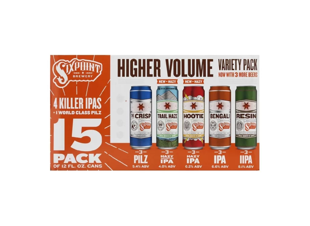
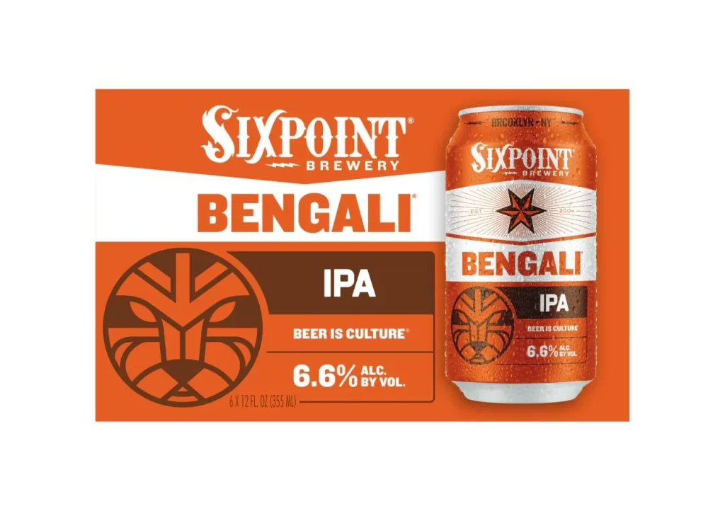
Vibrant orange saturates the packaging for Sixpoint Brewery's Bengali IPA, creating a bold visual statement across the six-pack carrier and single chilled aluminum can. The composition features a flat-lay view of the six-pack on the left and a condensation-beaded can on the right, both displaying the brand's signature palette of bright orange, crisp white, and deep brown. Visible text includes the stylized 'Sixpoint Brewery' wordmark in white script above 'Bengali' in bold orange letters, with 'IPA' and '6.6% ALC. BY VOL.' appearing alongside a geometric lion emblem and the tagline 'Beer is Culture'.
Visual distinction in this design comes from the aggressive use of high-contrast orange that dominates the entire field, creating immediate shelf presence through color alone. The typography employs a clever mix of a decorative, slightly weathered serif for the brewery name and a modern, blocky sans-serif for the beer style, establishing a clear hierarchy between brand identity and product information. That intricate lion emblem adds a layer of artisanal craftsmanship that balances the industrial feel of the aluminum can, making the overall aesthetic feel both mass-produced and carefully considered.
Brand managers studying craft beer market positioning would examine this to understand how color saturation drives category recognition in retail environments. Packaging engineers could analyze the layout efficiency of the carrier versus the cylindrical can label to optimize their own text placement strategies. Students of visual identity might deconstruct the relationship between the geometric mascot and the typographic choices to learn how heritage brands maintain consistency across different physical formats.