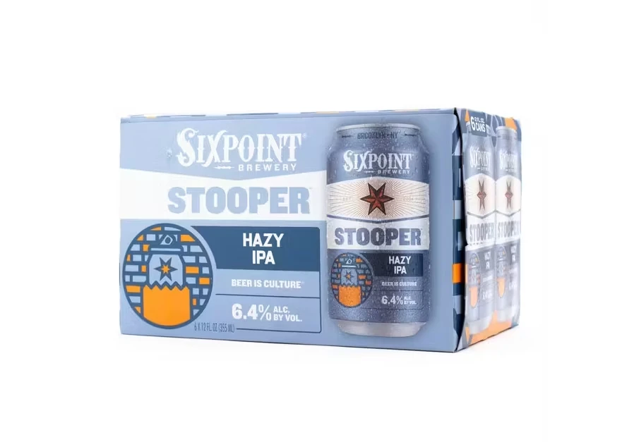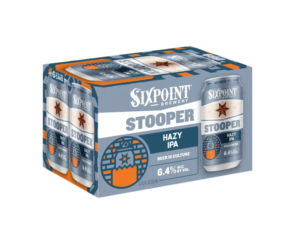
Sixpoint Brewery Stooper Hazy IPA 4 Pack Packaging
Topics
Details
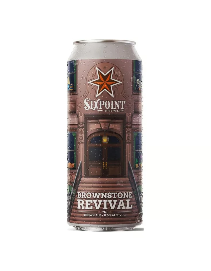
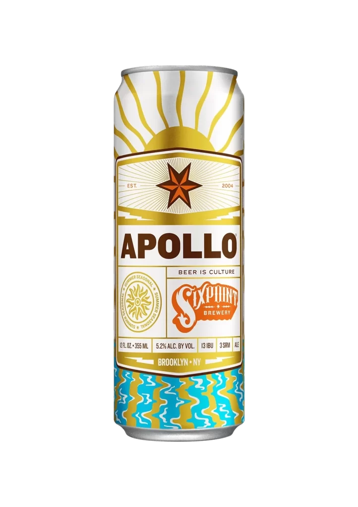
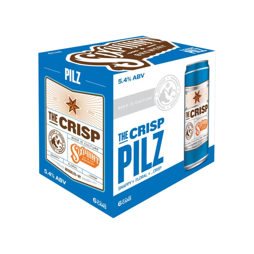
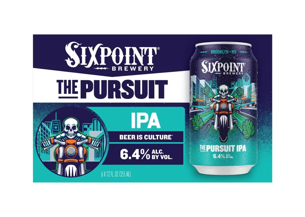
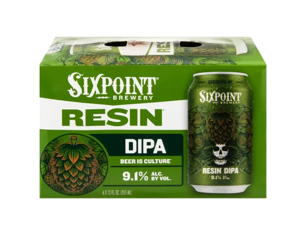
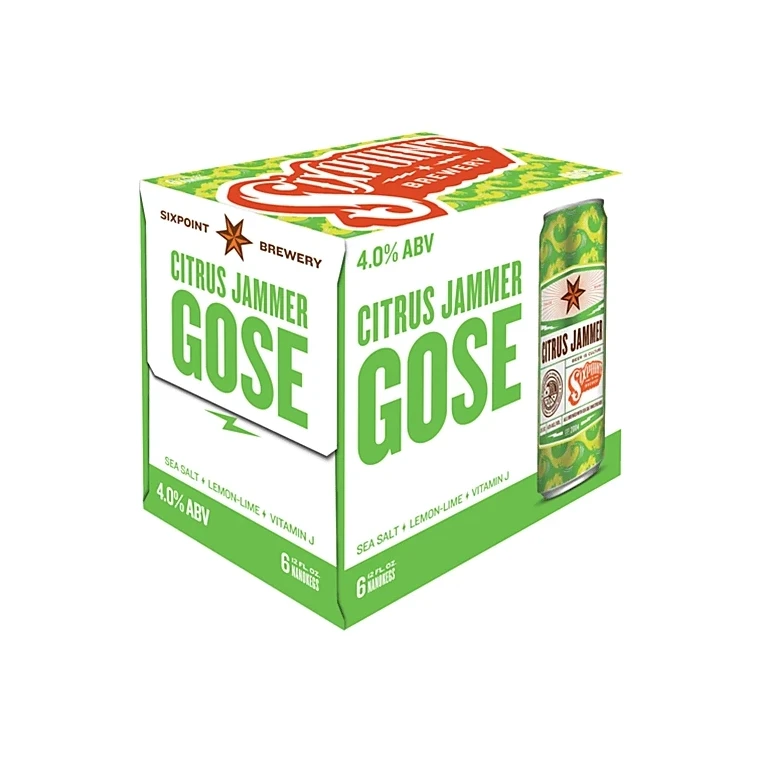
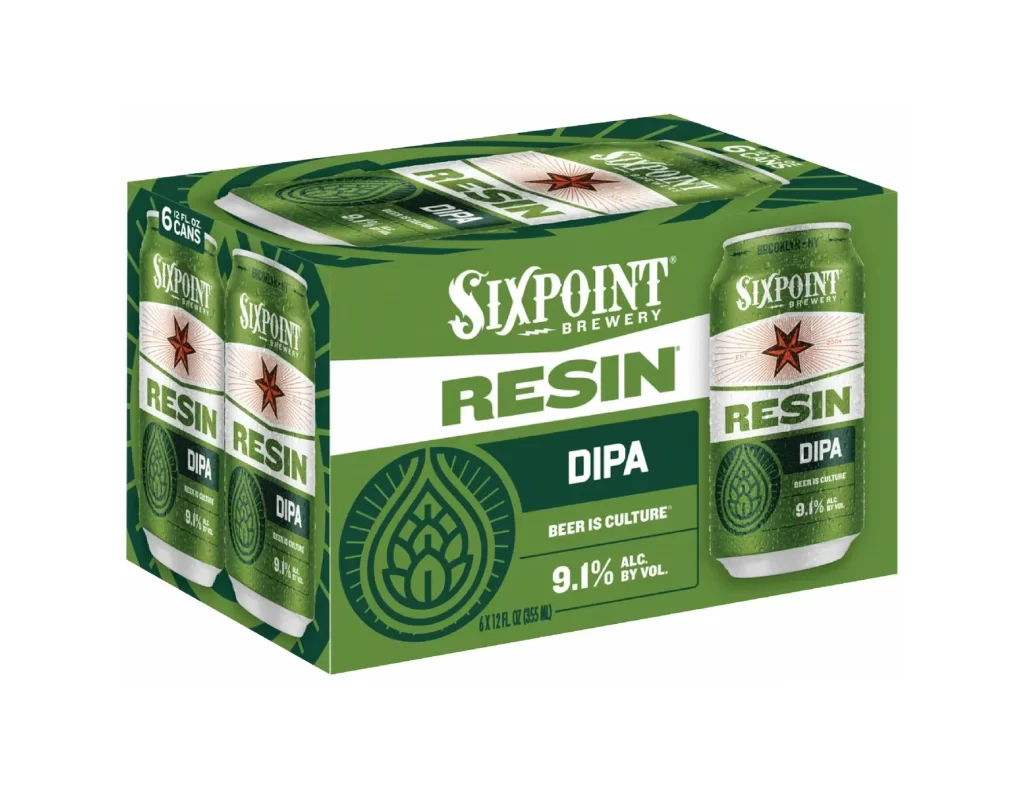
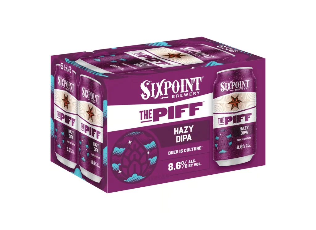
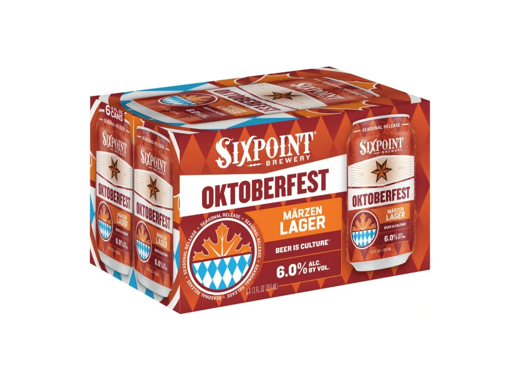
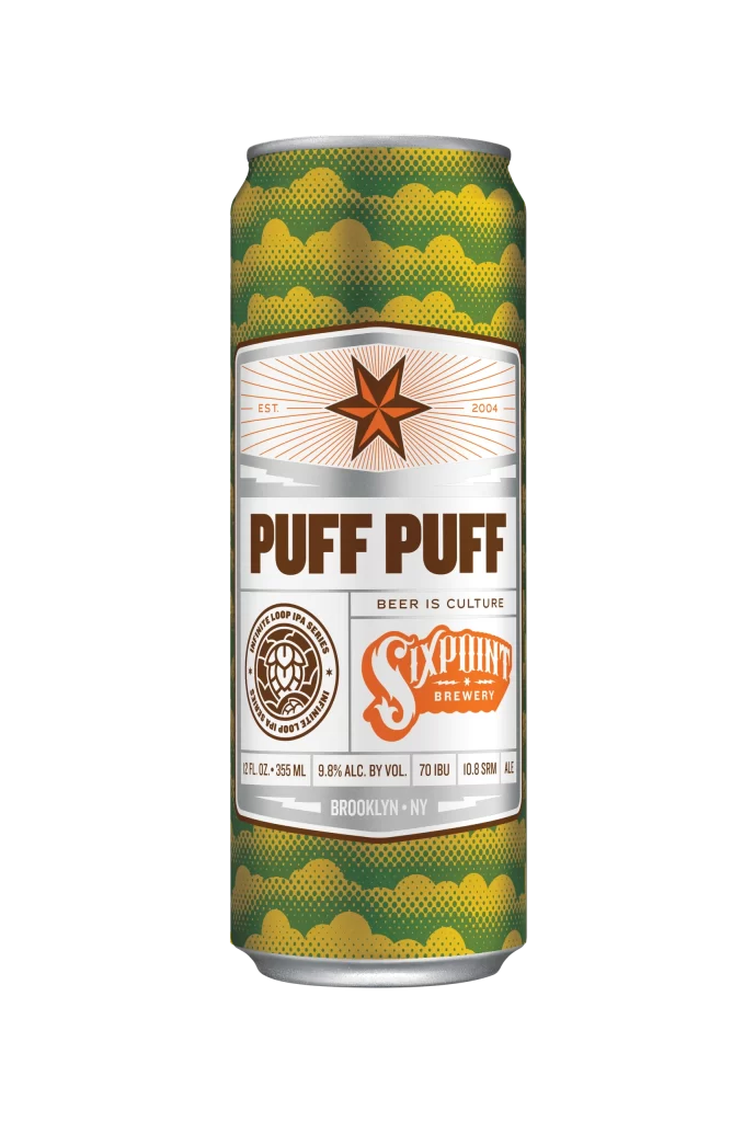
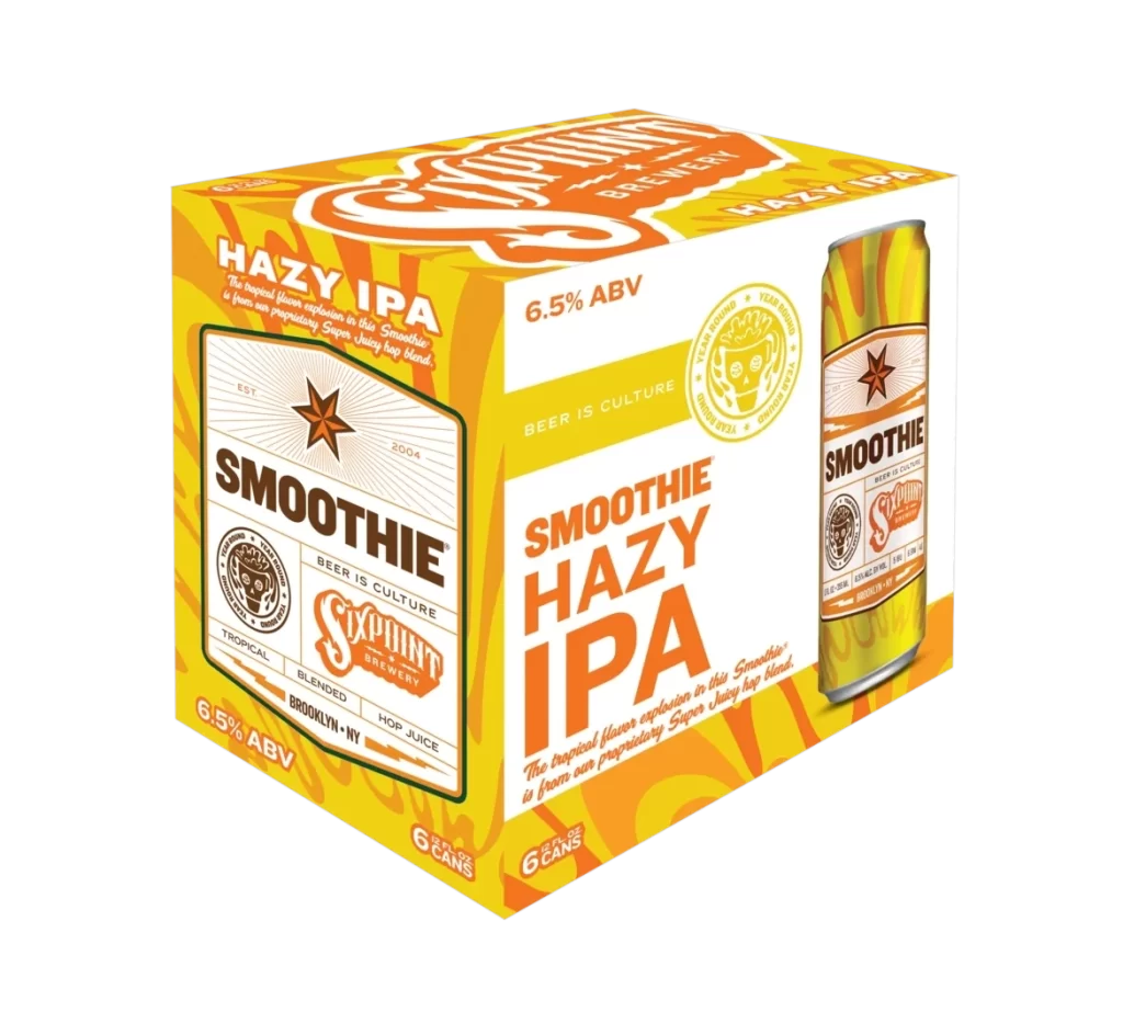
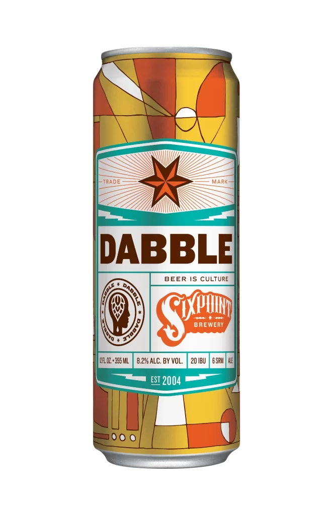
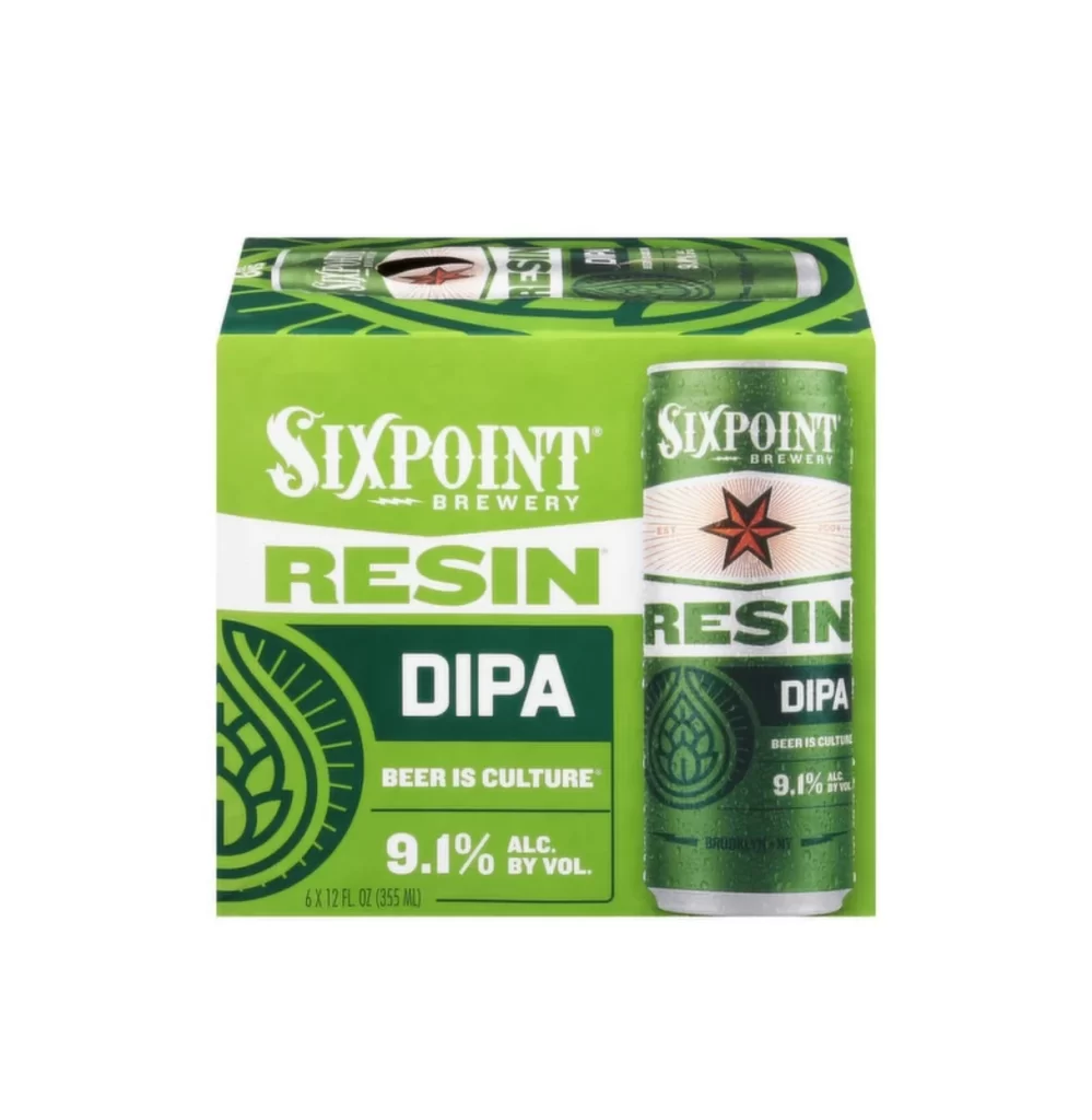
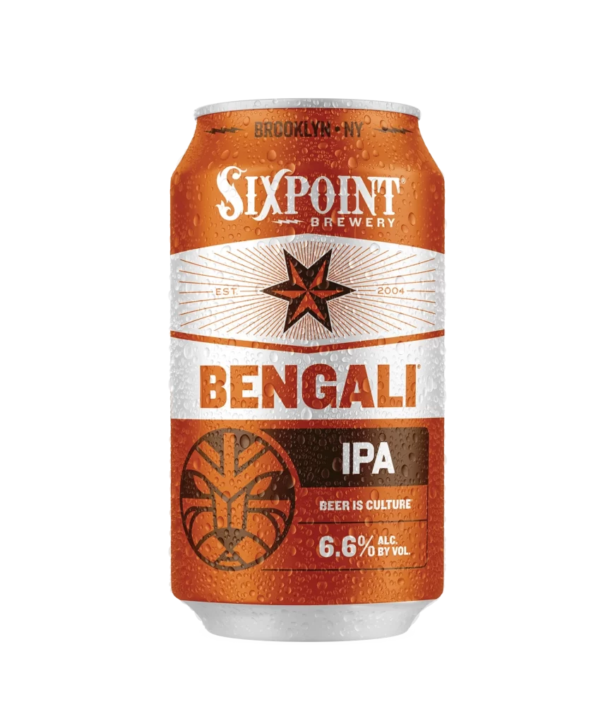
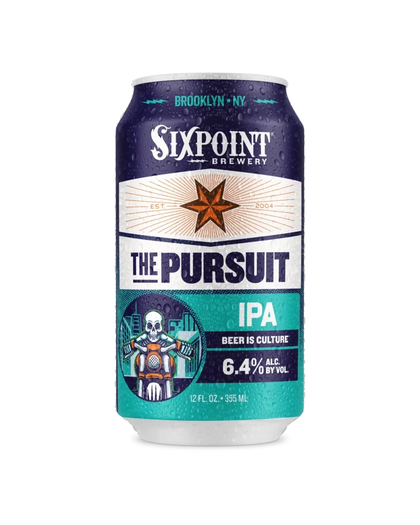
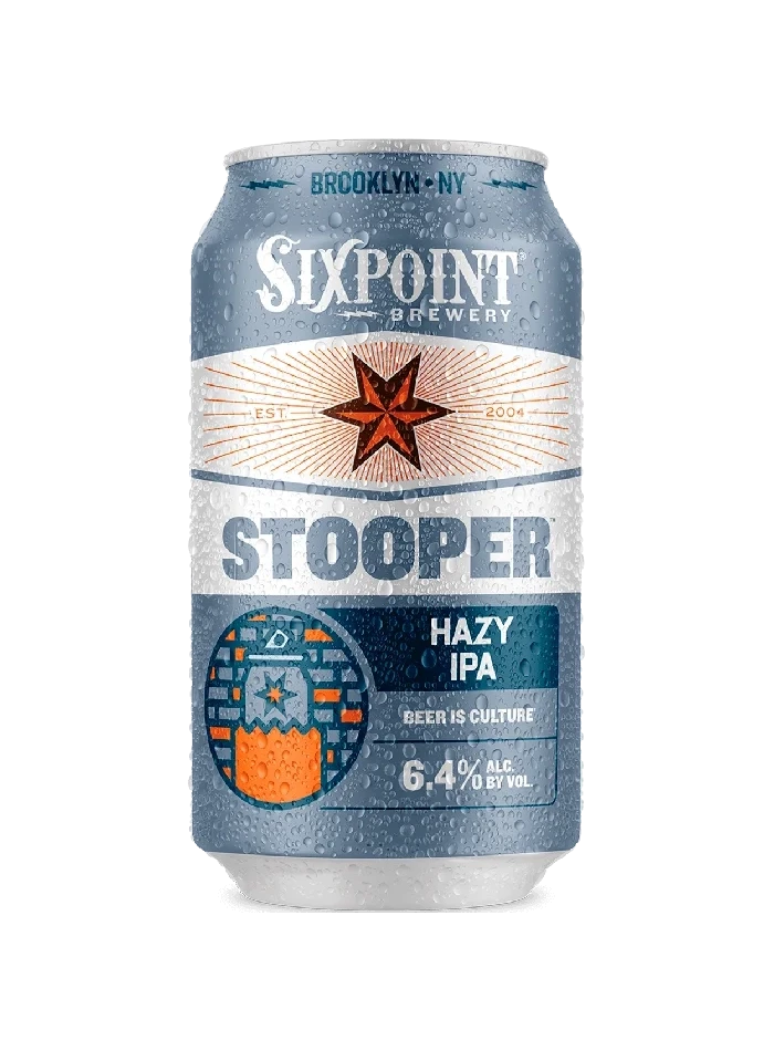
A chilled aluminum can of Sixpoint Brewery's Stooper Hazy IPA stands centered on a white surface, its slate blue surface glistening with fine condensation droplets that catch the light. The packaging features a sophisticated palette of slate blue, crisp white, and burnt orange, anchored by the brewery's signature five-pointed star emblem radiating from the center. Bold typography displays the brand name 'SIXPOINT BREWERY' at the top with 'BROOKLYN • NY' above it, while 'STOOPER' dominates the middle band in large silver letters and 'HAZY IPA' appears in white text on a dark teal field below.
Visual hierarchy plays a crucial role here, with the radial sunburst pattern behind the orange star creating immediate focal tension against the cool metallic background. The lower third introduces a darker teal band that grounds the composition, housing technical details like the 6.4% alcohol content and the ‘BEER IS CULTURE’ tagline in clean, modern typefaces. Texture contrasts between the smooth aluminum, the geometric mosaic pattern, and the realistic water droplets add dimensional depth that makes this particular SKU stand out on retail shelves.
Brand strategists analyzing craft beer market positioning would find this useful for studying how urban heritage elements integrate with contemporary beverage aesthetics. Packaging engineers might examine the condensation rendering to understand how moisture effects communicate product temperature and freshness to consumers. Illustrators working on beverage labels could reference the balance between typographic weight and iconography to achieve similar visual impact in their own projects.