Sixpoint Brewery The Crisp Pilz Beer Can Packaging
Topics
Details
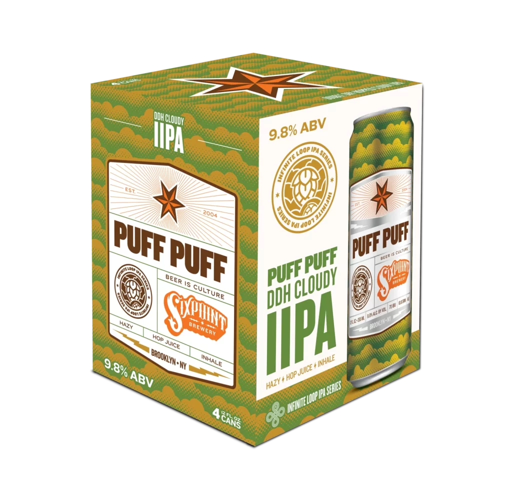
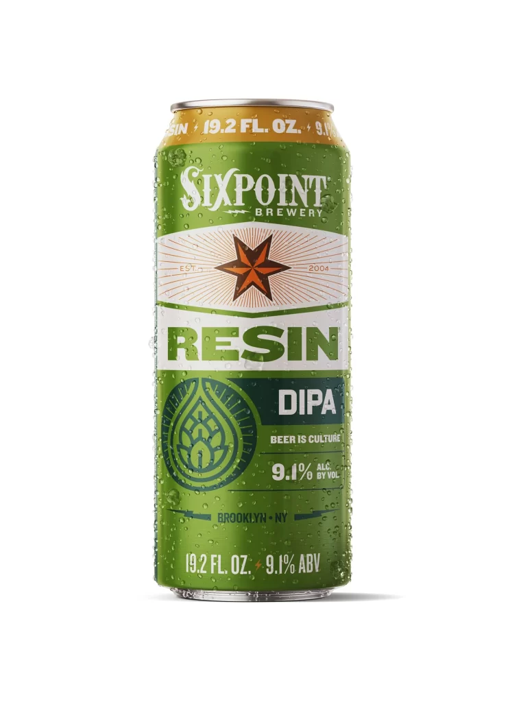
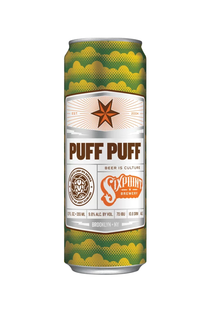
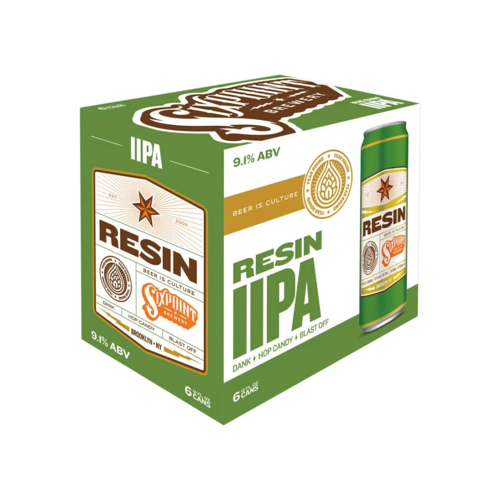
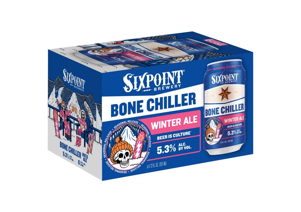
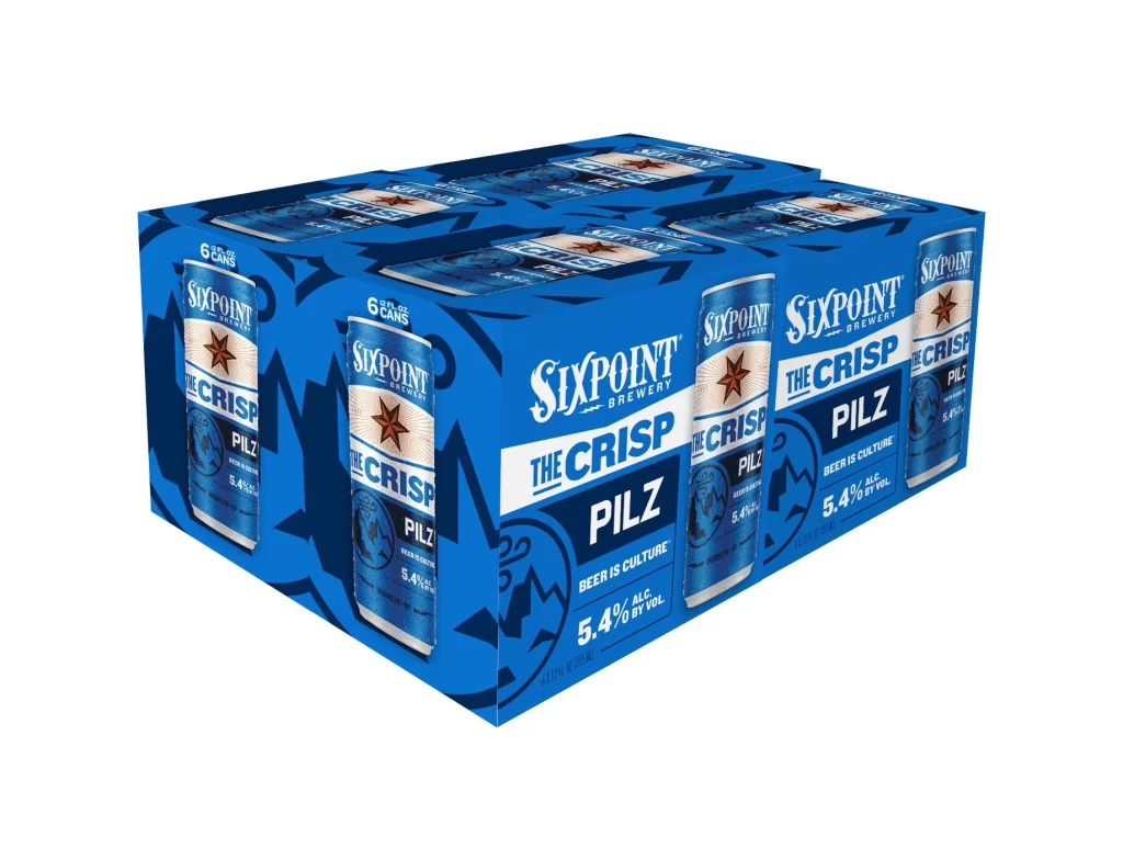
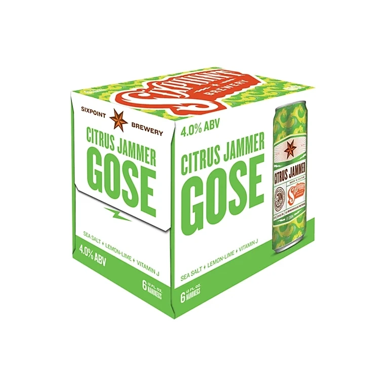
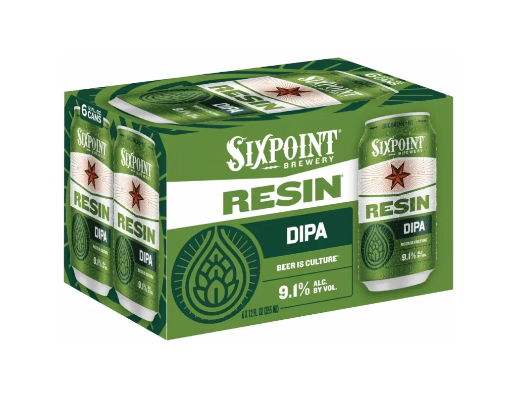
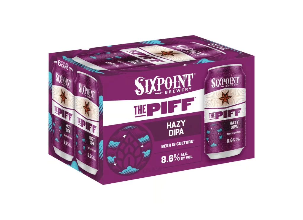
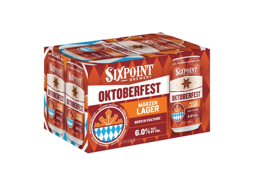
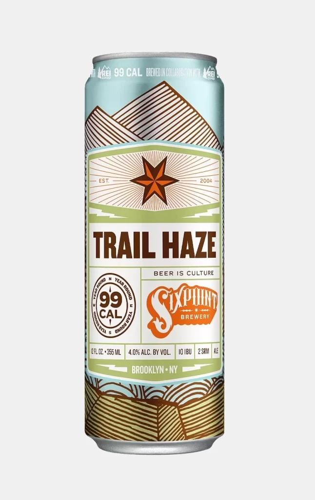
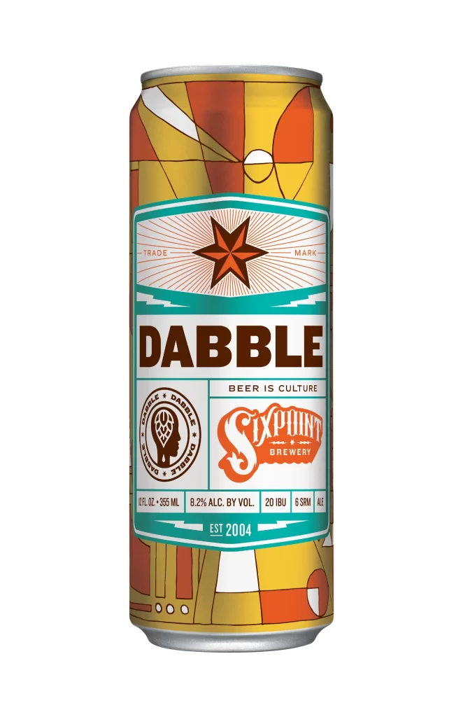
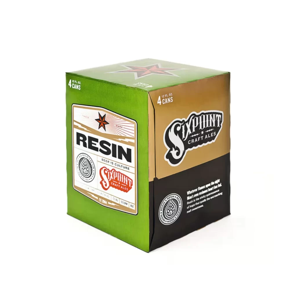
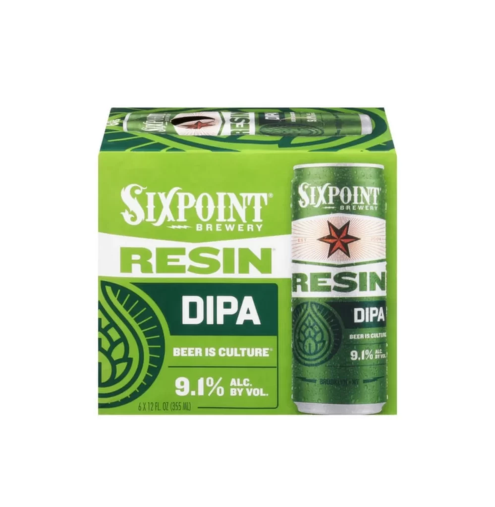
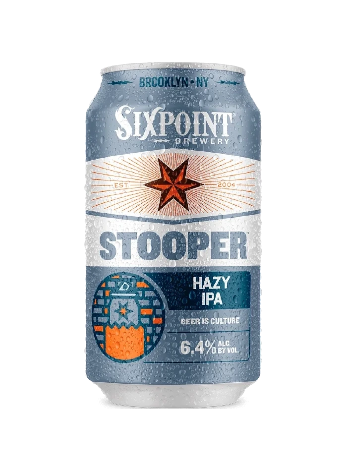
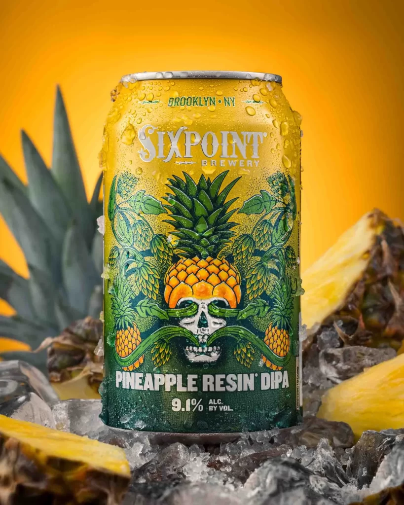
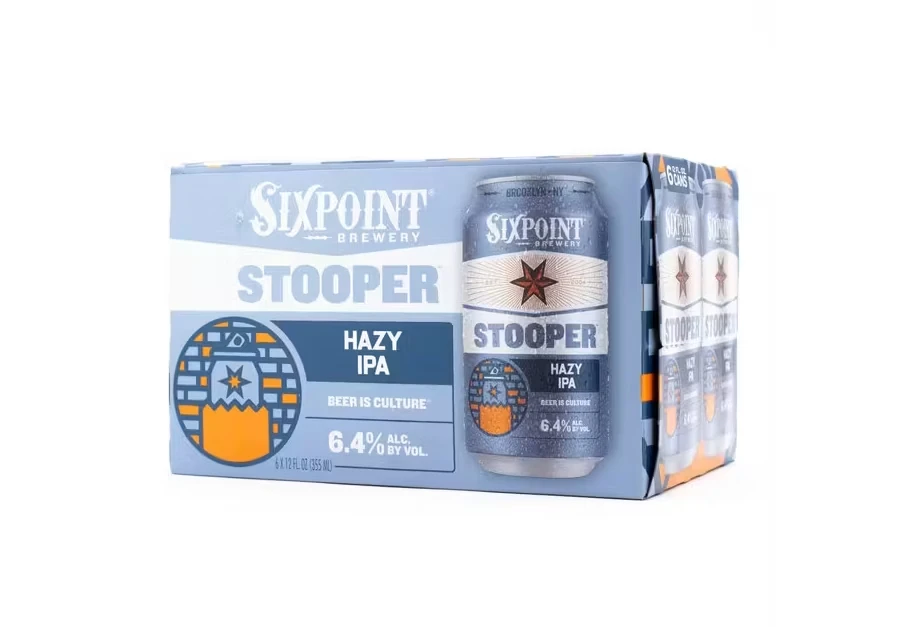
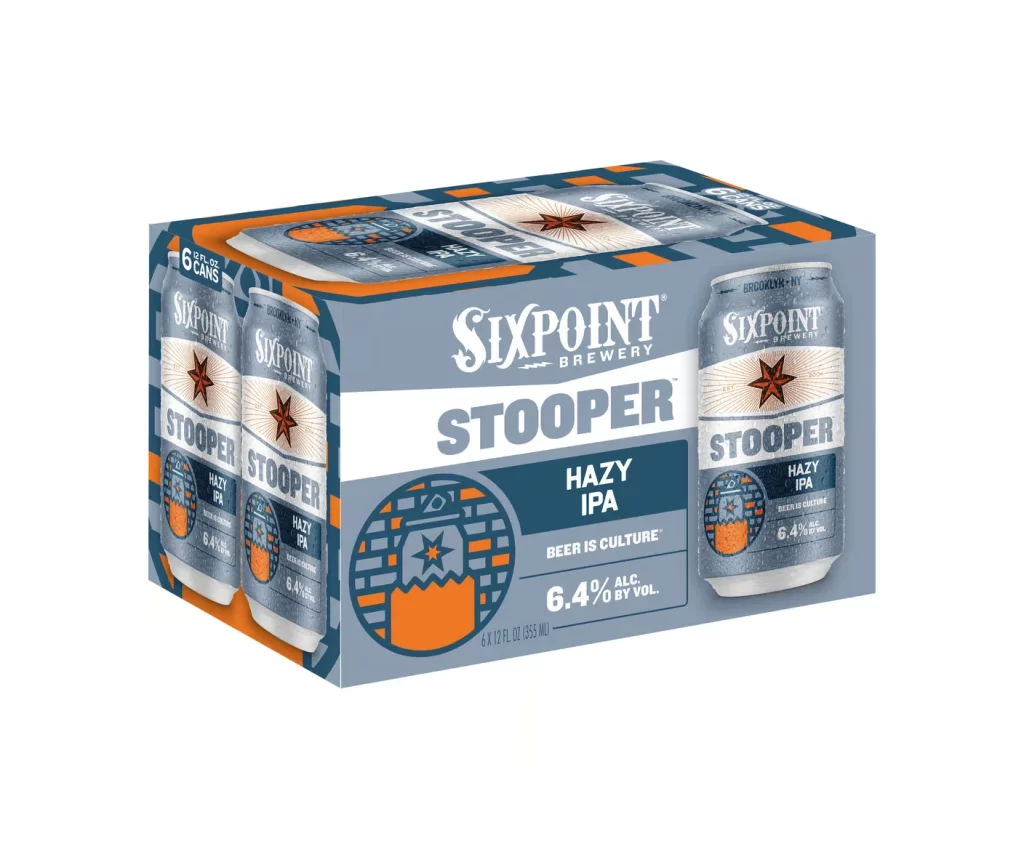
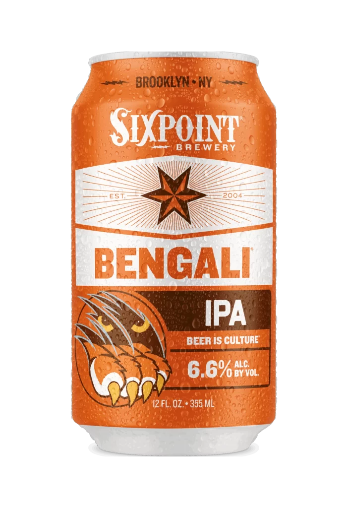
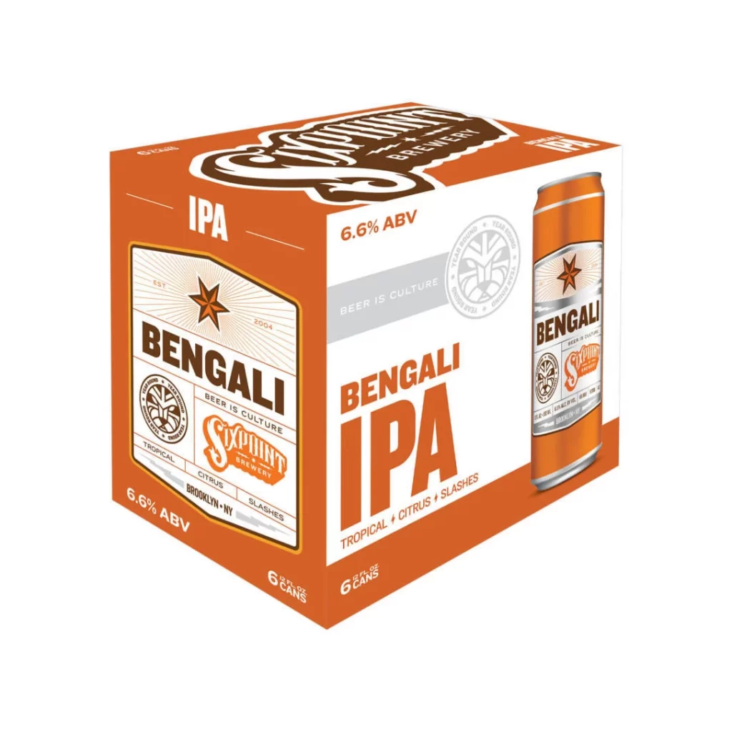
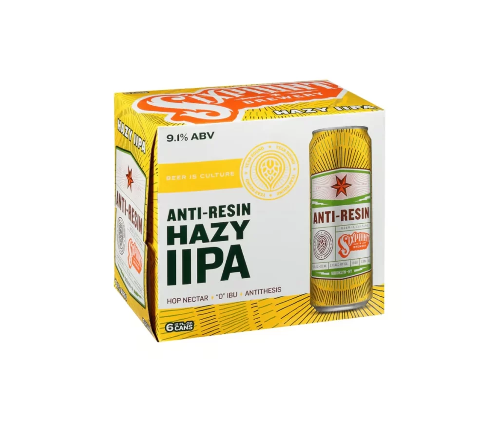
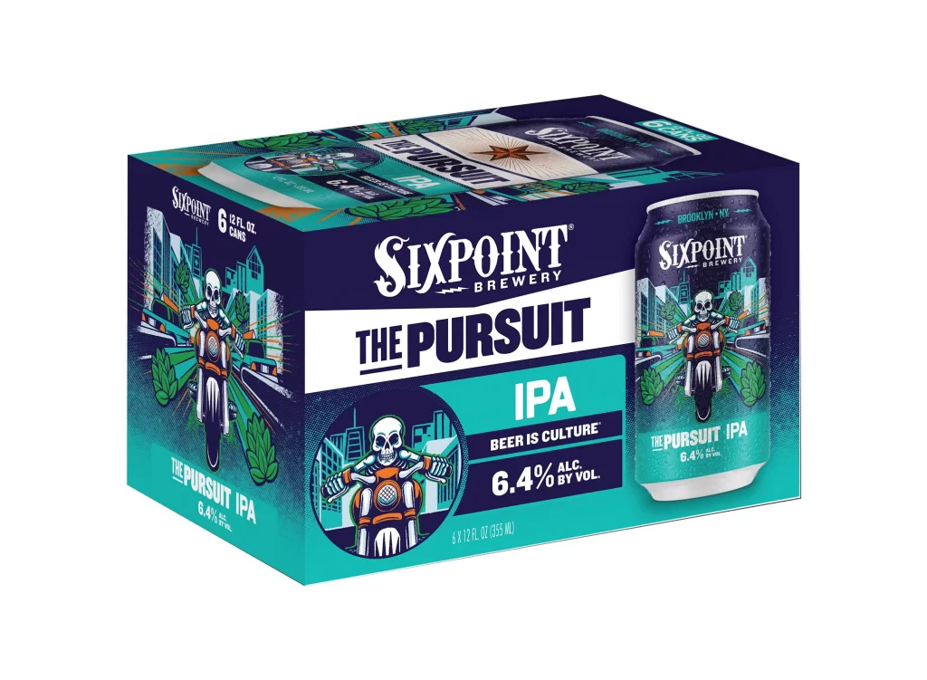
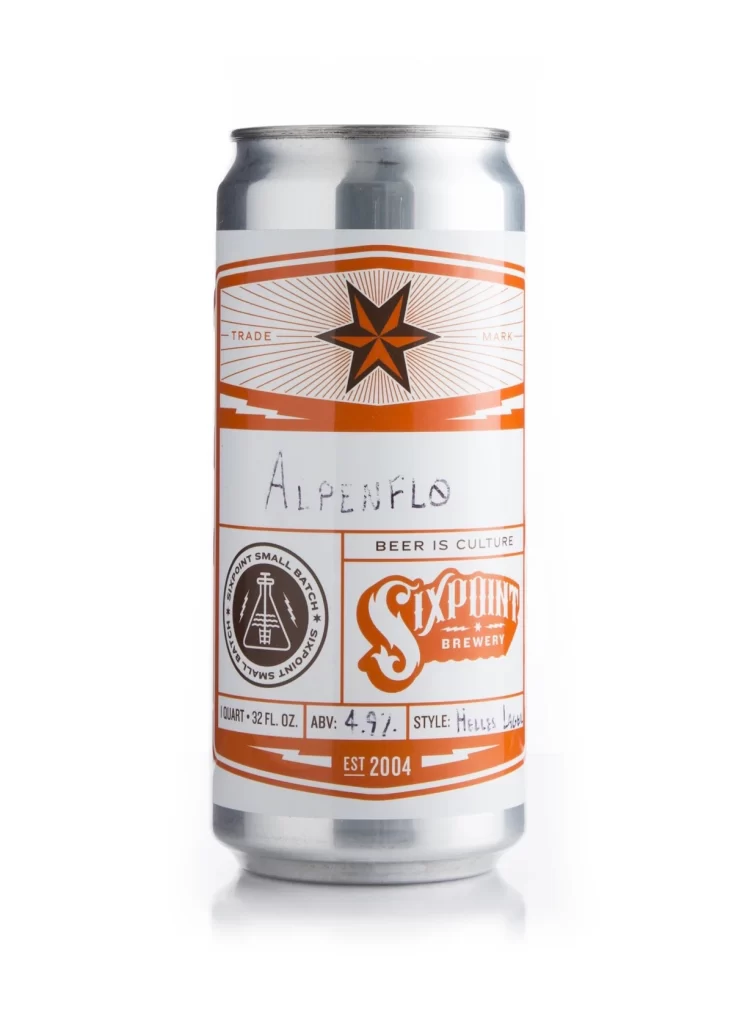
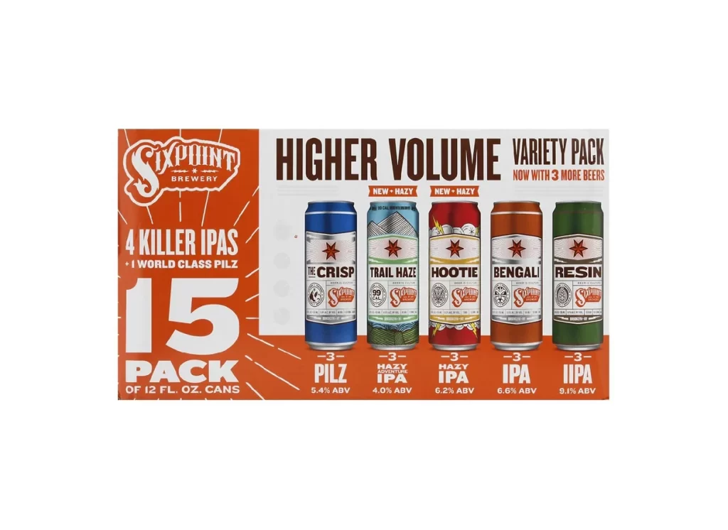
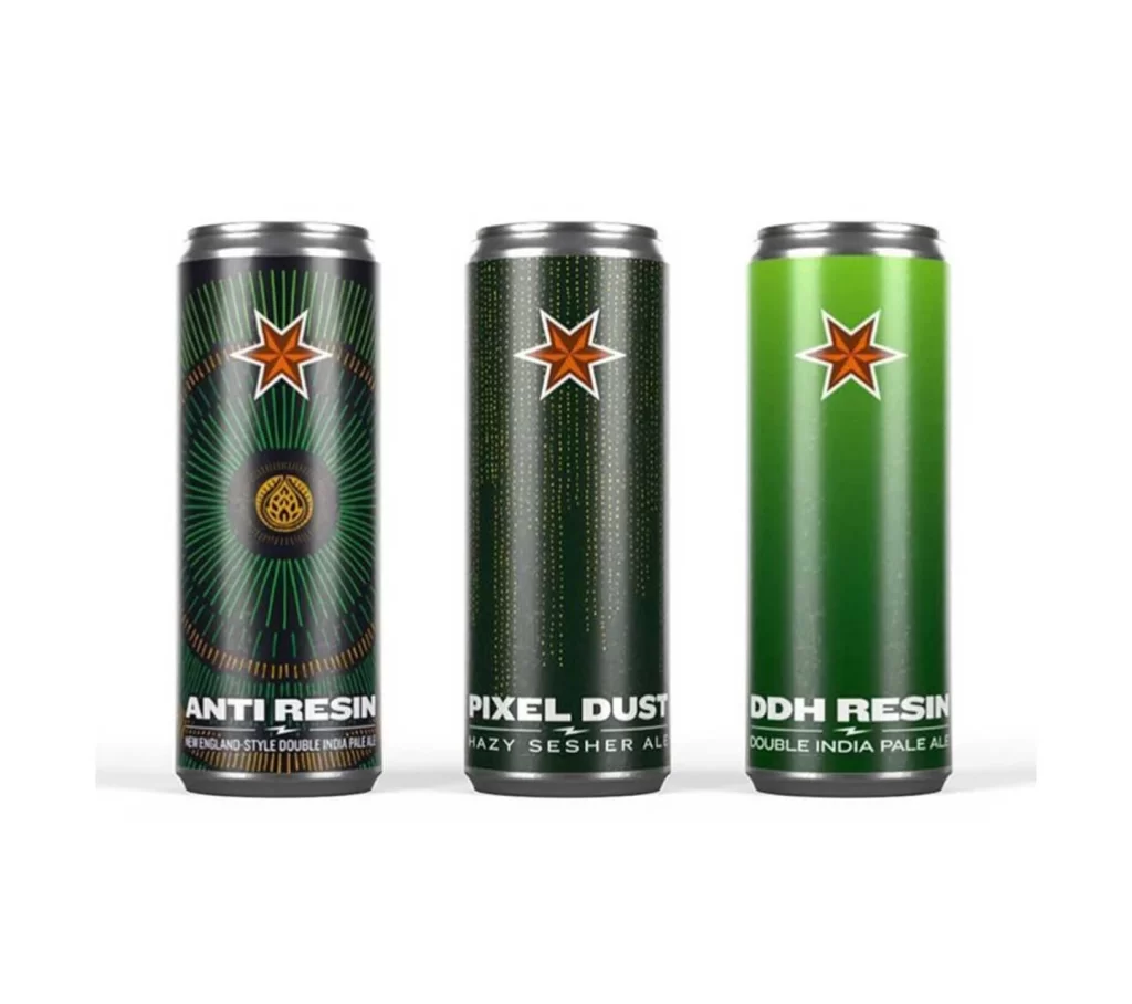
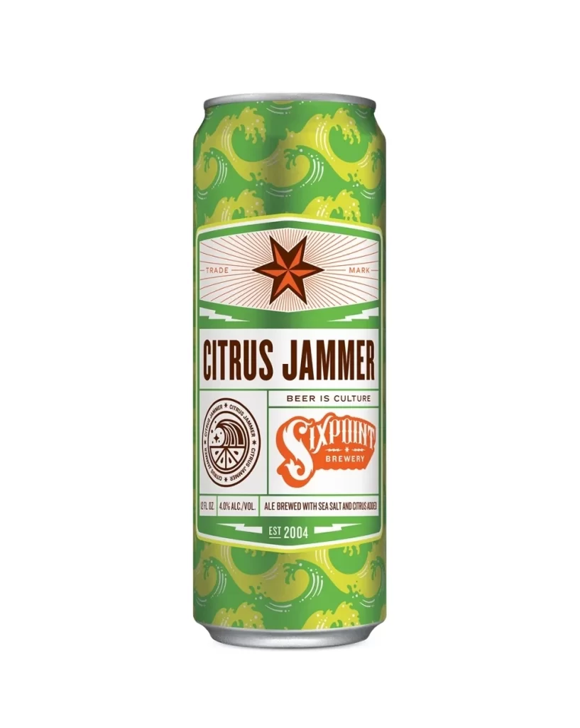
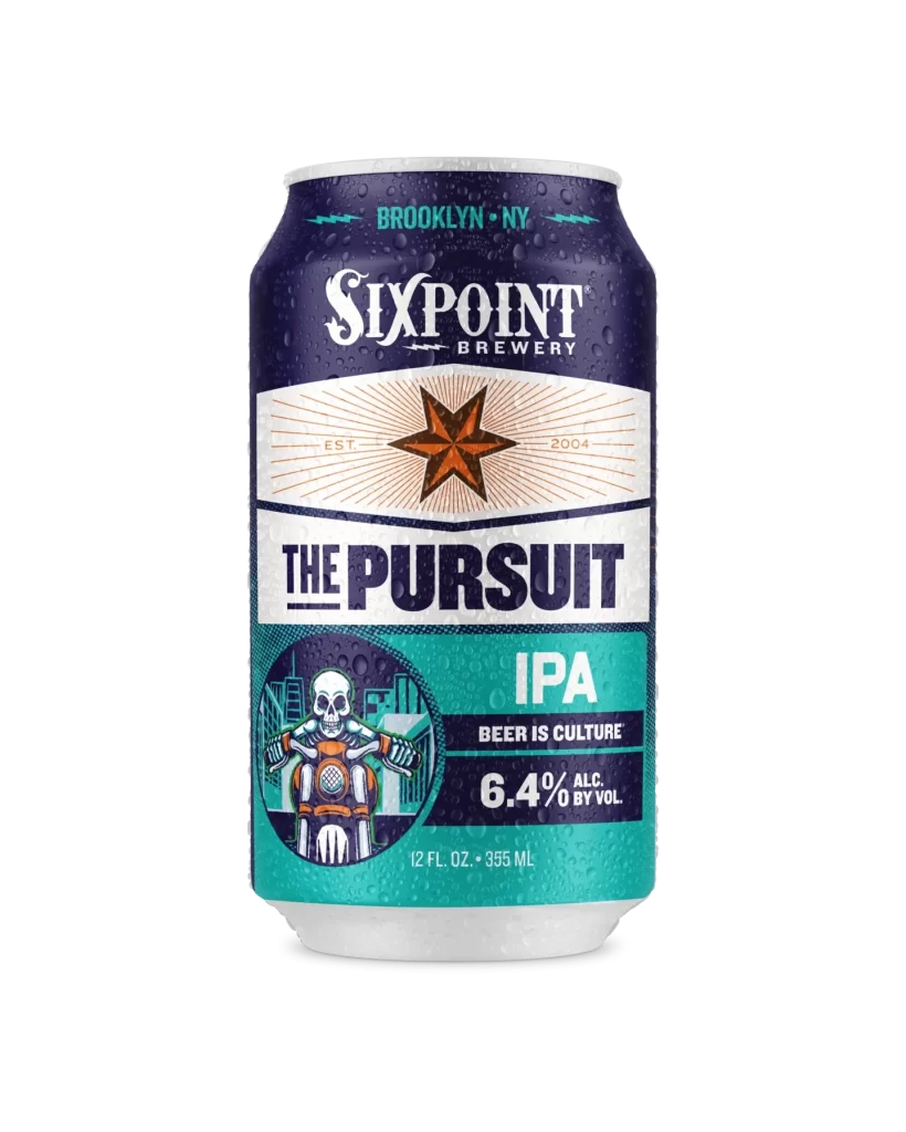
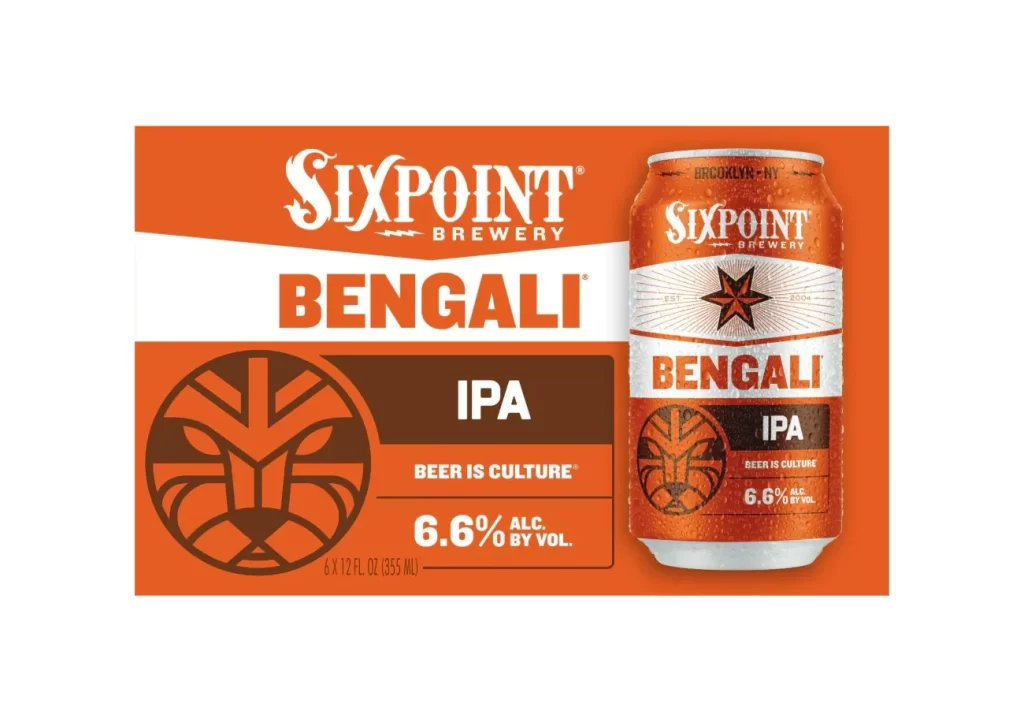
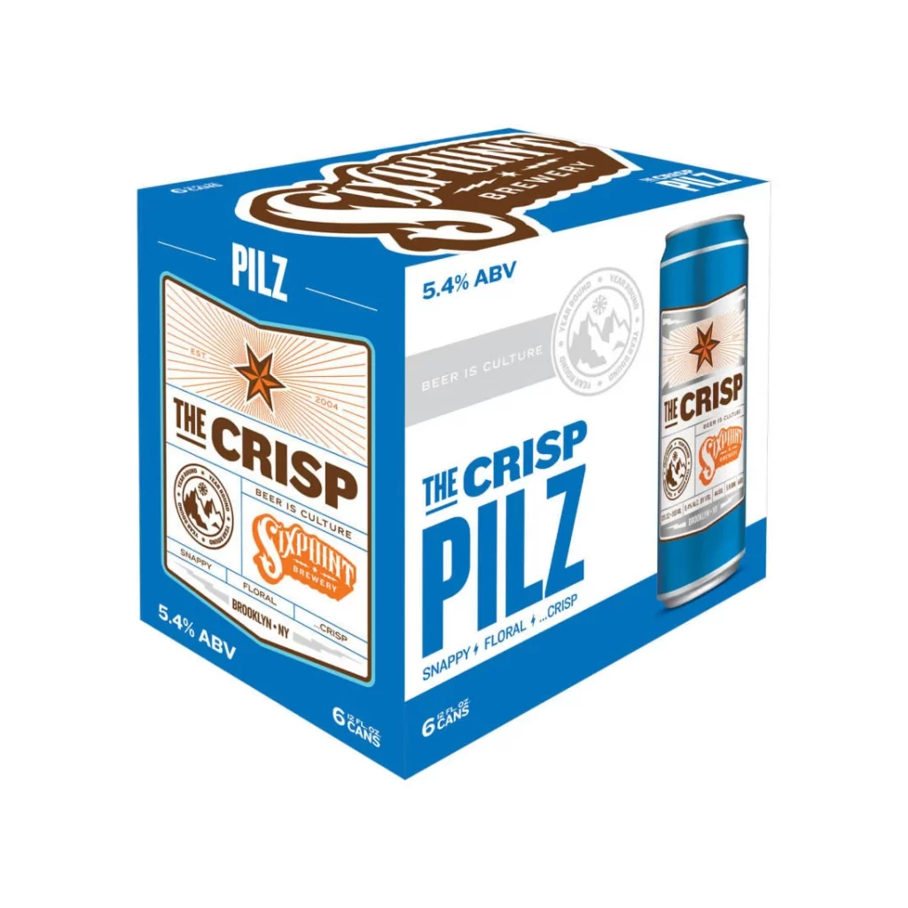
Rendered against a sterile white void, the six-pack carrier presents a dominant cobalt blue field that frames the central graphic elements with geometric precision. The front face features a cream-colored label containing a rust-orange starburst, while the side panel displays the product name in oversized, bold cyan typography. A three-quarter perspective reveals the top flap branding in deep chocolate brown script, alongside a photographic representation of the aluminum vessel which mirrors the box's high-contrast color palette.
Visual hierarchy is established through the aggressive scaling of 'PILZ' and 'THE CRISP,' creating an immediate typographic impact that balances industrial utility with craft-beer aesthetics. The interplay between the sharp, sans-serif lettering and the organic, circular seal motifs generates a dynamic tension between modern minimalism and traditional brewing iconography. Such deliberate use of negative space around the 5.4% ABV callout ensures technical specifications remain legible without disrupting the overall graphic flow.
Brand strategists might deconstruct this composition to understand how color blocking influences consumer perception within the competitive pilsner market. Packaging engineers could analyze the structural layout to optimize similar designs for retail shelf presence and material efficiency. Art directors seeking to revitalize heritage brands would benefit from studying how this specific iteration merges vintage badge elements with contemporary, bold typefaces.