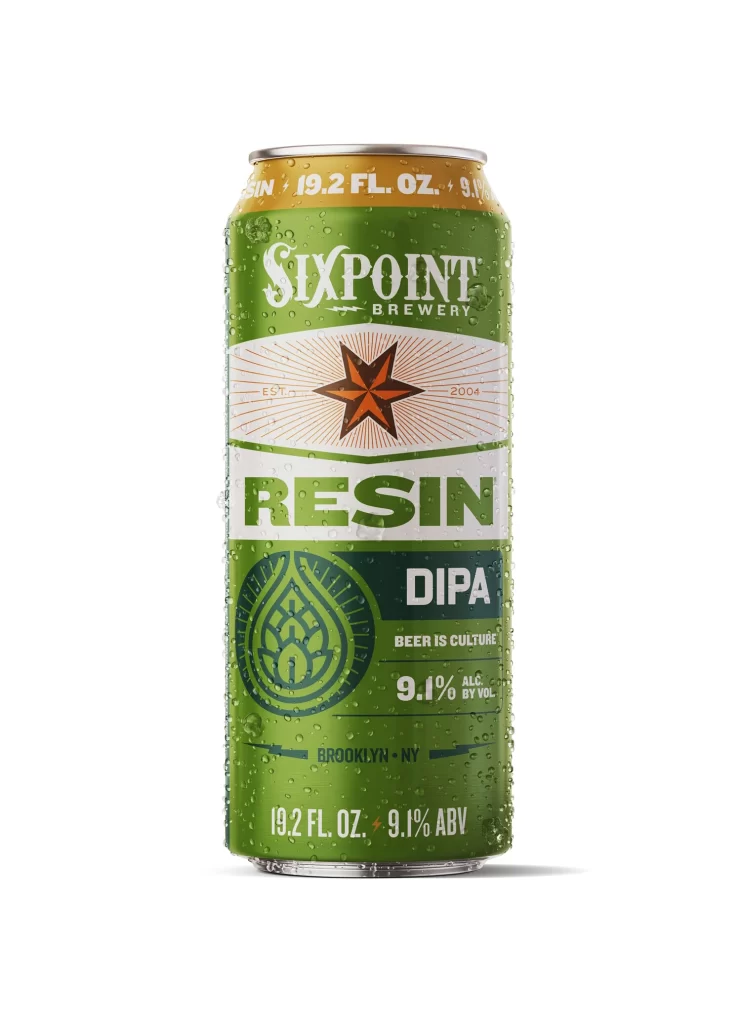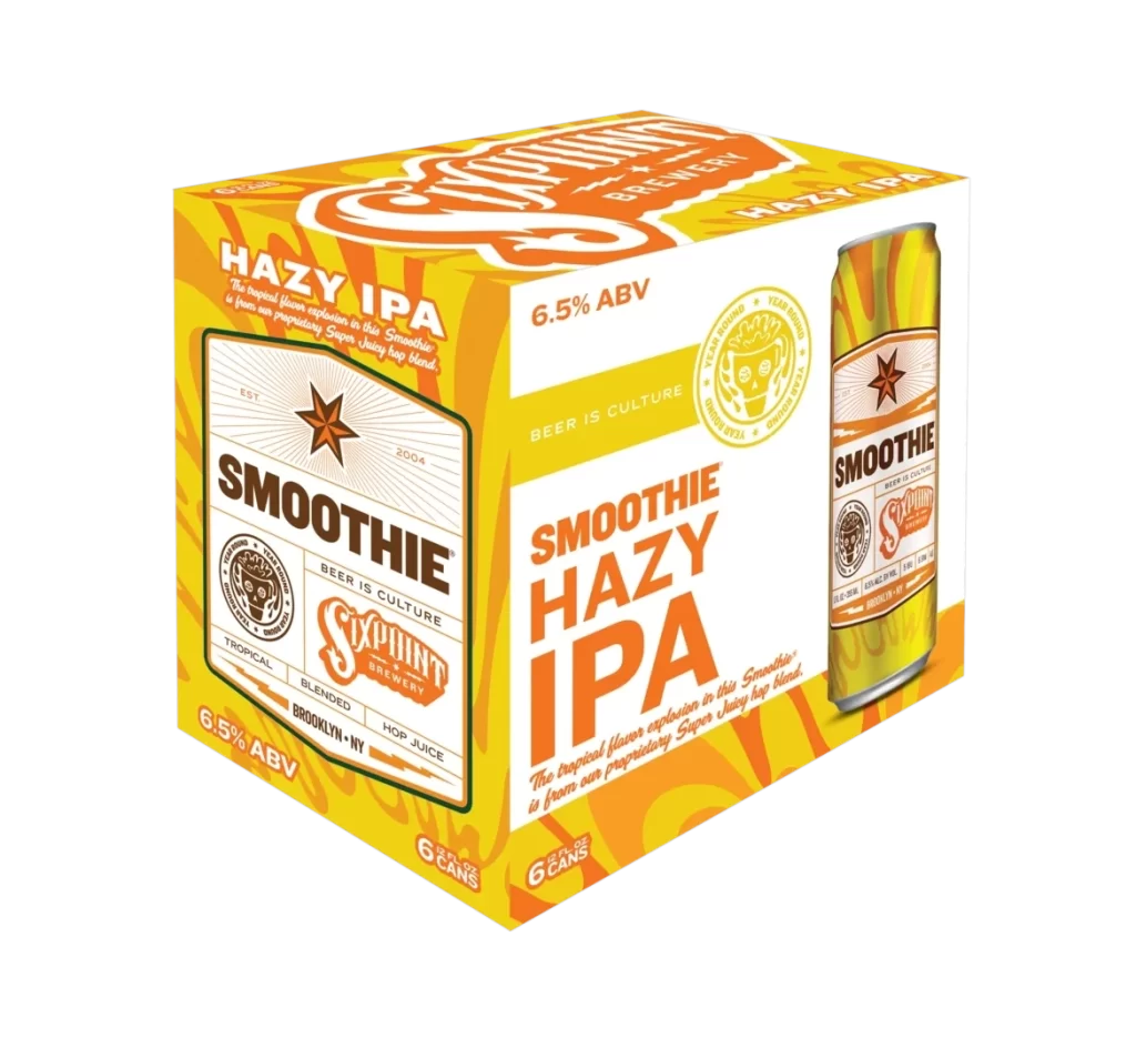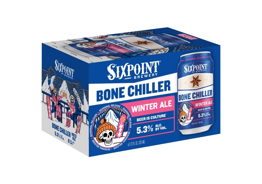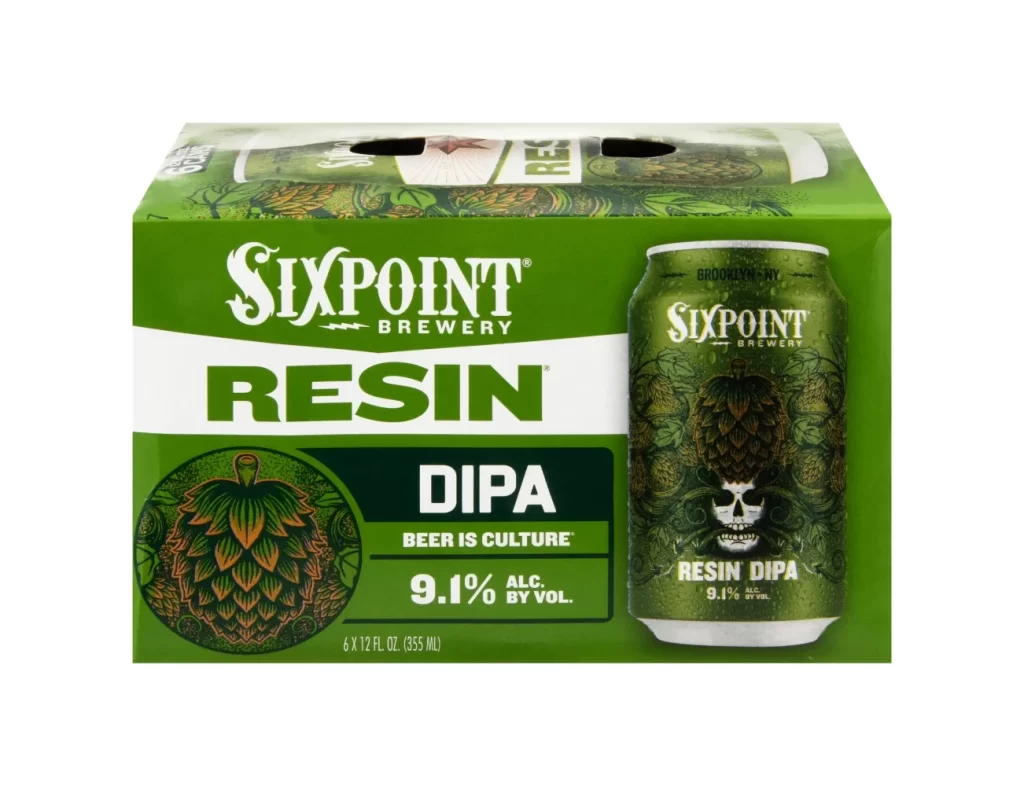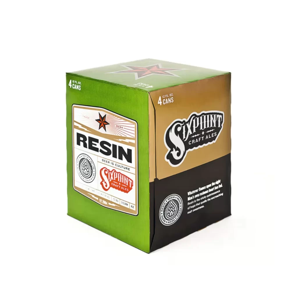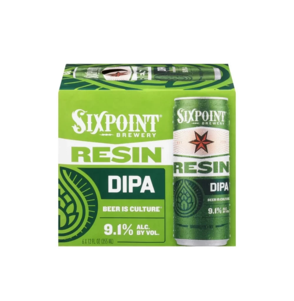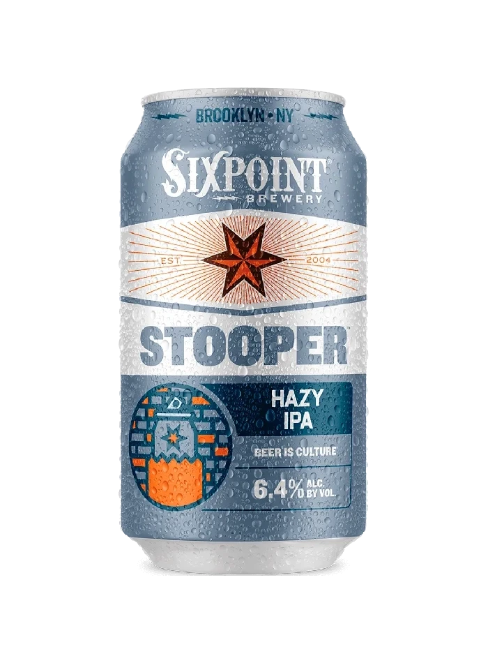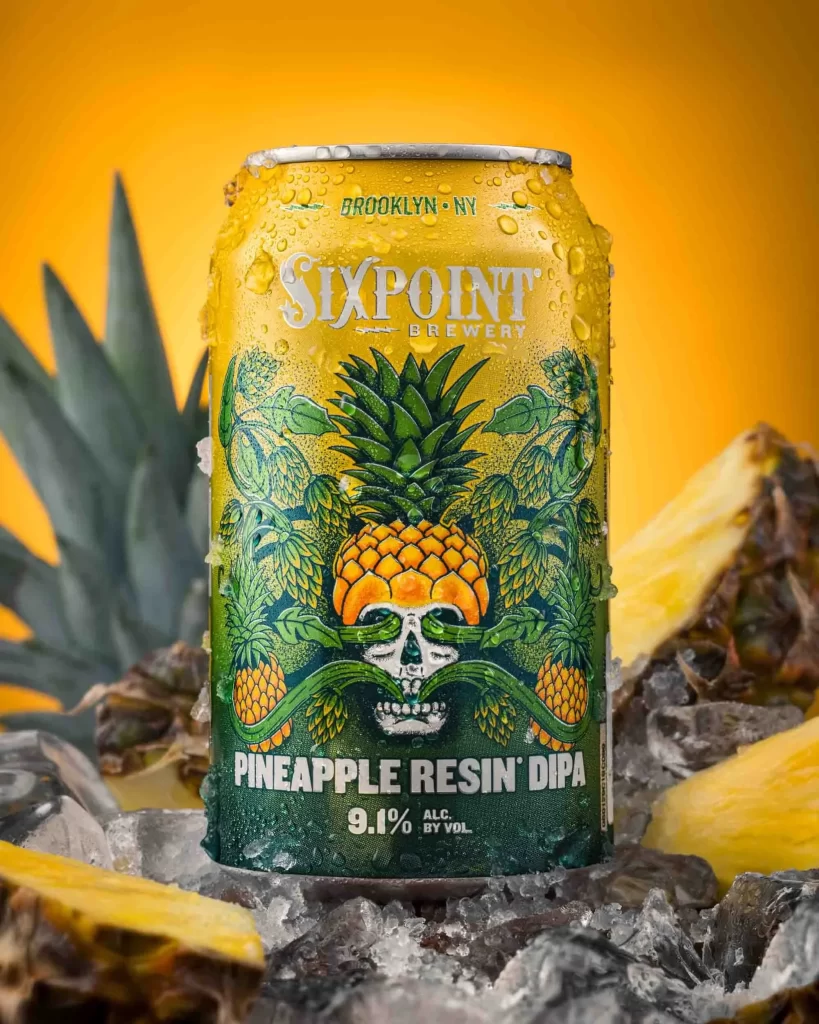
Sixpoint Brewery The Crisp Pilz Beer Display Packaging
Topics
Details
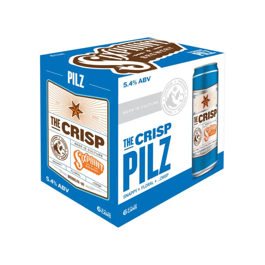
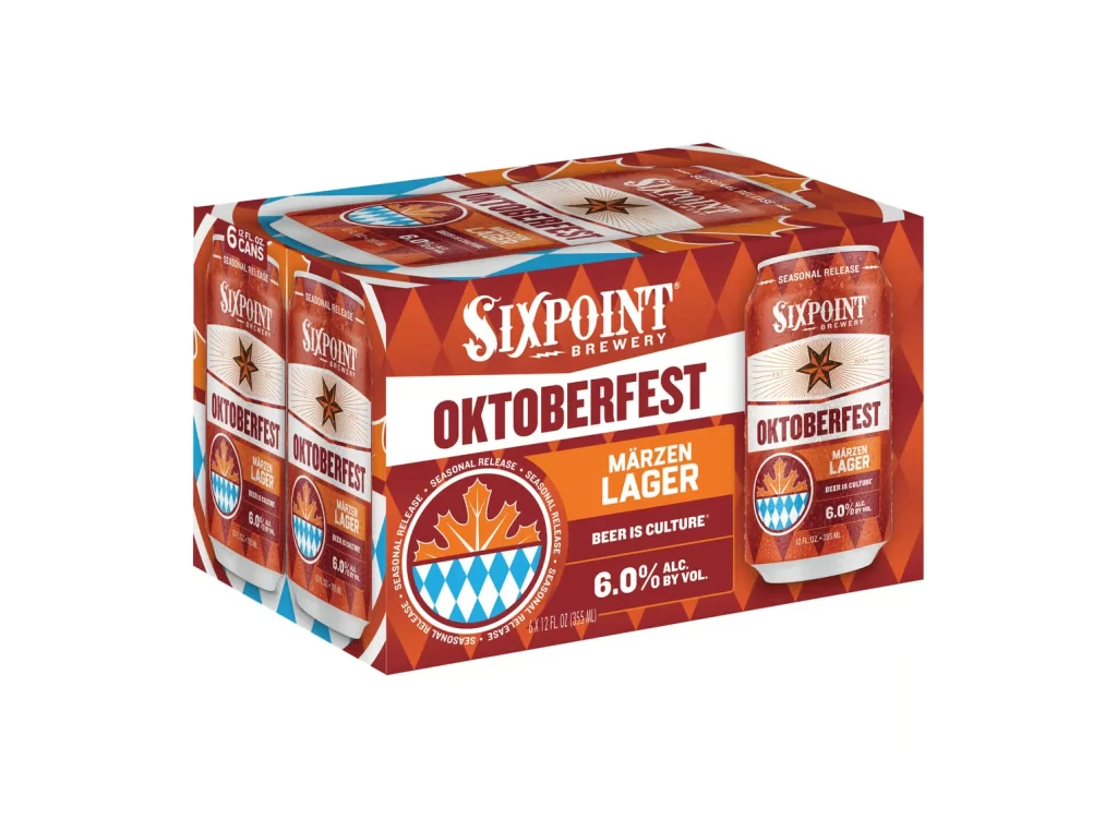
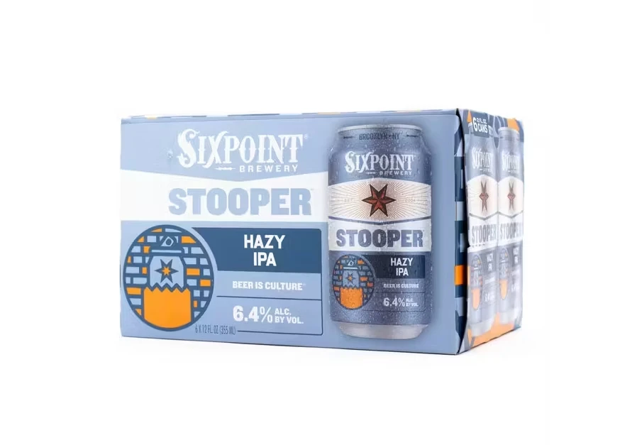
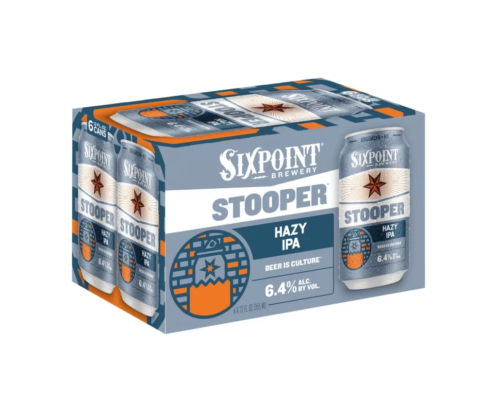
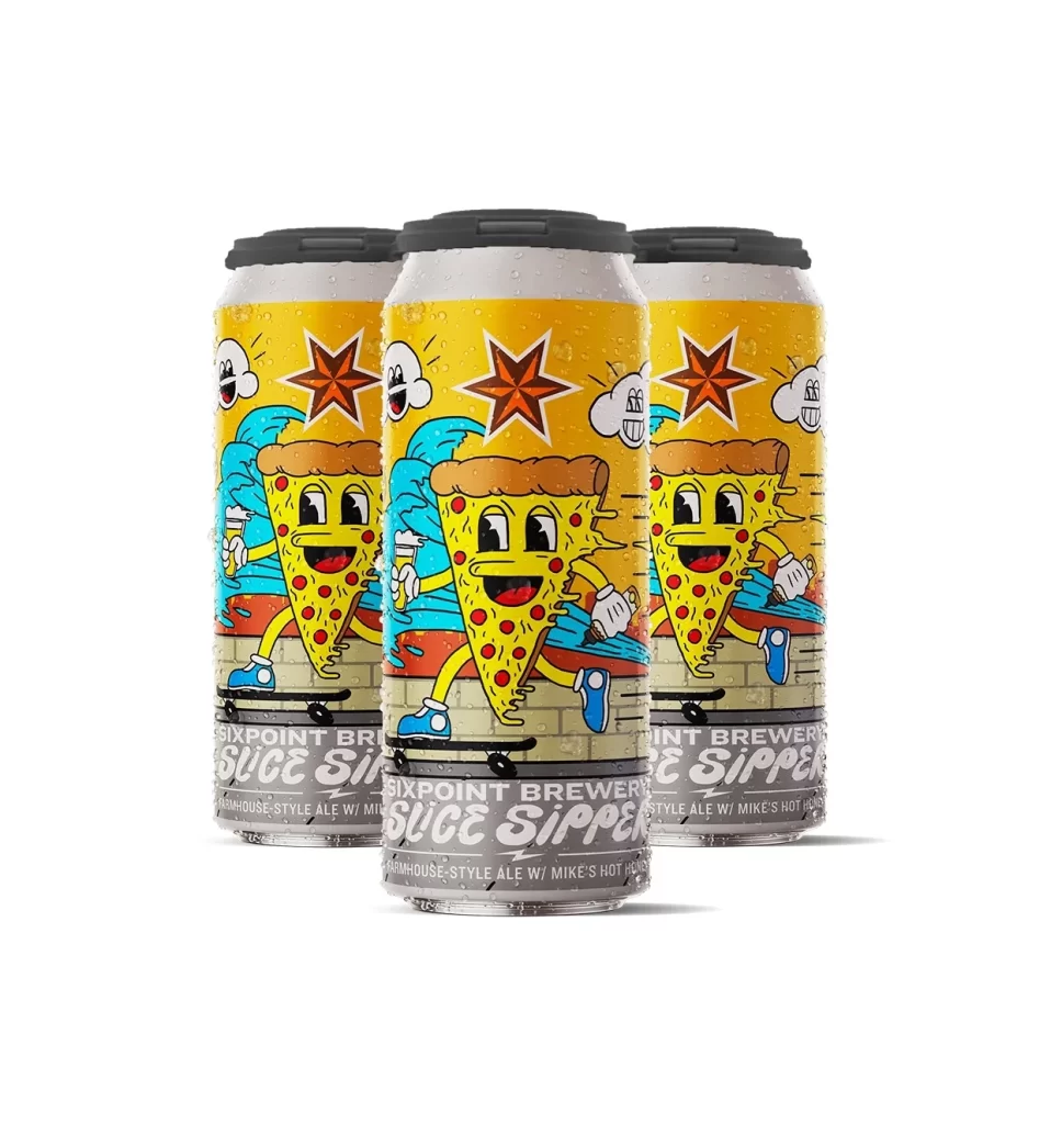
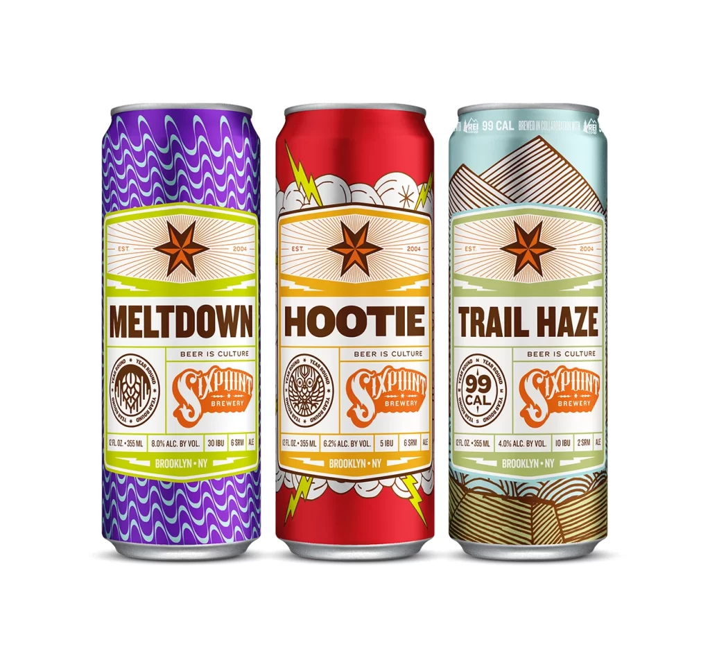
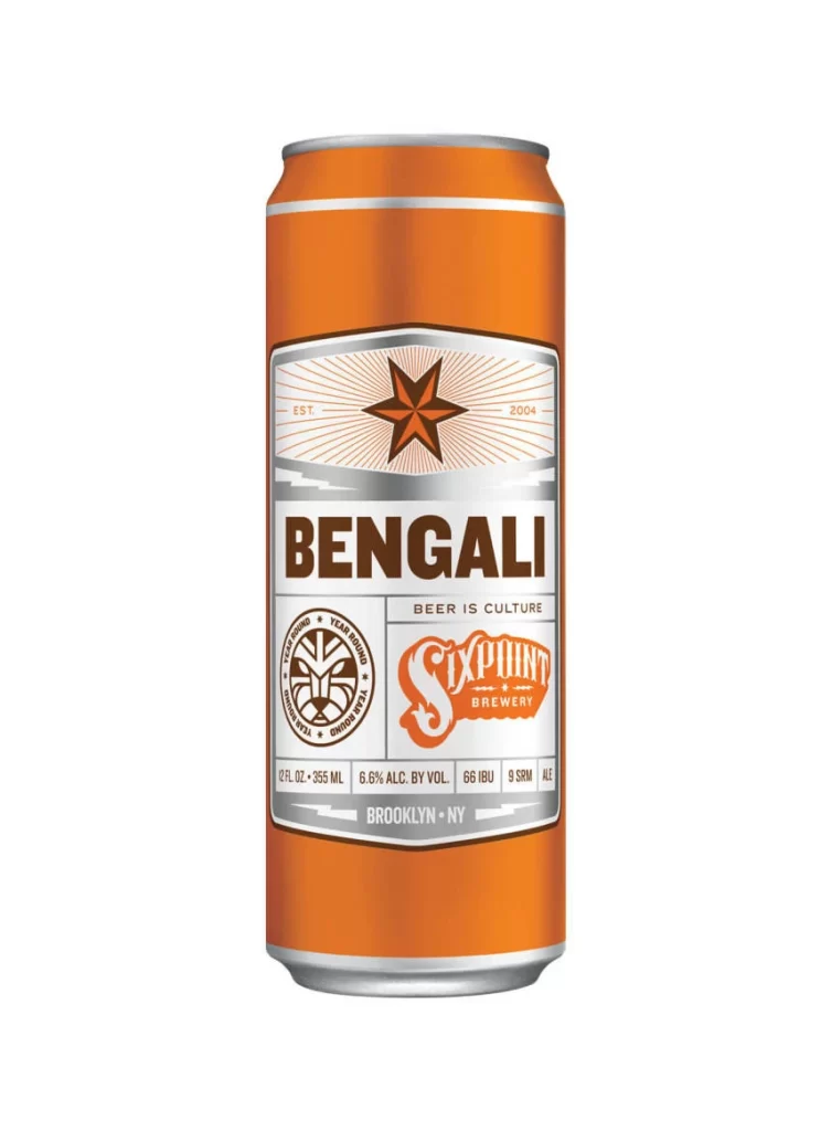
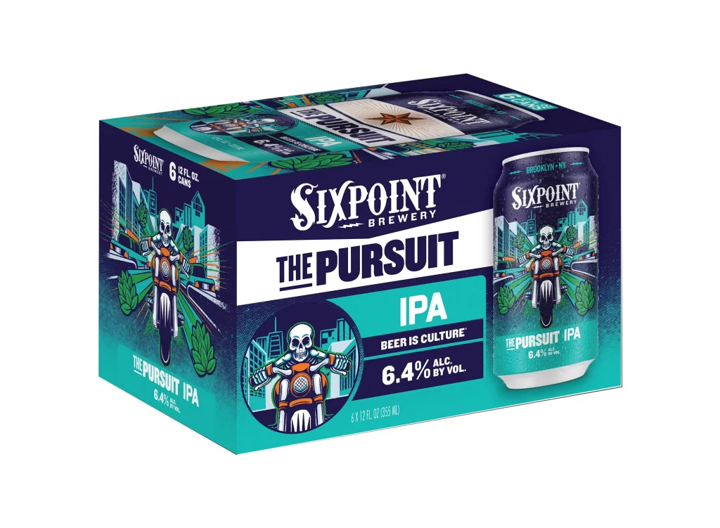
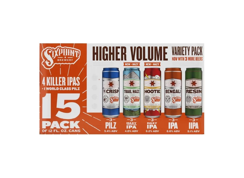
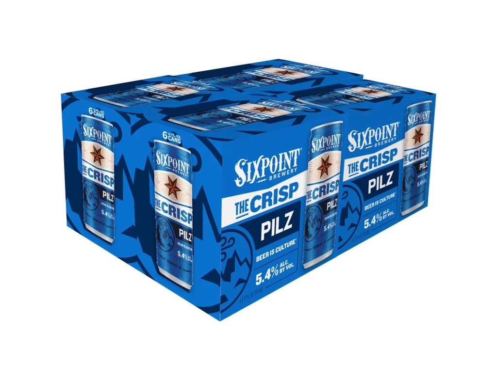
Rendered in a vibrant, saturated blue, the six-pack carrier for Sixpoint Brewery's The Crisp Pilz dominates the frame with its sharp, geometric lines. The packaging features a repeating pattern of the cylindrical cans, each adorned with a prominent red star and bold white typography spelling out the brand and product name. Set against a sterile, pure white background, the object is illuminated by even, studio-quality lighting that eliminates harsh shadows, while a slight three-quarter angle reveals both the front face and the left side panel of the box.
Visual interest is driven by the high-contrast interplay between the deep azure background and the crisp white lettering of 'The Crisp' and 'Pilz'. The design utilizes a layered aesthetic, where the individual can graphics are integrated into the larger carrier's surface, creating a sense of depth and continuity. Furthermore, the inclusion of specific technical details like the 5.4% alcohol by volume and the 'Beer is Culture' tagline adds a layer of informational density that balances the purely graphical elements.
Brand managers and packaging engineers might utilize this visual to analyze how color psychology is applied in the craft beer market to convey freshness and clarity. Graphic designers could study the typographic hierarchy to understand how to effectively prioritize product names over brewery branding on a crowded retail shelf. Additionally, 3D artists may find this composition useful for practicing material rendering, specifically focusing on the way light interacts with printed cardboard and metallic aluminum surfaces.