Sixpoint Brewery Brownstone Revival Beer Packaging
Topics
Details
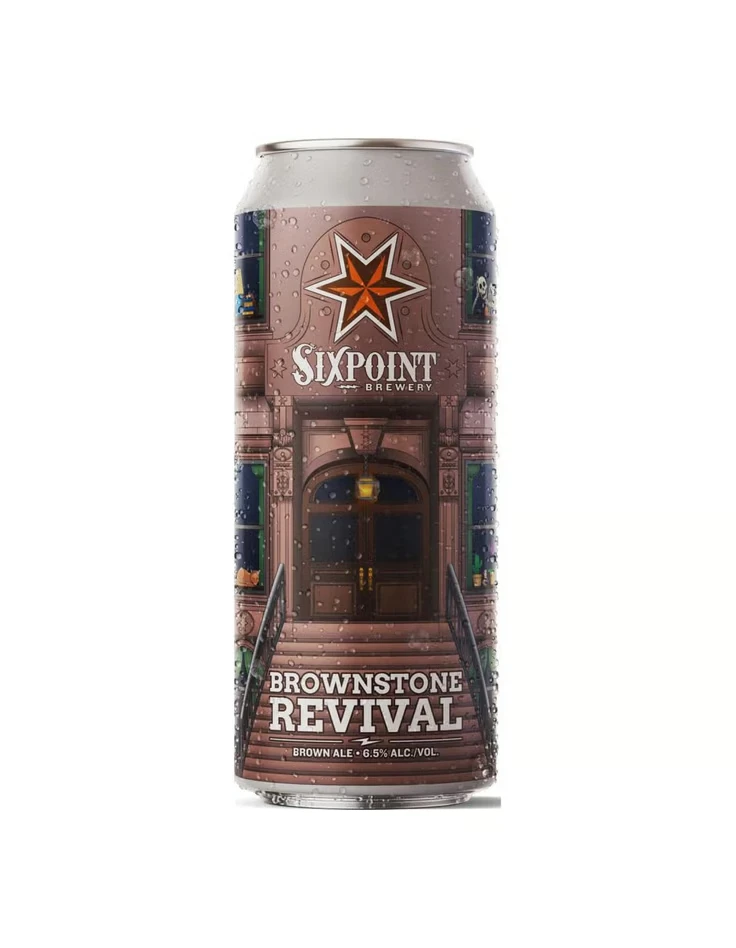
A cylindrical aluminum can condenses a detailed brownstone facade into its wraparound label, rendered in muted terracotta and deep umber tones with visible water droplets across the metallic surface. The architectural composition centers on an ornate entrance featuring a recessed arched doorway, flanked by green-framed windows and ascending concrete steps, while the Sixpoint Brewery star logo and brand name anchor the upper portion above the bold 'Brownstone Revival' text.
Architectural realism defines this packaging iteration, transforming the cylindrical substrate into a trompe-l’œil representation of urban residential architecture. The design leverages textural contrast between the smooth metallic silver of the can’s top rim and the granular, stone-like illustration covering the body. Typographic hierarchy is established through bold, white sans-serif lettering for ‘BROWNSTONE REVIVAL’ positioned at the base, creating a grounded visual weight that balances the intricate detailing above.
Packaging designers studying beverage market differentiation would examine this example for its integration of narrative illustration with functional container geometry. Brand strategists could reference the color palette when developing product lines targeting regional identity or heritage aesthetics. Illustrators requiring studies in perspective distortion on curved surfaces would find the window alignments and stairway vanishing points particularly instructive for technical execution.