Sixpoint Brewery The Piff Hazy DIPA Purple Beer Packaging
Topics
Details
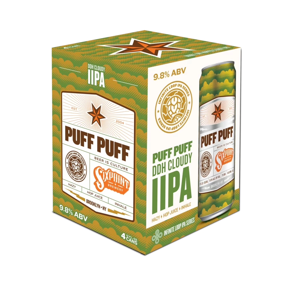
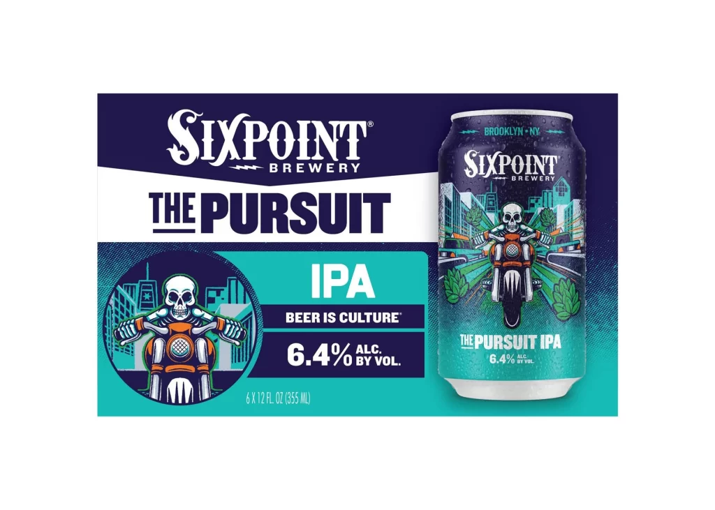
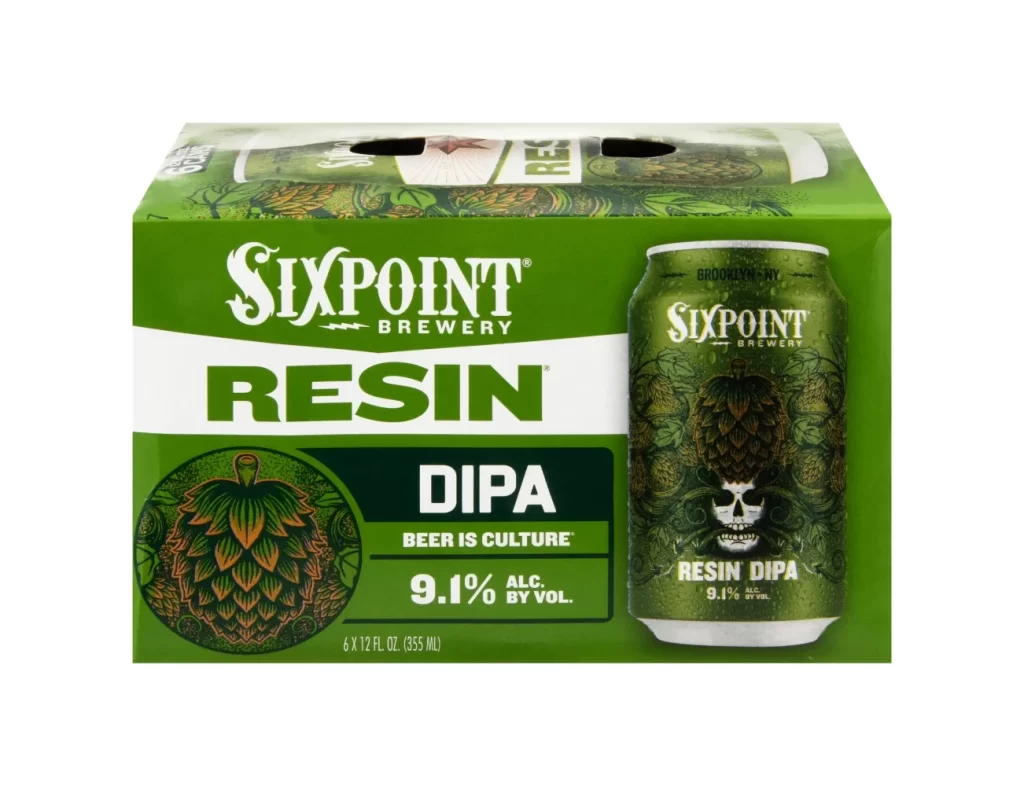
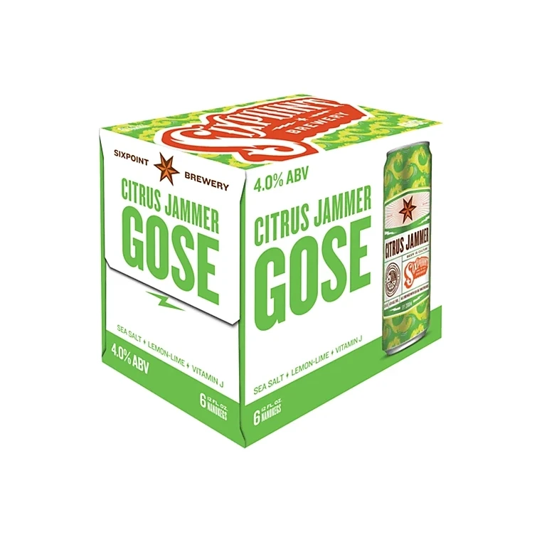
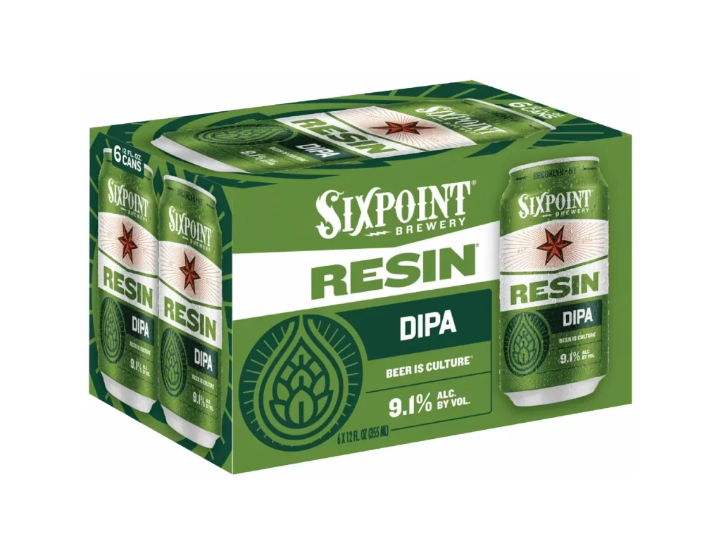
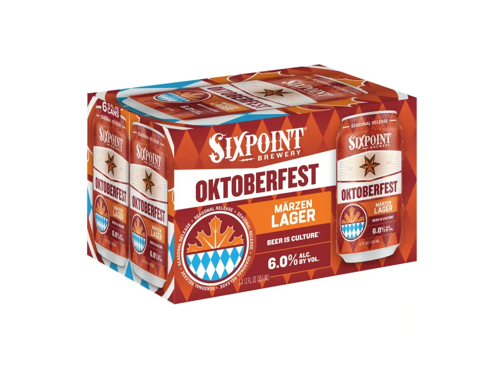
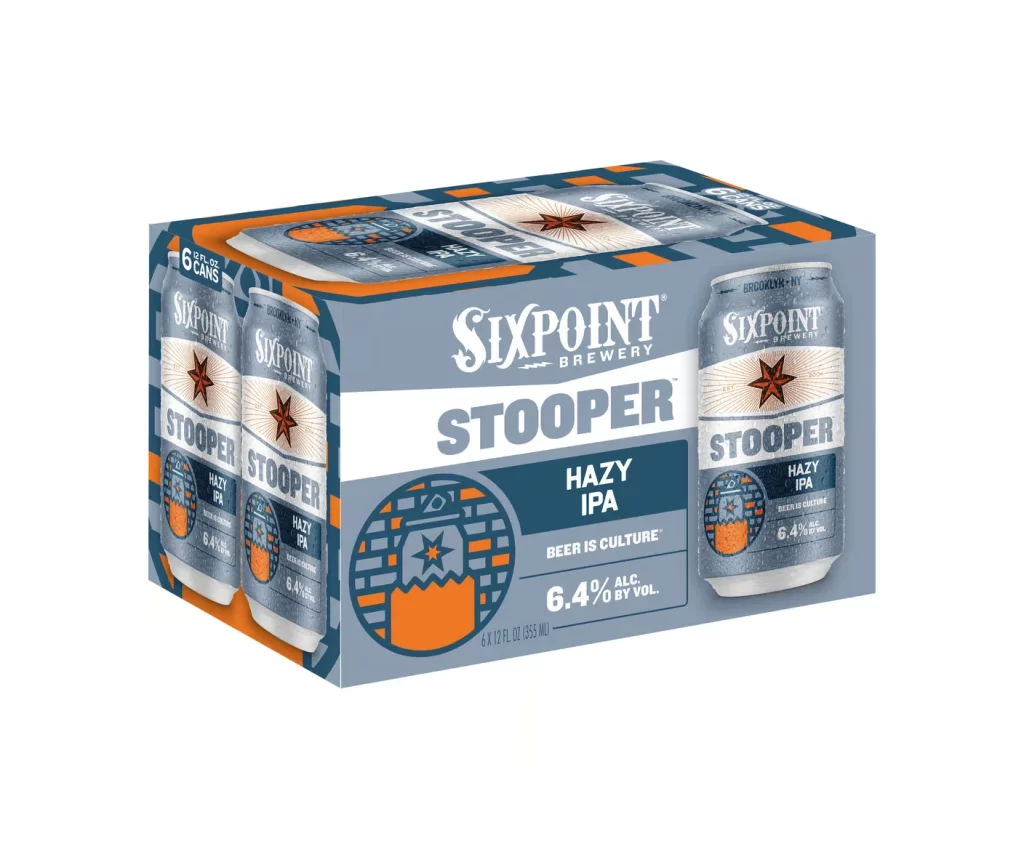
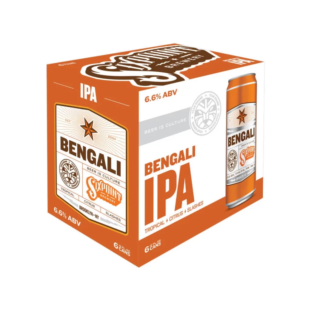
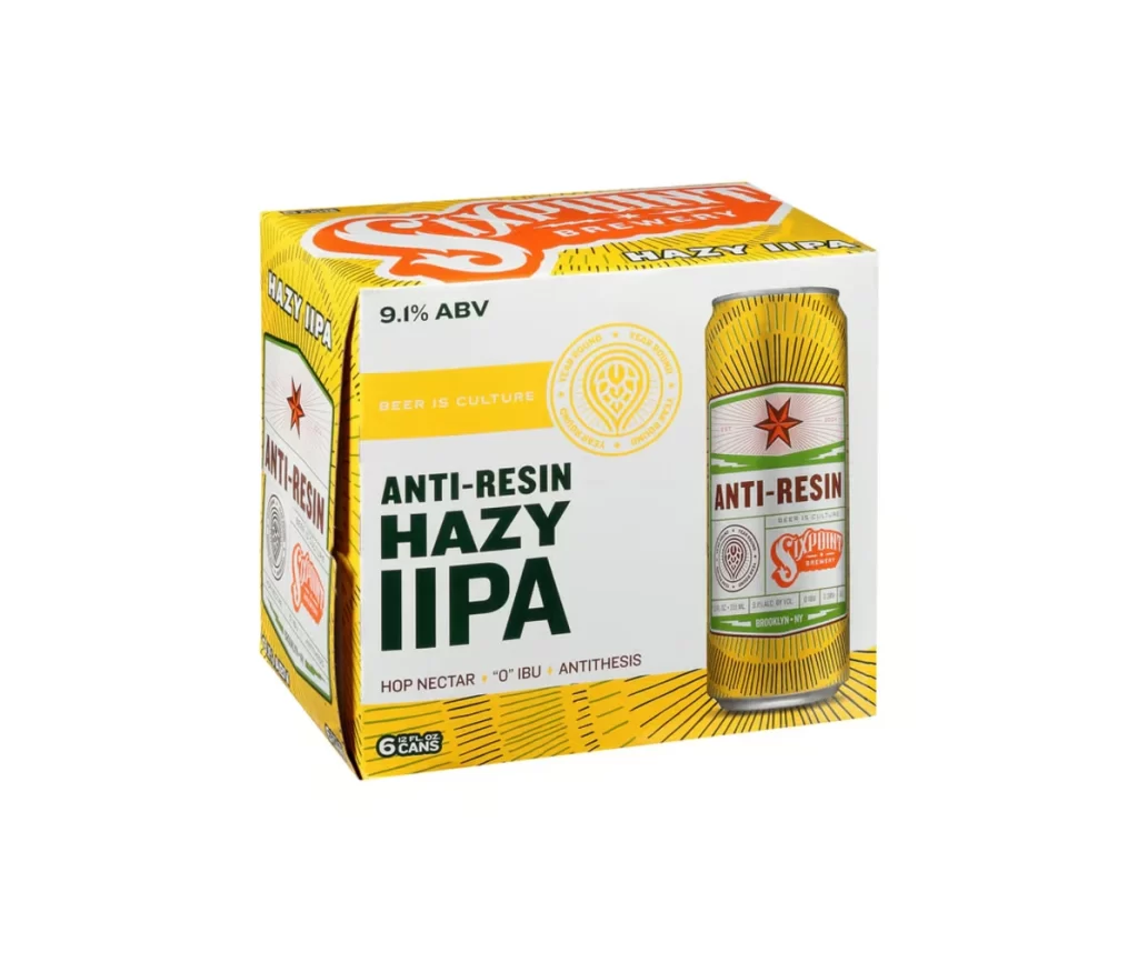
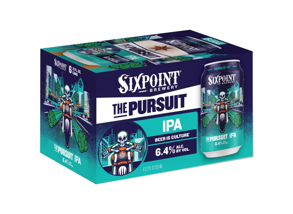
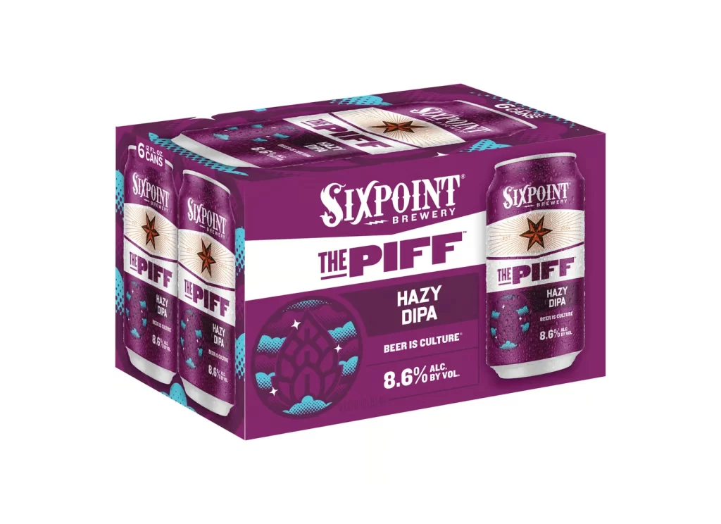
A deep violet six-pack carrier dominates the frame, displaying Sixpoint Brewery's 'The Piff' Hazy DIPA branding against a stark white background. The packaging features a bold white diagonal band across the center, flanked by circular can illustrations showcasing a rust-colored star logo and teal cloud motifs. Shot from a three-quarter perspective, the composition reveals both the front panel's typography and the side cans, with even studio lighting eliminating shadows to emphasize the saturated purple hue and crisp white lettering.
Vibrant purple saturates the entire surface, creating an immediate visual departure from typical amber or green beer packaging conventions. The interplay between the geometric star emblem, organic cloud patterns, and rigid sans-serif typeface establishes a dynamic tension between celestial and terrestrial themes. Such a monochromatic approach allows the white negative space and metallic silver accents on the can representations to pop with high contrast, making the 8.6% alcohol content and 'Beer is Culture' tagline immediately legible.
Brand strategists analyzing color psychology in alcoholic beverage marketing will find this case study useful for understanding how non-traditional hues impact shelf presence. Packaging engineers might examine the structural layout of the carrier design, particularly how the circular die-cut windows integrate with the overall graphic system. Students of typography could study the hierarchy between the brewery name, product title, and descriptive text to understand effective information layering on limited real estate.