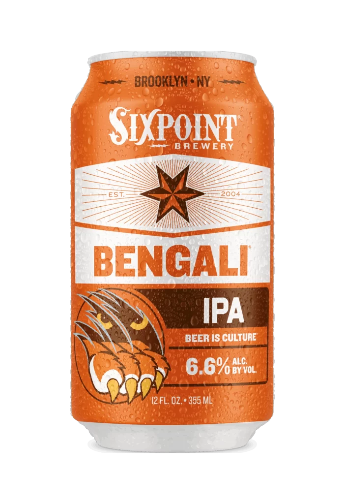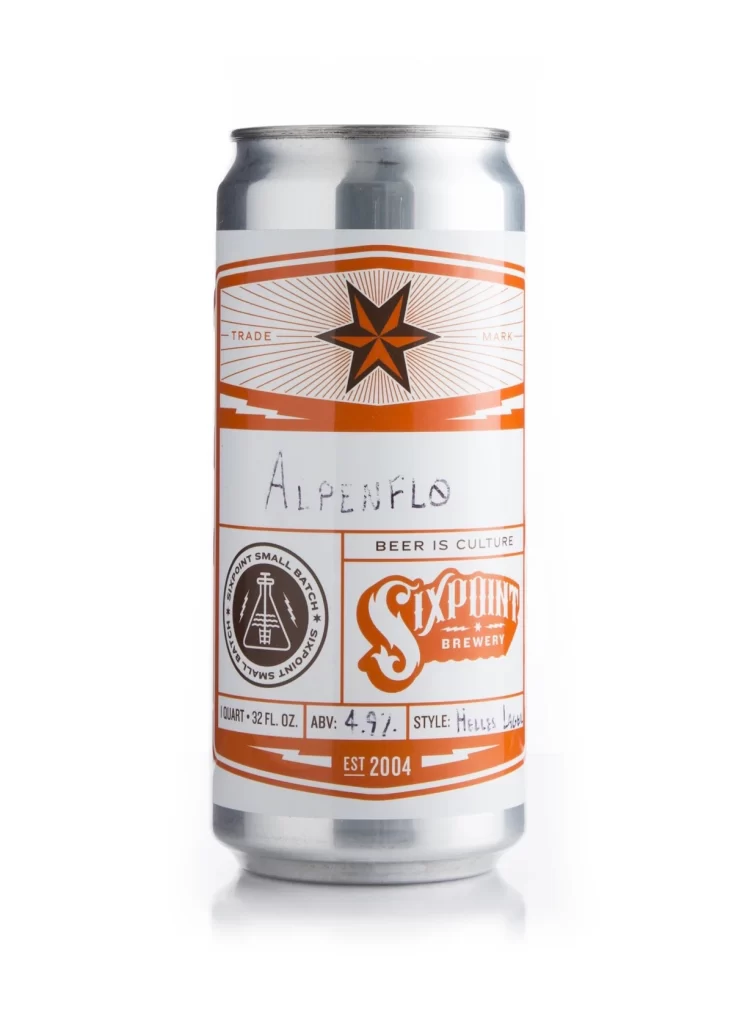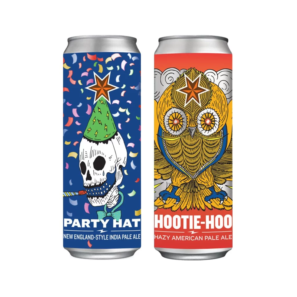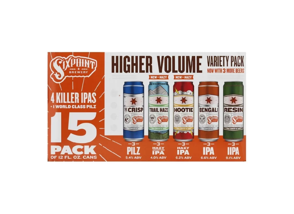
Sixpoint Brewery Resin Green brown black Beer Packaging
Topics
Details
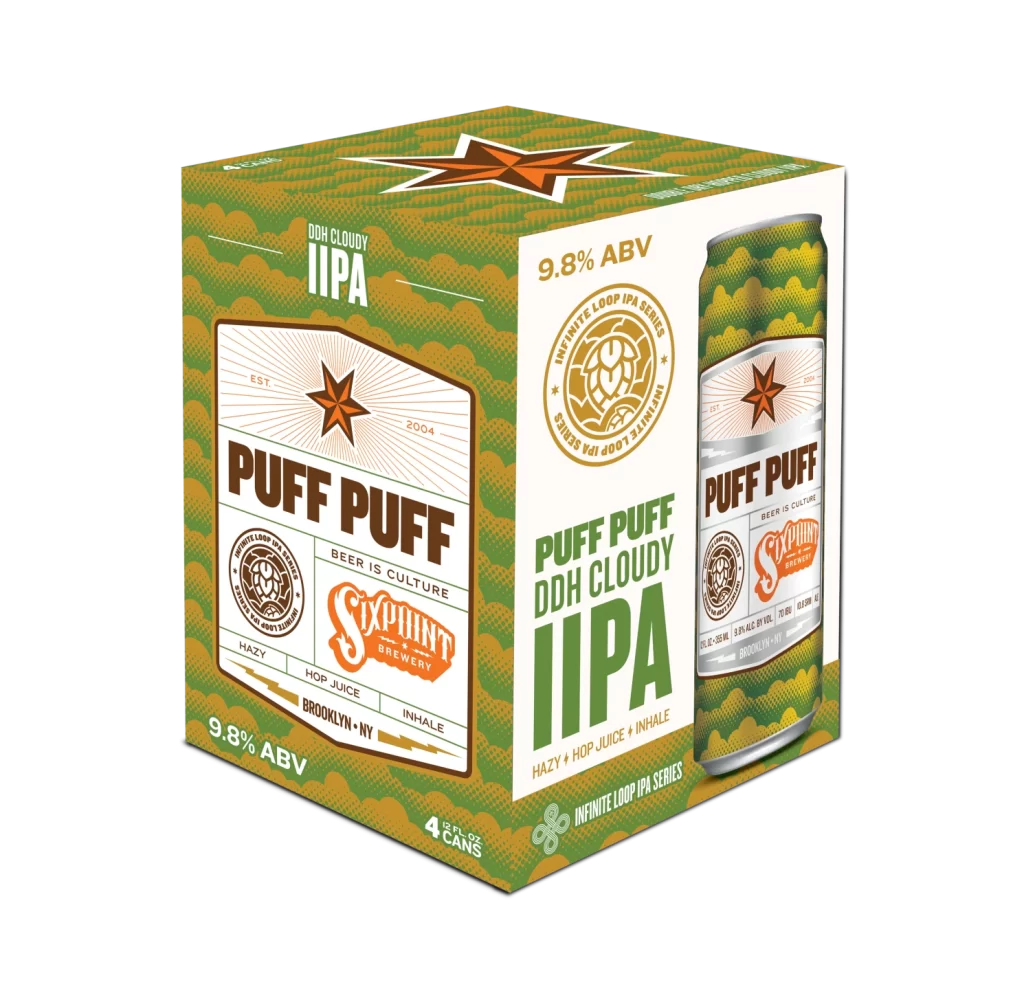
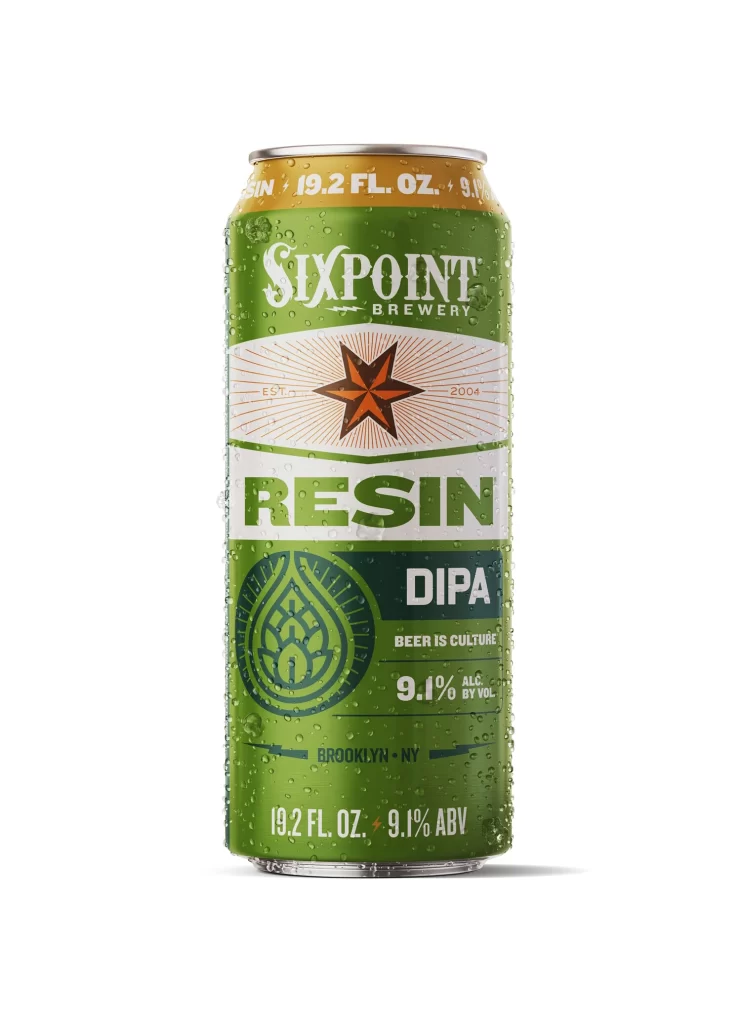
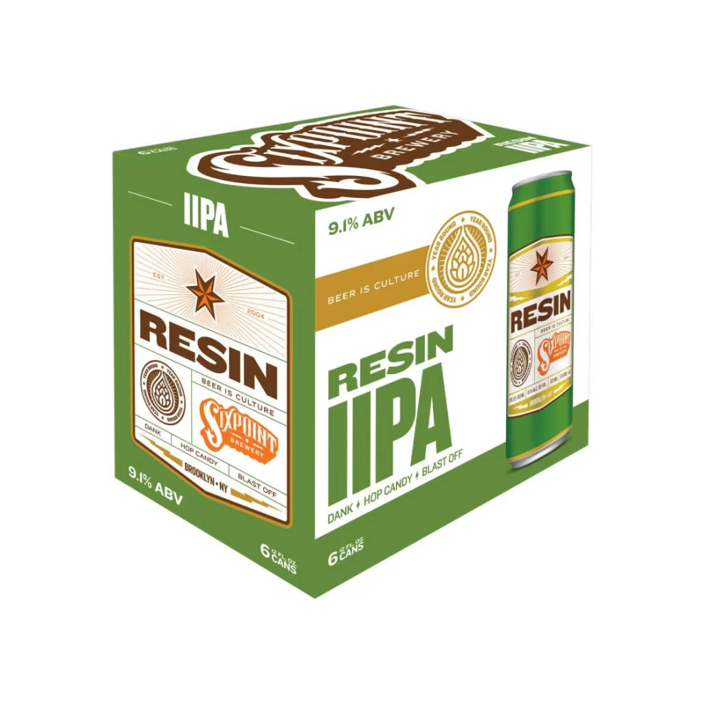
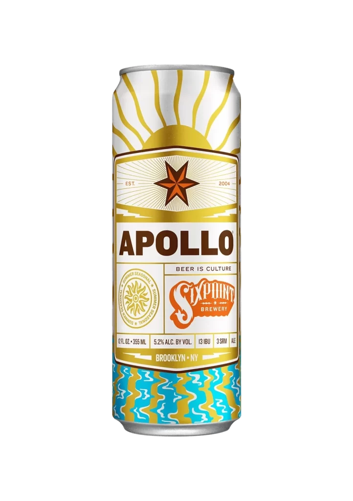
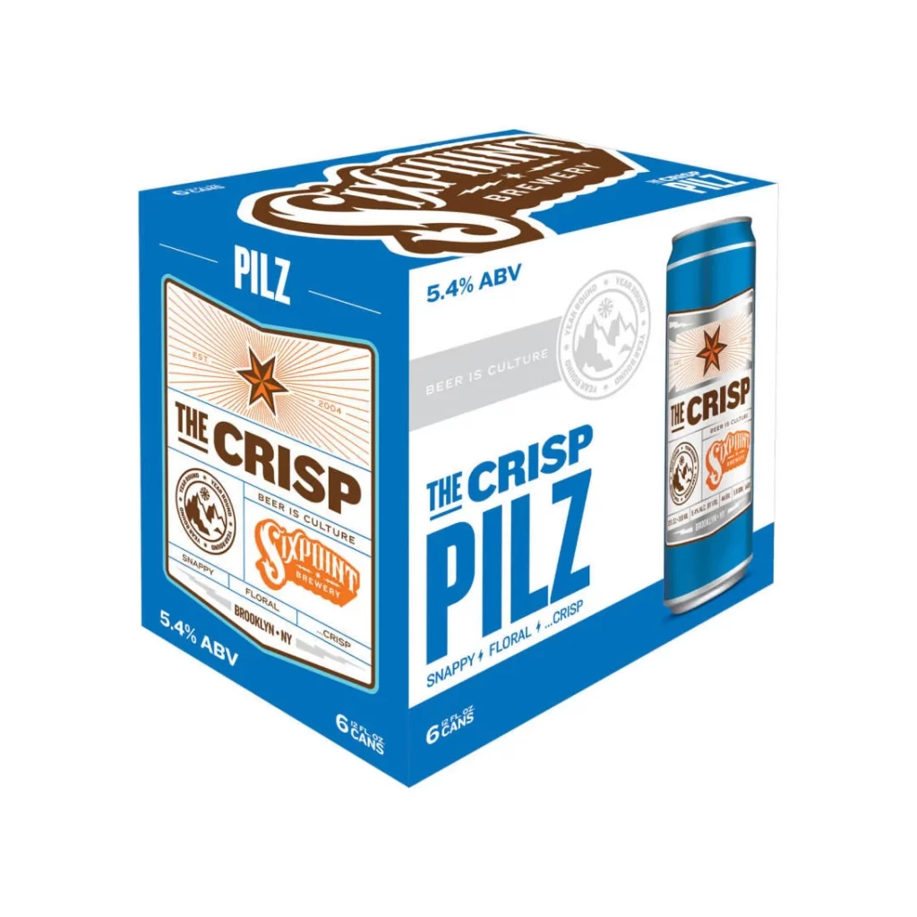
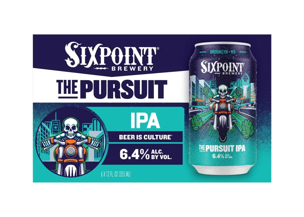
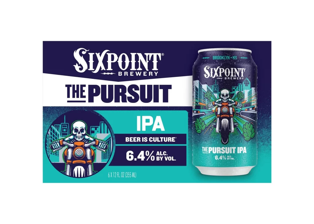
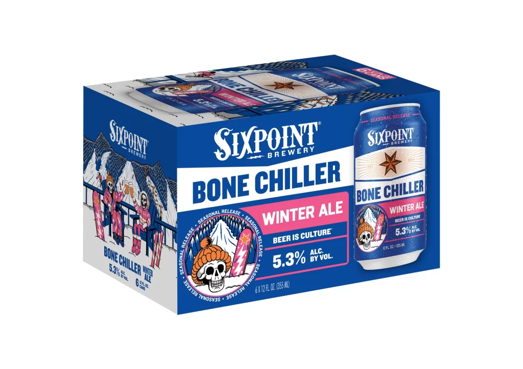
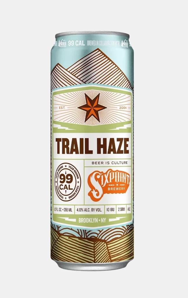
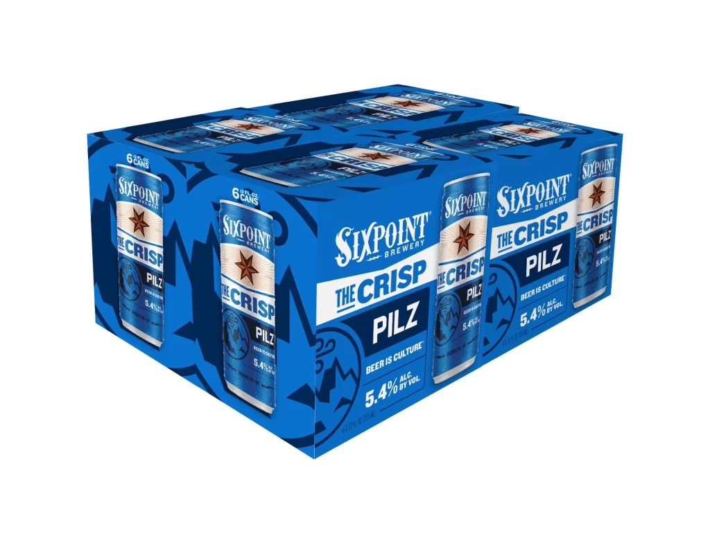
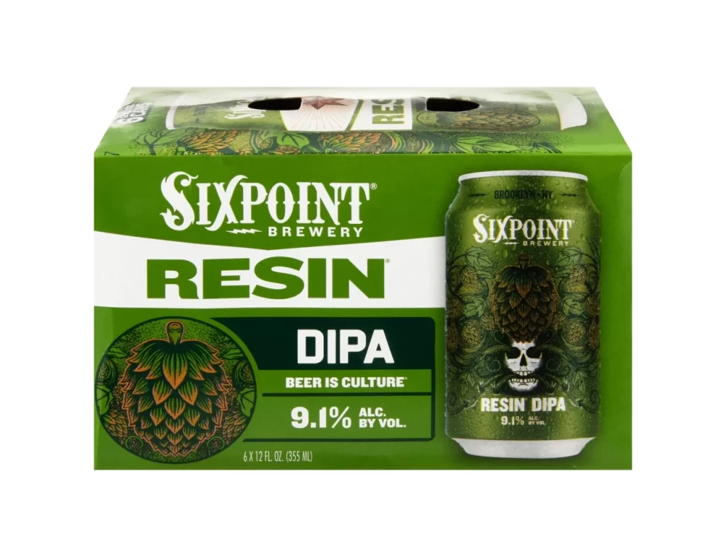
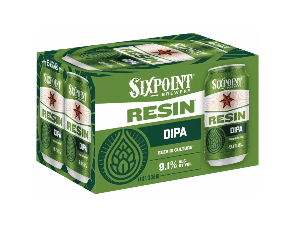
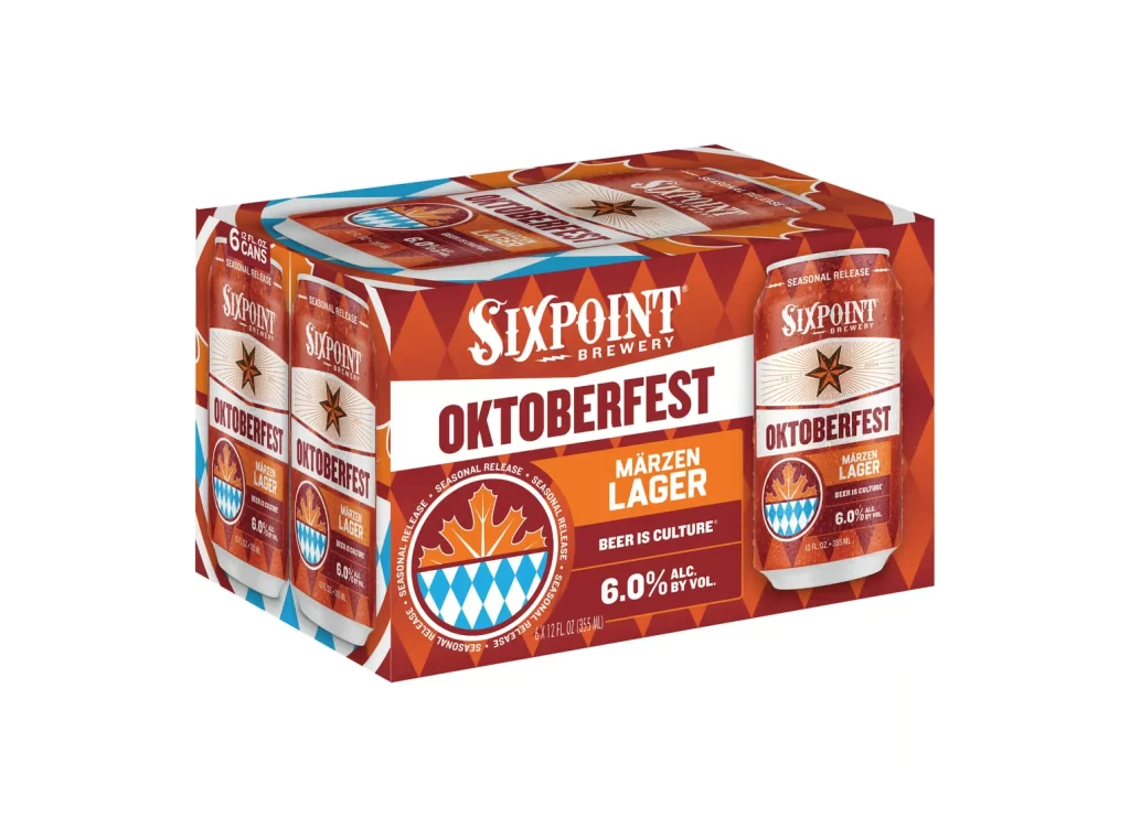
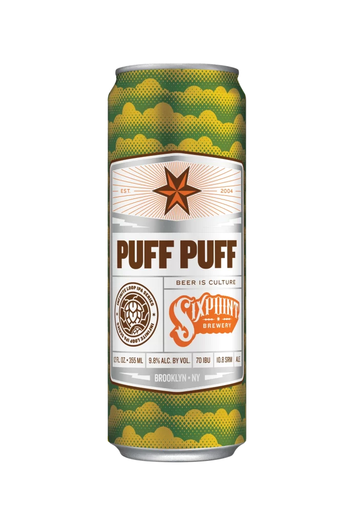
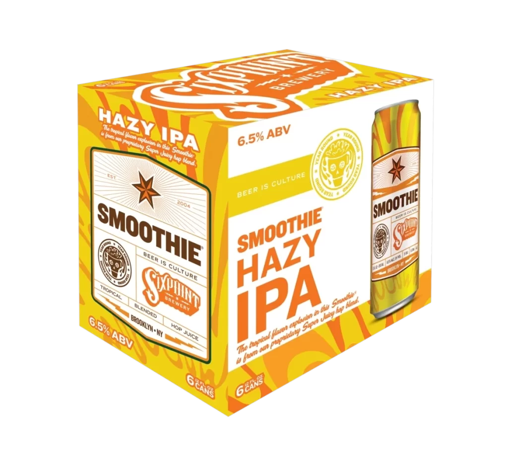
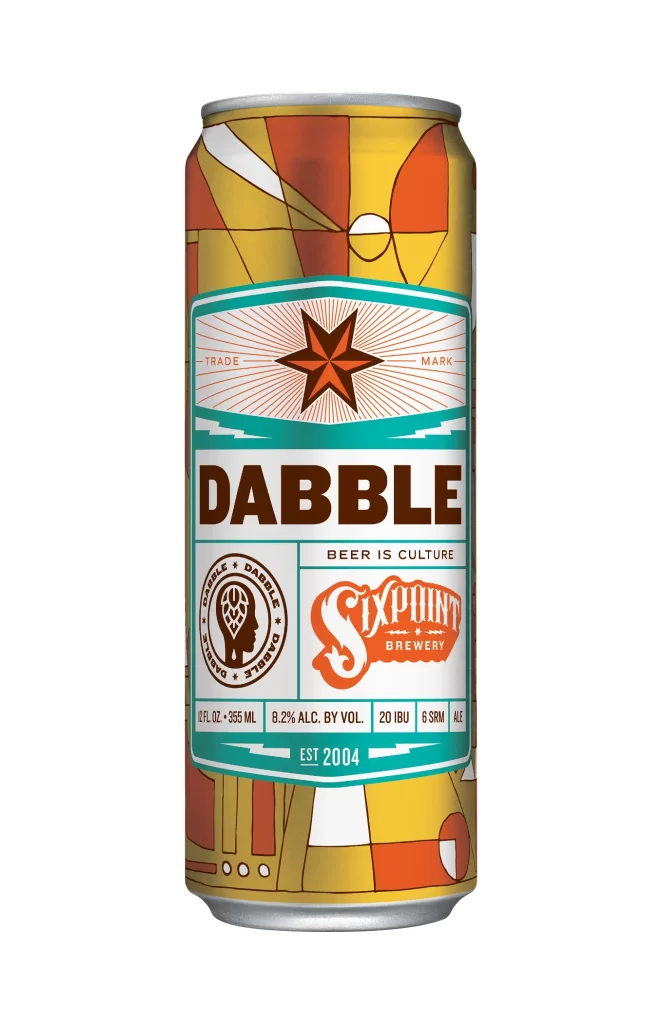
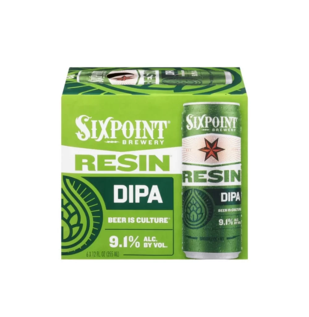
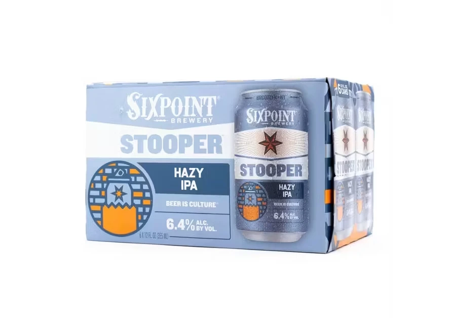
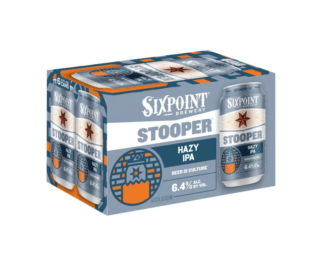
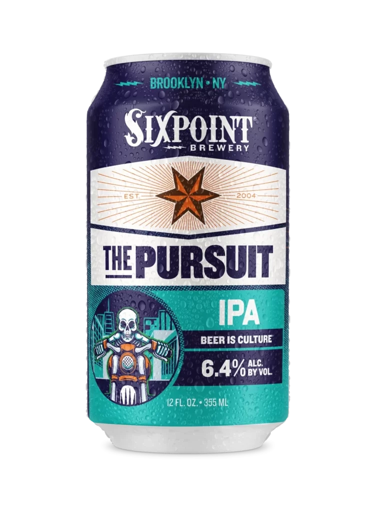
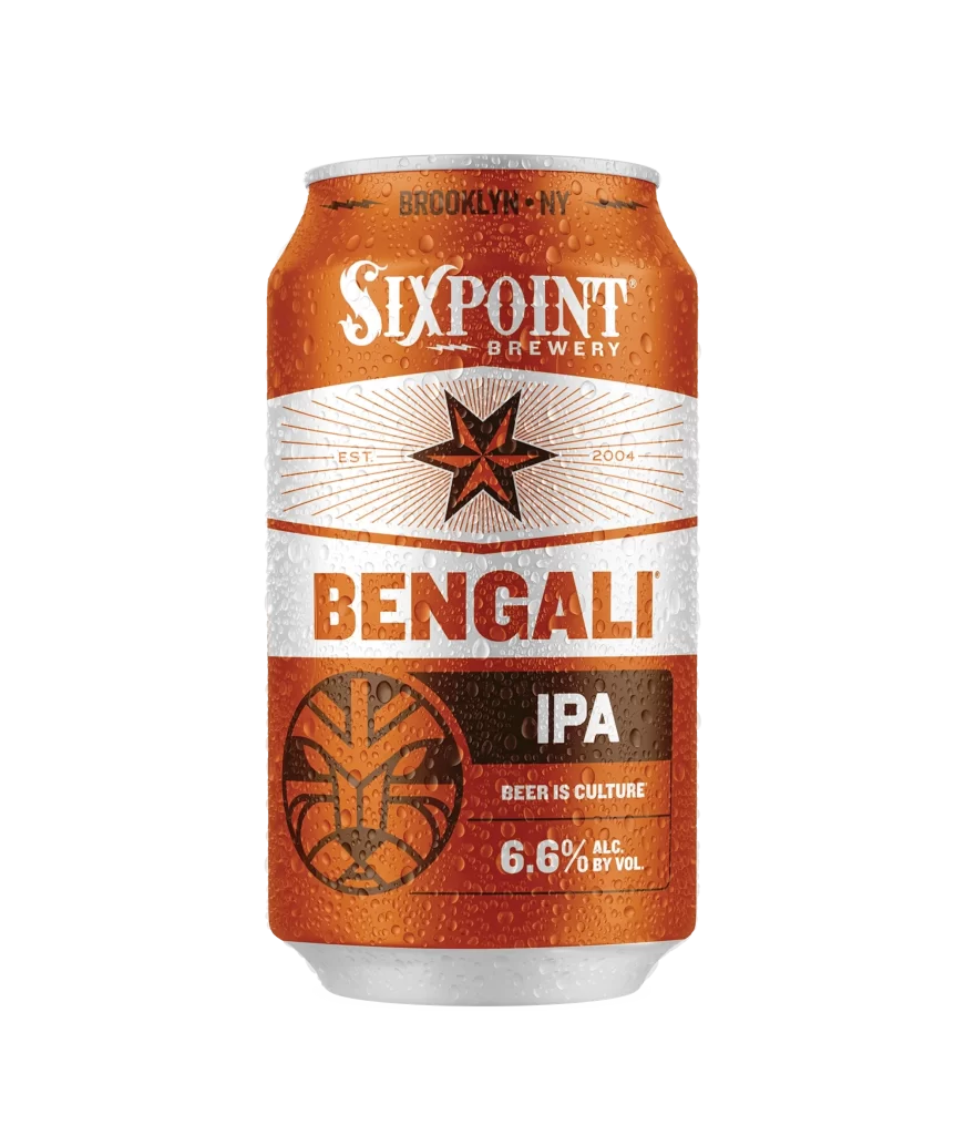
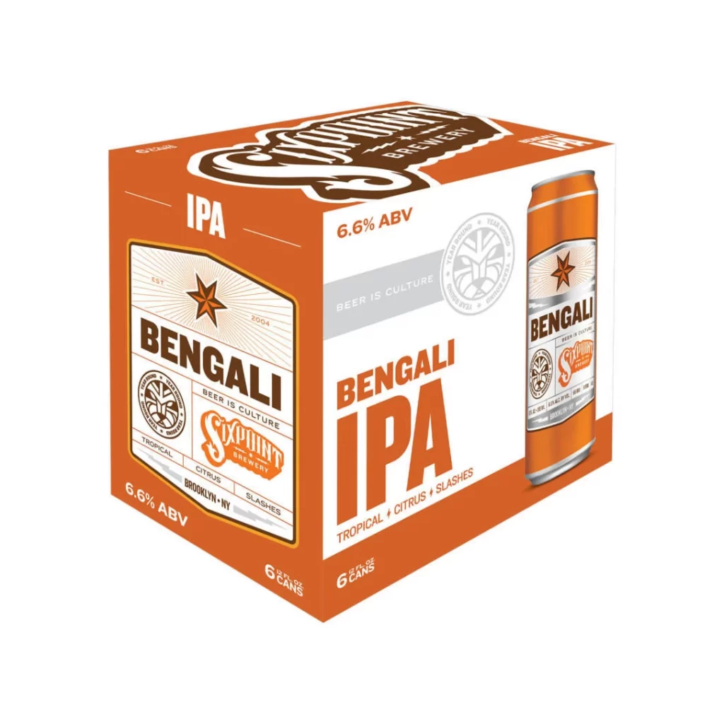
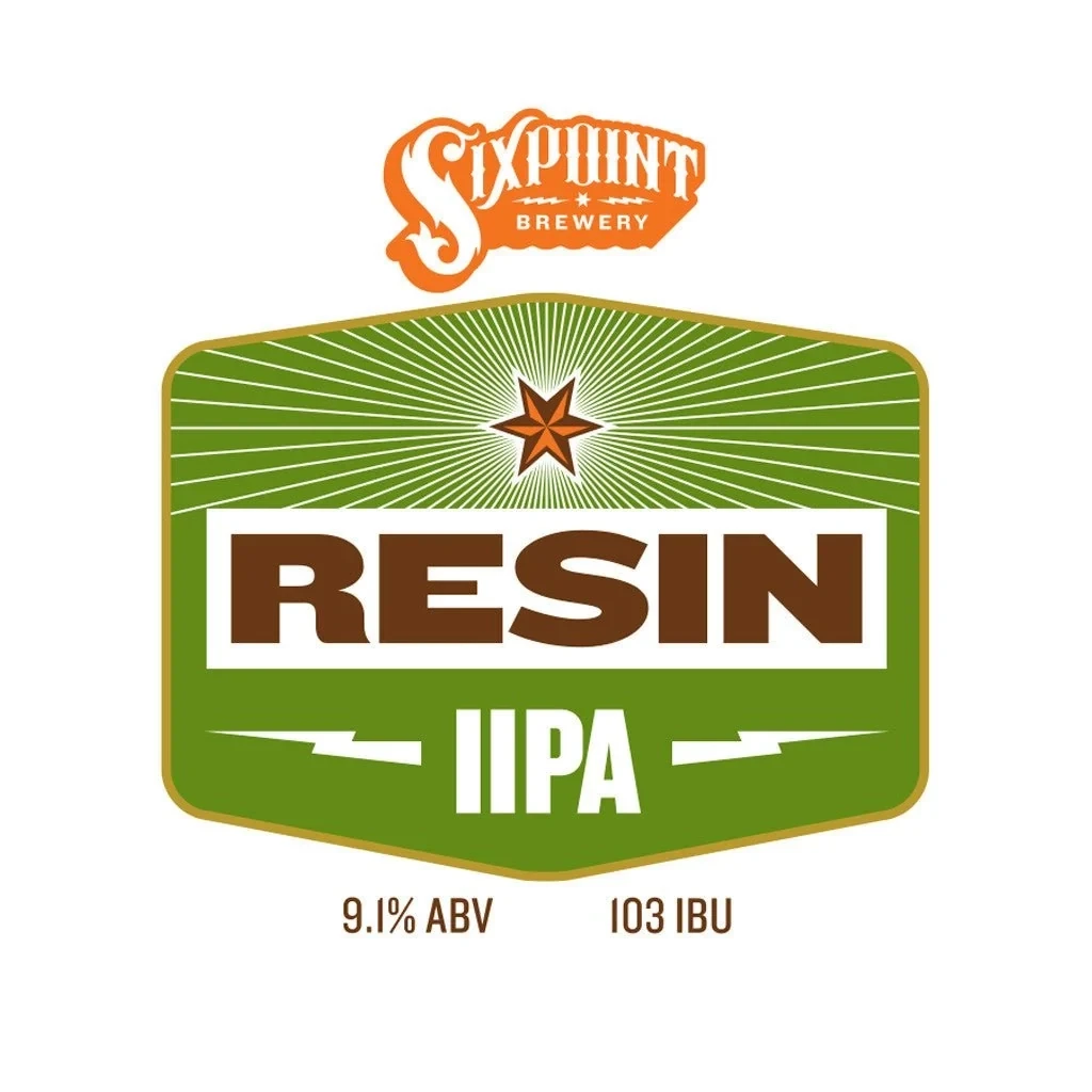
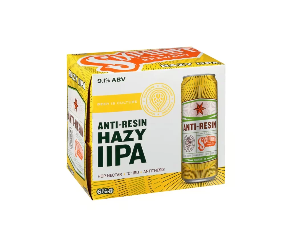
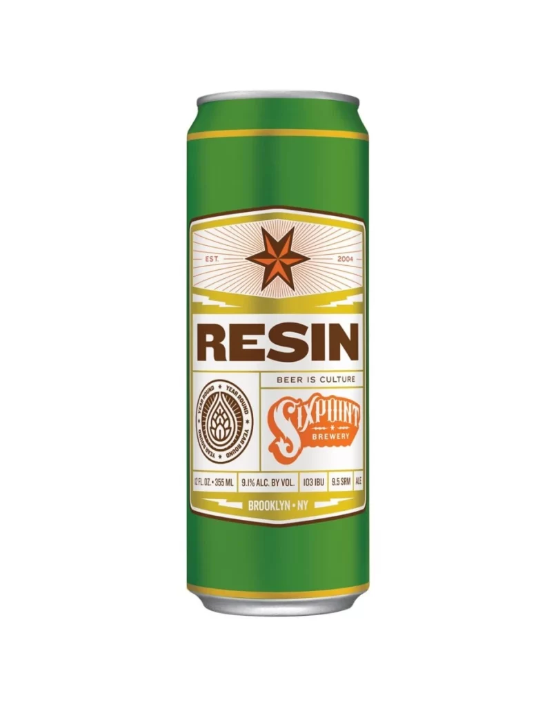
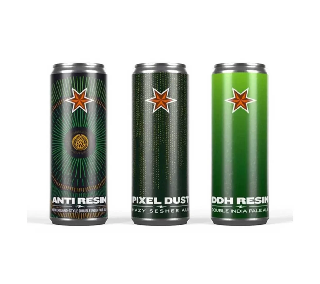
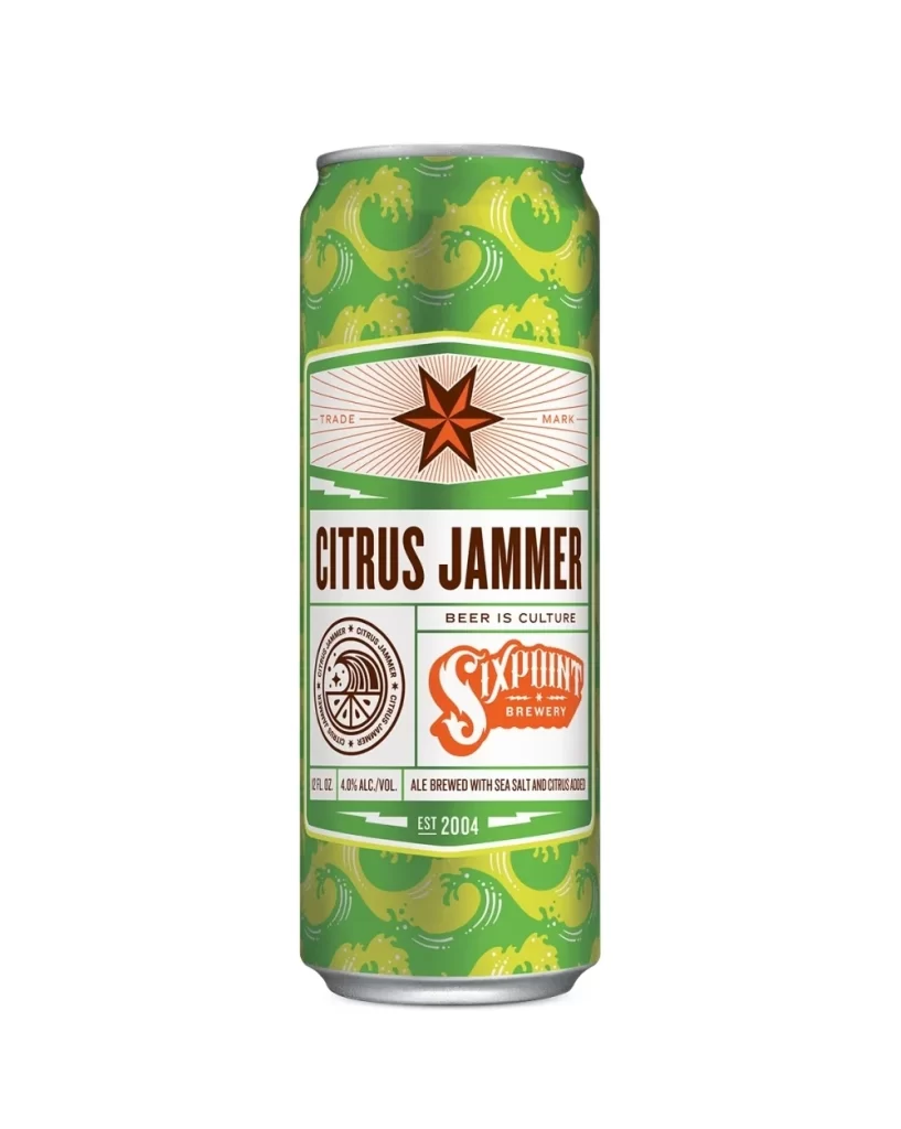
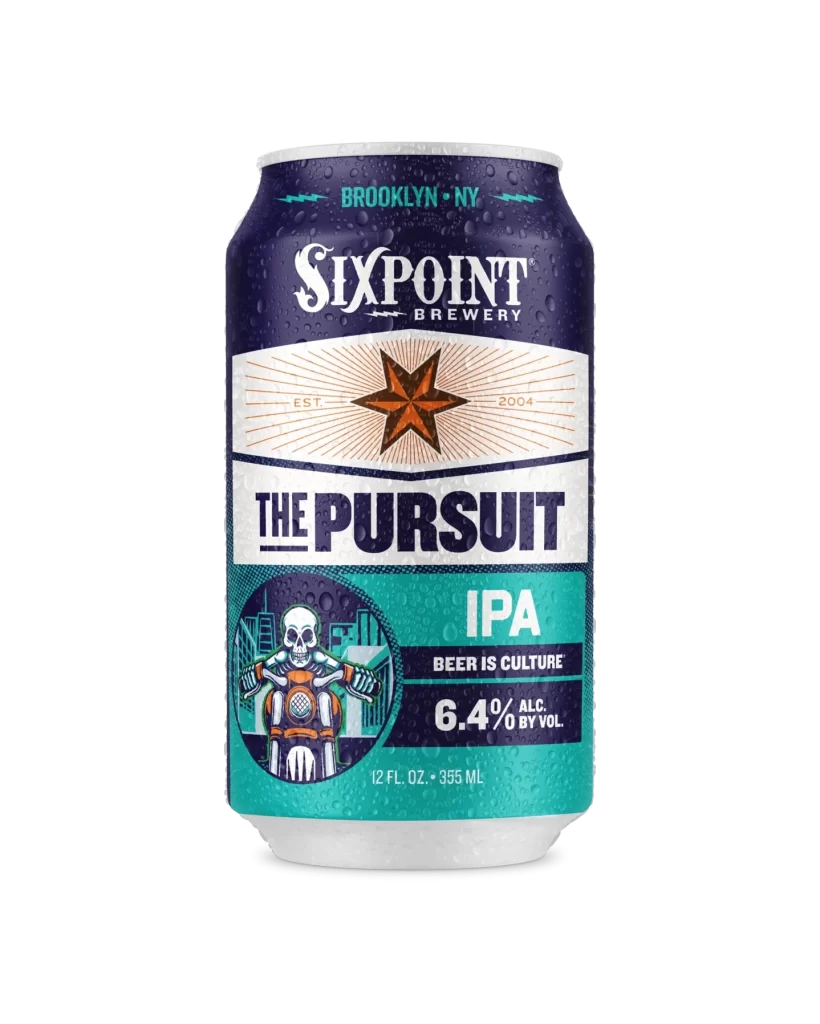
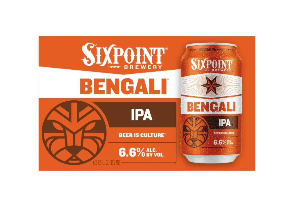
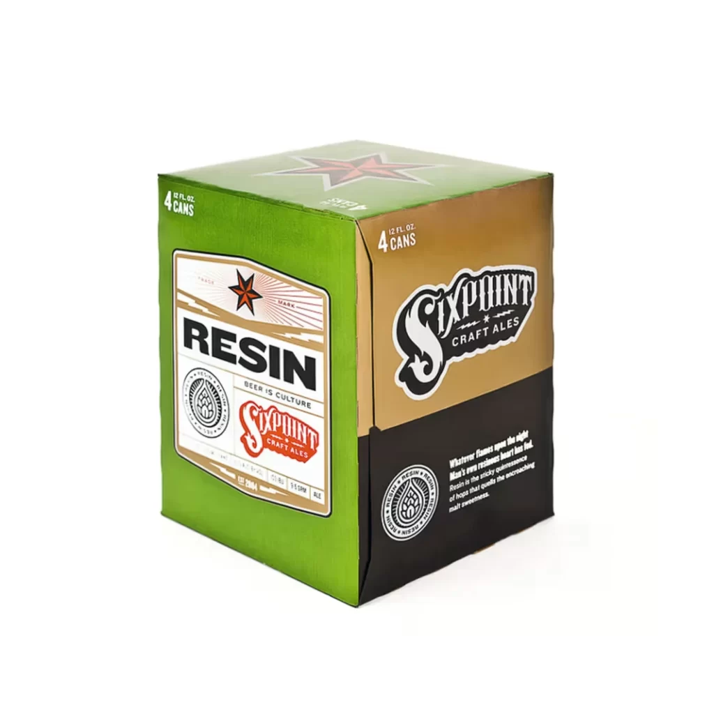
Vibrant green, warm tan, and deep black panels construct the geometric four-pack of Sixpoint Resin beer. Heavy black type spells 'RESIN' across the green front face, while 'Sixpoint Craft Ales' appears in stylized script on both the tan side and red-accented label below. The packaging sits on a white surface with '4 CANS / 12 FL.OZ.' printed in white at the upper corners of the green and tan faces.
Visual interest is generated by the sophisticated interplay of industrial textures and vintage-inspired typography. The design merges modern minimalism with classic brewery aesthetics, utilizing the iconic red star motif to bridge the gap between contemporary craft branding and traditional ale heritage. Such a distinct color-blocking strategy ensures high shelf visibility while conveying a sense of premium quality and artisanal craftsmanship.
Brand strategists might analyze this layout to understand effective color theory in beverage marketing, while packaging engineers could study the structural integrity of the cardboard carrier. Art directors seeking to revitalize a legacy brand would find the typographic hierarchy particularly instructive for balancing bold lettering with subtle informational text. Students of industrial design can also examine how the three-tone palette creates depth without overwhelming the central product identity.