Sixpoint Brewery Beer Packaging
Topics
Details
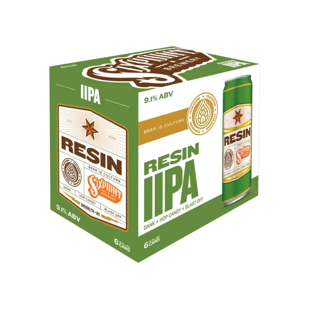
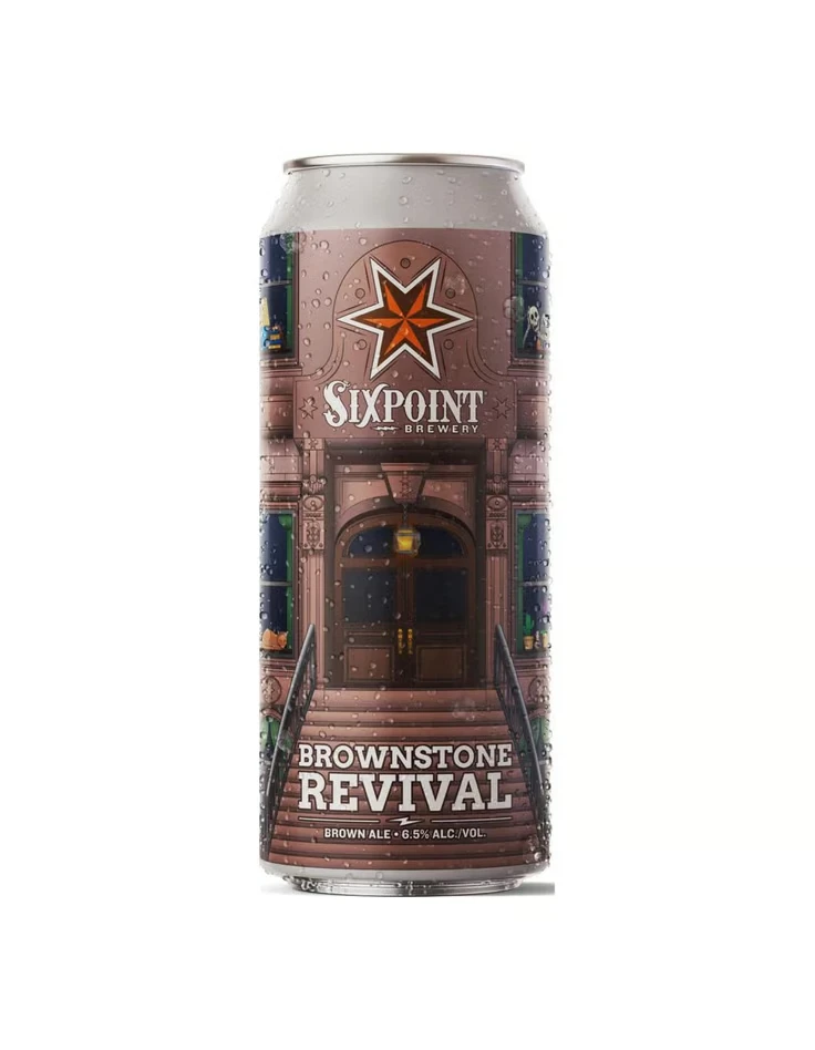
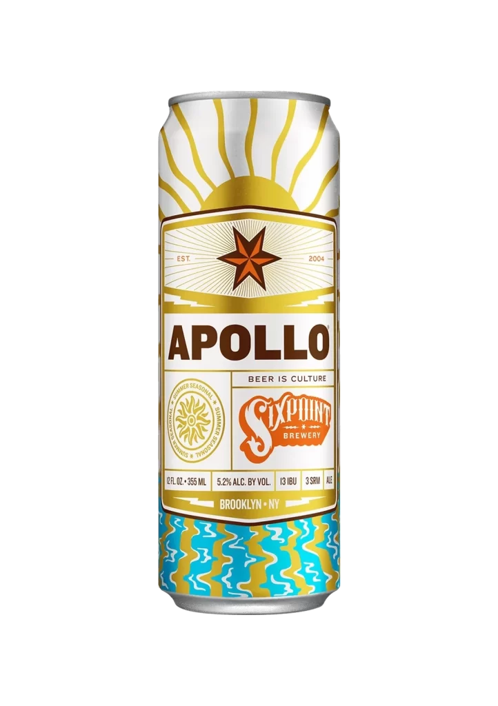
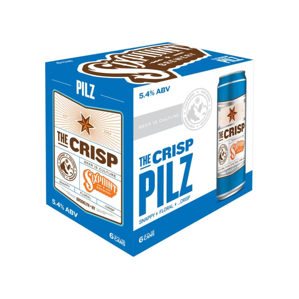
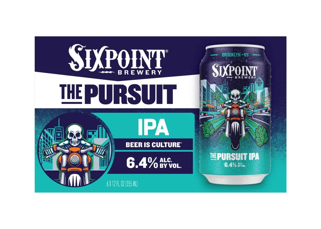
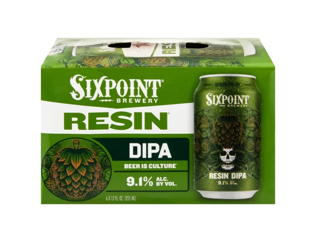
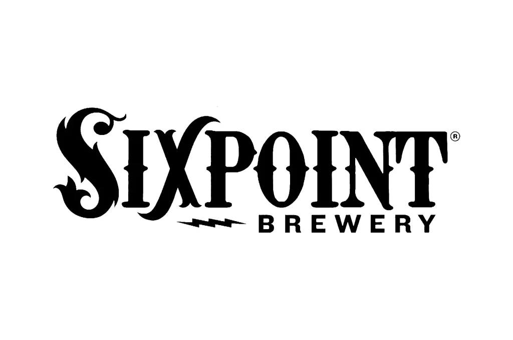
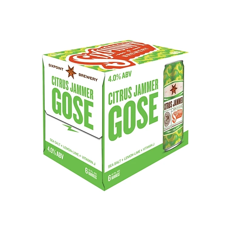
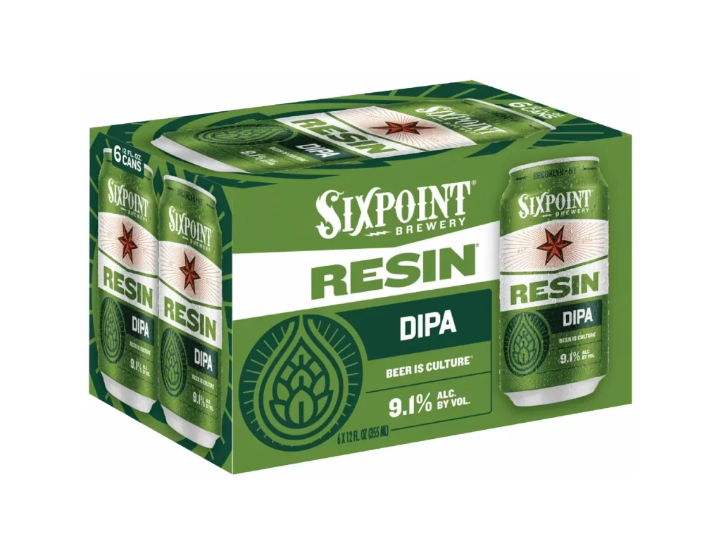
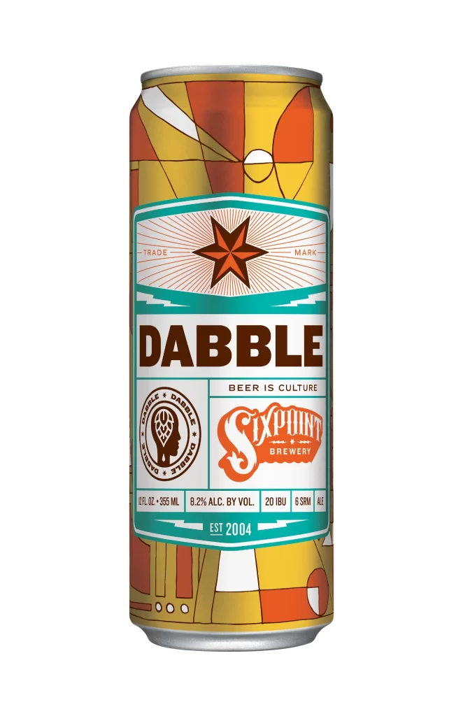
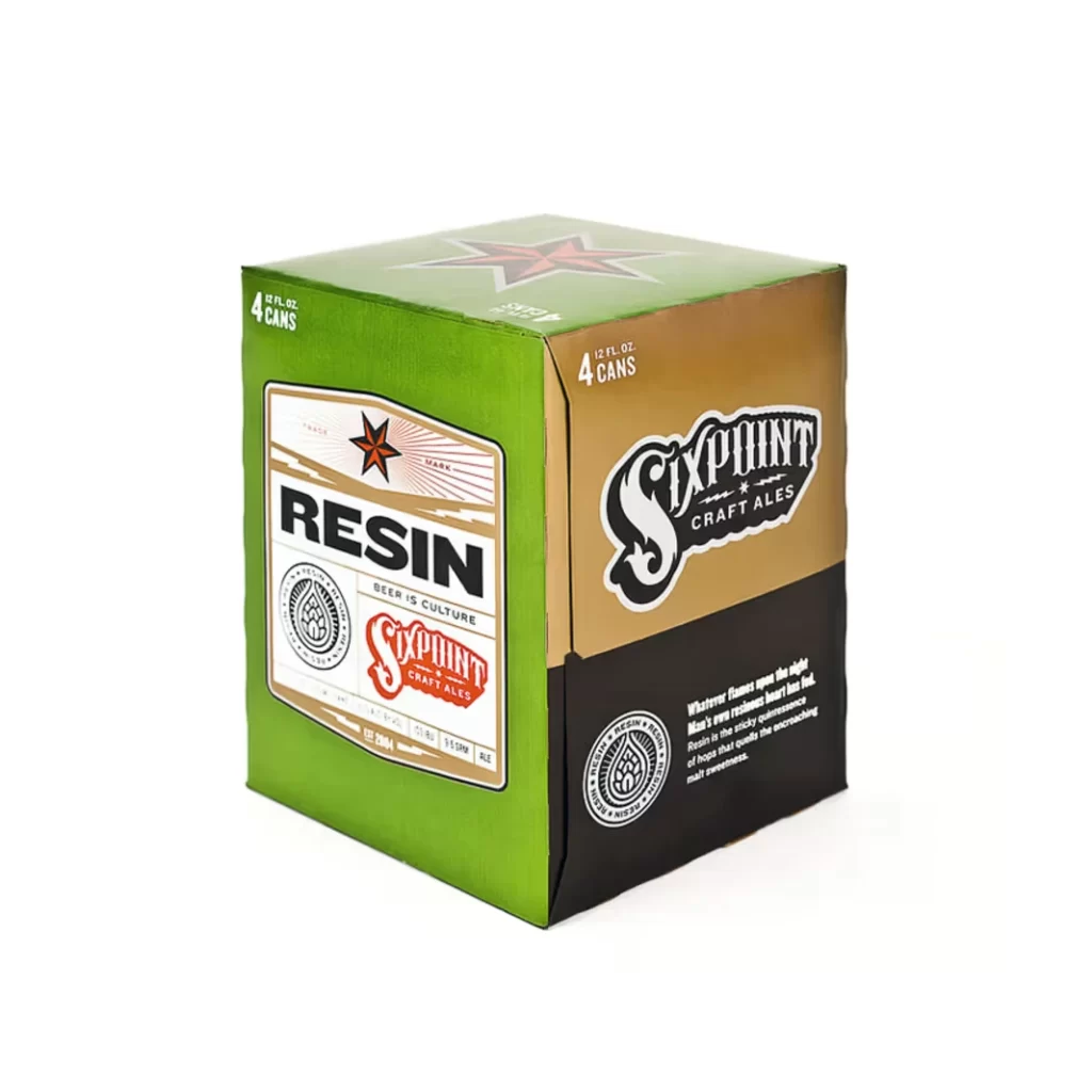
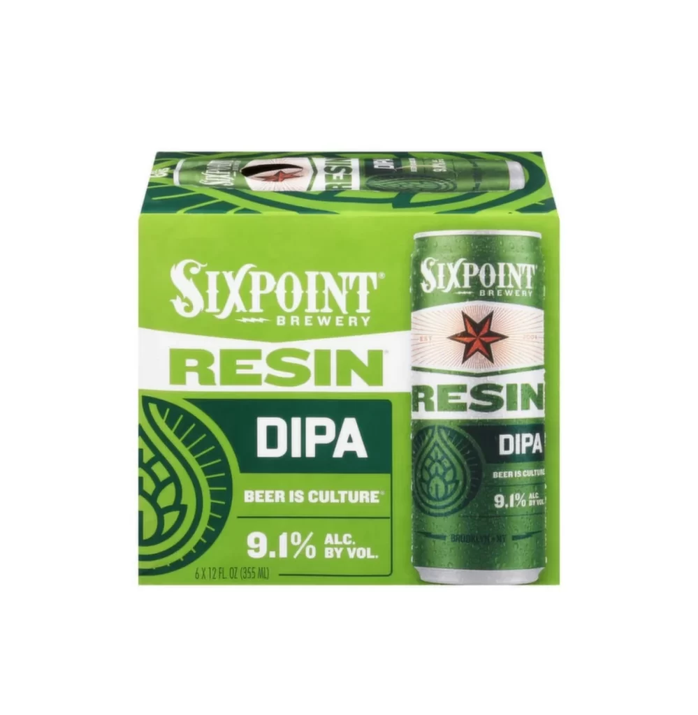
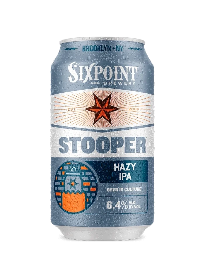
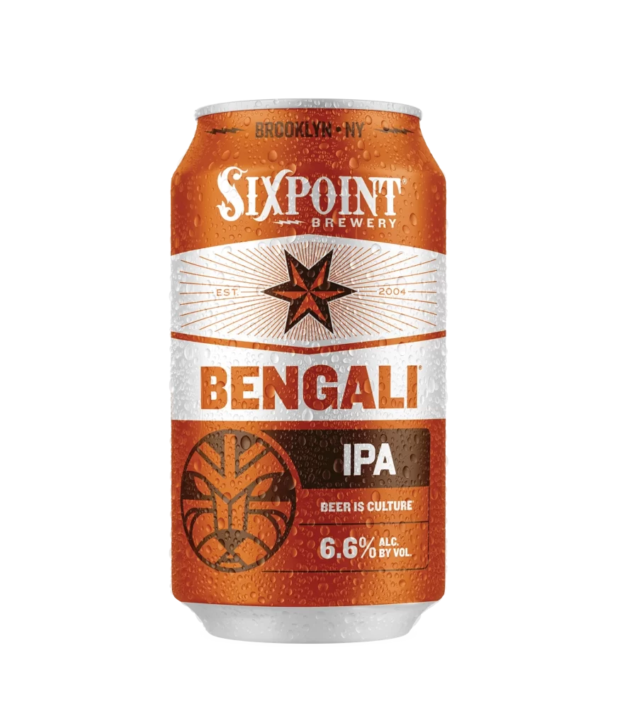
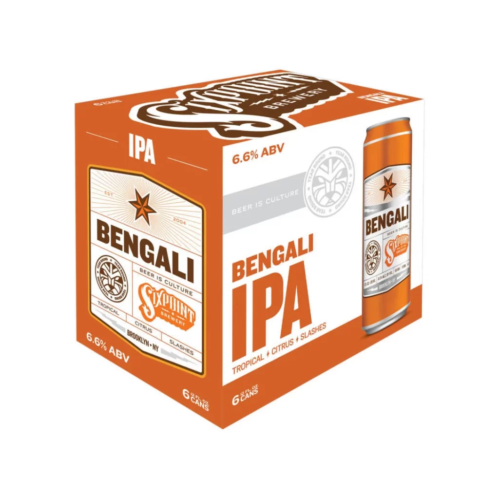
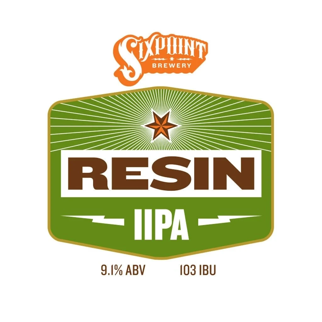
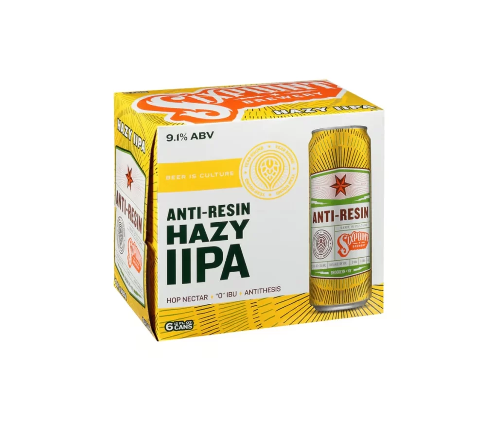
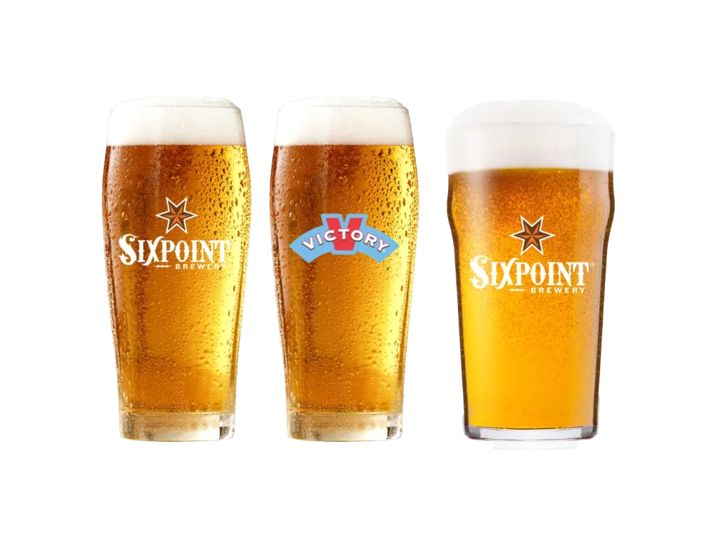
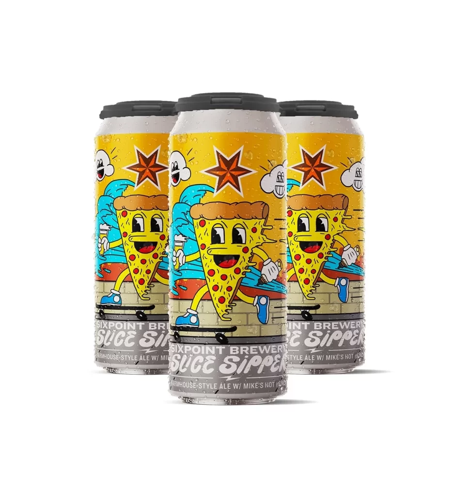
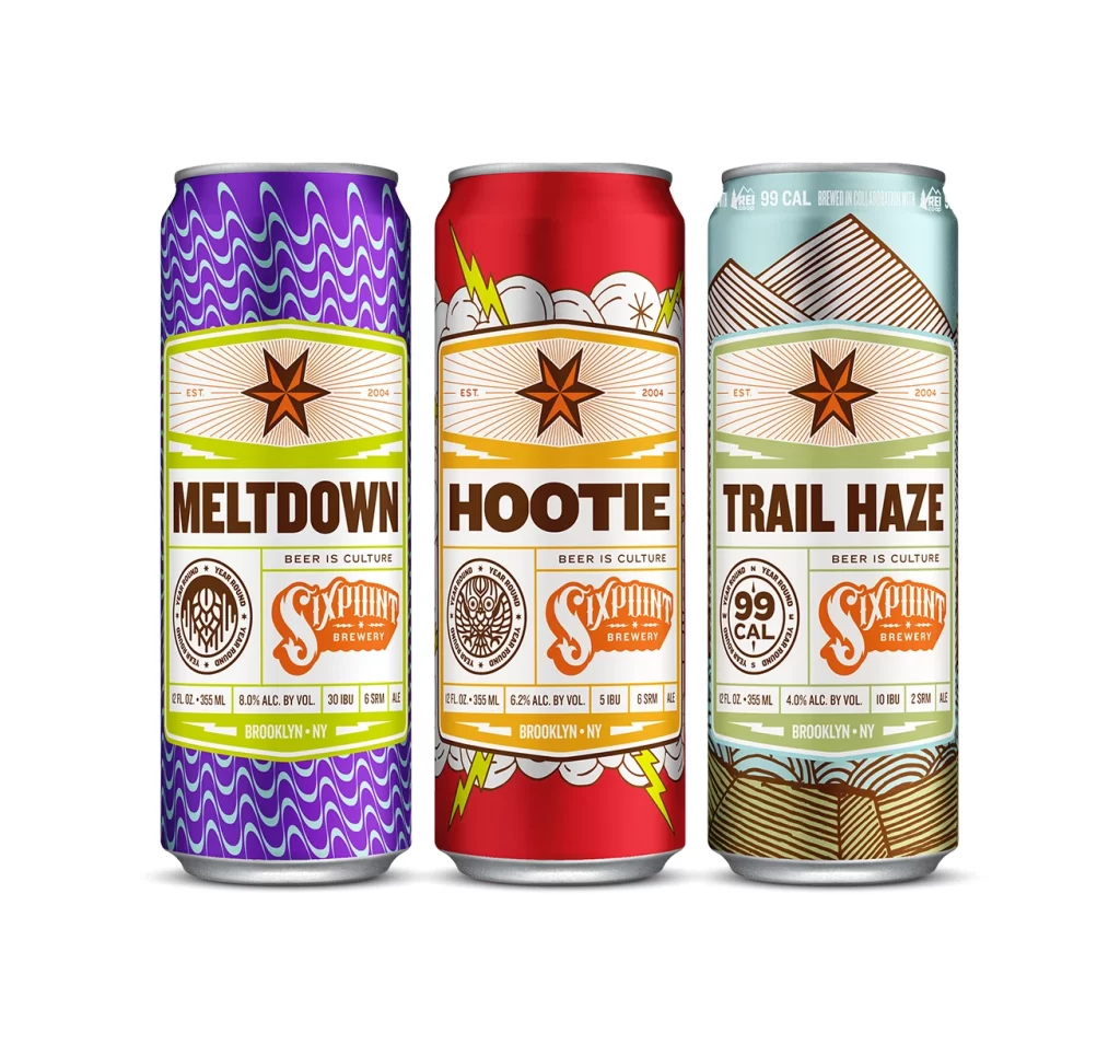
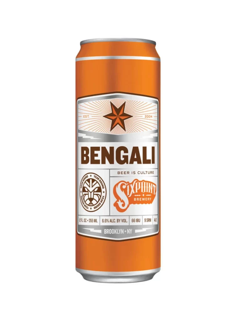
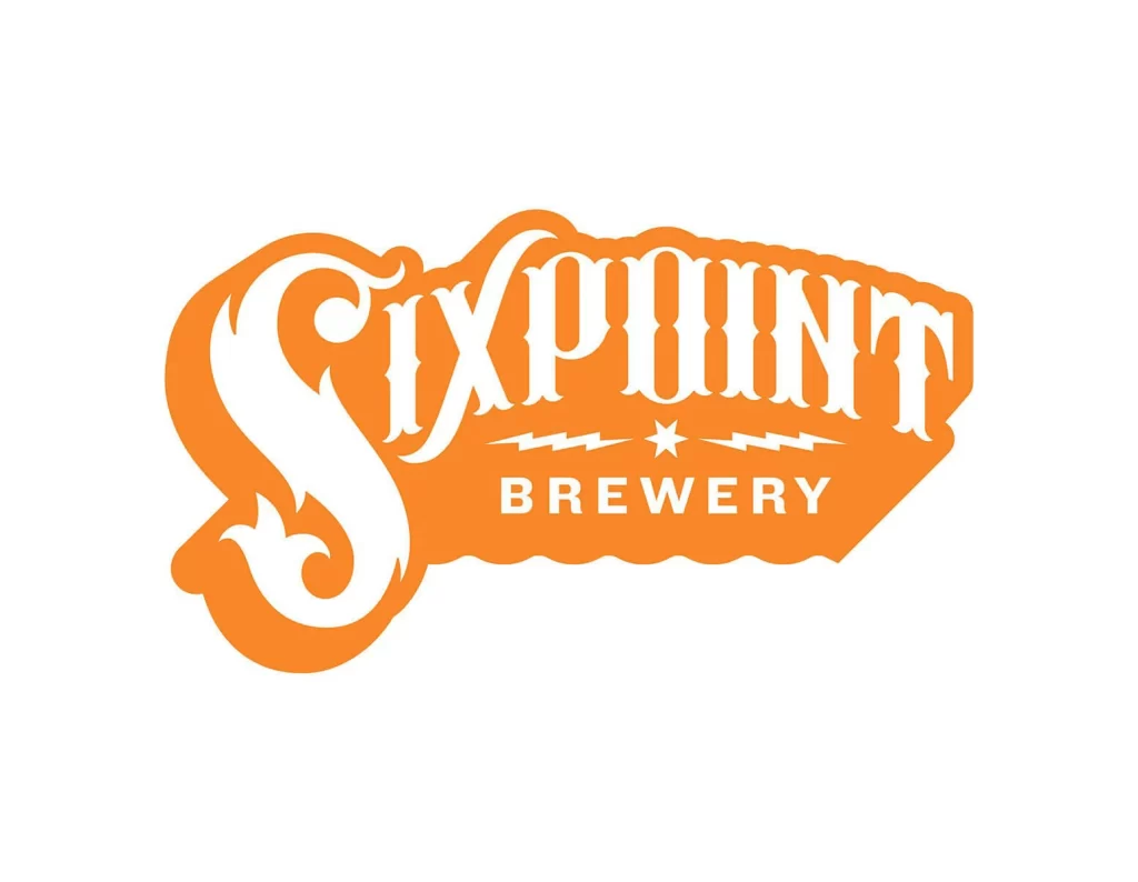
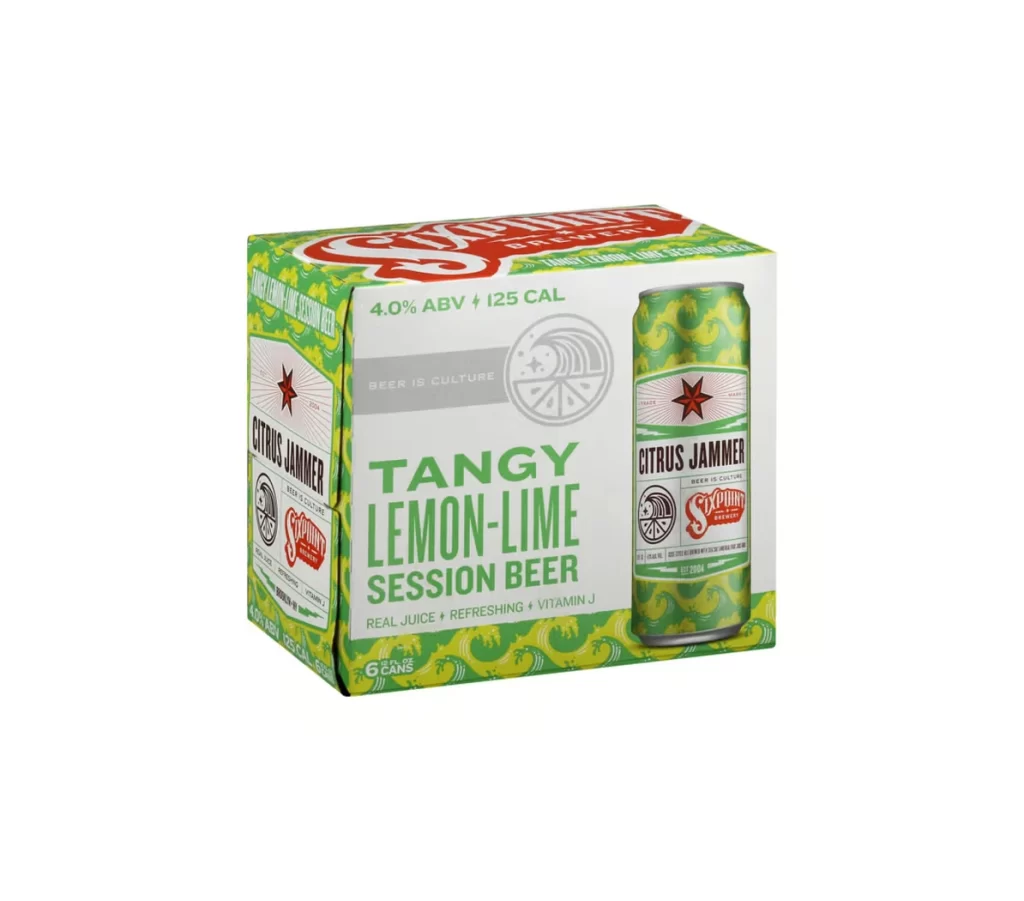
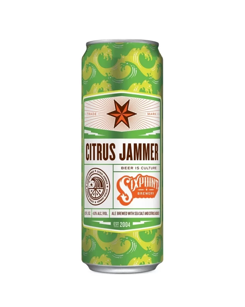
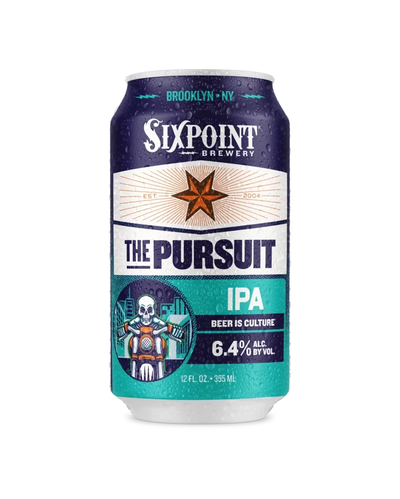
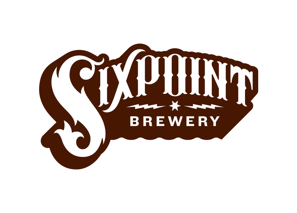
Deep chocolate brown and white form the two-tone color palette of this Sixpoint Brewery logo. The word 'Sixpoint' dominates the composition in a bold, custom serif typeface featuring exaggerated curves and sharp terminals, while 'Brewery' appears below in a compact sans-serif font. A central star flanked by two horizontal lightning bolts bridges the two text elements, all contained within an irregular, wavy-edged brown shape.
Visual weight concentrates in the oversized initial ‘S’, whose sweeping tail anchors the entire mark with dynamic energy. The contrast between the ornate, almost Victorian lettering of the primary name and the utilitarian clarity of the secondary text creates a compelling typographic hierarchy. Subtle scalloping along the bottom edge softens the otherwise rigid geometry, lending an artisanal, handcrafted quality to the digital execution.
Brand strategists might analyze this mark to understand how heritage aesthetics communicate craft authenticity in saturated markets. Packaging engineers could reference the lockup’s proportions when allocating real estate on cans or bottles for similar tiered branding systems. Typography students will find value in studying how decorative serifs can coexist with modern minimalist elements without visual conflict.