Sixpoint Brewery Resin DIPA Green Beer Packaging
Topics
Details
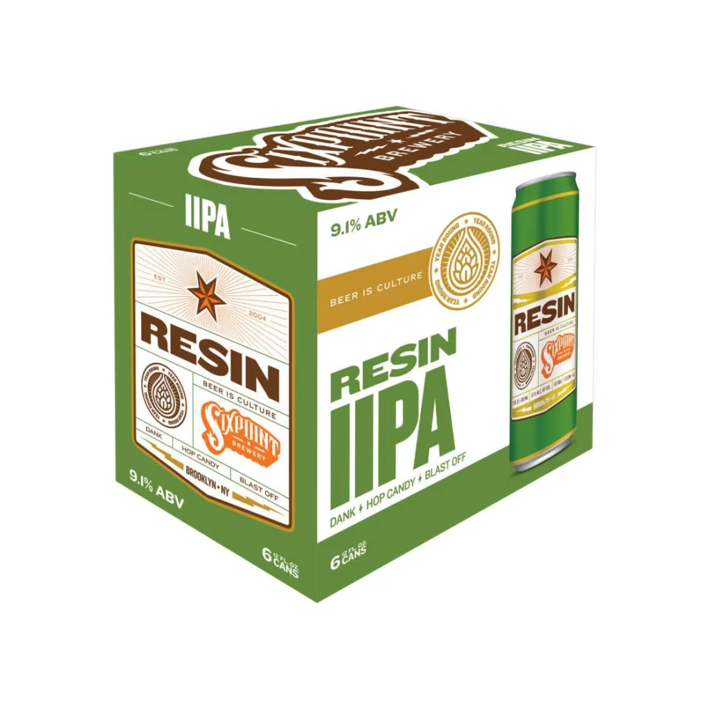
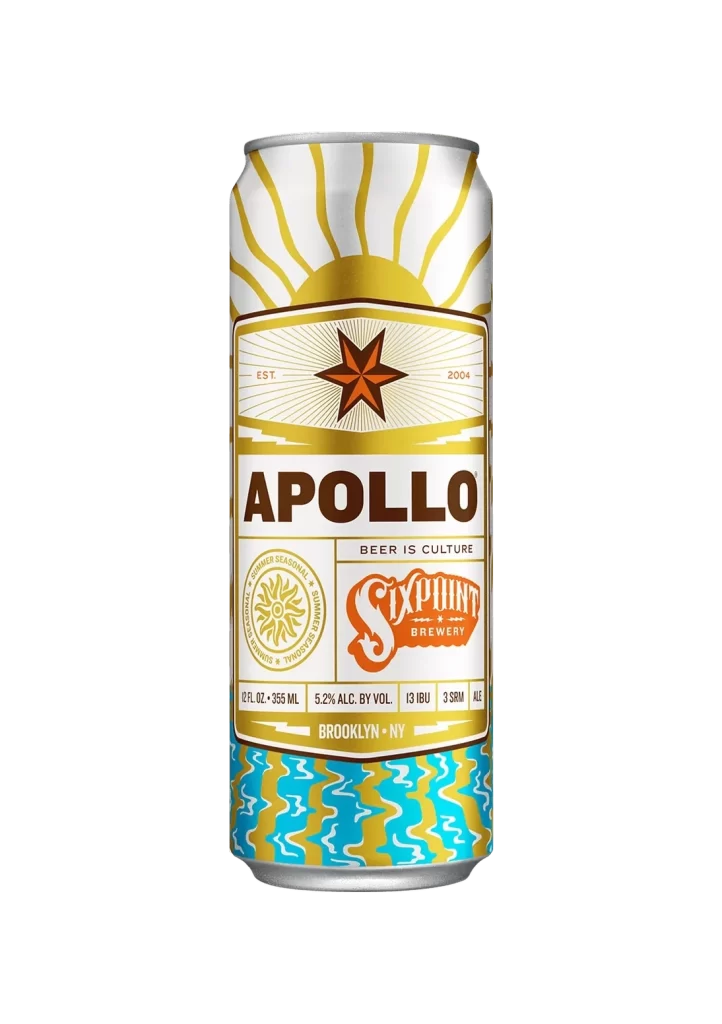
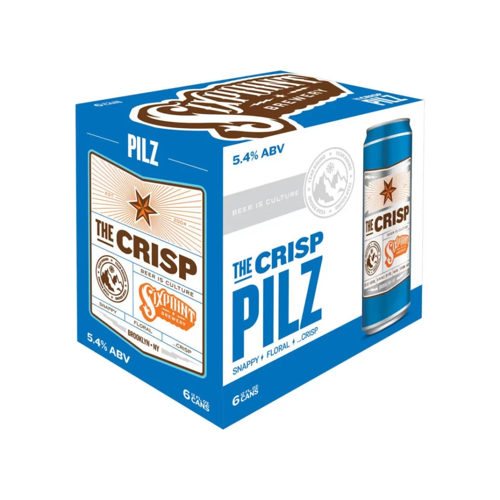
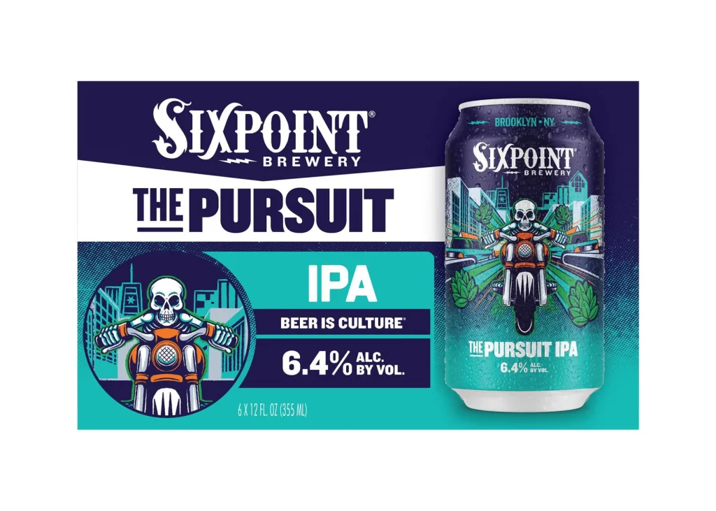
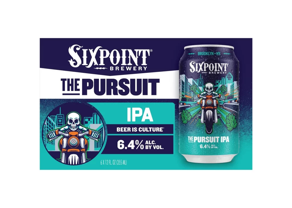
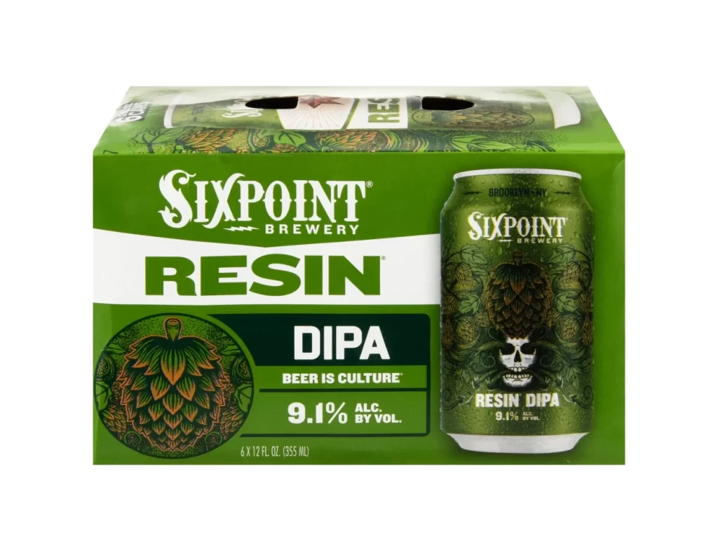
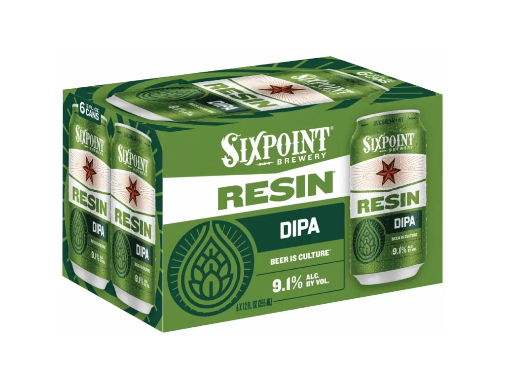
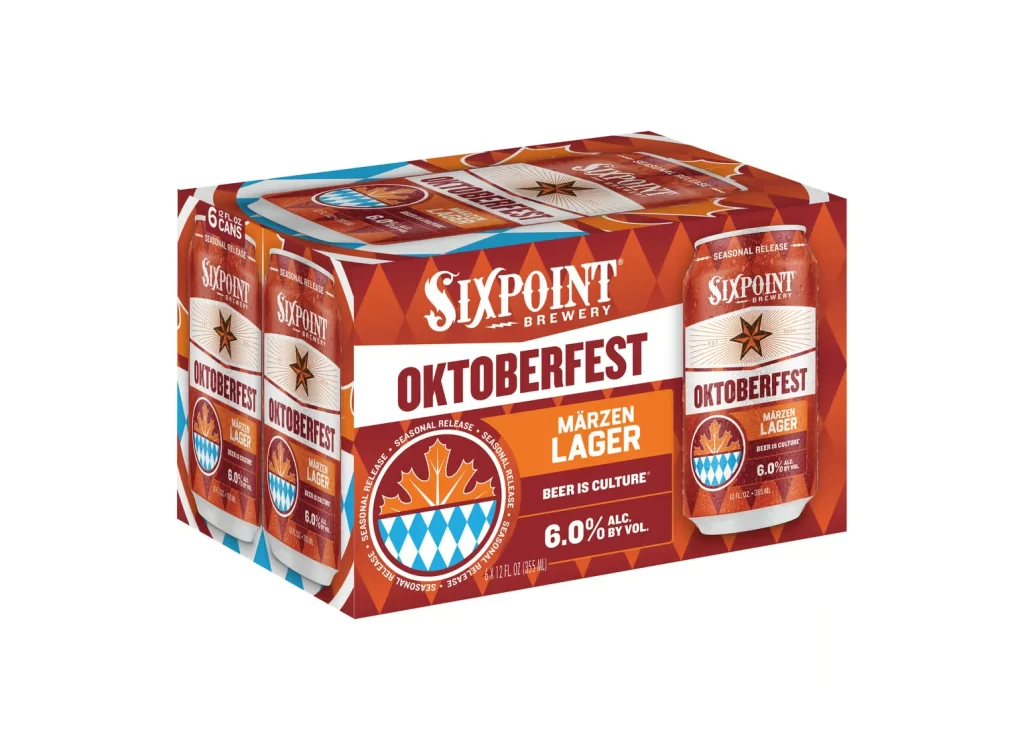
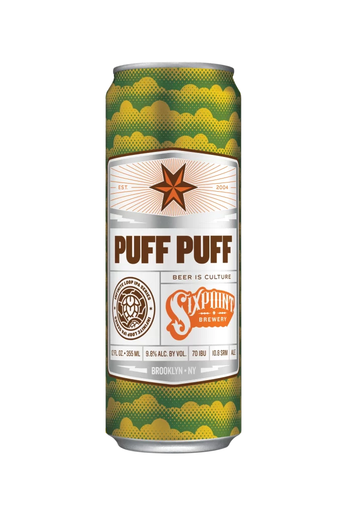
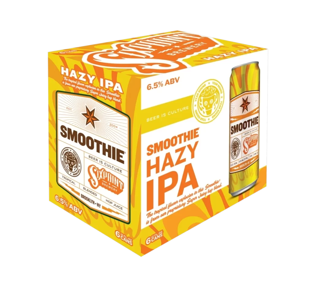
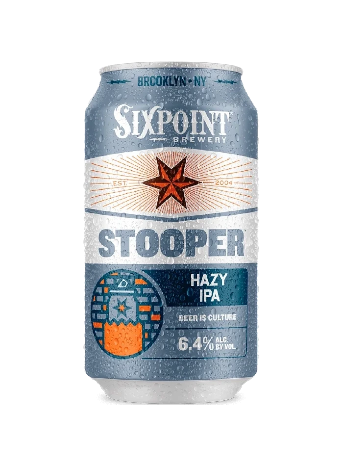
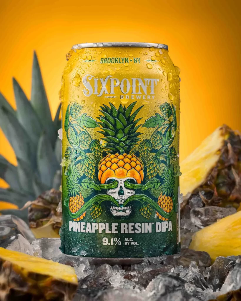
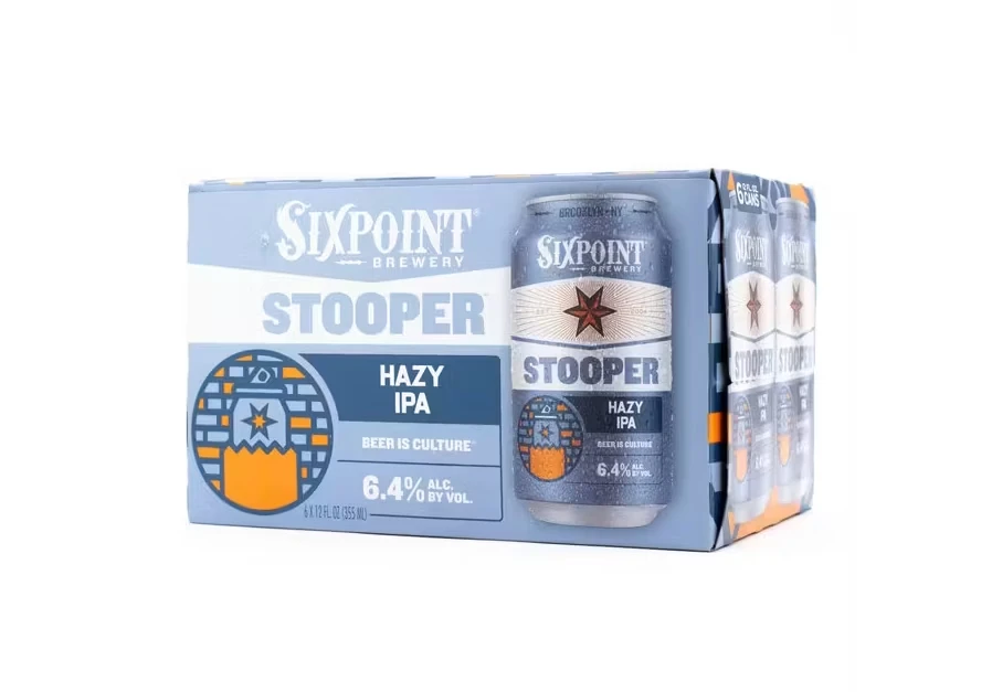
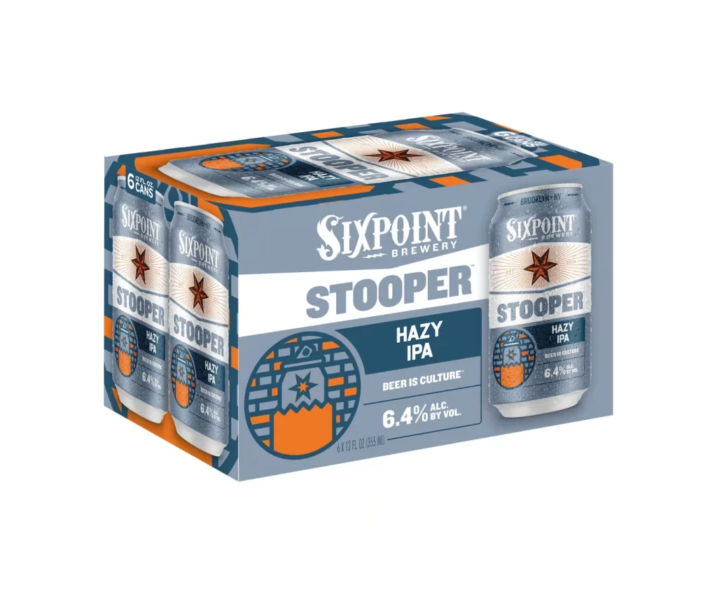
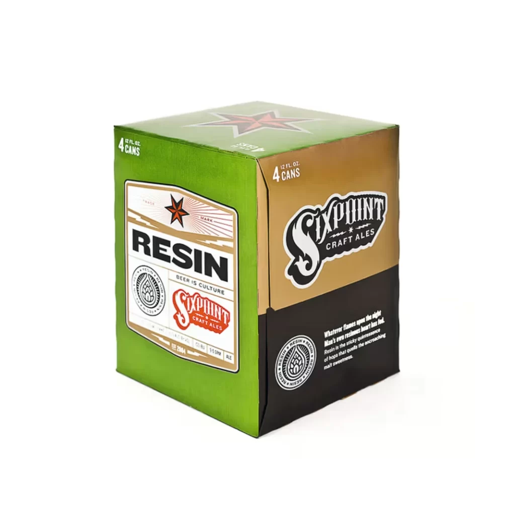
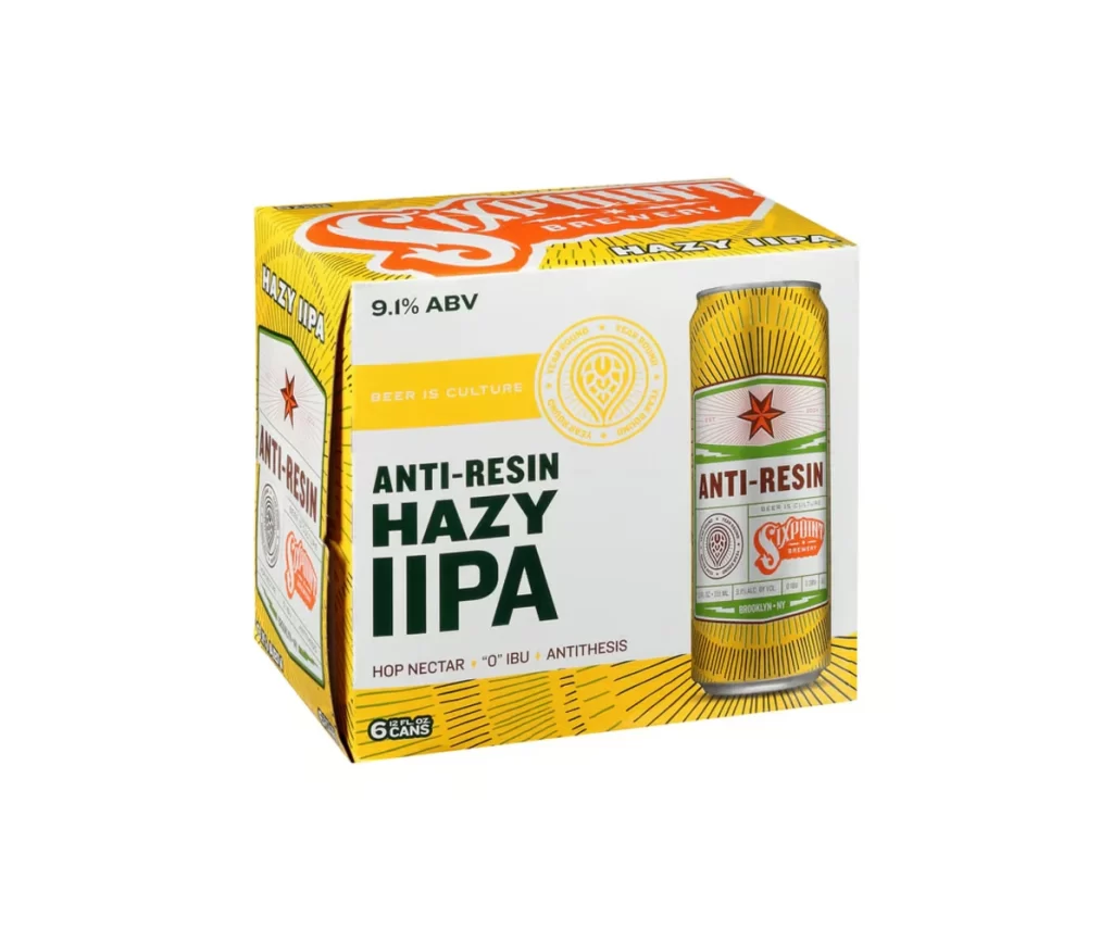
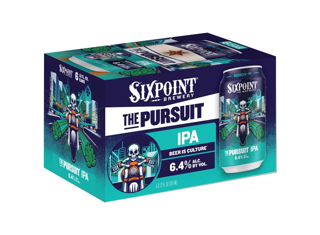
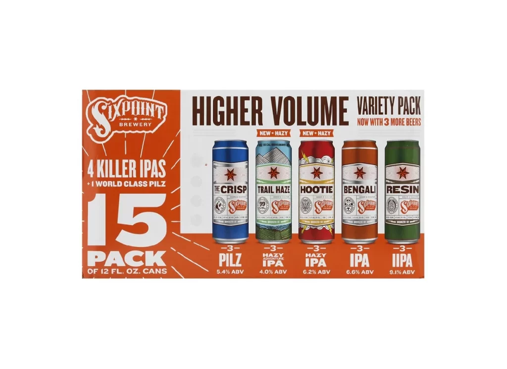
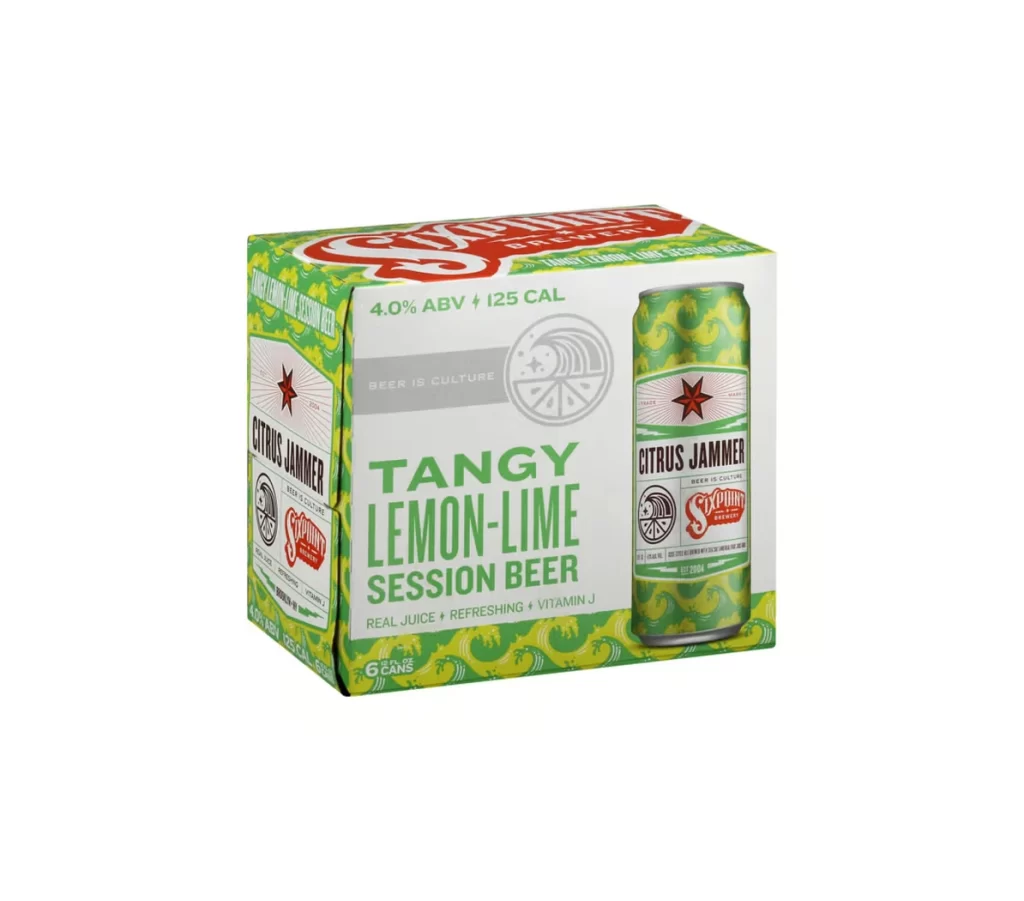
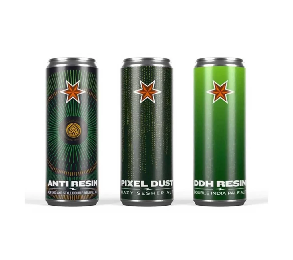
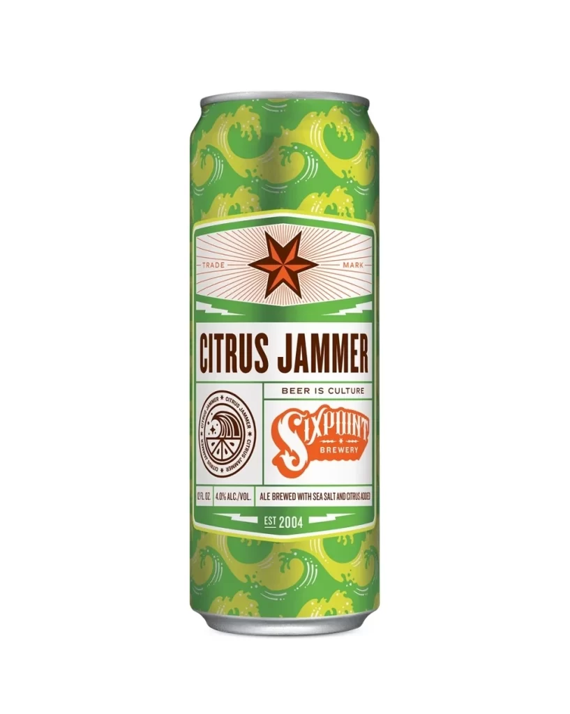
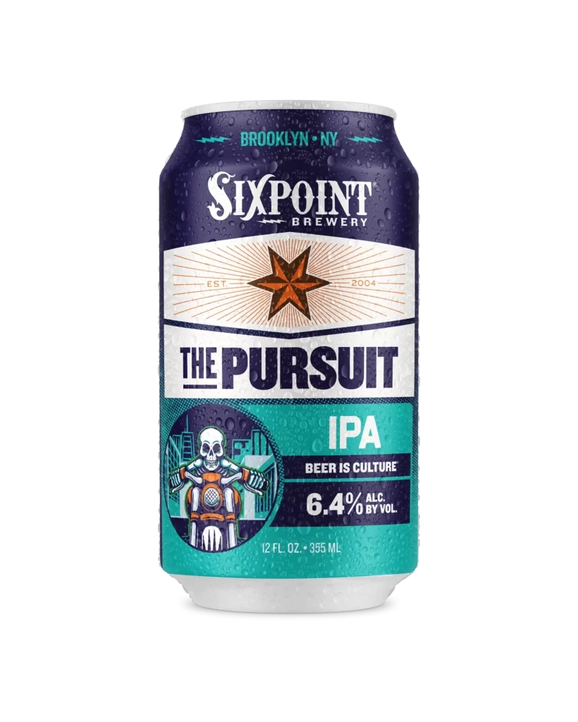
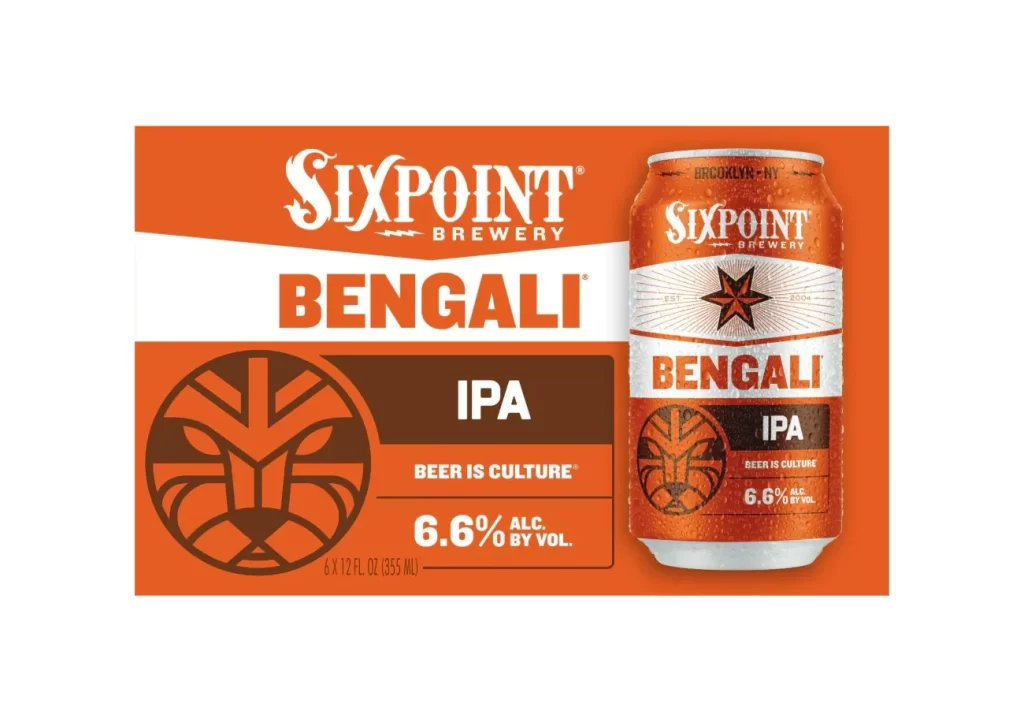
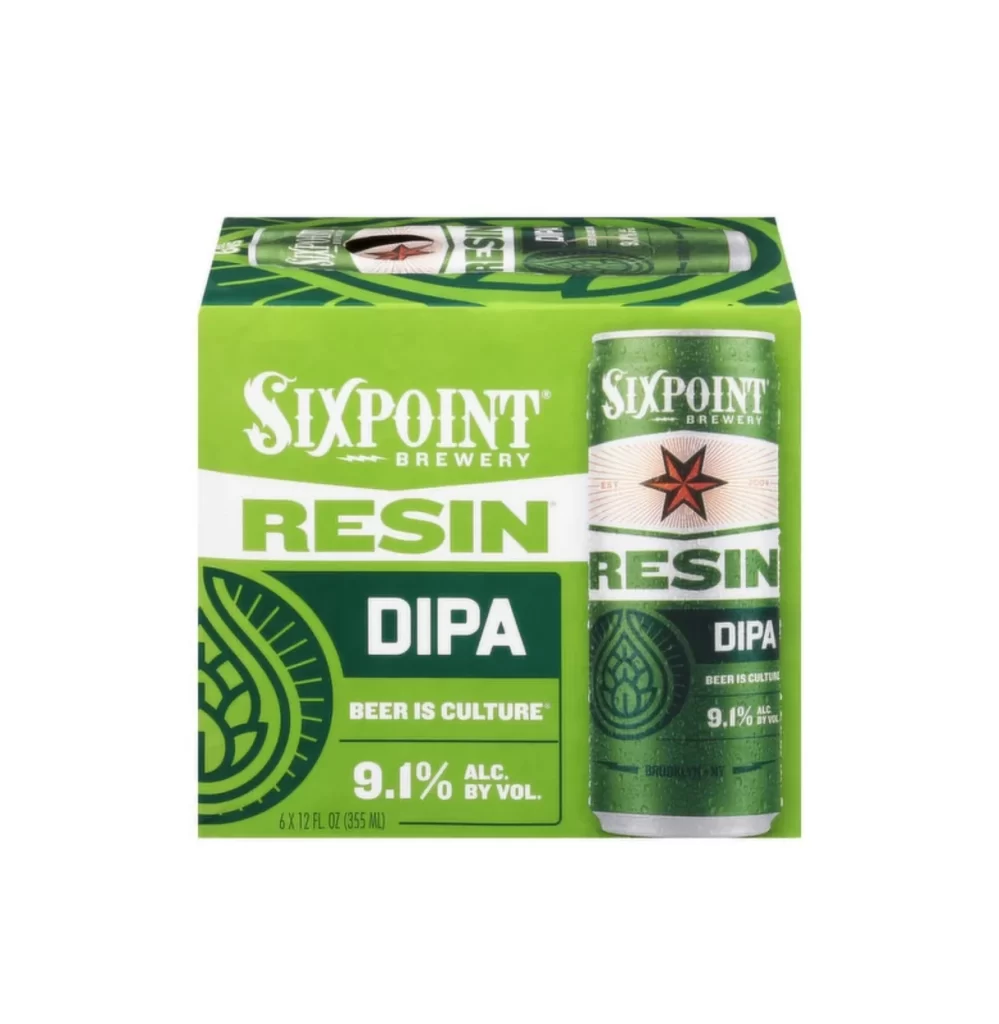
Vibrant lime green dominates the six-pack carrier, creating a high-contrast backdrop for the bold white and dark forest green typography. The composition features a single aluminum can positioned on the right side of the box, showcasing the Sixpoint star logo in deep red against a cream-colored band. Shot from a straight-on, eye-level perspective against a clean white void, the lighting is perfectly even, highlighting the glossy finish of the cardboard and the metallic sheen of the can's surface.
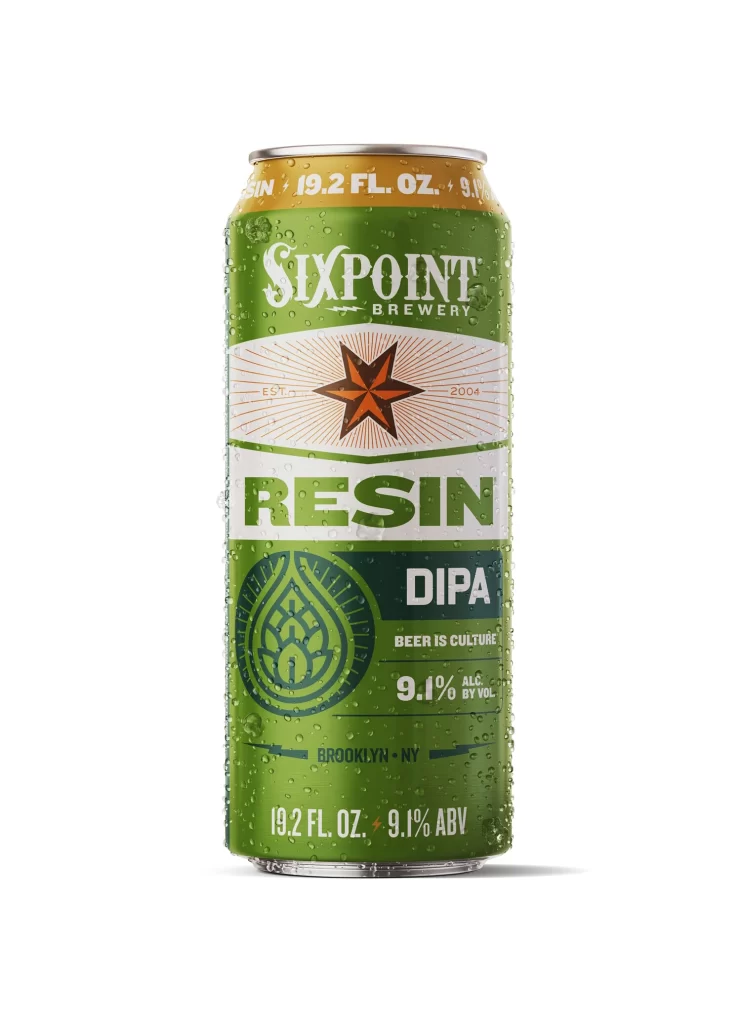
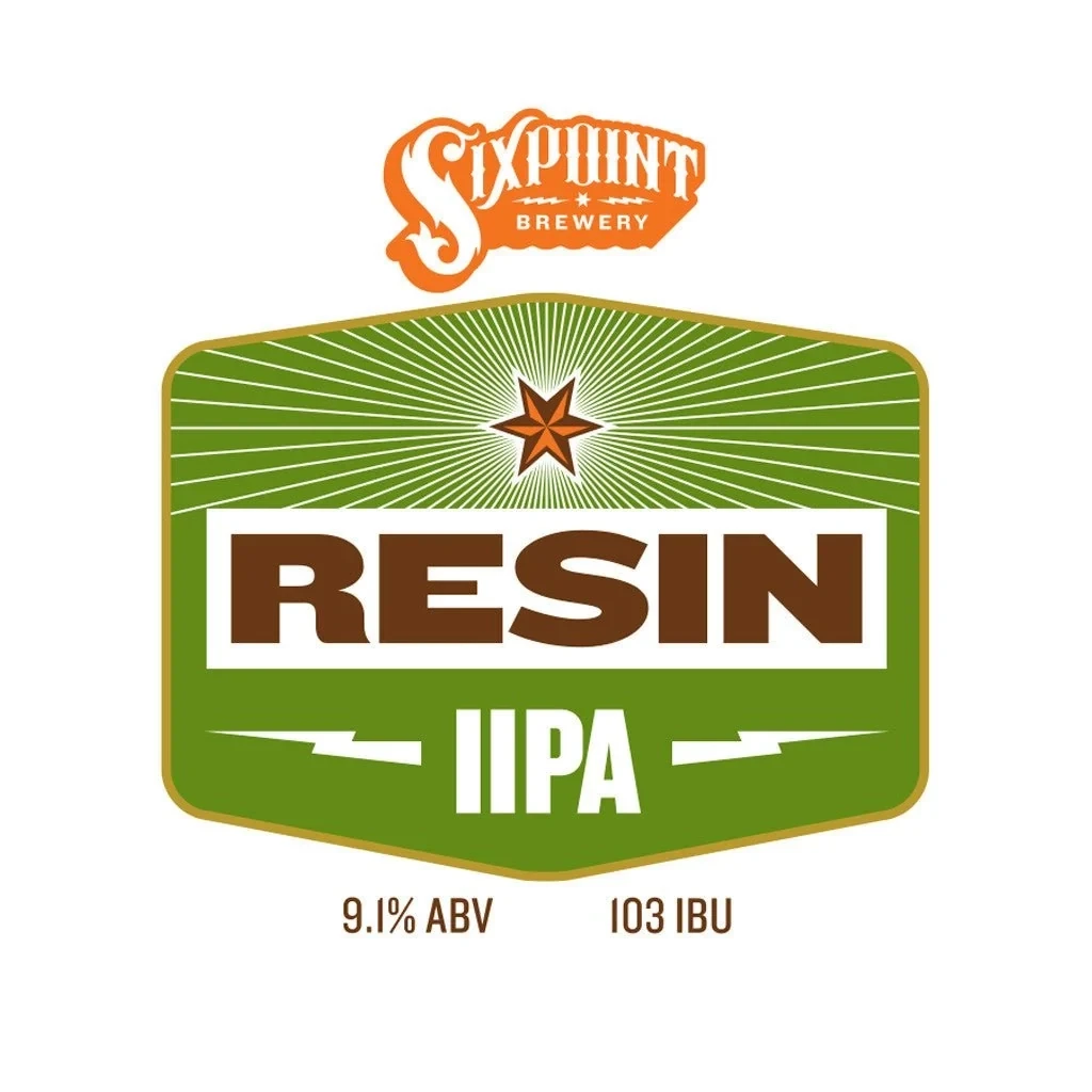
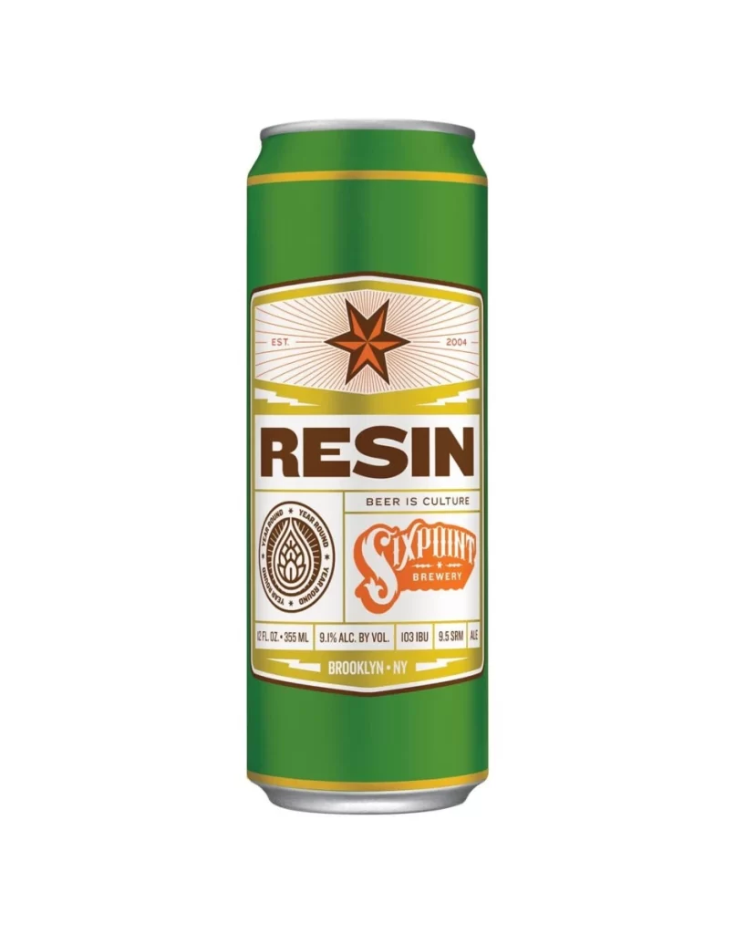
Graphic designers will appreciate how the packaging utilizes a layered color blocking strategy to organize information hierarchy effectively. Circular hop motifs and radiating line patterns add organic texture that balances the rigid rectangular geometry of the container. The interplay between the retro-inspired serif wordmark and the heavy sans-serif 'RESIN' lettering creates a dynamic visual tension that feels both industrial and artisanal.
Brand strategists studying craft beer market positioning could analyze this as a case study in bold color psychology within crowded retail environments. Packaging engineers might examine the structural layout to understand how product photography integrates with physical box dimensions. Students of typography could deconstruct the mixed-font approach to see how different weights convey specific flavor profiles like 'DIPA' and alcohol content.