Sixpoint Brewery orange beer Packaging
Topics
Details
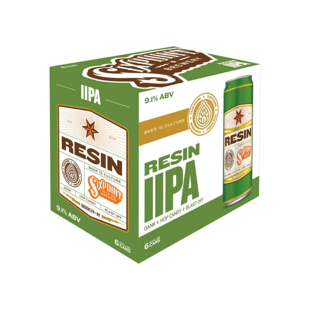
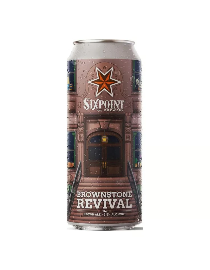
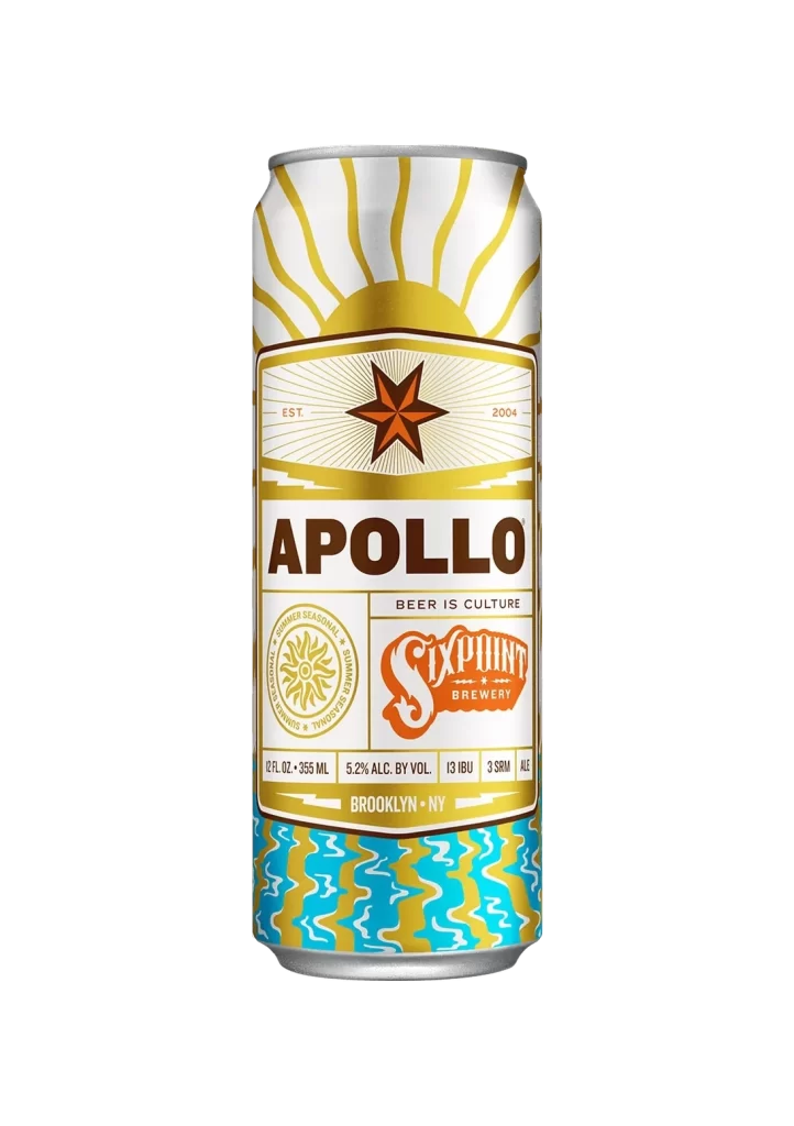
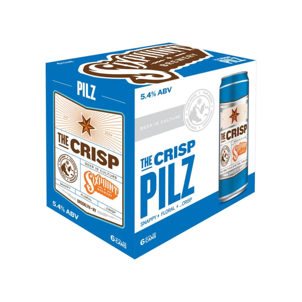
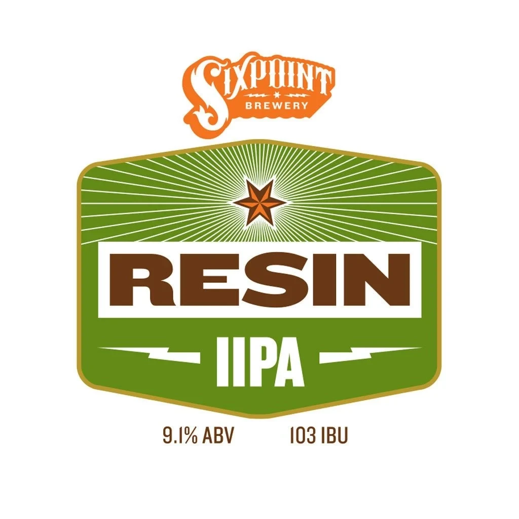
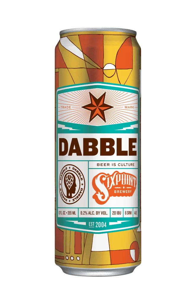
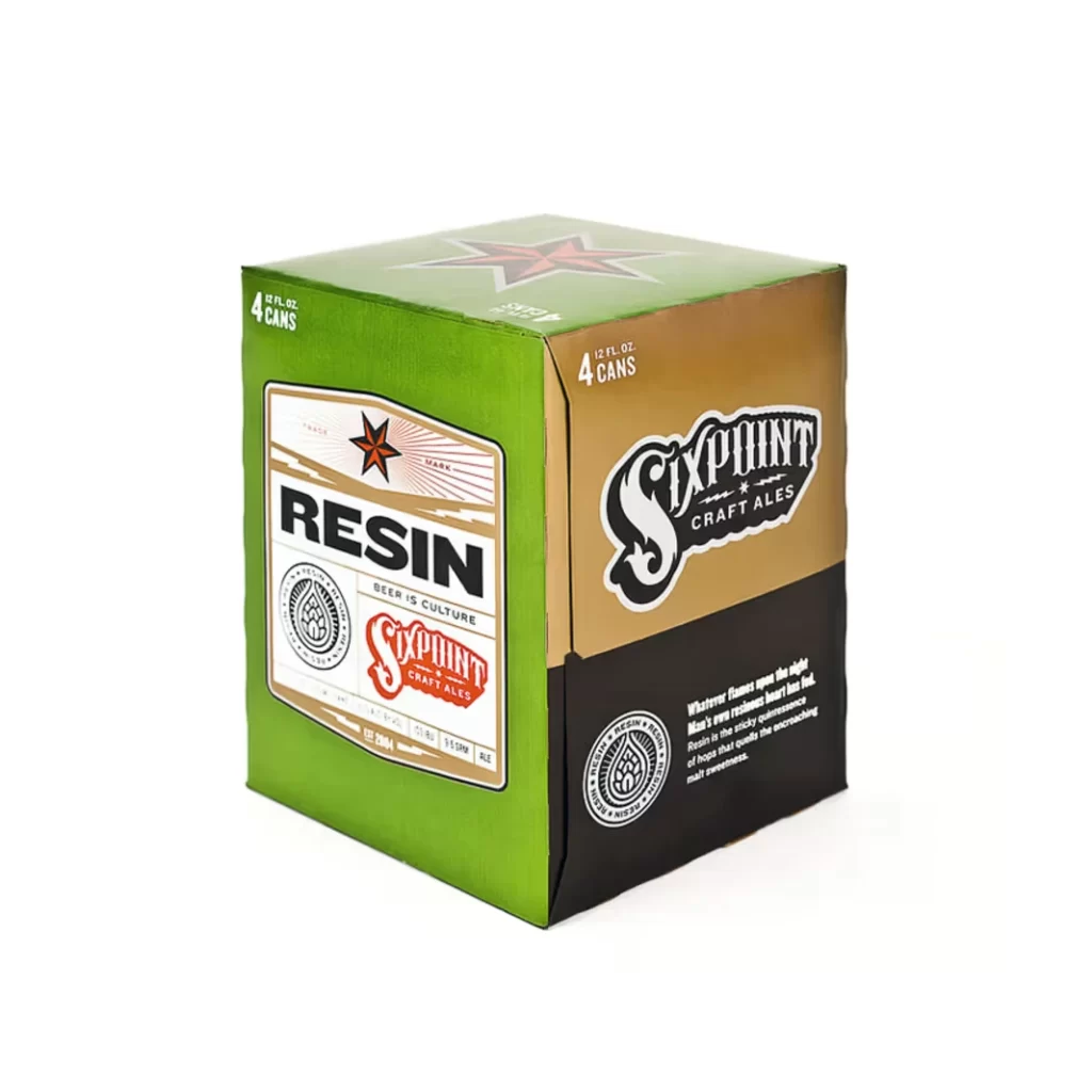
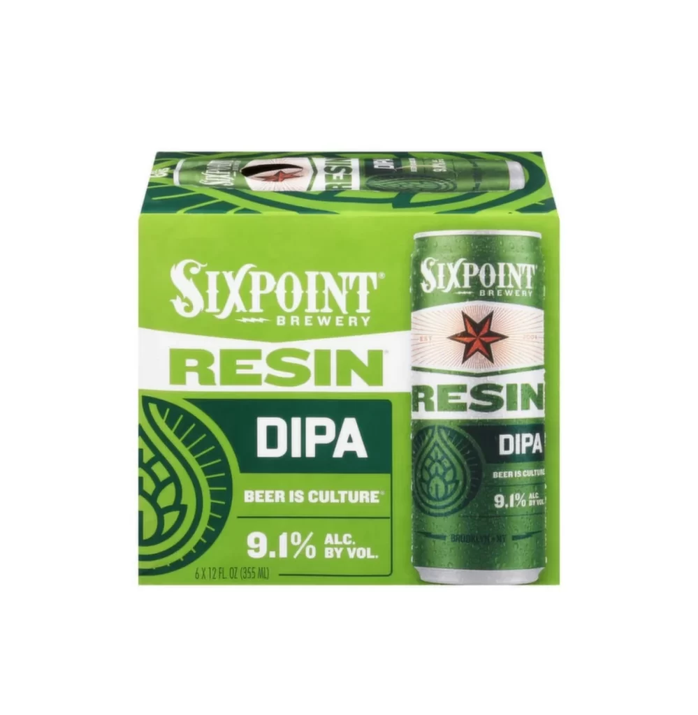
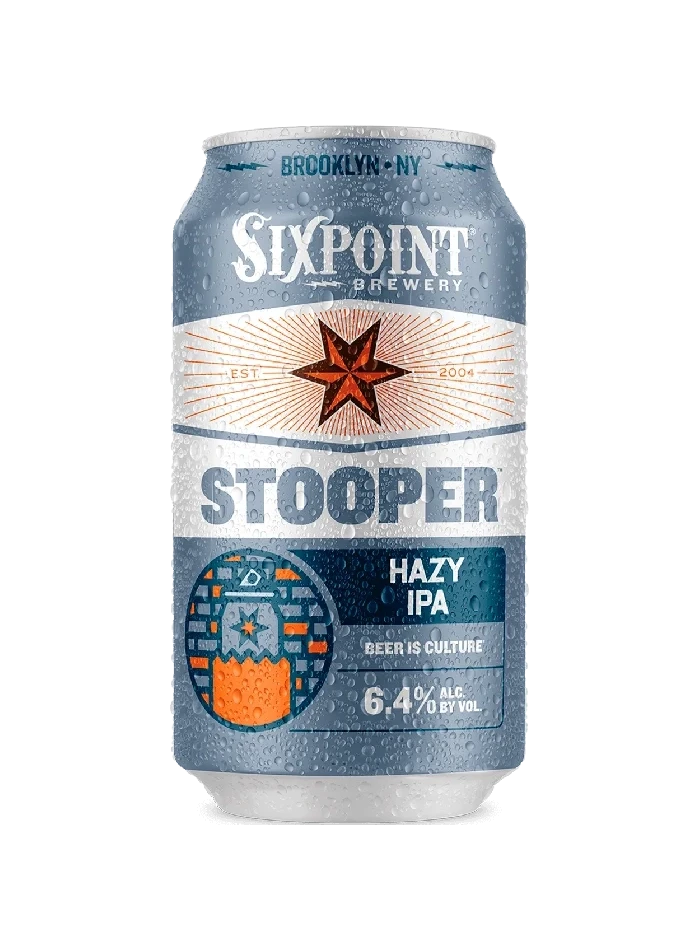
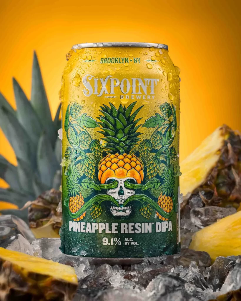
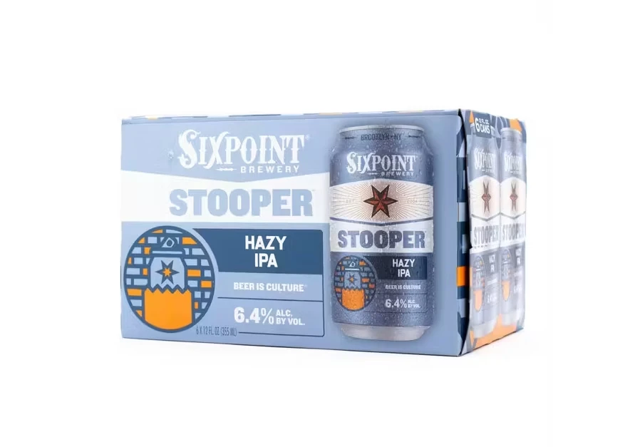
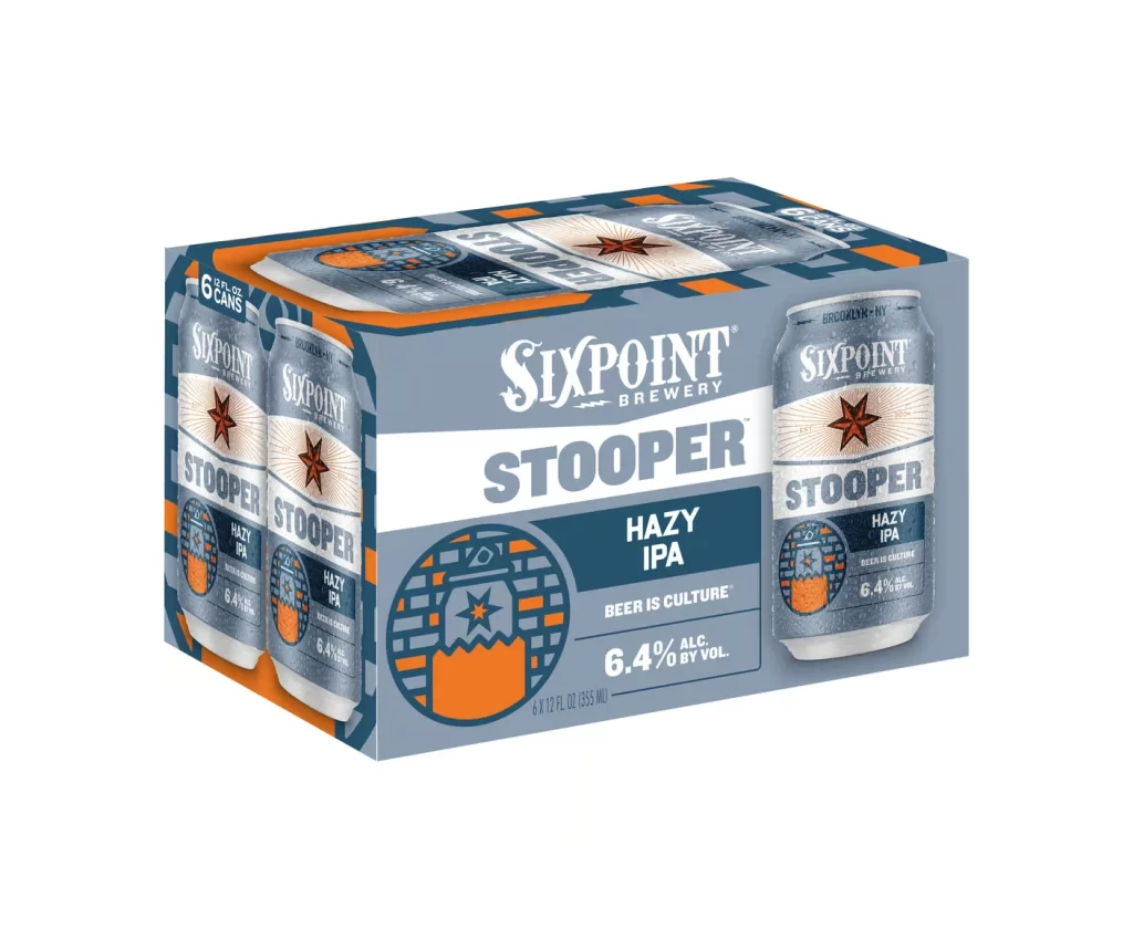
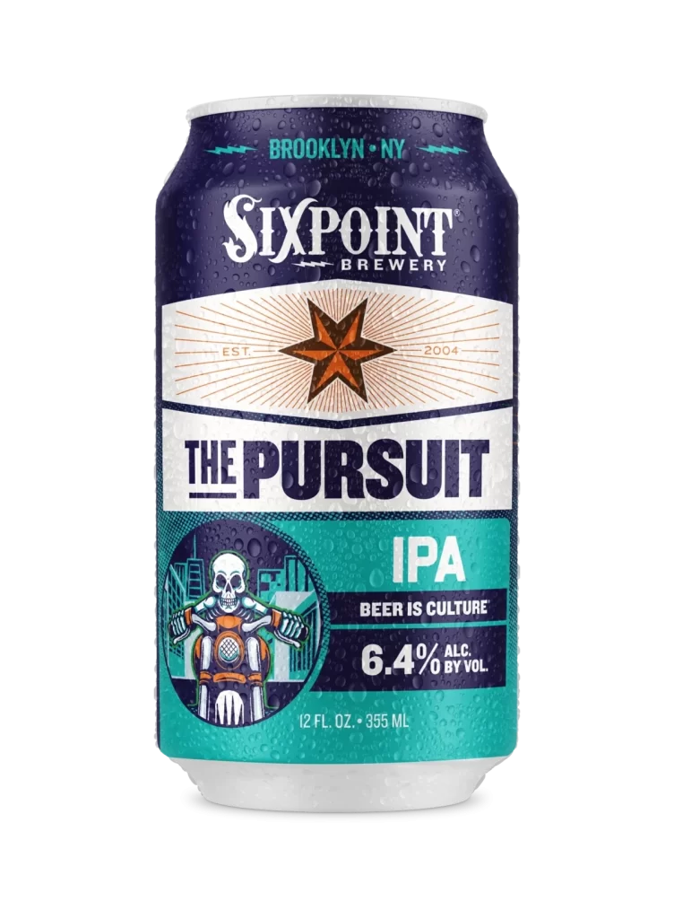
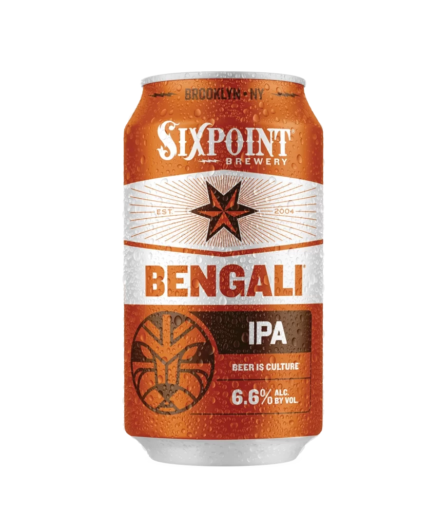
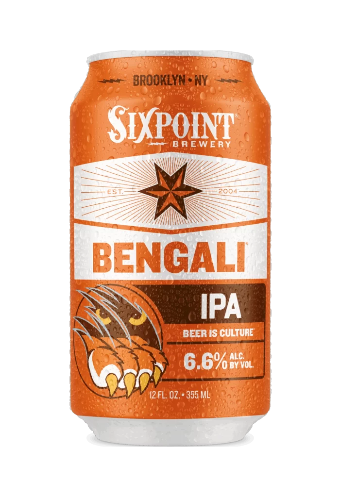
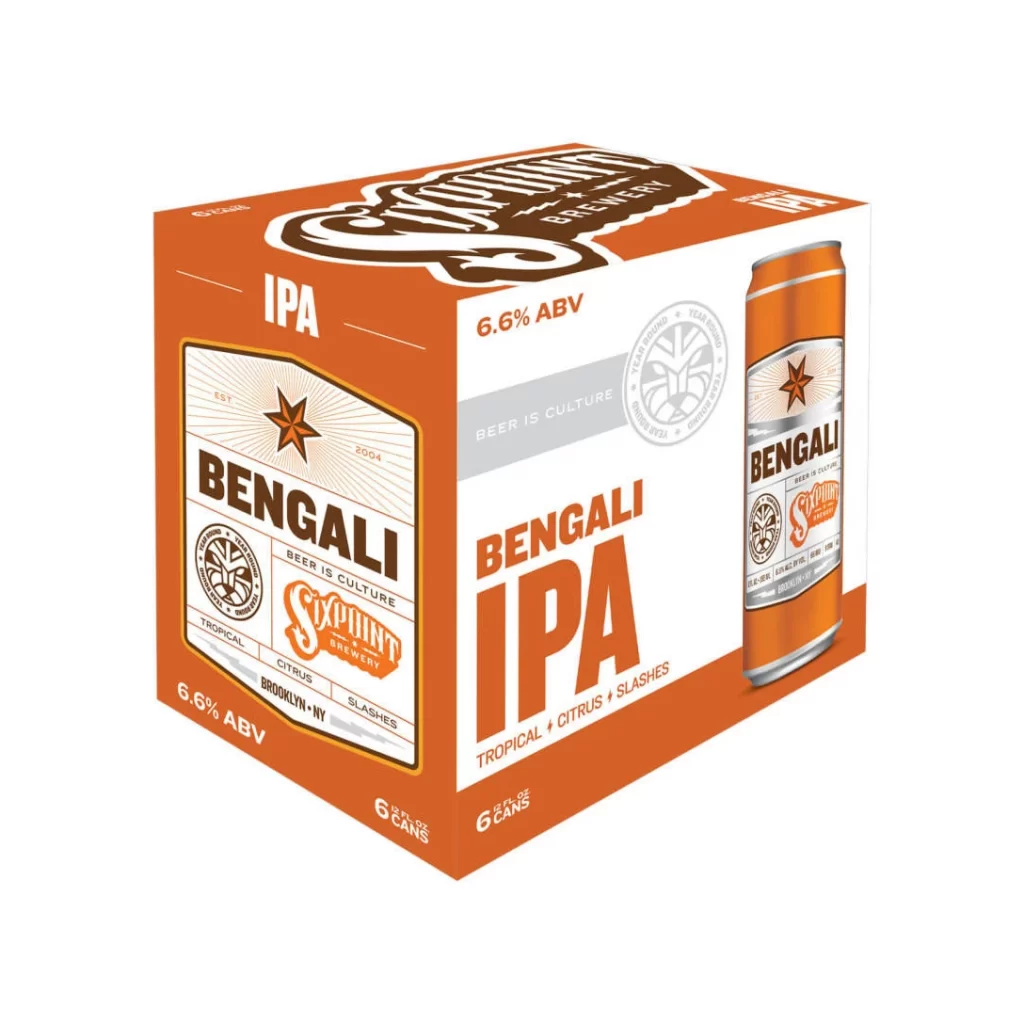
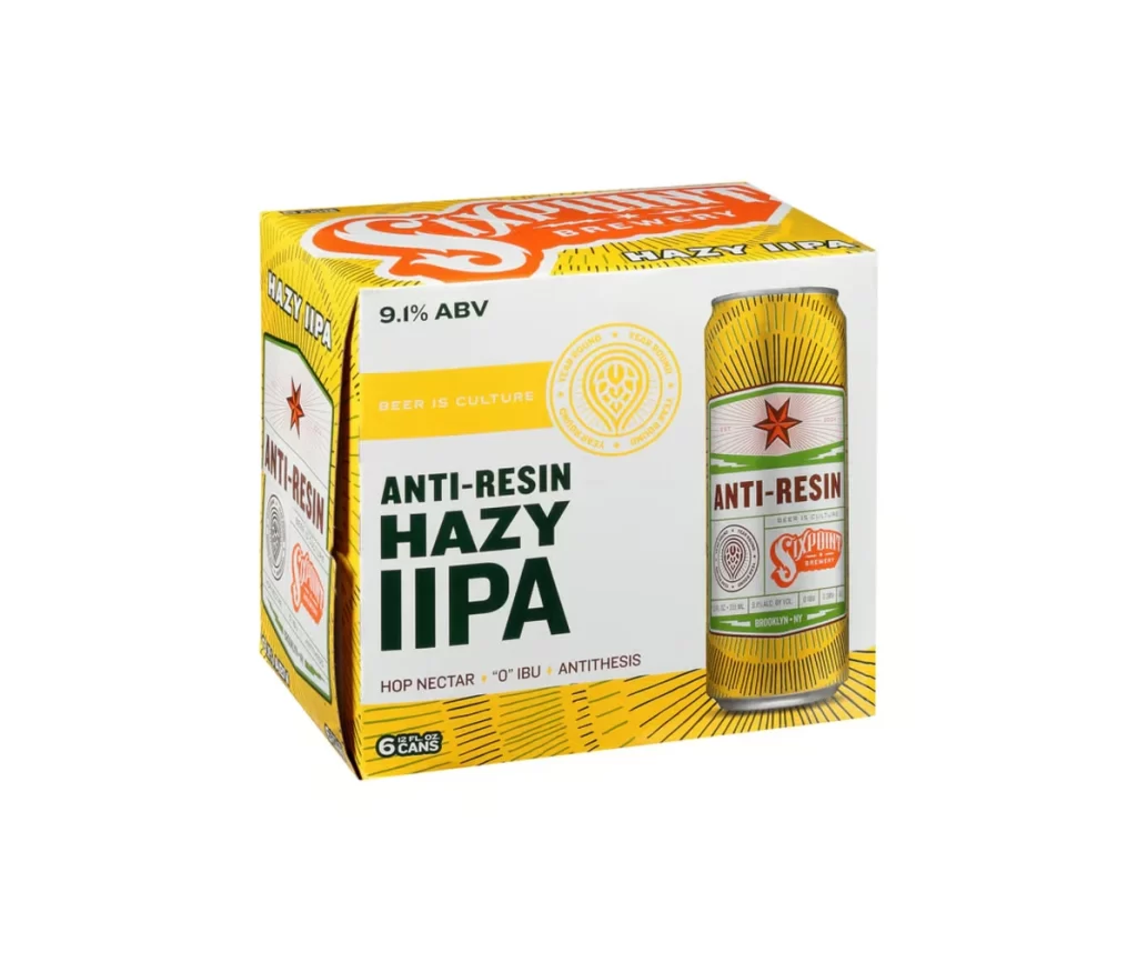
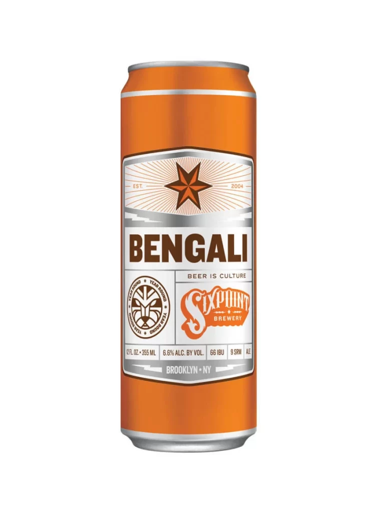
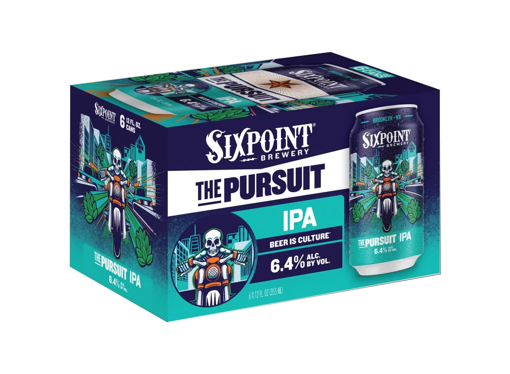
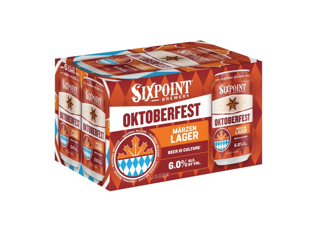
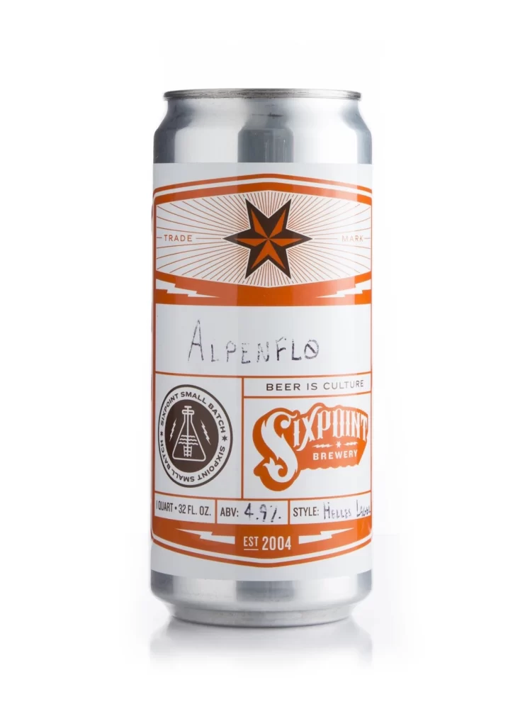
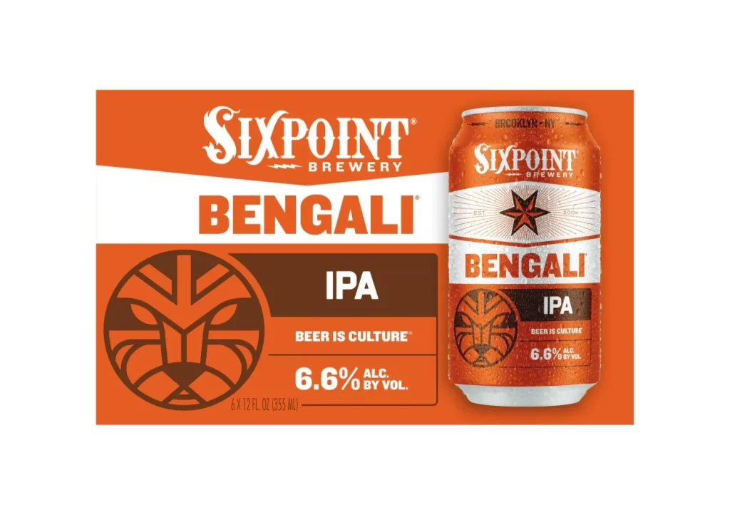
A vibrant orange emblem with a bold, irregular silhouette dominates the central frame, featuring the word 'Sixpoint' rendered in an ornate, white Western-style typeface where the initial 'S' curls dramatically to the left. Beneath this primary text, 'BREWERY' appears in a clean, sans-serif font flanked by two horizontal lightning bolts and a small star. The entire composition sits on a simple white surface that allows the saturated orange hue to stand out clearly.
Visual tension arises from the juxtaposition of the fluid, almost organic outer boundary against the rigid typographic elements within. The high-contrast palette of saturated orange and pure white ensures immediate legibility while evoking a sense of industrial energy. Such a design choice leverages vintage Americana motifs to establish a brand identity that feels both established and rebellious.
Brand strategists might analyze this mark to understand how color psychology influences consumer perception in the craft beverage sector. Typographers could study the interplay between the decorative serif and the utilitarian sans-serif to balance decorative flair with modern clarity. Furthermore, packaging engineers may utilize this specific layout as a baseline for testing label adhesion and ink saturation on various can substrates.