Sixpoint Brewery Pursuit-1-1 Packaging
Topics
Details
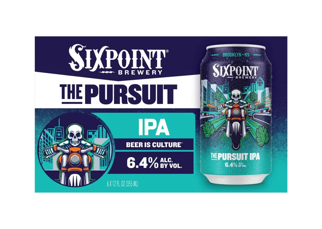
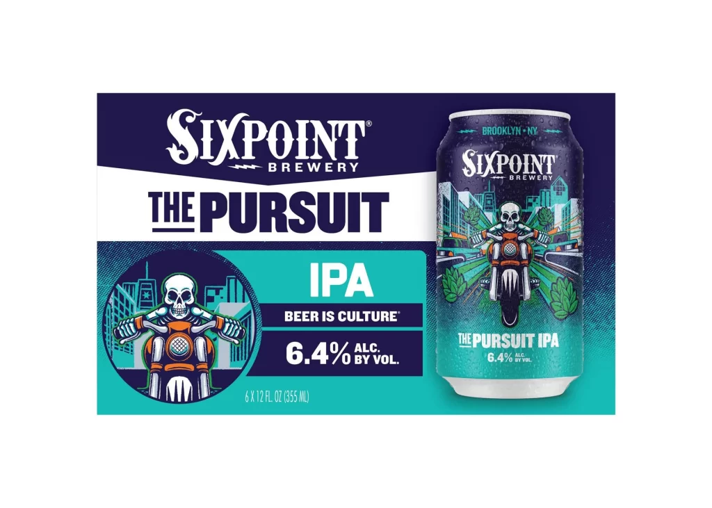
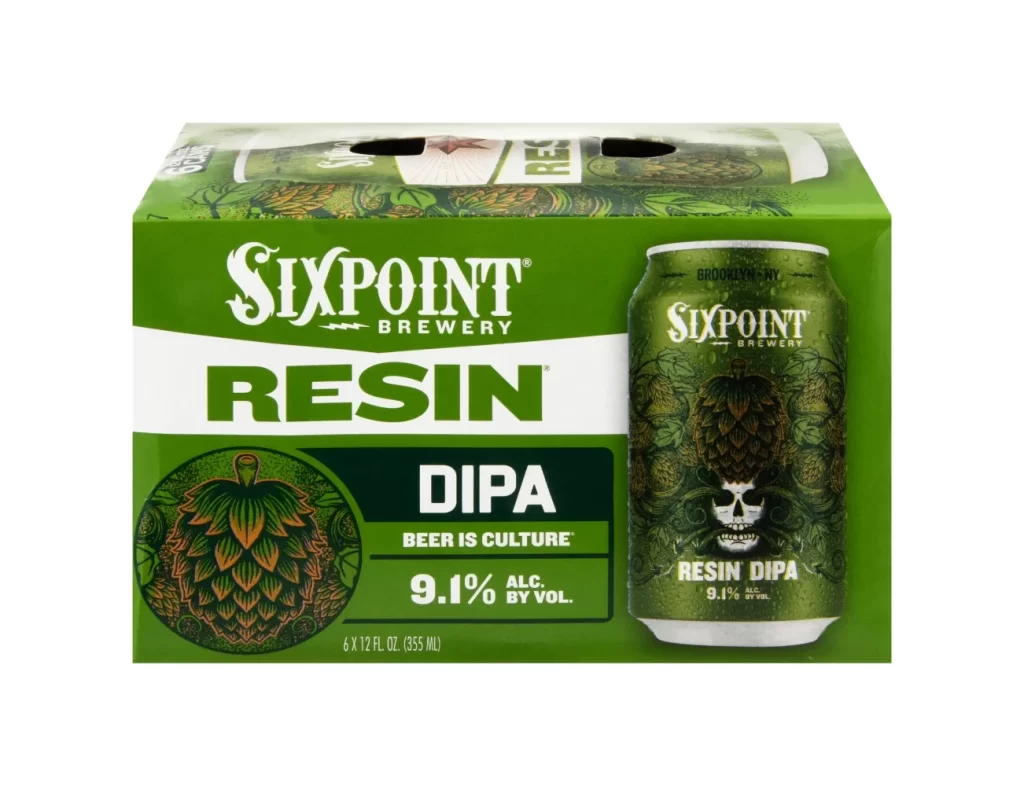
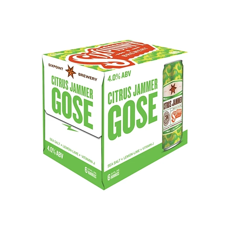
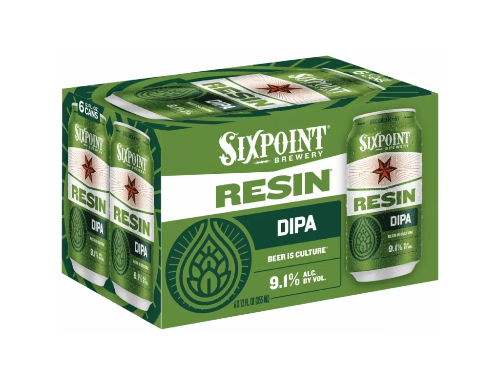
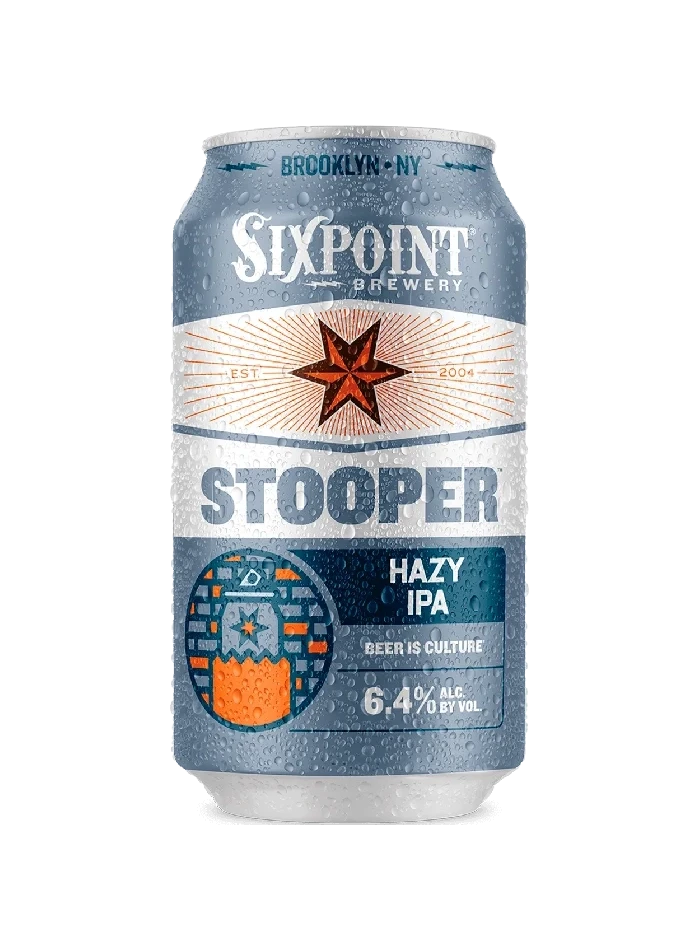
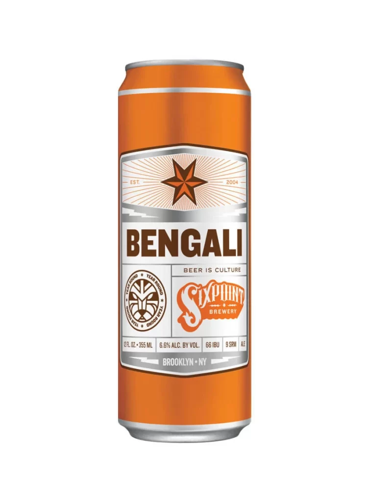
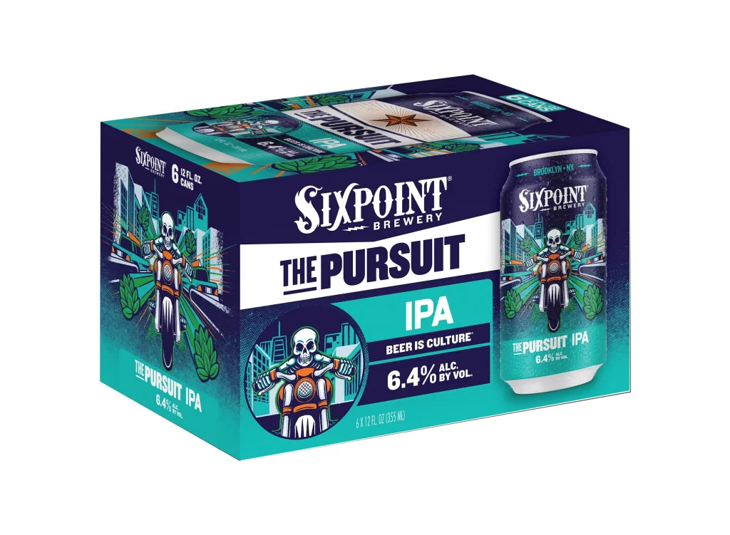
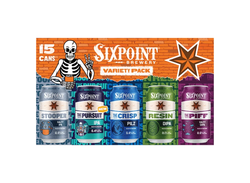
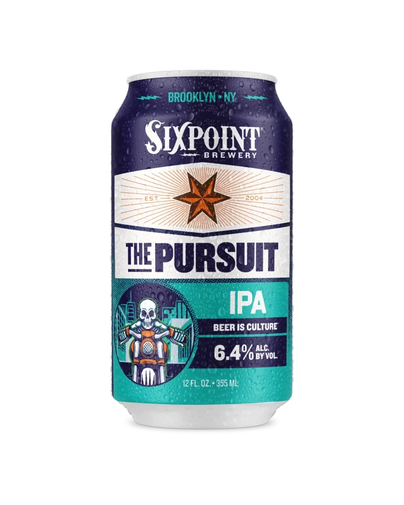
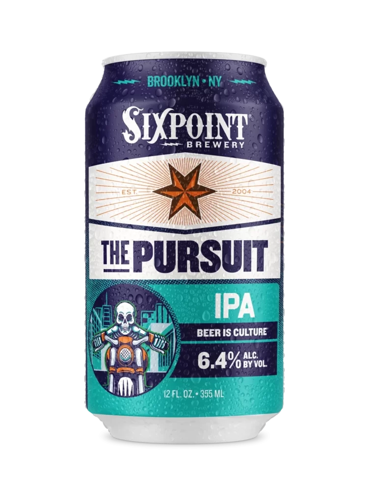
A chilled aluminum can of Sixpoint Brewery's 'The Pursuit' IPA stands in a direct, eye-level shot on a white surface. The packaging features a deep navy blue top section that transitions into a crisp white band and finishes with a vibrant teal base. Visible condensation droplets cover the metallic surface, highlighting the bold typography of the brand name and the intricate graphic details below.
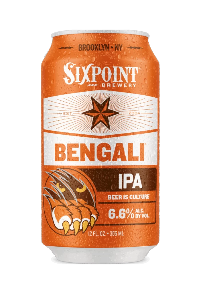
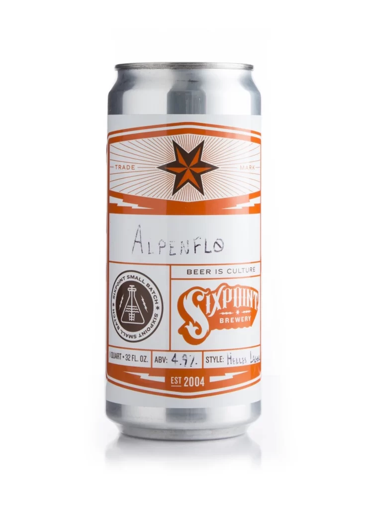
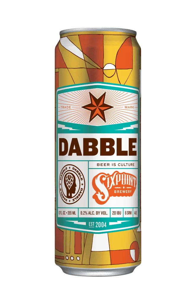
Visual interest is driven by the striking tri-color blocking and the mix of illustrative styles. While the upper half relies on clean, vintage-inspired typography and geometric sunburst patterns, the lower section introduces a gritty, tattoo-art aesthetic with the biker skull motif. This juxtaposition creates a dynamic tension between the refined brewery branding and the rebellious ‘Beer Is Culture’ slogan, making the can instantly recognizable on a crowded shelf.
Brand strategists might analyze this layout to understand how to balance heritage elements with modern subcultural graphics. Packaging designers could study the specific way the color bands are divided to create visual hierarchy without cluttering the essential information like the 6.4% alcohol content. Illustrators looking to blend retro signage with edgy character art will find the composition a useful case study in merging disparate artistic voices into a cohesive product identity.