Sixpoint Brewery Resin DIPA Green Can Packaging
Topics
Details
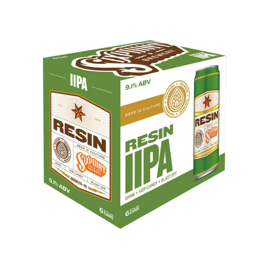
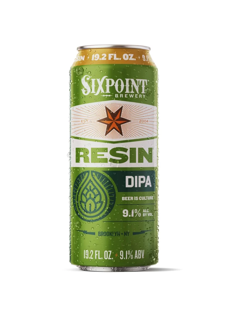
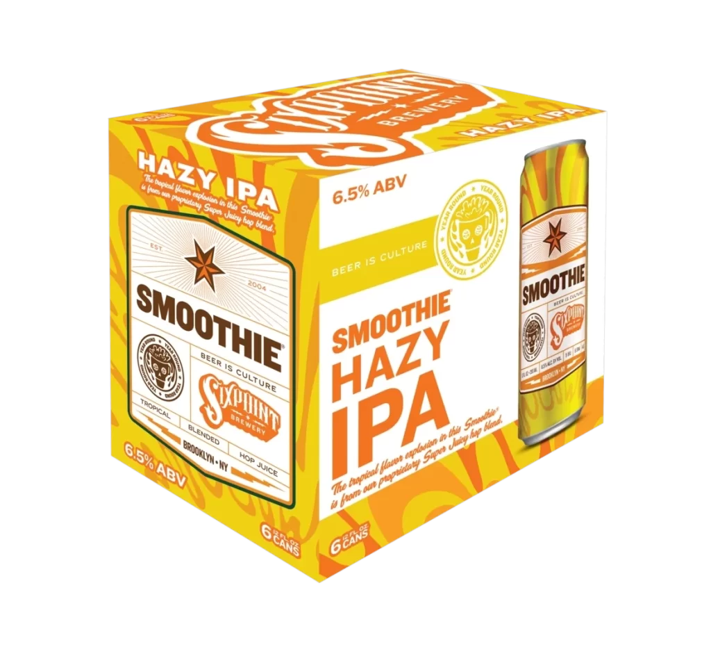
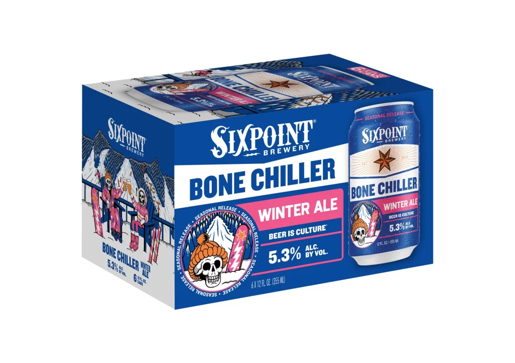
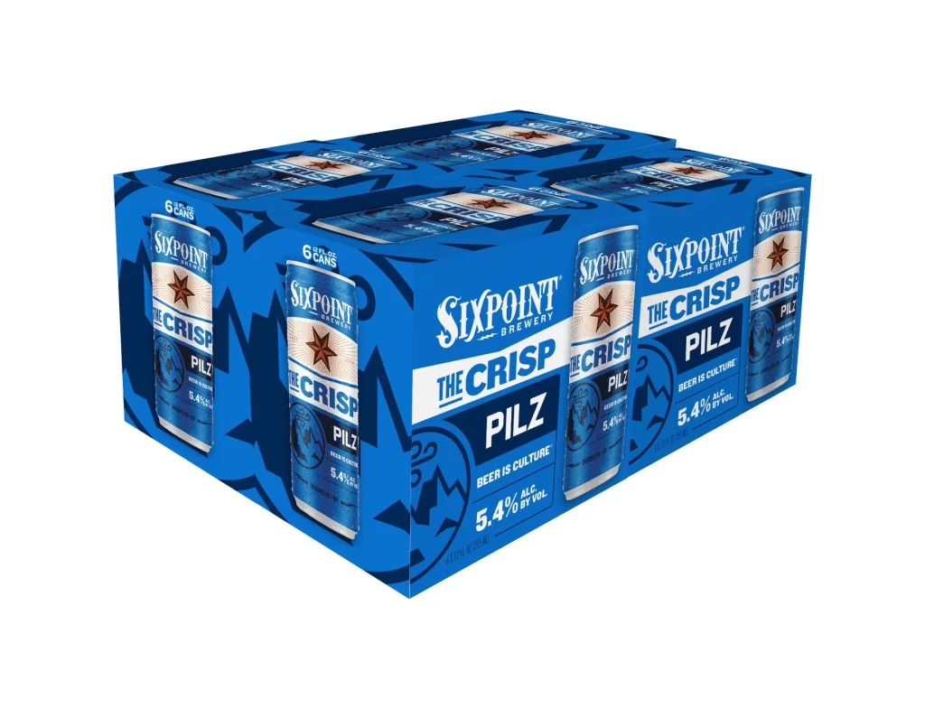
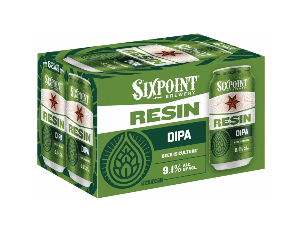
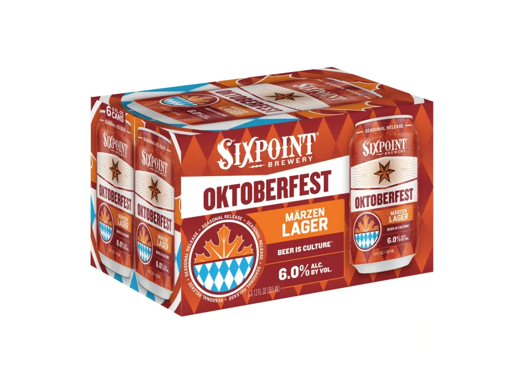
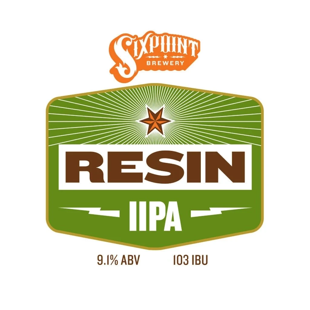
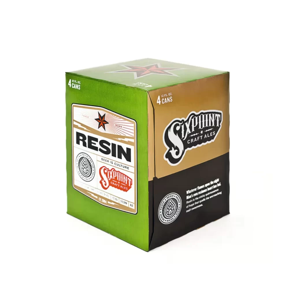
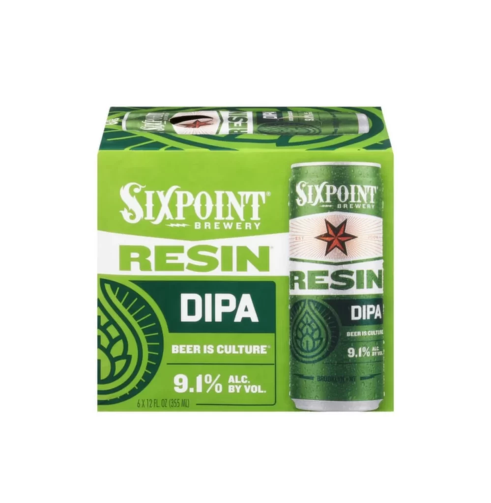
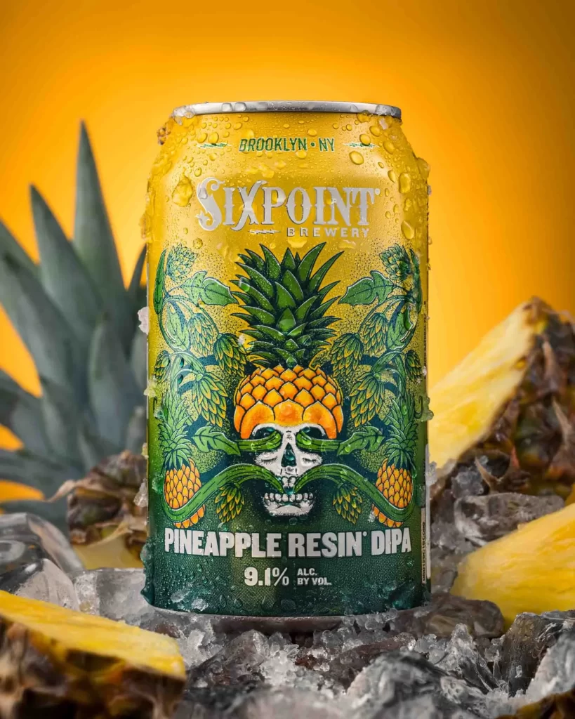
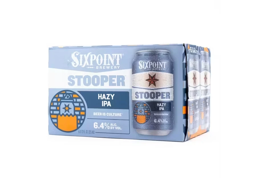
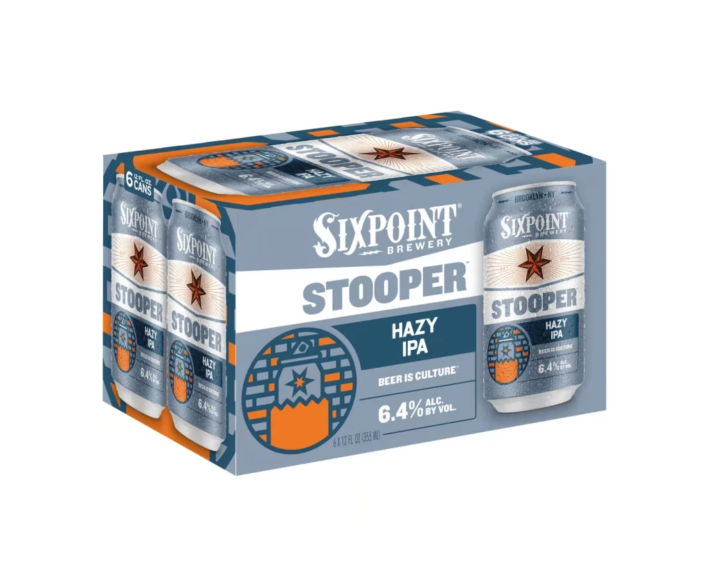
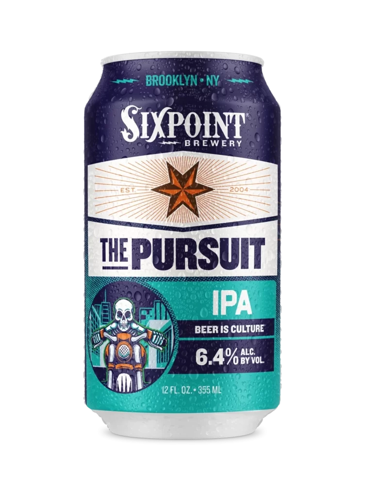
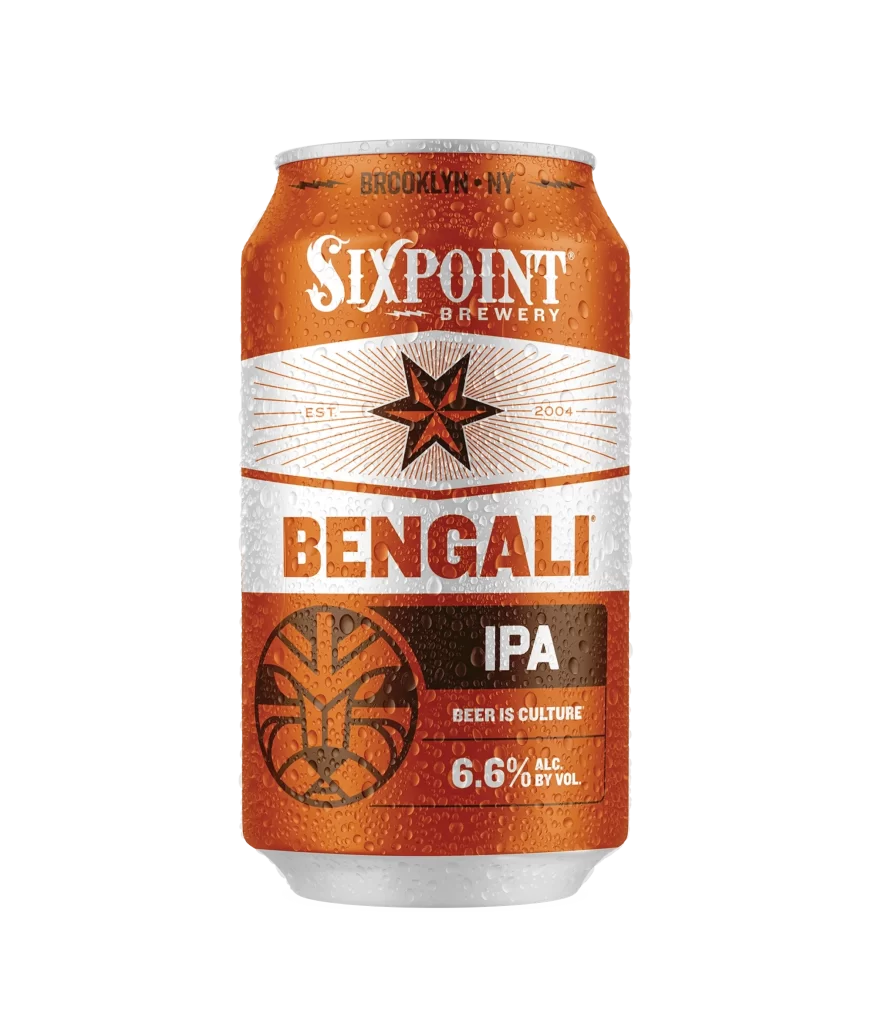
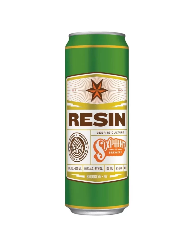
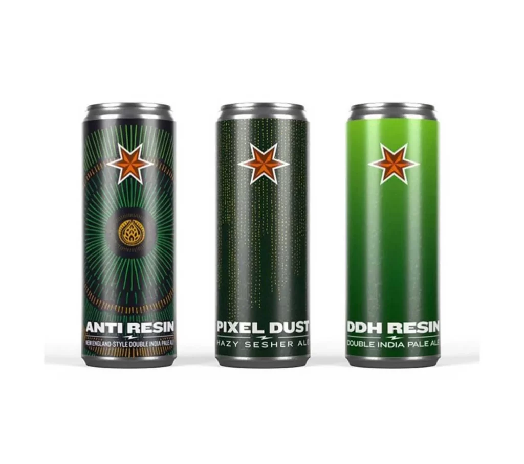
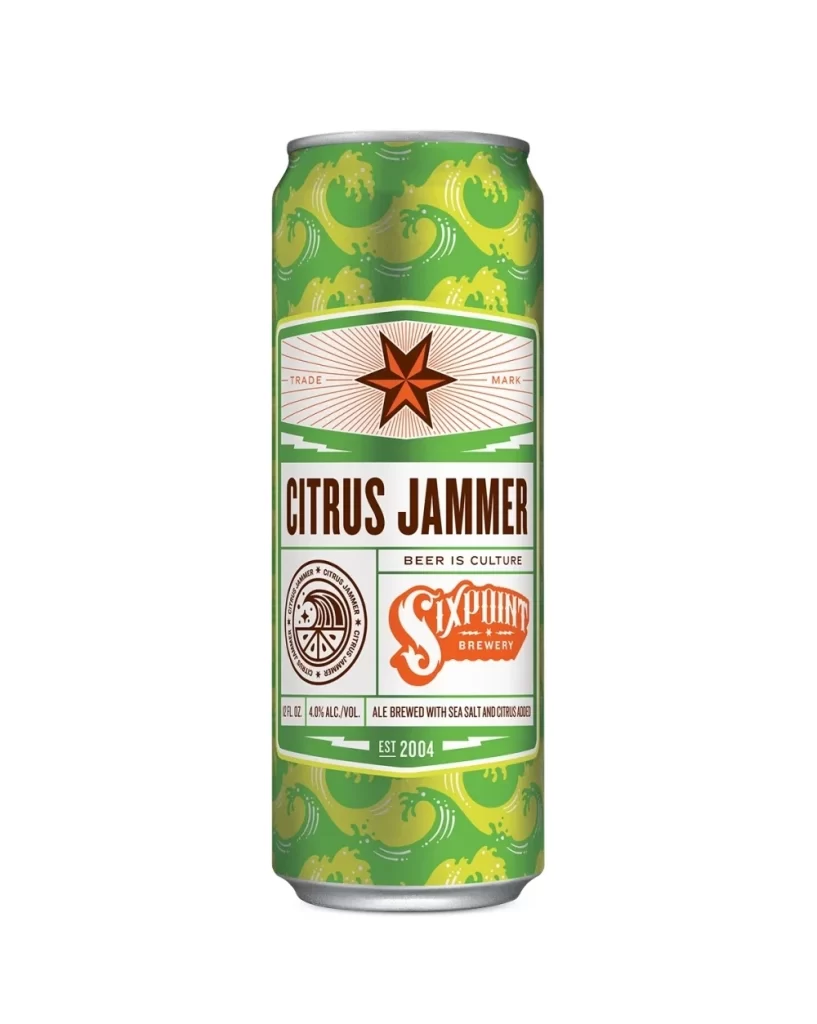
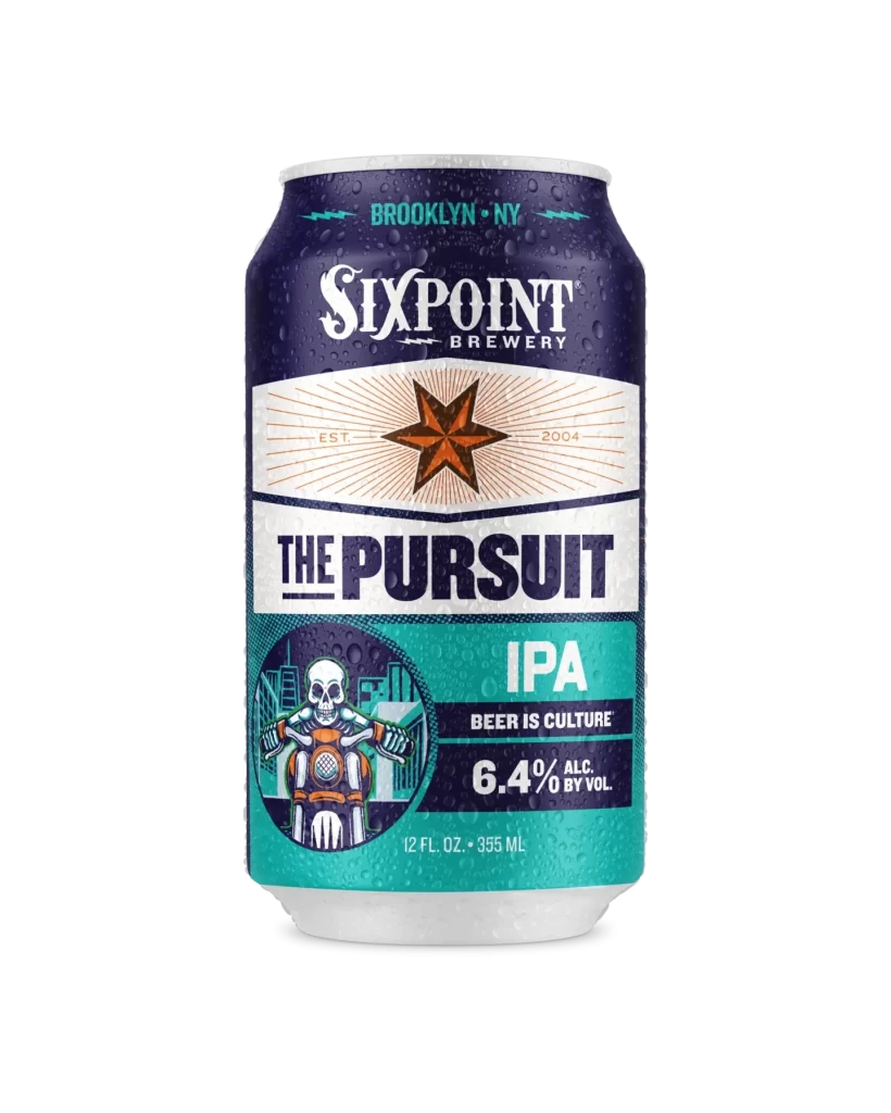
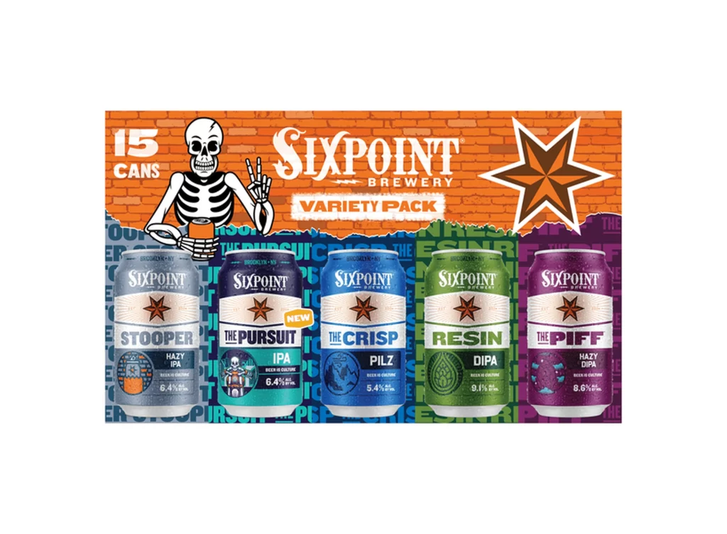
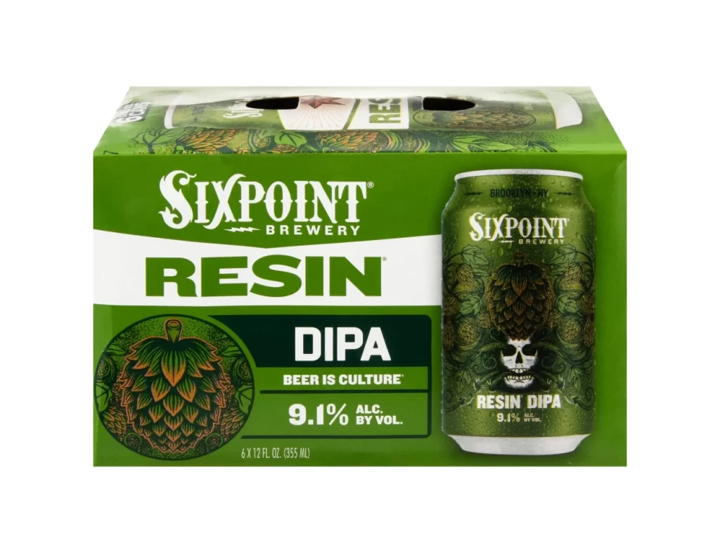
Dominating the frame is a vibrant, forest-green six-pack carrier for Sixpoint Brewery's Resin DIPA, photographed from a straight-on perspective against a stark white void. The packaging features bold, white serif typography spelling out the brand name above a heavy, sans-serif 'RESIN' title that cuts across a horizontal white band. To the right, a single aluminum can displays intricate hop-cone illustrations and a stylized skull graphic, while the left side showcases a circular emblem containing a detailed, multi-toned green and orange hop graphic.
Visual weight is distributed through the high-contrast interplay between the deep emerald background and the crisp white text elements, creating an aggressive yet organic aesthetic typical of modern craft beer branding. The inclusion of the skull motif nestled within the dense foliage of the can's artwork adds a rebellious edge that contrasts with the clean, geometric layout of the box information panel. Such a design successfully merges botanical realism with street-art sensibilities, making the product stand out on retail shelves through its unique combination of natural imagery and edgy iconography.
Brand strategists might analyze the color psychology behind the green palette to understand how it signals freshness and bitterness to the consumer. Packaging engineers could study the structural layout of the carrier holes and the placement of the nutritional information block for their own production templates. Illustrators seeking to master the art of beverage labeling would find value in dissecting how the vector-style hop textures interact with the photographic elements of the skull.