Sixpoint Brewery The Pursuit IPA Skeleton Beer Packaging
Topics
Details
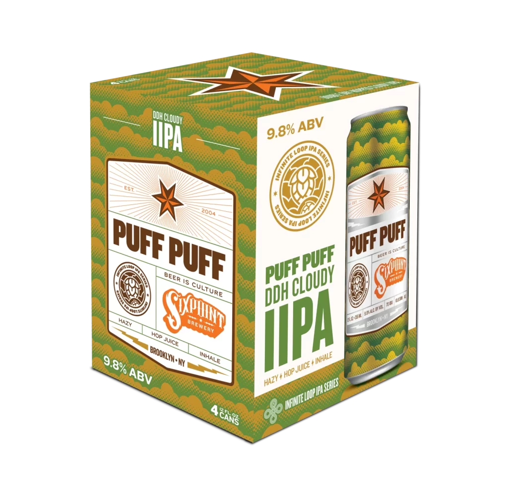
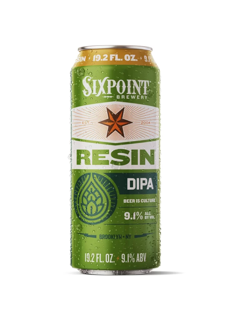
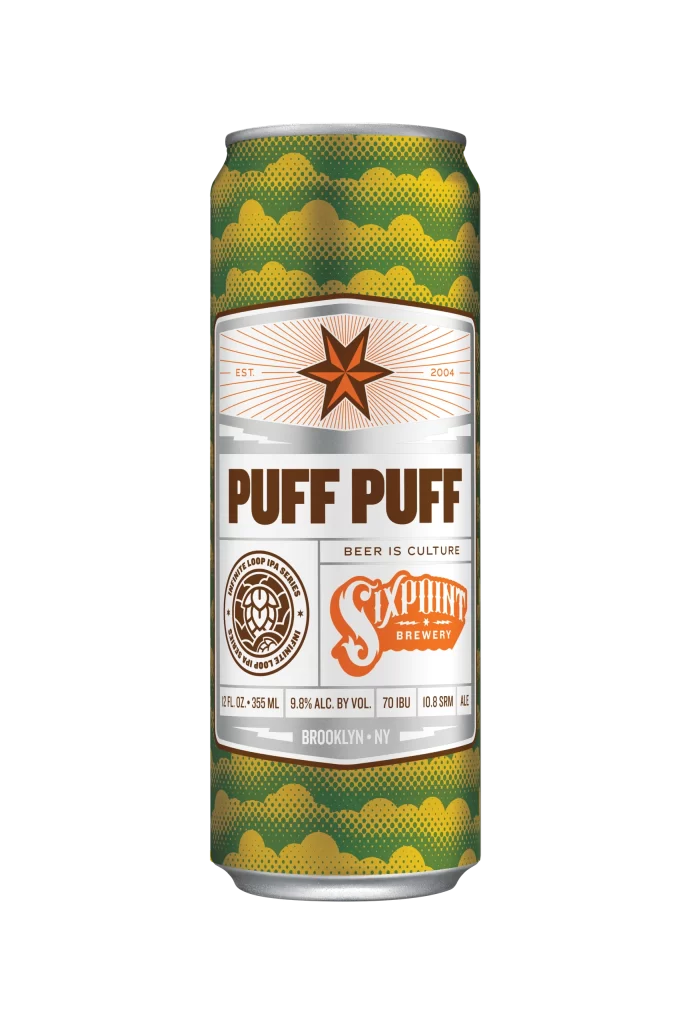
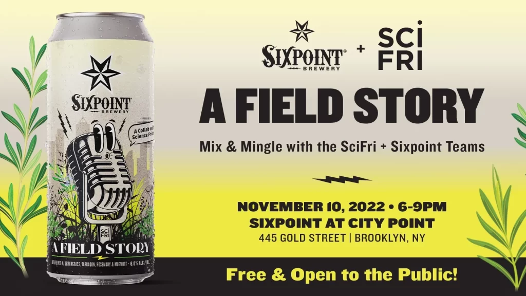
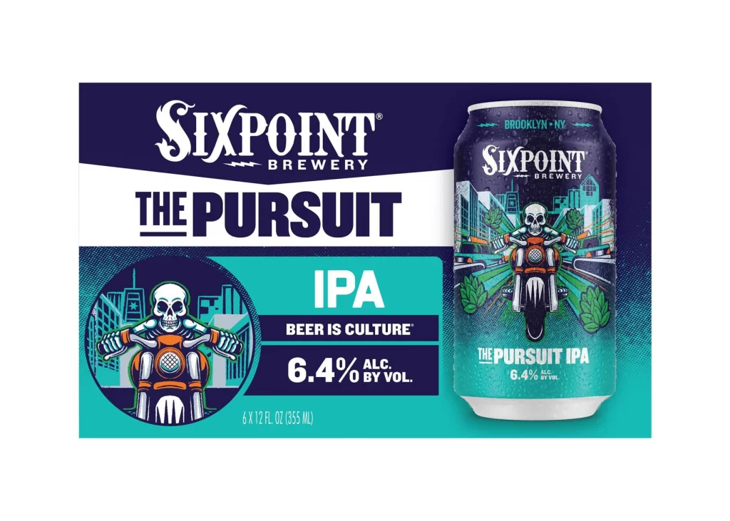
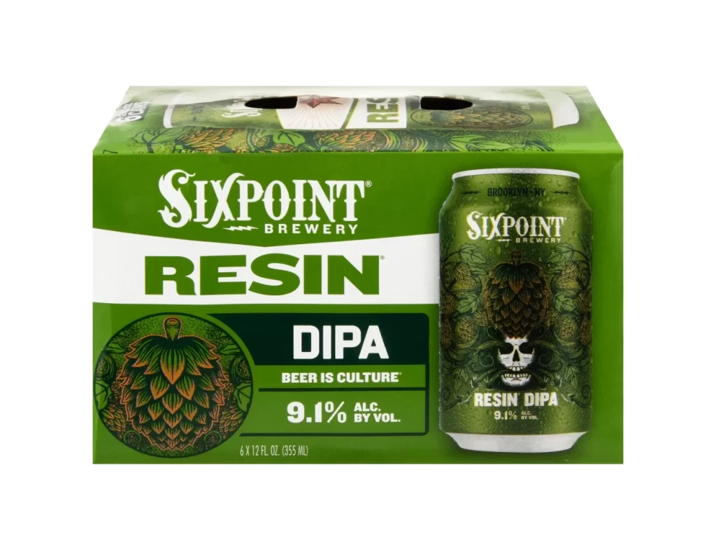
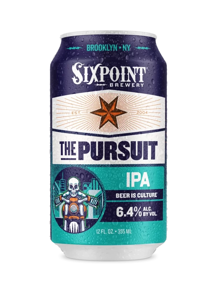
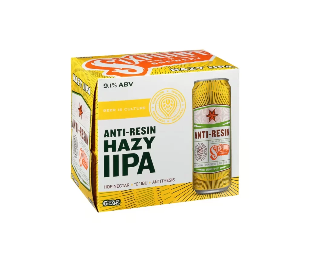
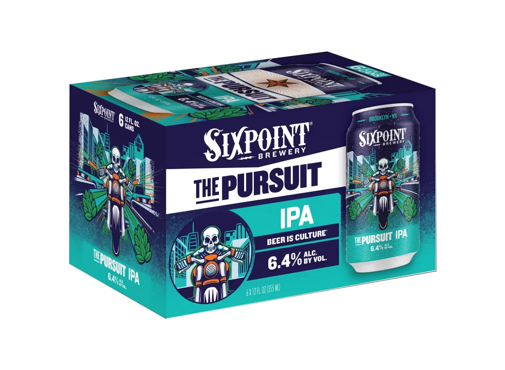
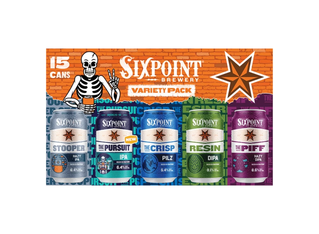
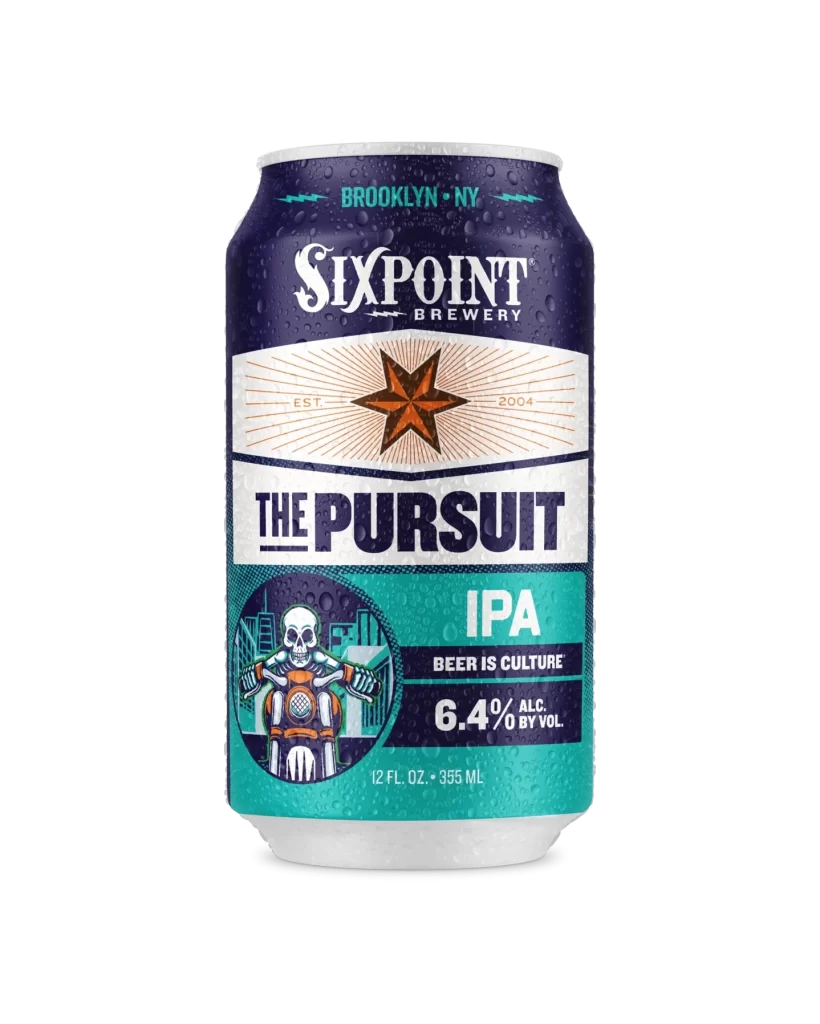
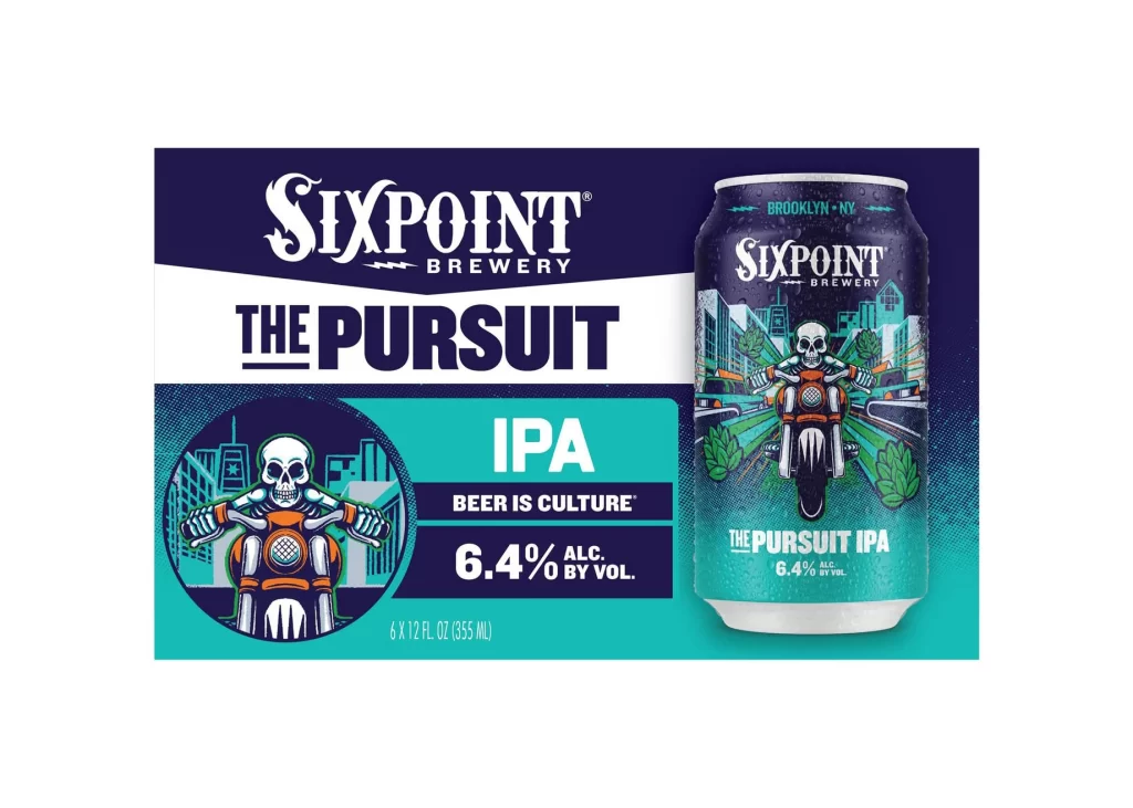
Deep navy blue dominates the upper register of the six-pack carrier, transitioning into a vibrant cyan field that anchors the lower half and showcases Sixpoint Brewery's The Pursuit IPA packaging alongside a rendered aluminum can. The composition features the brand's ornate white serif logo above bold black sans-serif lettering for the product name, with a circular illustration of a skeleton riding a motorcycle against an urban skyline appearing on the left side of the carrier. Both the flat packaging and the cylindrical can display the 6.4% alcohol by volume specification and 'Beer is Culture' tagline on a white surface.
Visual distinction arises from the juxtaposition of gothic typography with punk-inspired illustration, creating a rebellious yet polished aesthetic. The motorcycle-riding skeleton motif serves as a recurring narrative element across both the cardboard substrate and the metallic can surface. Teal and orange accents provide sharp contrast against the dark blue base, ensuring high visibility while maintaining a cohesive color story throughout the packaging system.
Brand strategists might analyze this layout to understand how illustrative assets reinforce identity across different physical substrates. Packaging engineers could study the spatial relationship between the carrier’s informational panels and the three-dimensional can rendering. Illustrators seeking to integrate character art into commercial beverage branding would find the layering of vector graphics over halftone textures particularly instructive for their own projects.