Sixpoint Brewery The Pursuit IPA Skull Beer Packaging
Topics
Details
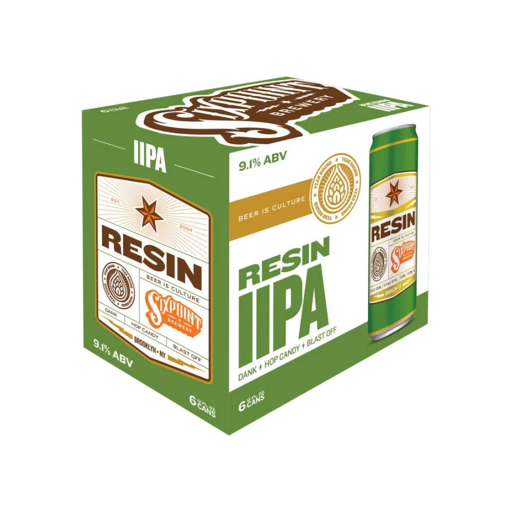
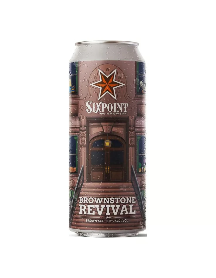
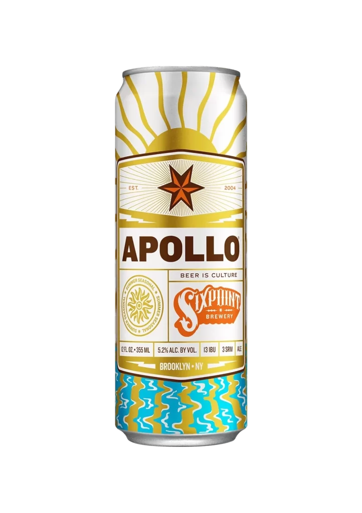
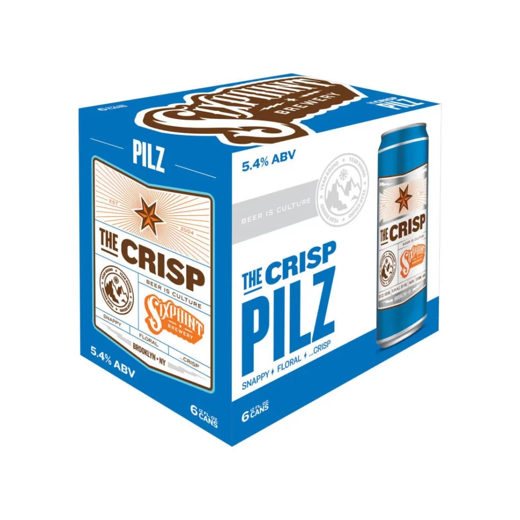
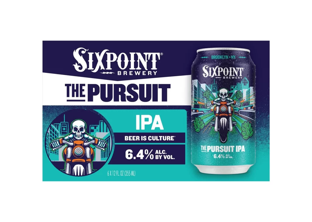
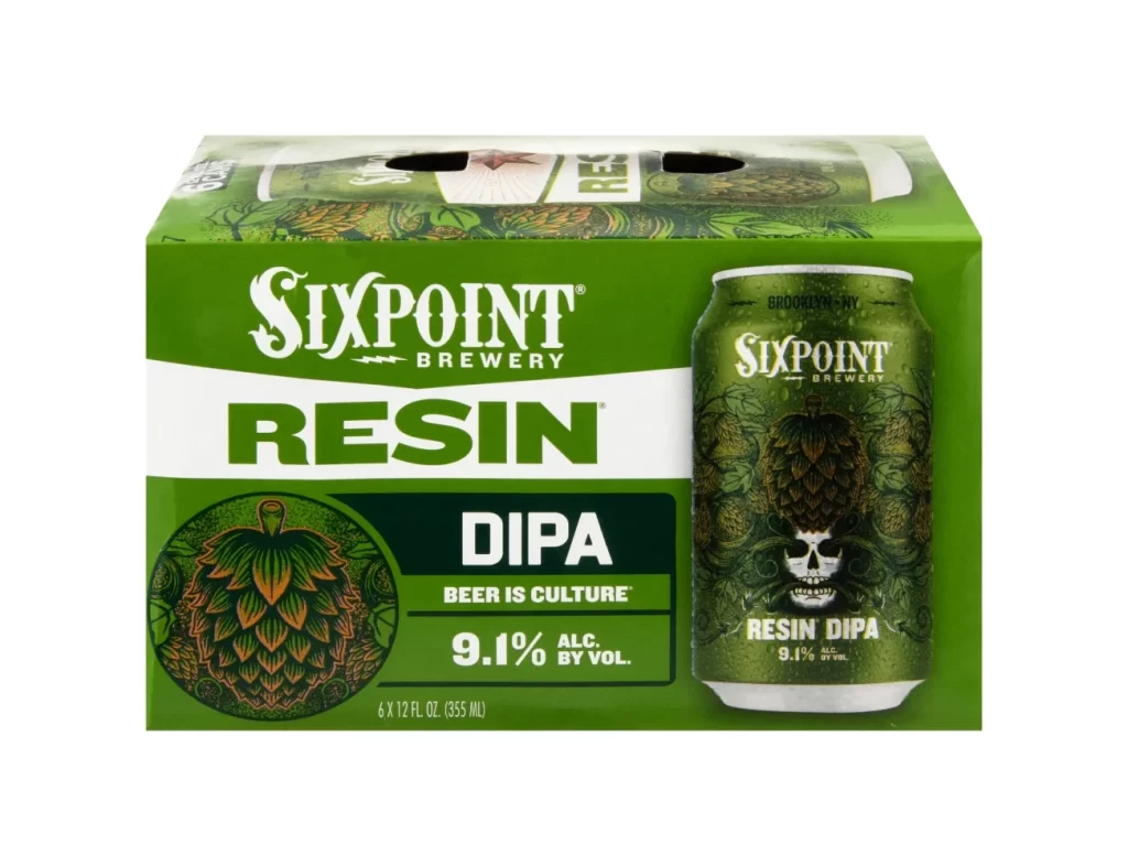
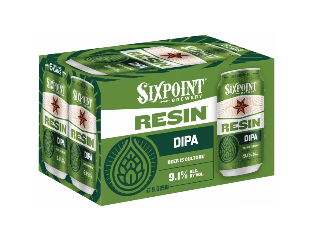
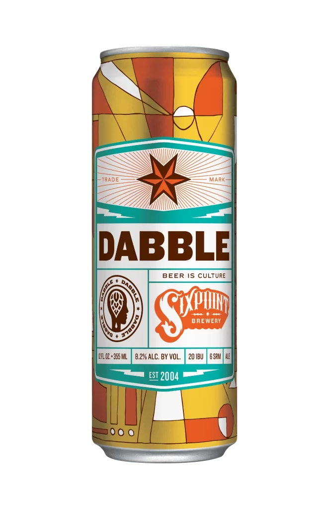
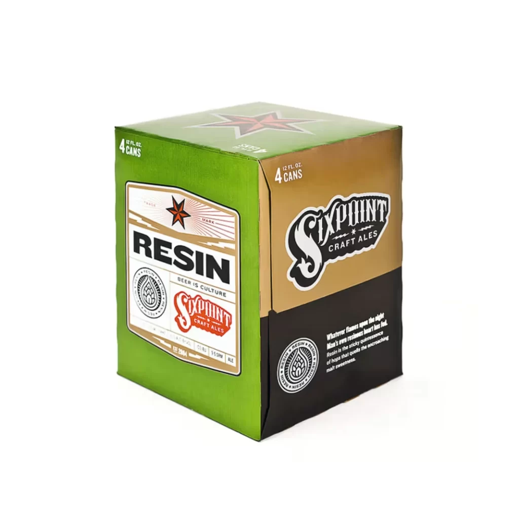
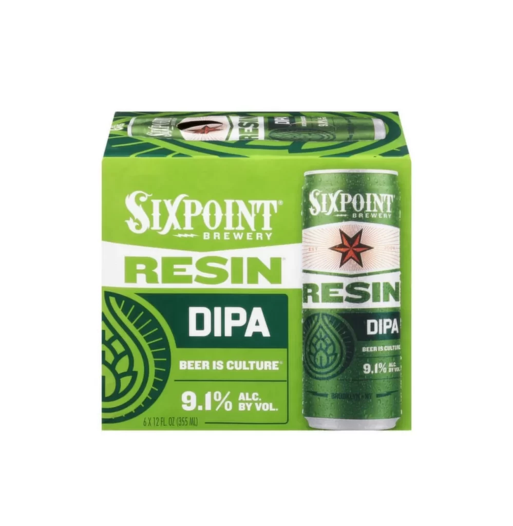
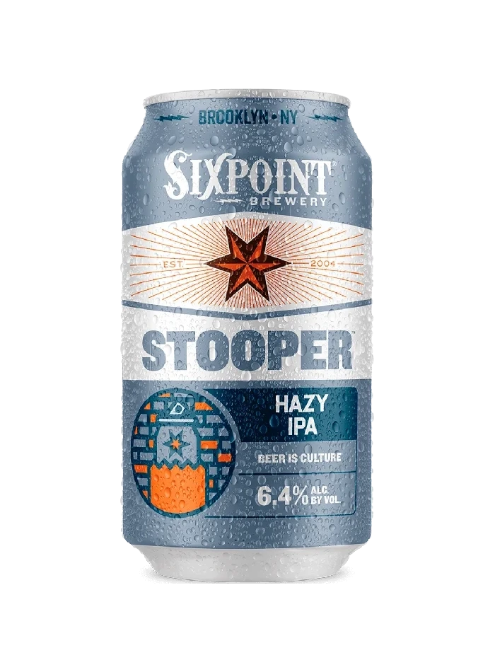
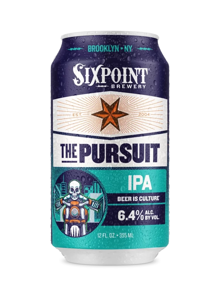
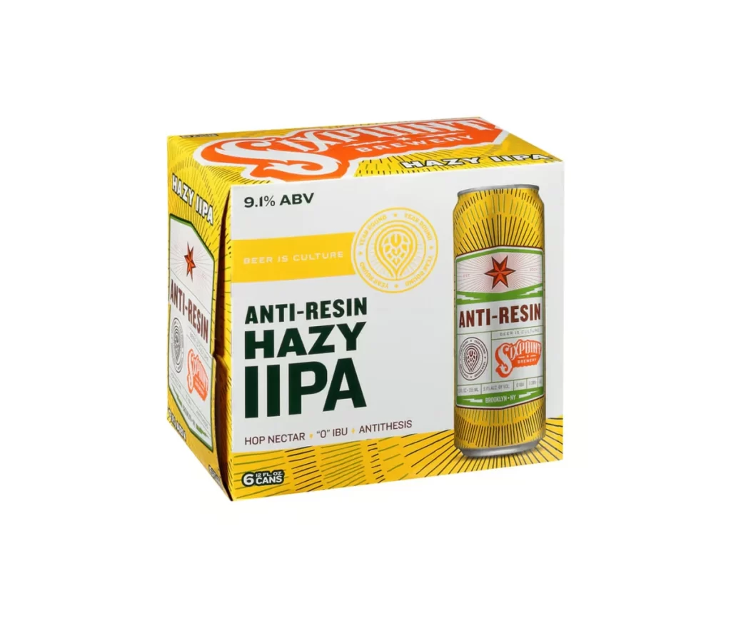
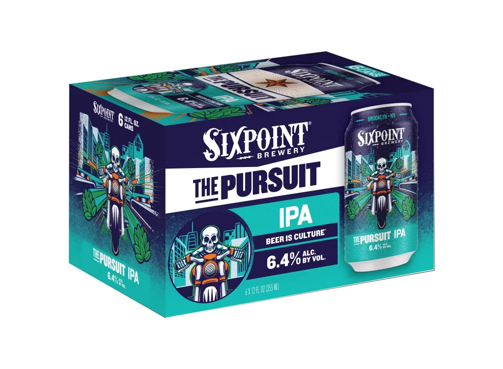
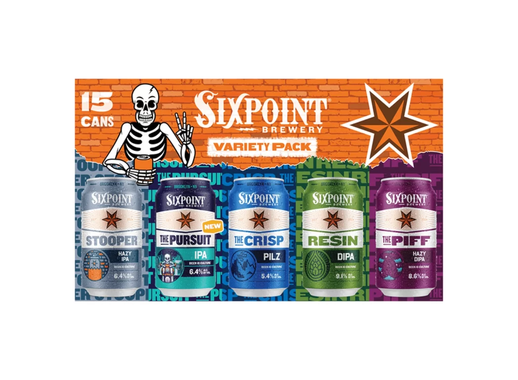
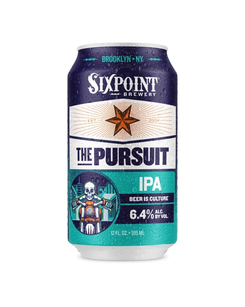
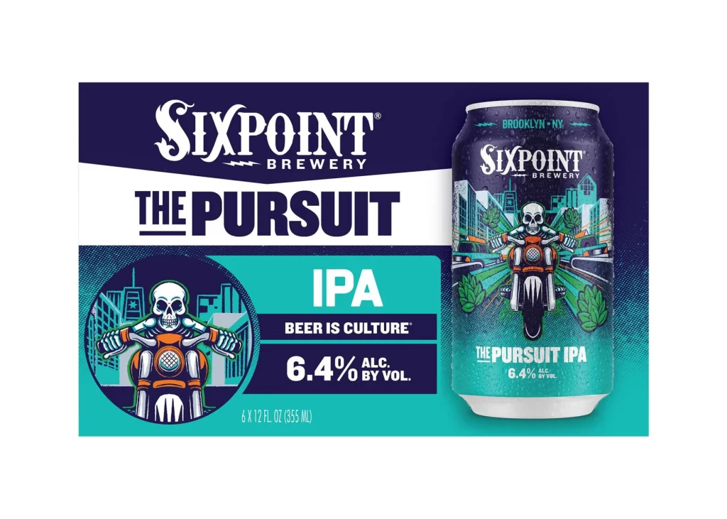
Deep navy blue fills the background of the Sixpoint Brewery packaging for The Pursuit IPA, where a bold white chevron slices across the upper left to anchor the brewery's gothic serif logo above the heavy, underlined sans-serif product name. Teal and cyan gradients dominate the lower half of the six-pack carrier, framing a circular illustration of a skull riding an orange motorcycle against a city skyline. To the right, a single aluminum can mirrors the design with the same skull-and-motorcycle artwork, displaying 'BROOKLYN • NY' at its rim and '6.4% ALC. BY VOL.' near the base.
Visual tension emerges from the juxtaposition of mortality and motion, as the skeletal rider’s grin contrasts with the dynamic speed lines radiating from the motorcycle’s wheels. Urban architecture rendered in simplified geometric forms grounds the fantastical element in Brooklyn’s industrial aesthetic, while hop cones flanking the vehicle subtly reinforce the beer’s botanical origins without disrupting the graphic narrative. The restricted palette of midnight blue, electric turquoise, and bone white creates immediate shelf presence through high-contrast layering rather than photographic realism.
Brand strategists analyzing craft beer market positioning would examine how the skull motif balances edginess with approachability for millennial consumers. Illustrators developing mascot systems could study the integration of character art with typographic hierarchy, noting how the circular crop contains complexity while maintaining legibility at reduced sizes. Packaging engineers might reference the structural relationship between carrier graphics and can labeling when coordinating multi-SKU product families.