Sixpoint Brewery Resin IIPA Beer Packaging
Topics
Details
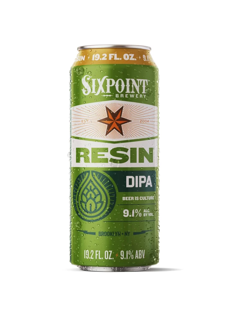
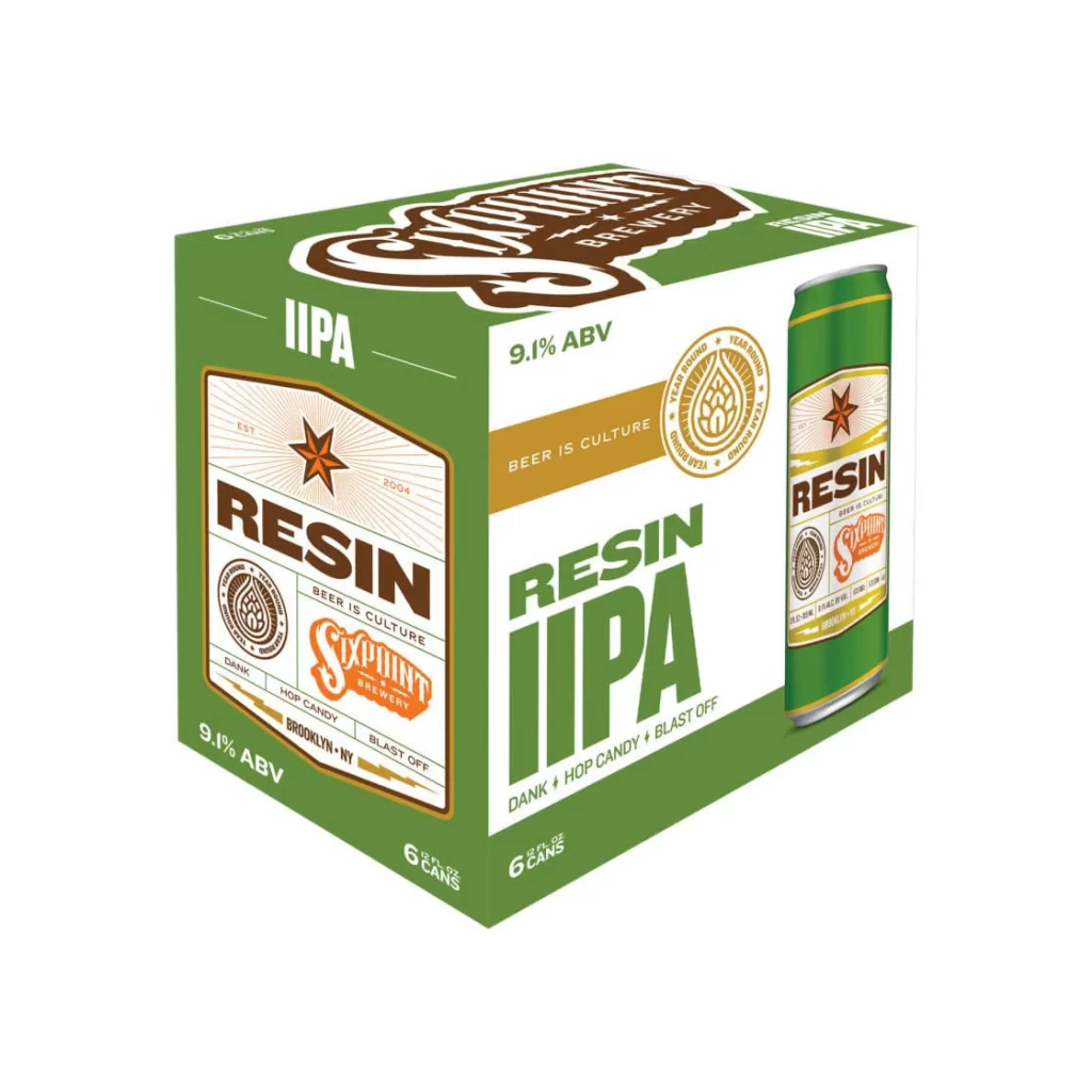
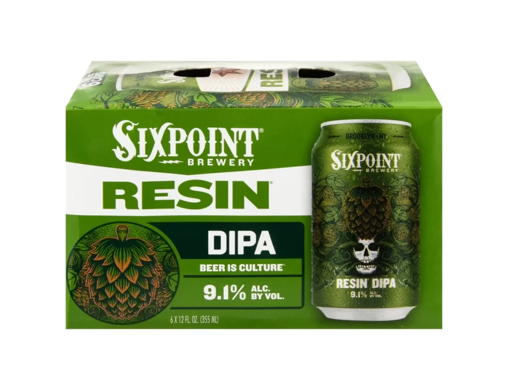
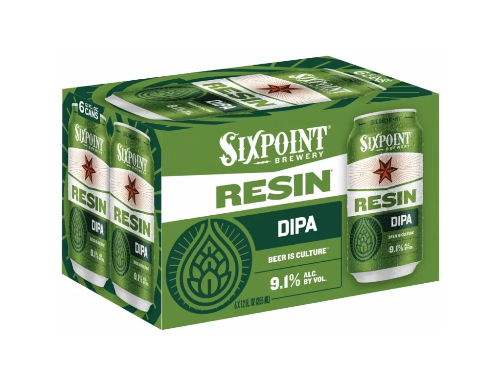
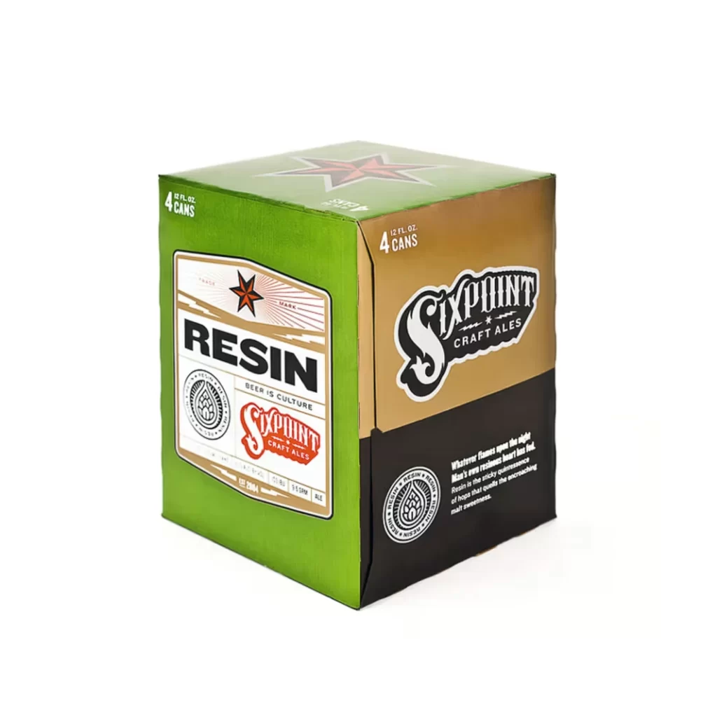
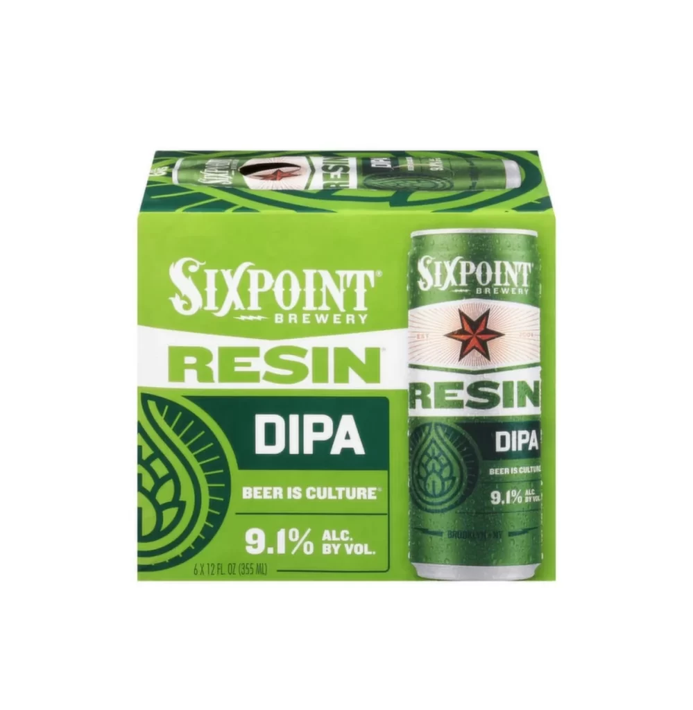
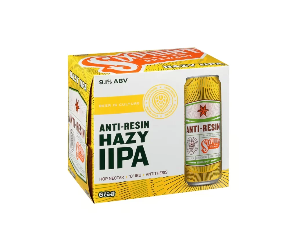
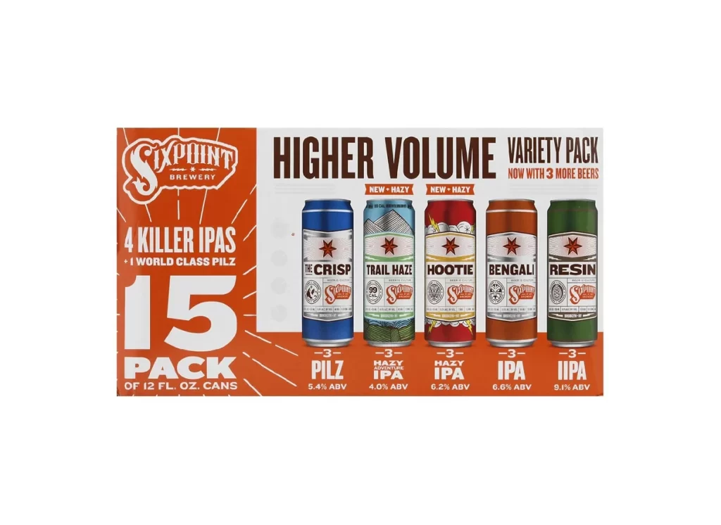
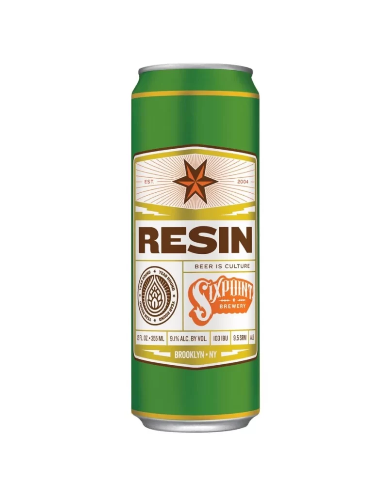
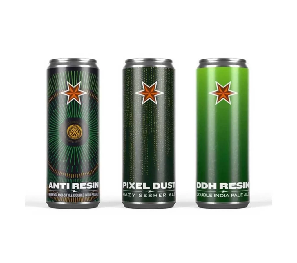
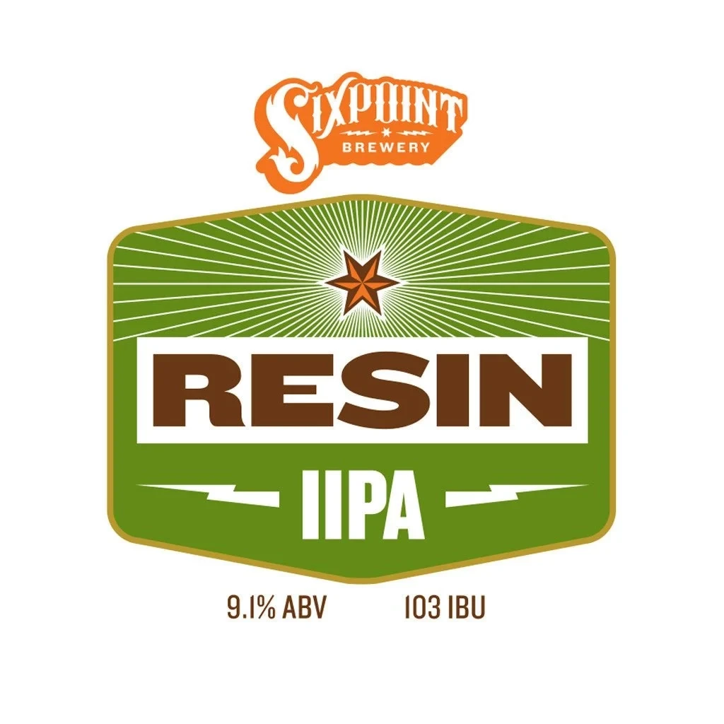
A vibrant forest green shield dominates the Sixpoint Resin IIPA label, its surface etched with radiating white sunburst lines that converge on a rust-colored five-pointed star. Heavy brown sans-serif lettering spells 'RESIN' across a horizontal white band, with 'IIPA' appearing below in white between two lightning bolt motifs, while a burnt orange brewery logotype floats above the main badge on a white background.
Visual hierarchy operates through deliberate weight contrasts between the massive product name and secondary typographic elements, creating immediate legibility at distance. The radial line pattern behind the star introduces dynamic movement that balances the otherwise static geometric shield shape, while the limited palette of green, orange, brown, and white establishes a bold, industrial aesthetic typical of contemporary craft beer branding. Symmetrical balance and military-inspired insignia elements suggest strength and potency appropriate for a double IPA’s high alcohol content.
Brand strategists analyzing competitive packaging within the India Pale Ale category would examine this specimen for its effective use of heraldic forms to convey product intensity. Typography researchers could study the interplay between slab-serif display fonts and clean sans-serifs for beverage labeling applications. Color theorists might reference this specific combination of earthy greens and oxidized metallic oranges when developing visual identities for artisanal food or beverage products requiring perceived authenticity and robust character.