Sixpoint Brewery black and white sticker Packaging
Topics
Details
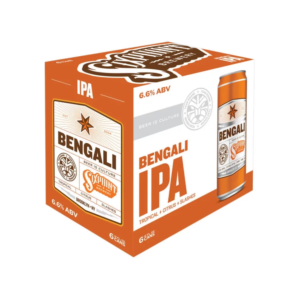
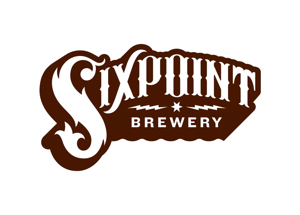
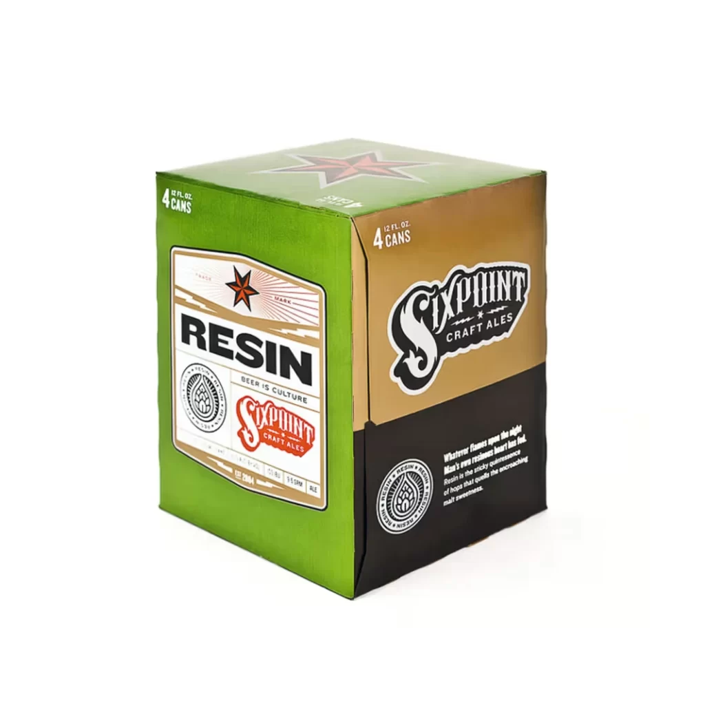
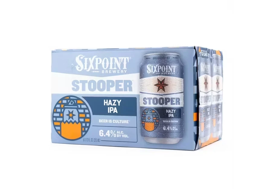
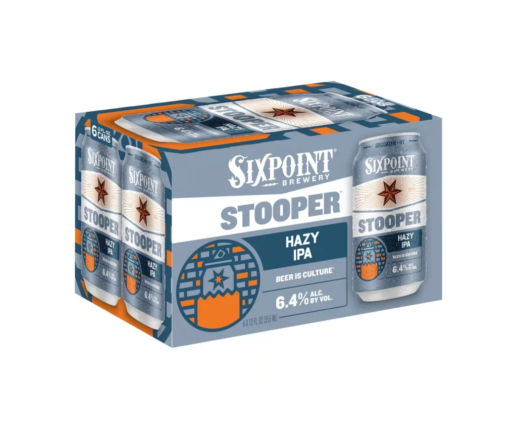
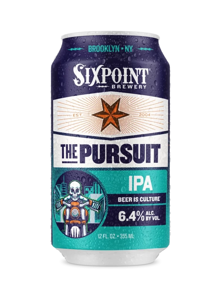
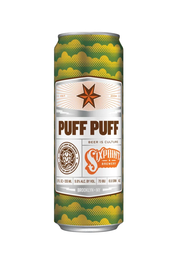
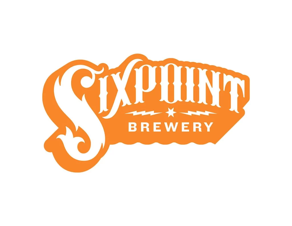
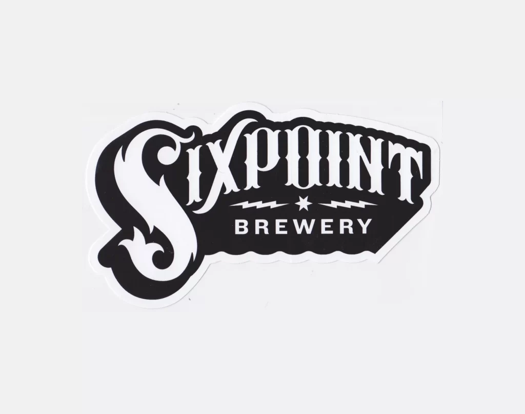
A die-cut vinyl sticker renders the Sixpoint Brewery logo in high-contrast black and white. An ornate, swirling 'S' anchors the word 'SIXPOINT' in a bold, vintage serif typeface, with 'BREWERY' positioned below in clean sans-serif lettering. A central star flanked by two lightning bolts sits between the brand name and the descriptor on a white surface.
Visual distinction arises from the interplay between the fluid, almost calligraphic curves of the initial letter and the rigid, blocky structure of the remaining typography. The monochromatic palette emphasizes the negative space within the die-cut shape, creating a sharp graphic presence that relies entirely on form rather than color. Such deliberate typographic hierarchy and symbolic iconography establish a memorable brand identity rooted in industrial aesthetics.
Brand historians analyzing craft beer visual culture will find this specimen useful for documenting mid-2010s packaging trends. Print technicians might examine the edge definition to understand kiss-cutting techniques for complex contours. Marketing teams could study the balance between decorative and functional elements when developing their own emblematic signage systems.