521 Gin Bottle View
Topics
Details
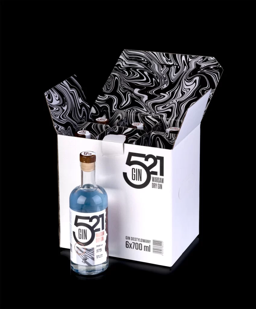
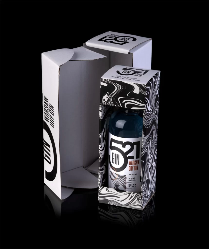
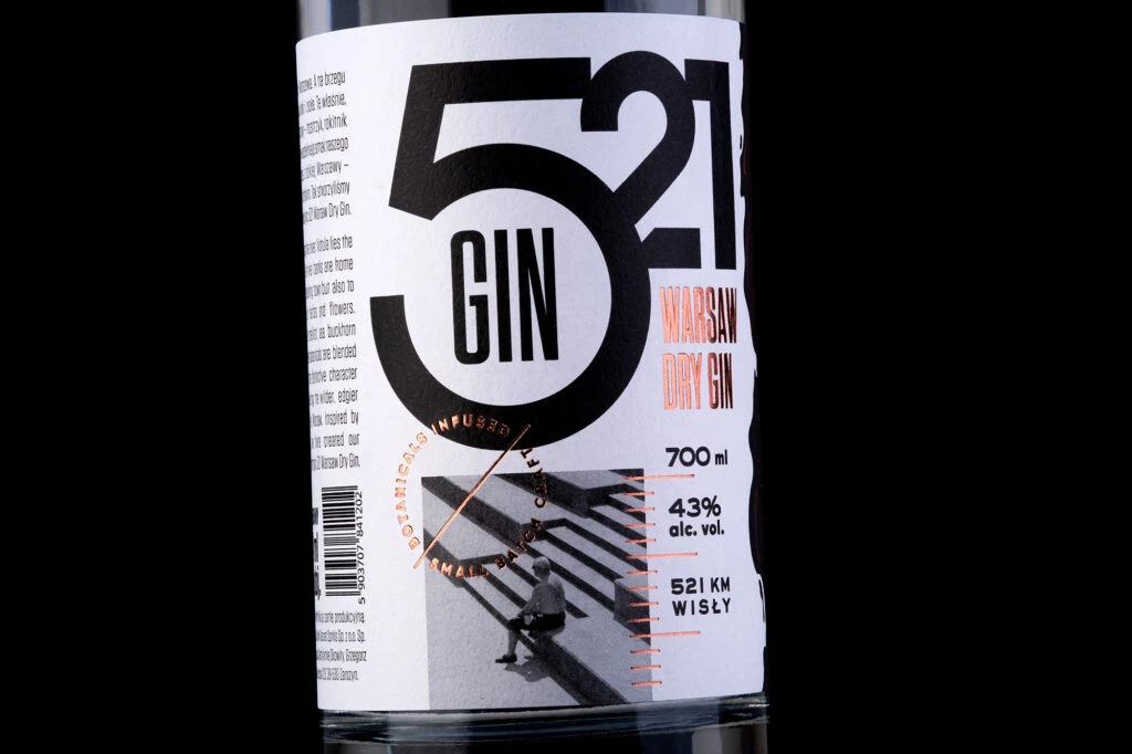
521 GIN dominates the white label in massive black typography, with 'WARSAW DRY GIN' printed in copper-orange to the right, while a grayscale photograph of a seated figure on striped stairs anchors the lower portion alongside 700 ml and 43% alc. vol. details.
Visual hierarchy is established through a masterful interplay of scale and color, where the massive numerals immediately command attention before guiding the eye to finer textual elements. The inclusion of a grainy, documentary-style photograph introduces a human element that softens the otherwise industrial and geometric layout. Copper foil accents on the circular stamp and measurement lines add a tactile, premium quality that elevates the minimalist aesthetic beyond standard liquor packaging.
Brand strategists might analyze this composition to understand how bold typography can convey geographic identity and product strength simultaneously. Packaging engineers could study the balance between negative space and information density to optimize their own label layouts for clarity and impact. Art directors seeking a modernist approach to spirits branding will find the contrast between photographic realism and abstract graphic forms particularly instructive.