Cat Food Packaging Design Box
Topics
Details
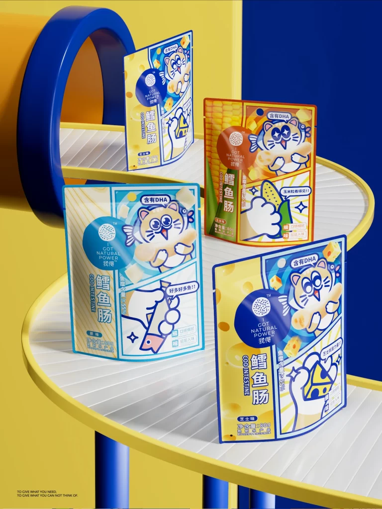
Four distinct pouches of cod fish sausage rest on a curved, white ribbed surface that spirals through a vibrant 3D environment. The background features a bold split between a sunny yellow wall and a deep blue vertical plane, accented by a large, hollow blue cylinder on the left. Each package showcases a playful cartoon cat holding the product, with colorways in bright cyan, warm orange-red, and two variations of yellow. Visible text includes 'GOT NATURAL POWER', 'COD INTESTINE', and '含有DHA' alongside specific flavor callouts like '玉米粒' (corn) and '芝士' (cheese).
Visual interest is driven by the high-contrast, pop-art aesthetic that combines thick navy outlines with flat, saturated color fields. The anthropomorphic cat mascot changes its expression and pose across the different SKUs, creating a cohesive yet varied brand identity that feels energetic and child-friendly. Geometric patterns such as polka dots and starbursts are layered behind the central illustration to add depth without cluttering the essential nutritional information.
Brand strategists developing snack lines for children or young adults can study how mascot consistency aids flavor differentiation. Packaging engineers might reference the standing pouch structure and the placement of nutritional badges to optimize their own layout grids. Illustrators looking to adapt characters for commercial food products will find a clear example of balancing cute aesthetics with legible product photography.