NaturVet Hip & Joint Supplement Bottle
Topics
Details
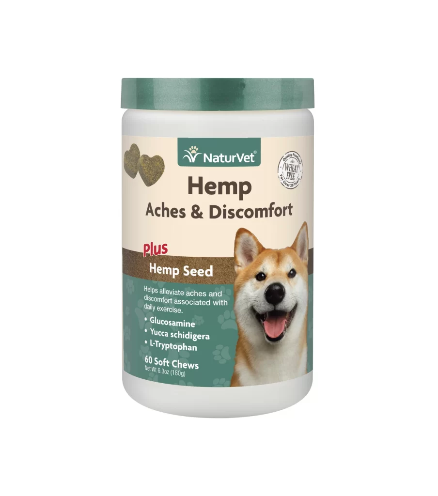
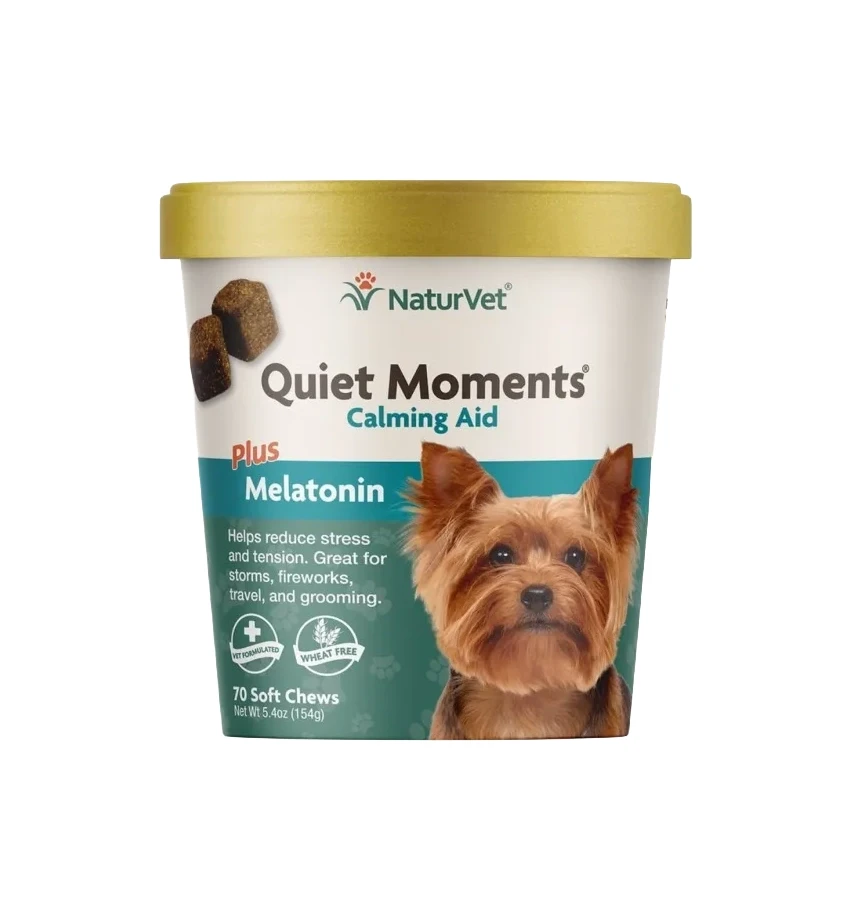
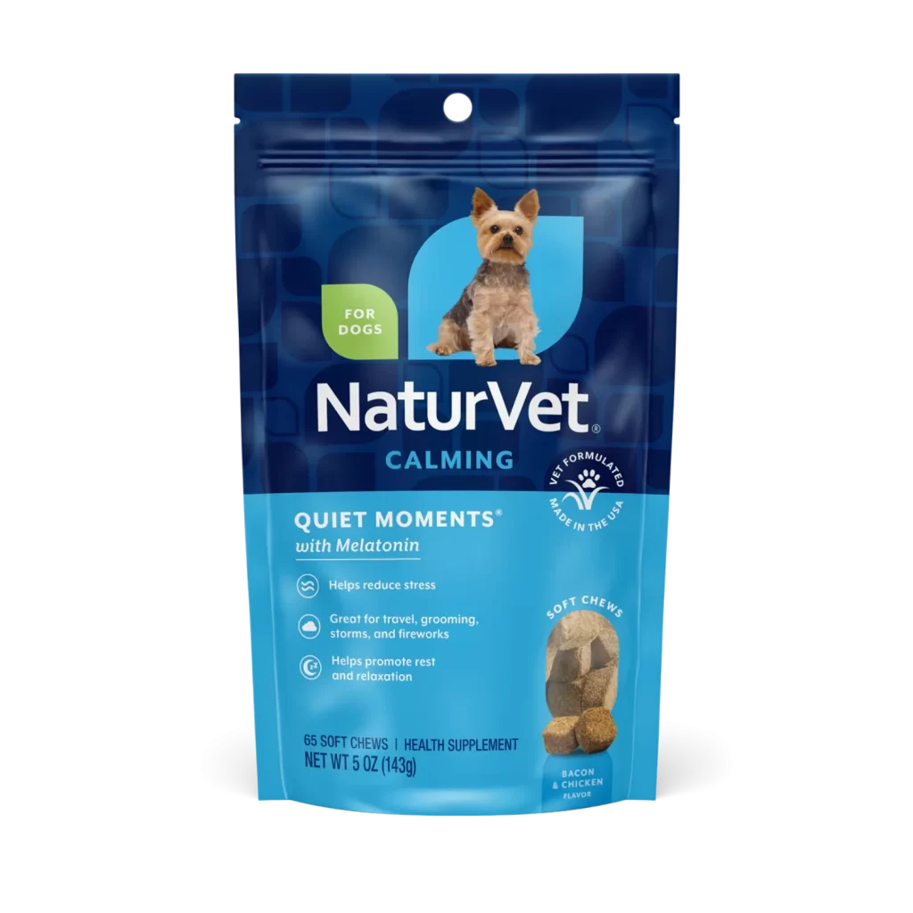
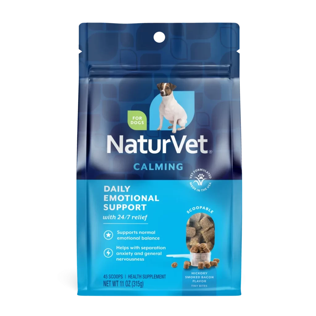
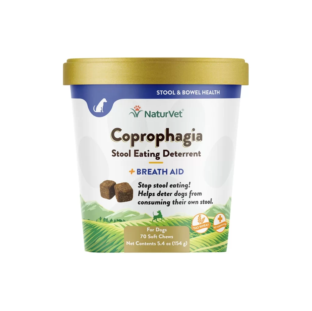
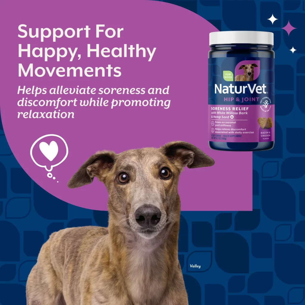
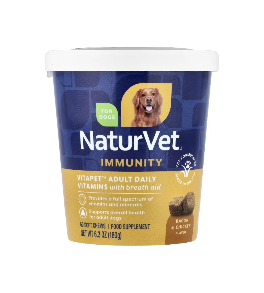
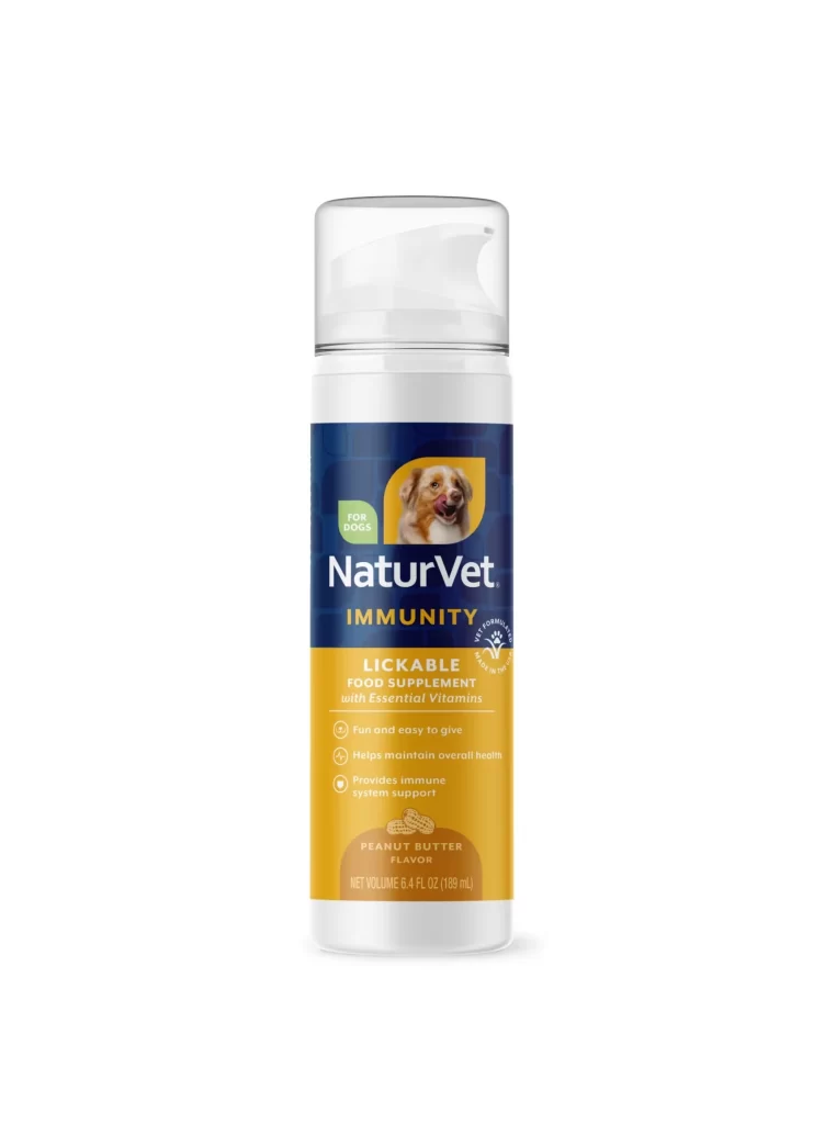
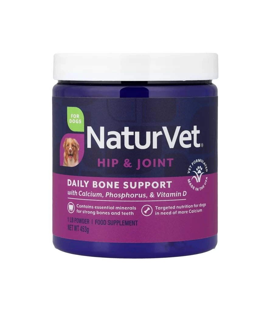
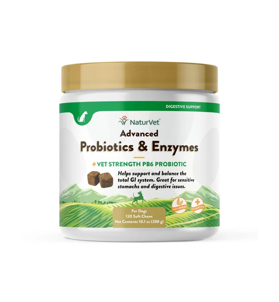
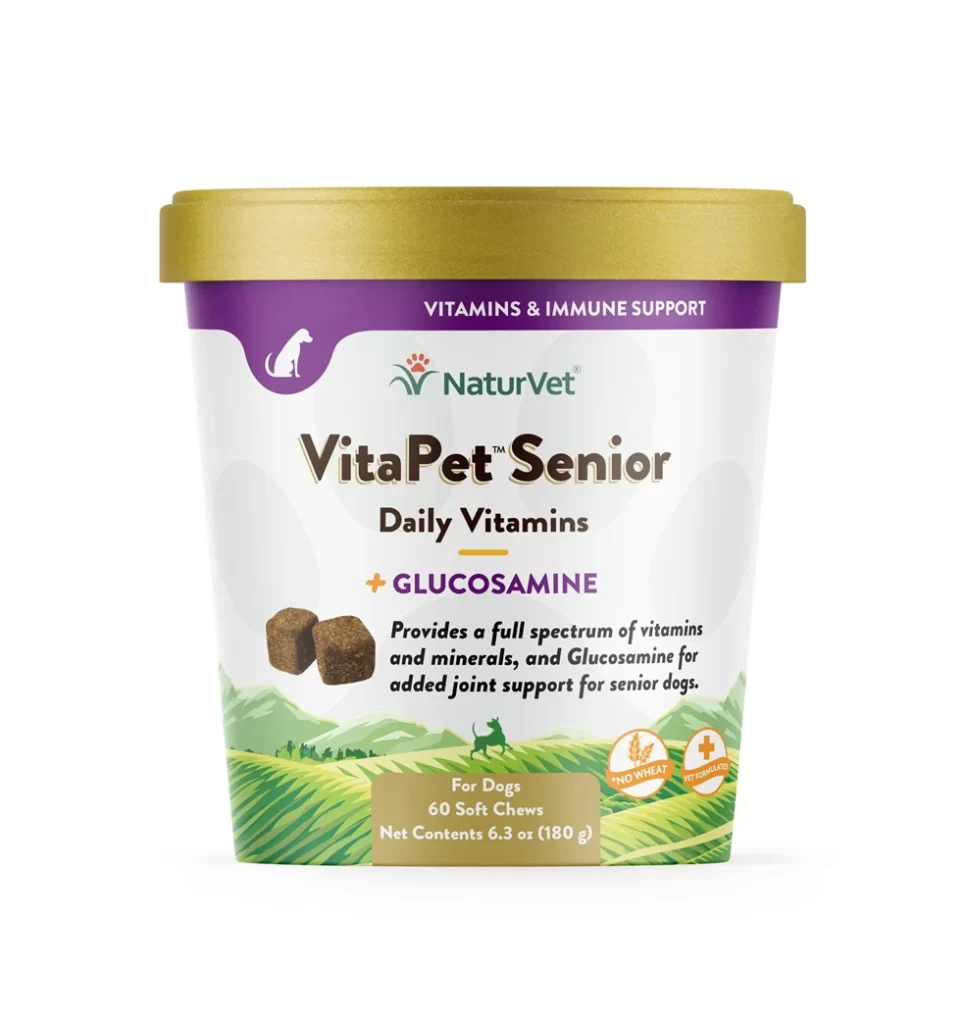
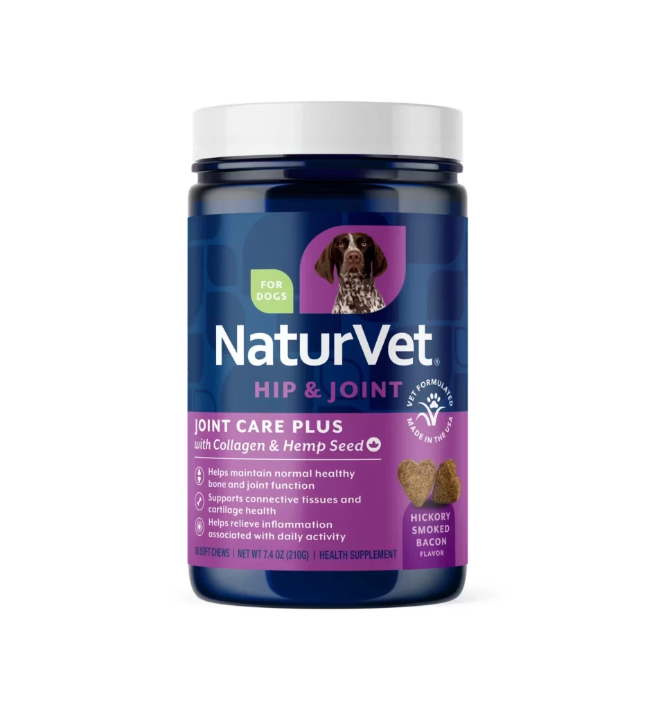
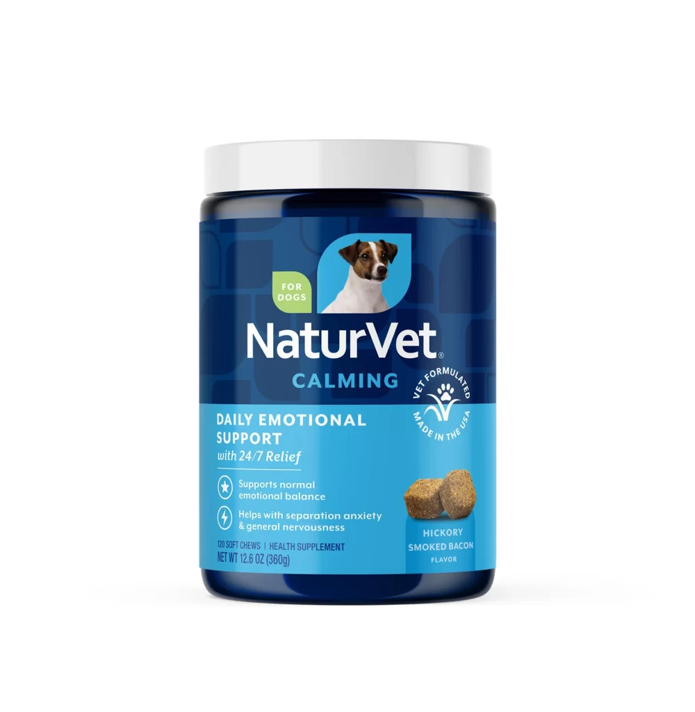
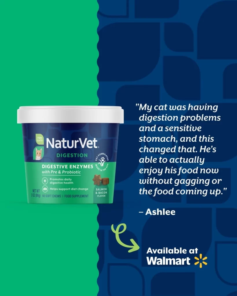
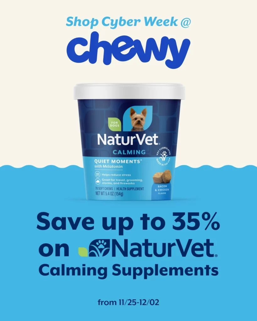
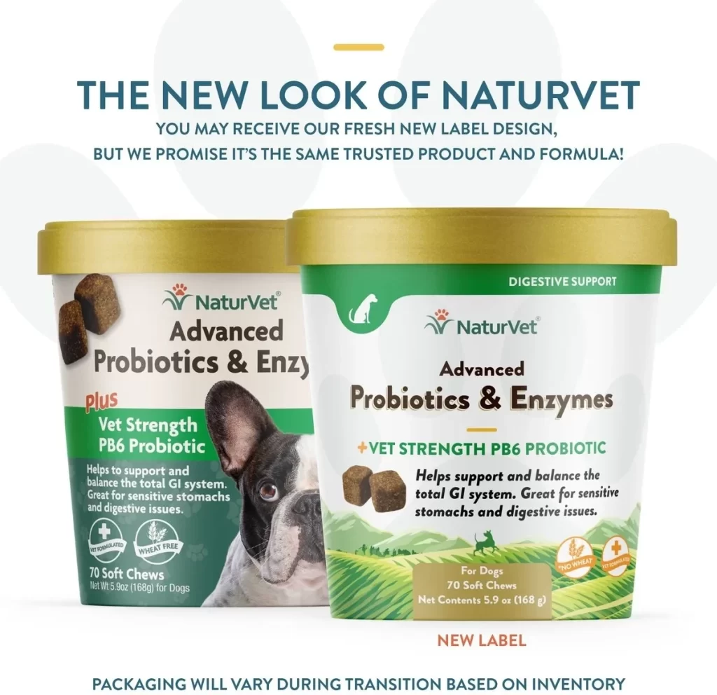
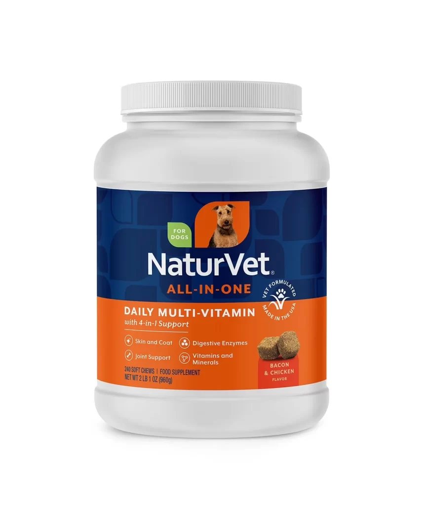
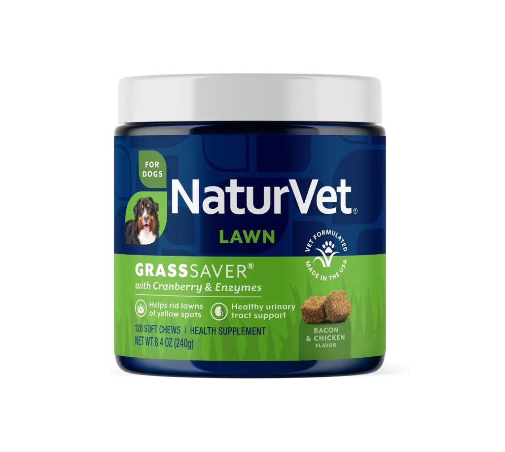
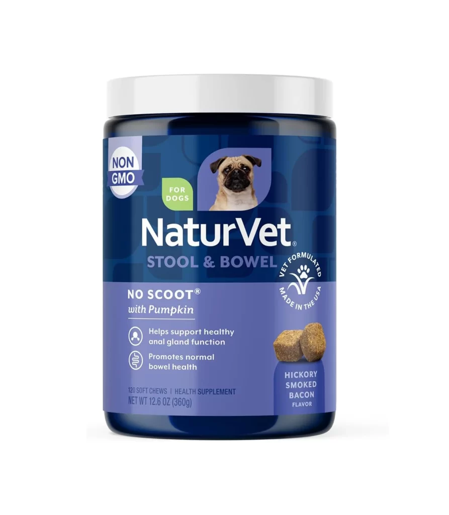
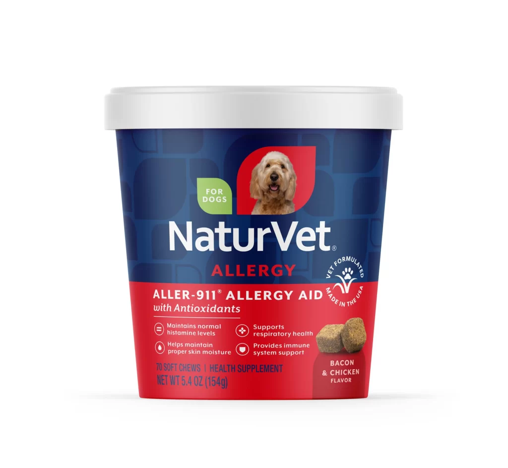
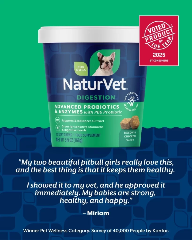
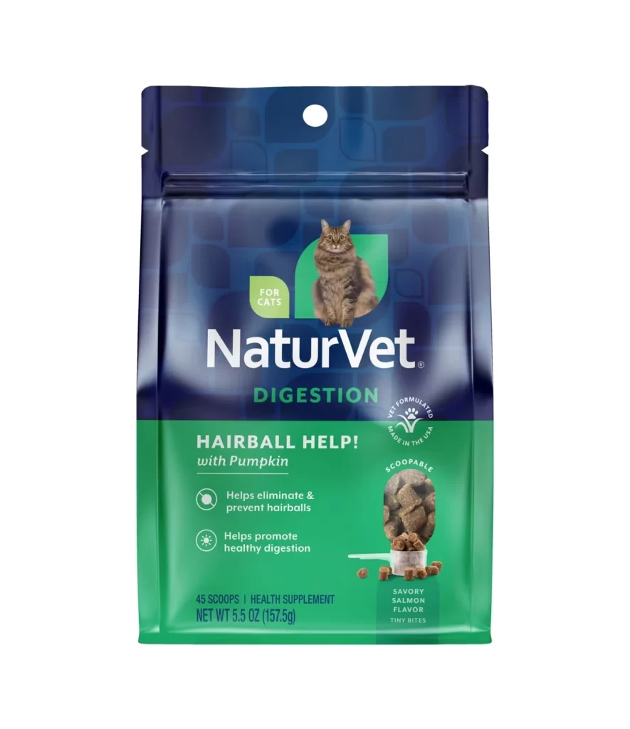
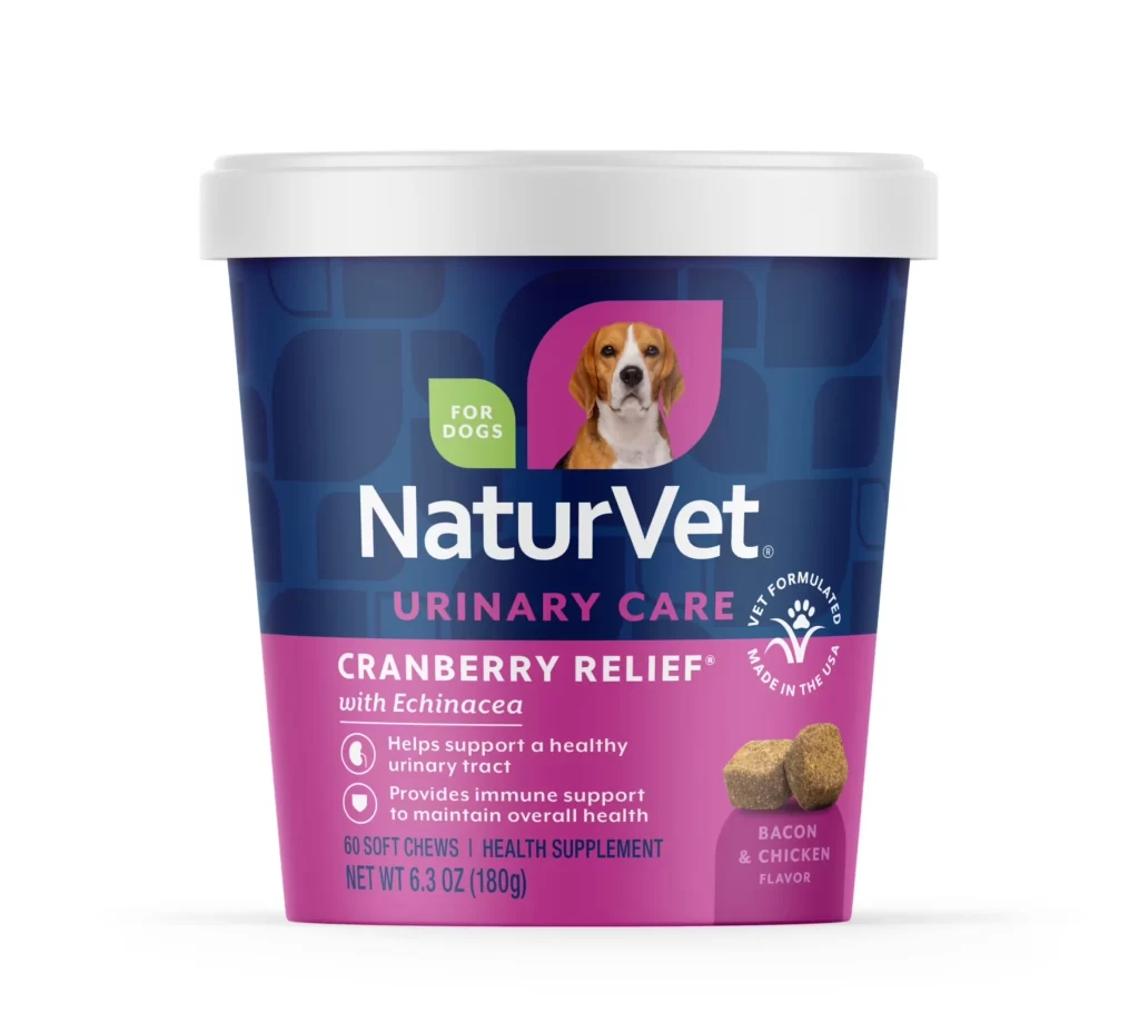
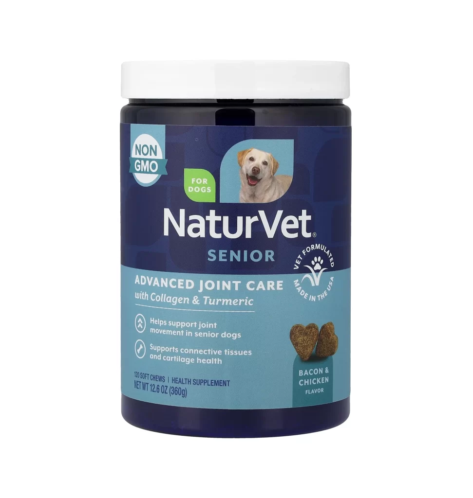
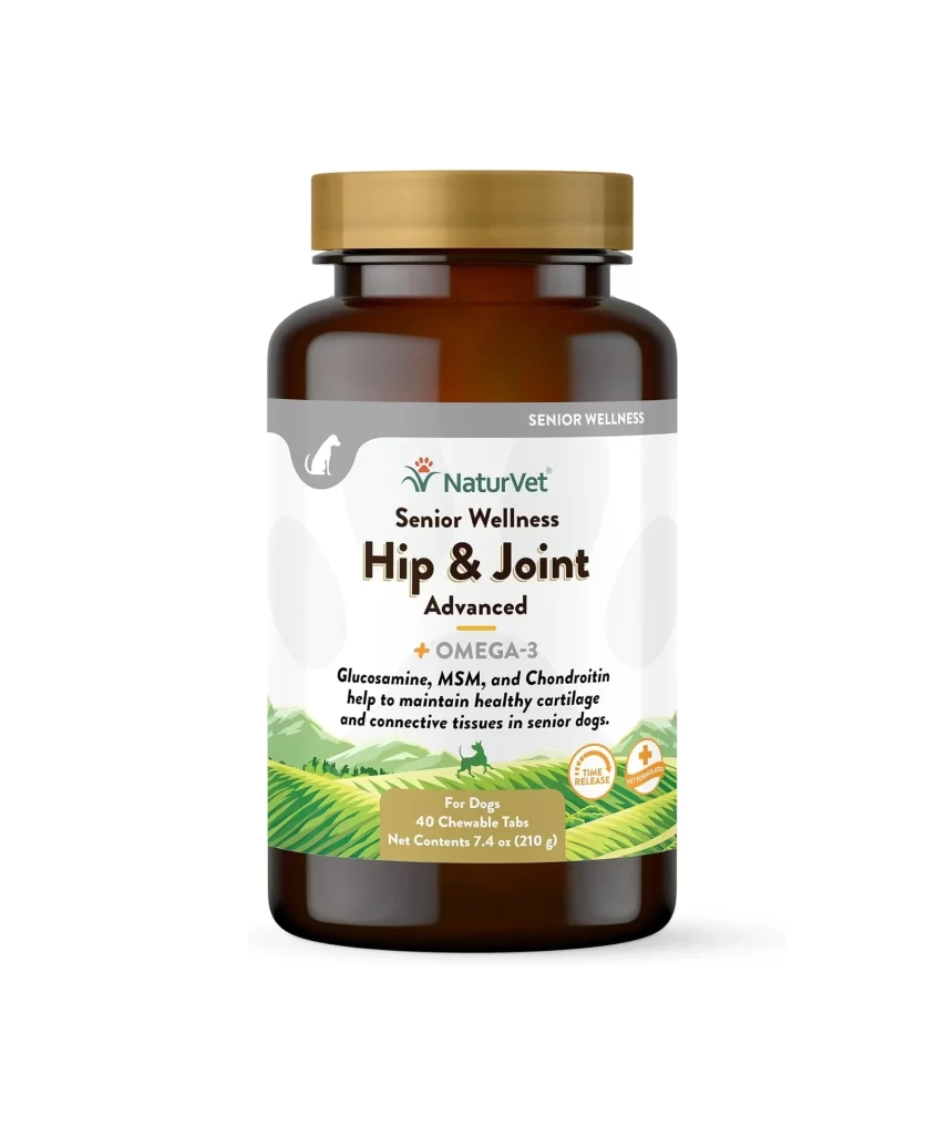
A cylindrical amber glass vessel dominates the frame, capped by a brushed gold lid that catches the light with a metallic sheen. The label wraps around the midsection in a clean white band, featuring a subtle gray header bar embossed with a canine silhouette and the words 'SENIOR WELLNESS.' Below the green NaturVet logo, bold black typography announces 'Hip & Joint Advanced,' while a pastoral illustration of rolling green hills and a small dog anchors the bottom third of the composition. Soft studio lighting eliminates harsh shadows, presenting the product against an infinite white void that emphasizes every typographic detail and color choice.
Visual hierarchy plays a crucial role here, with the warm brown bottle creating immediate contrast against the clinical purity of the label's background. The strategic placement of 'OMEGA-3' in gray text beneath the main product name adds a layer of technical credibility without cluttering the primary message. Notably, the integration of nature-inspired graphics—specifically those stylized agricultural fields—softens the pharmaceutical aesthetic, making the supplement appear more approachable for pet owners seeking holistic care solutions.
Packaging designers studying pet wellness branding would find this composition particularly useful for analyzing how earth tones communicate trust and natural ingredients. Marketing teams could reference the label's layout when developing their own senior-care product lines, noting how the specific combination of serif and sans-serif fonts targets an demographic concerned with animal longevity. Additionally, photographers preparing e-commerce shoots might examine the lighting setup to understand how to render translucent materials without losing text legibility on curved surfaces.