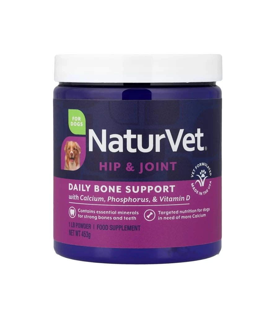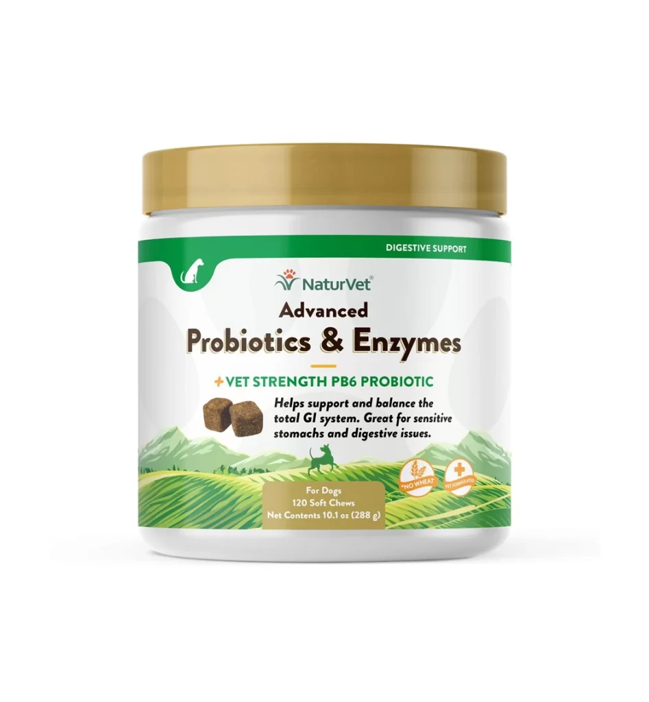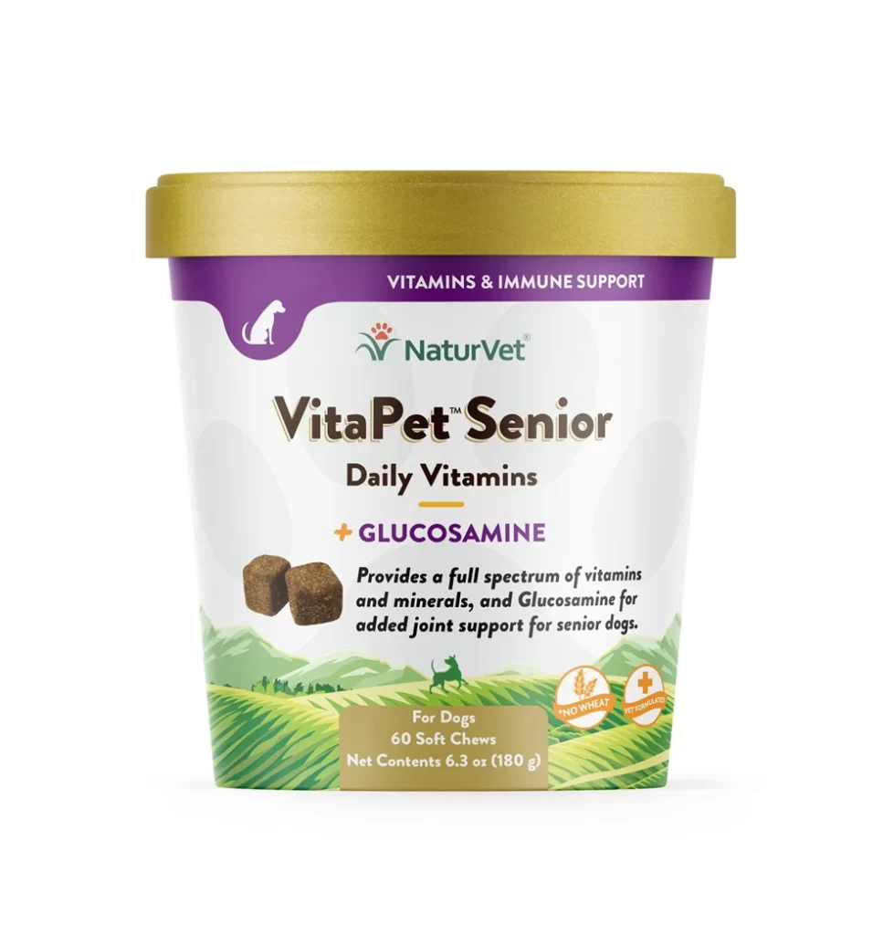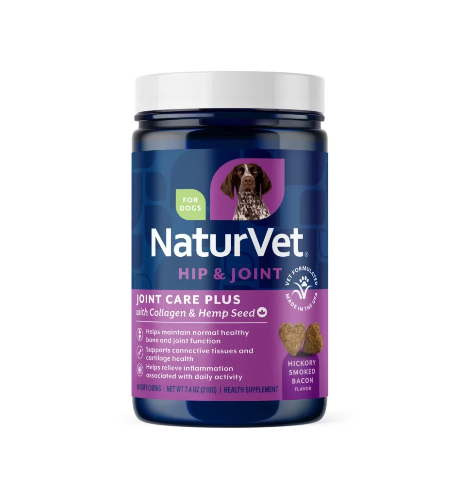
NaturVet Urinary Care Supplement Jar
Topics
Details
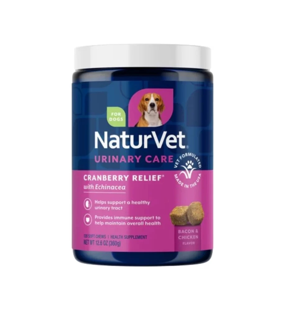
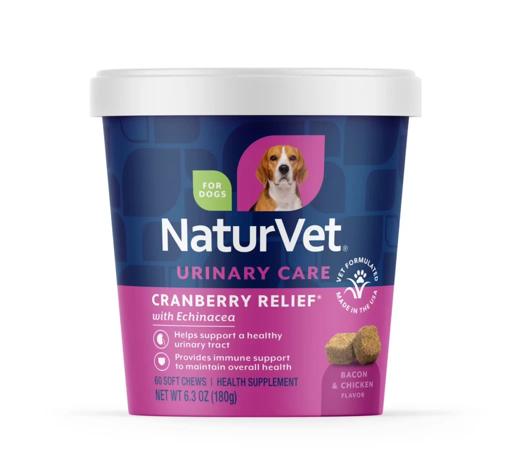
A cylindrical supplement container stands against a seamless white background, featuring a two-tone color scheme of deep navy blue and vibrant magenta. The white plastic lid sits flush atop the tub, while the front label displays a beagle's portrait within a pink rounded rectangle, positioned above the bold white 'NaturVet' brand name. Below the branding, 'URINARY CARE' appears in magenta capital letters, followed by 'CRANBERRY RELIEF with Echinacea' in white text against the lower pink section, which also contains two circular benefit icons and an image of brown soft chews on the right side.
Visual hierarchy emerges through the strategic division between the dark upper portion and the saturated pink base, creating immediate product categorization at a glance. The inclusion of an actual dog photograph rather than illustration adds authenticity to the veterinary supplement category, while the green 'FOR DOGS' badge provides quick species identification. Typography varies significantly in weight and size, guiding the eye from brand identity down to specific health claims and flavor details without visual clutter.
Packaging designers studying pet supplement aesthetics might analyze this layout for its effective use of color blocking to separate branding from functional information. Marketing teams could reference the label's information architecture when developing similar health-product packaging that requires balancing regulatory text with consumer appeal. Photographers specializing in product shots might examine the even lighting technique used here to eliminate shadows while maintaining the metallic sheen of the container's surface.