Olay Beauty Fluid Sensitive Skincare Packaging
Topics
Details
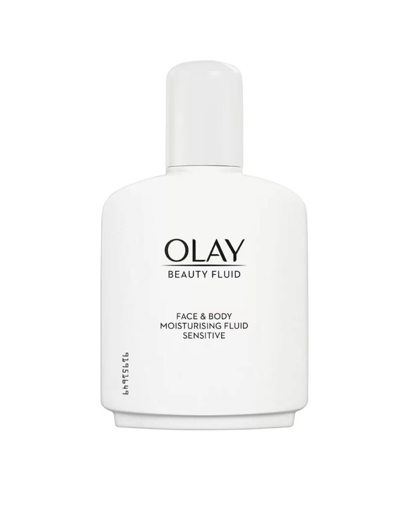
A matte white bottle of Olay Beauty Fluid Sensitive features soft, rounded shoulders that taper into a flat base, topped by a cylindrical cap sitting flush with the neck to create a continuous silhouette. Black typography dominates the front face, with the brand name 'OLAY' rendered in an elegant serif font above 'BEAUTY FLUID' and smaller text identifying it as a face and body moisturising fluid for sensitive skin. The minimalist design stands out on a white surface with a vertical batch code printed along the left edge.
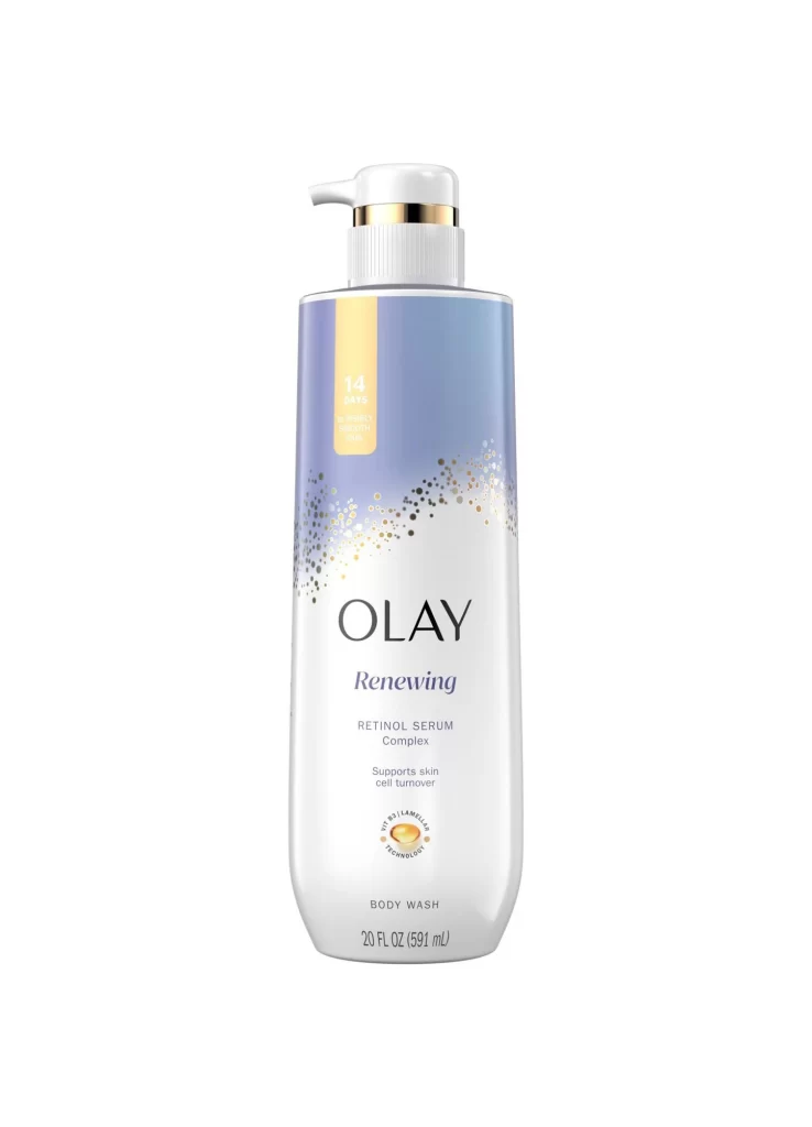
Visual restraint defines this packaging iteration, where the absence of color gradients or photographic imagery forces attention onto typographic hierarchy and spatial balance. The contrast between the substantial serif lettering of the logo and the utilitarian clarity of the product claims creates a sophisticated tension between luxury positioning and clinical accessibility. Such deliberate simplicity suggests a design philosophy that prioritizes ingredient transparency over decorative elements, making the blank canvas of the bottle itself a statement of purity.
Brand strategists analyzing heritage skincare identities would examine this composition to understand how minimalism communicates gentleness for sensitive skin formulations without relying on traditional soothing color palettes. Packaging engineers might reference the structural proportions when developing containers for fluid products requiring controlled dispensing, while typographers could study the interplay between serif branding and sans-serif informational text to achieve similar visual authority in their own label designs.