Packaging Design
Topics
Details
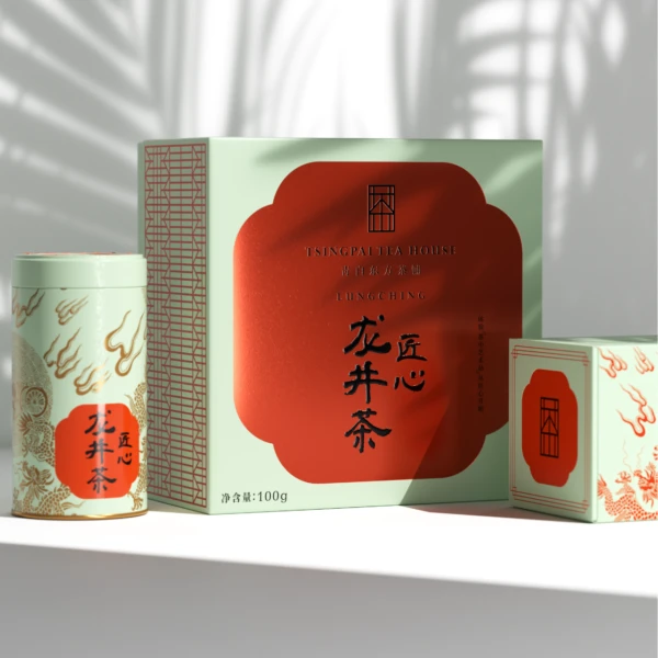
Set against a white surface with soft palm-leaf shadows, this composition features a trio of tea packaging items in a muted sage green and deep terracotta palette. The central rectangular box displays a prominent red scalloped medallion containing the bold black characters for Longjing Tea, alongside a minimalist window-like logo and 100g net weight notation. Flanking the main box are a cylindrical tin and a smaller square container, both adorned with stylized golden dragon motifs that echo traditional Chinese aesthetics while maintaining contemporary graphic clarity.
Visual distinction arises from the sophisticated interplay between the cool mint-green background and the warm, oxidized-red focal shapes, creating a color harmony that feels both heritage-rich and modern. The typographic hierarchy skillfully balances English branding elements with expressive calligraphy, while the repeating geometric lattice pattern on the main box's side panel adds textural depth without overwhelming the primary message. Such deliberate restraint in ornamentation allows the cultural symbolism—dragons, cloud forms, and classical script—to communicate luxury and authenticity through subtle rather than ostentatious means.
Brand strategists developing premium Asian food or wellness products might study this layout to understand how traditional motifs can be abstracted for global markets. Packaging engineers could reference the structural variety shown here when planning product lines requiring different volume options within a unified visual system. Art directors seeking to modernize heritage brands would find the color-blocking technique and logo integration particularly instructive for balancing cultural specificity with universal design principles.