SAMBazon Frozen A Jar
Topics
Details
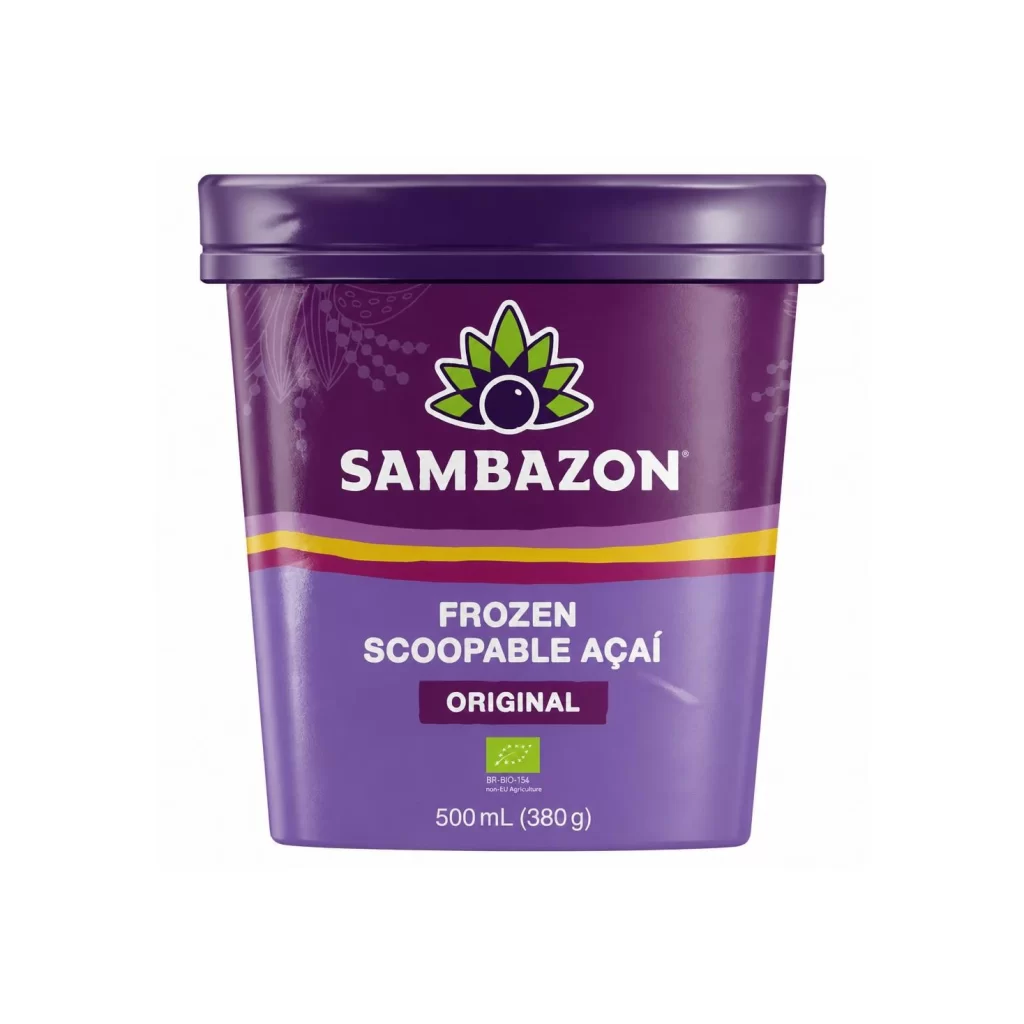
Deep violet and lavender gradients dominate the cylindrical tub, capped by a glossy dark purple lid that catches the light along its rounded edge. The Sambazon logo sits prominently in the upper half, featuring a stylized green leaf crown encircling a dark berry, while bold white sans-serif text spells out the brand name beneath it. A vibrant yellow stripe cuts horizontally across the middle, separating the darker upper section from the lighter purple base where 'Frozen Scoopable Açaí Original' appears in clean white typography alongside a green organic certification seal and 500mL volume marking.
Color blocking creates immediate visual hierarchy here, with the saturated purple palette immediately signaling the açaí fruit contents while the yellow accent adds unexpected energy to an otherwise cool-toned scheme. The organic leaf motif within the logo reinforces the product's natural positioning without relying on photographic imagery, making the packaging feel both modern and authentically rooted in botanical origins. Subtle decorative patterns linger in the background of the upper portion, adding texture that prevents the solid color fields from feeling flat or industrial.
Packaging designers studying frozen food branding might examine how this container balances premium organic cues with approachable, scoopable convenience messaging. Brand identity teams could reference the logo's integration of natural iconography with bold typography when developing visual systems for health-focused products. Color strategists will find the specific purple-to-lavender transition useful for analyzing how hue shifts guide the eye downward toward essential product information and certification trust marks.