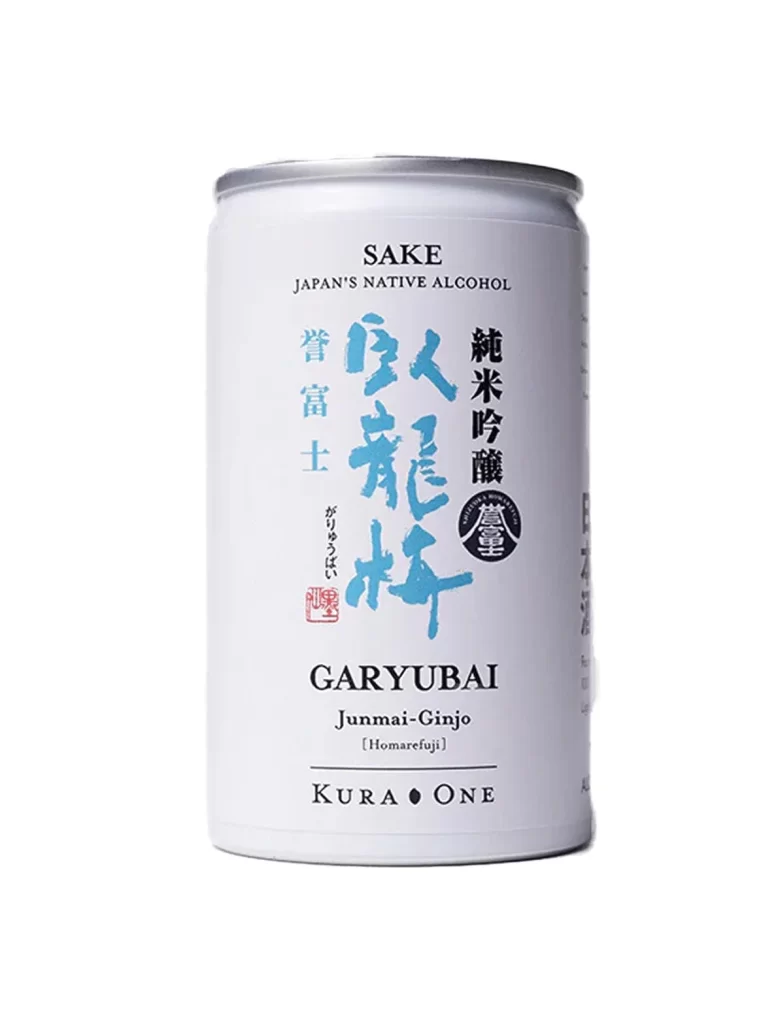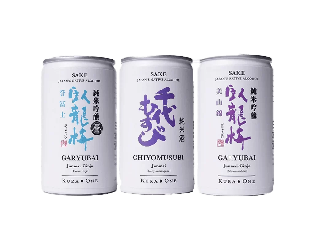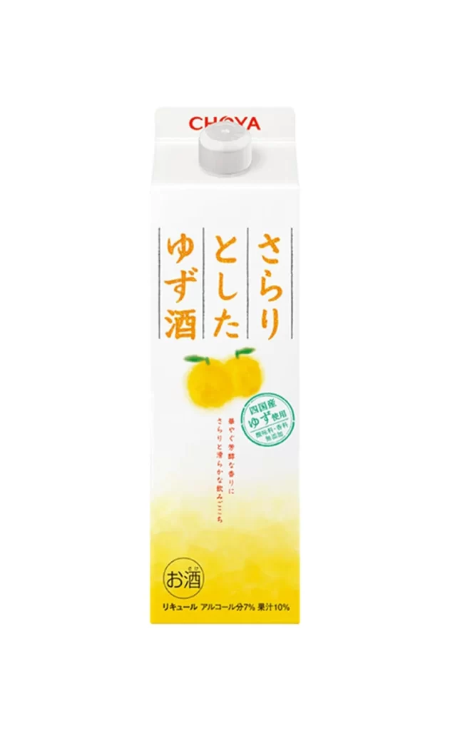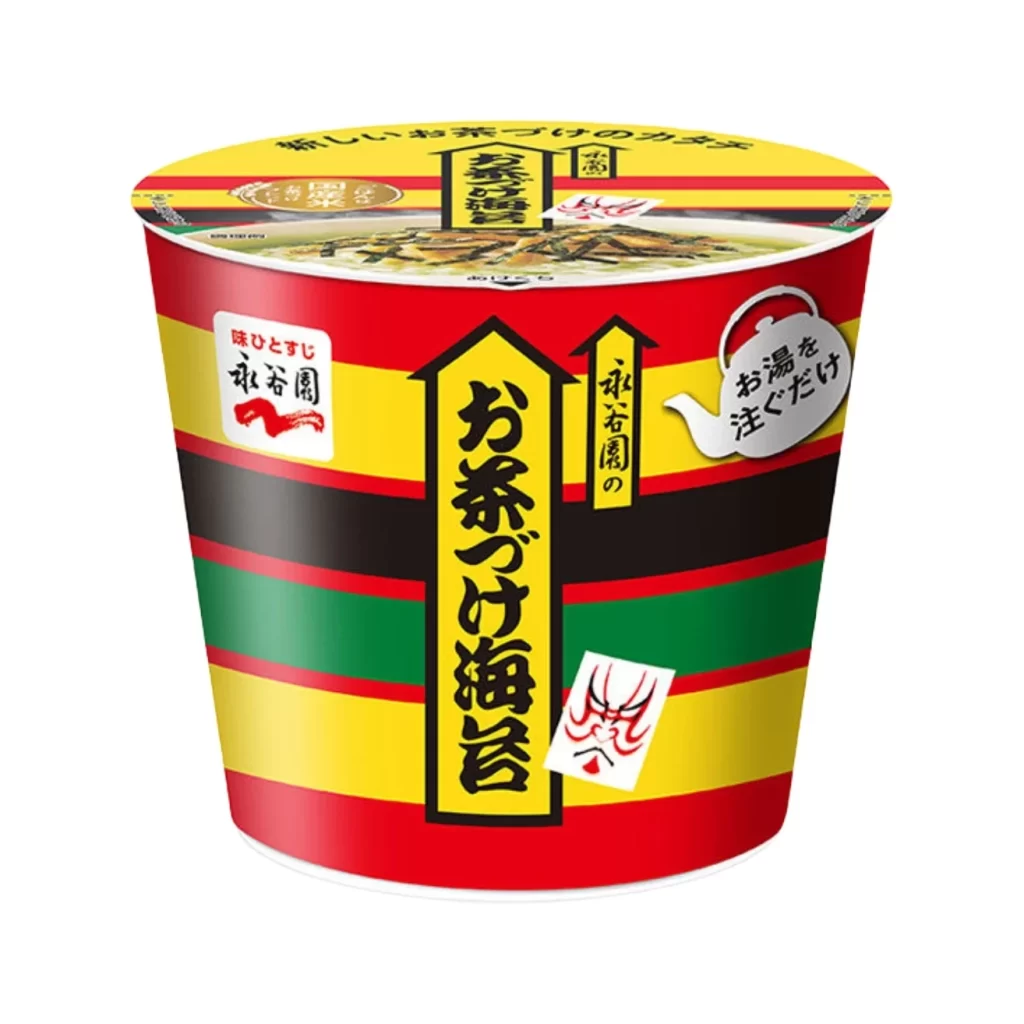
Traditional Japanese Packaging White Red Minimalist Design
Topics
Details
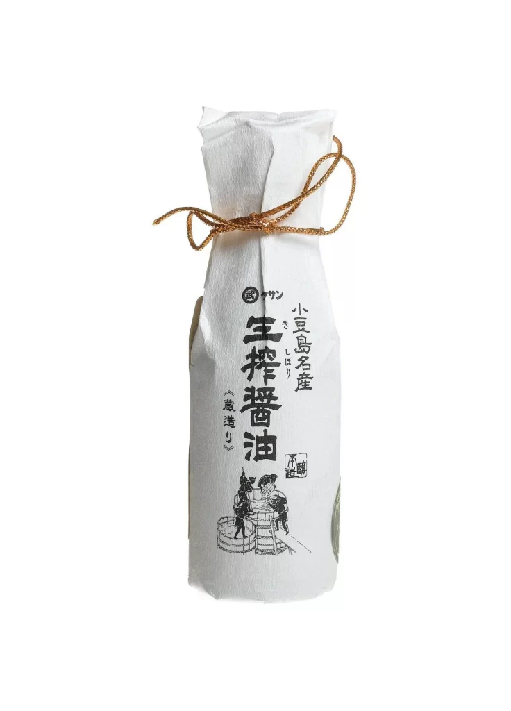
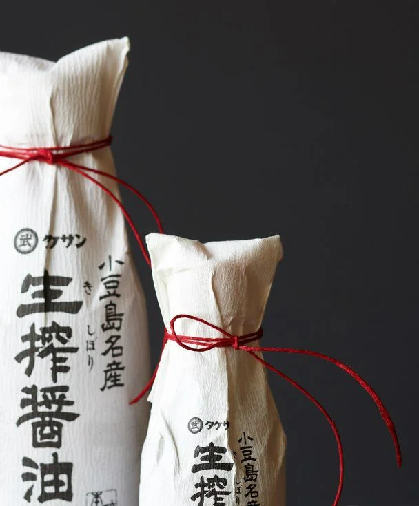
Two cylindrical bottles wrapped in off-white textured paper stand in a staggered arrangement, their necks gathered and secured with thin crimson cords tied into loose bows. Bold black kanji characters for 'Nama-zuri shoyu' (unpasteurized soy sauce) and 'Oshima meisan' (Oshima famous product) dominate the surface, accompanied by smaller hiragana and circular emblems. Soft directional light from the left casts gentle shadows across the crinkled paper texture, while a deep charcoal background recedes to emphasize the subjects' sculptural presence.
The visual tension between the organic, slightly irregular paper wrapping and the precise calligraphic lettering creates a compelling aesthetic that balances rustic authenticity with graphic clarity. That single red thread introduces a deliberate accent color that draws the eye upward along the bottle's silhouette, transforming utilitarian food packaging into an object of contemplative beauty. The material honesty of unbleached fiber against dark negative space demonstrates how minimal elements can achieve maximum visual impact through restraint.
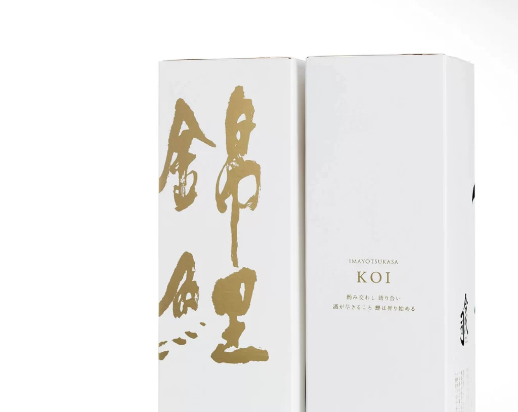
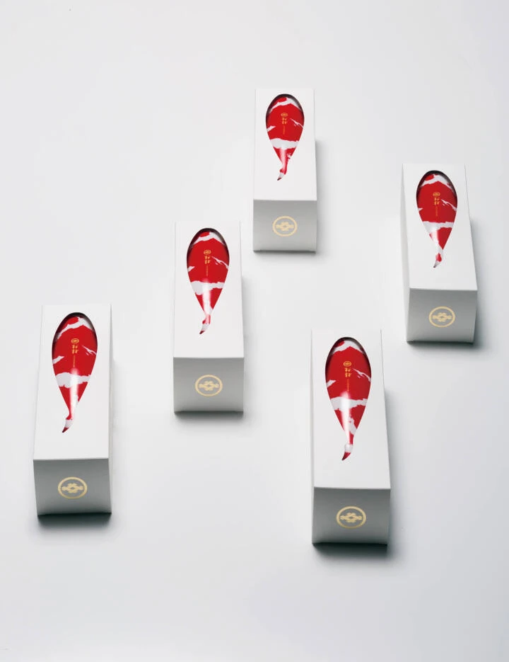
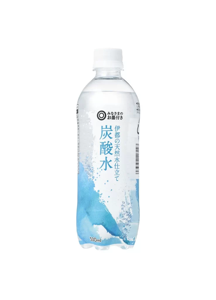
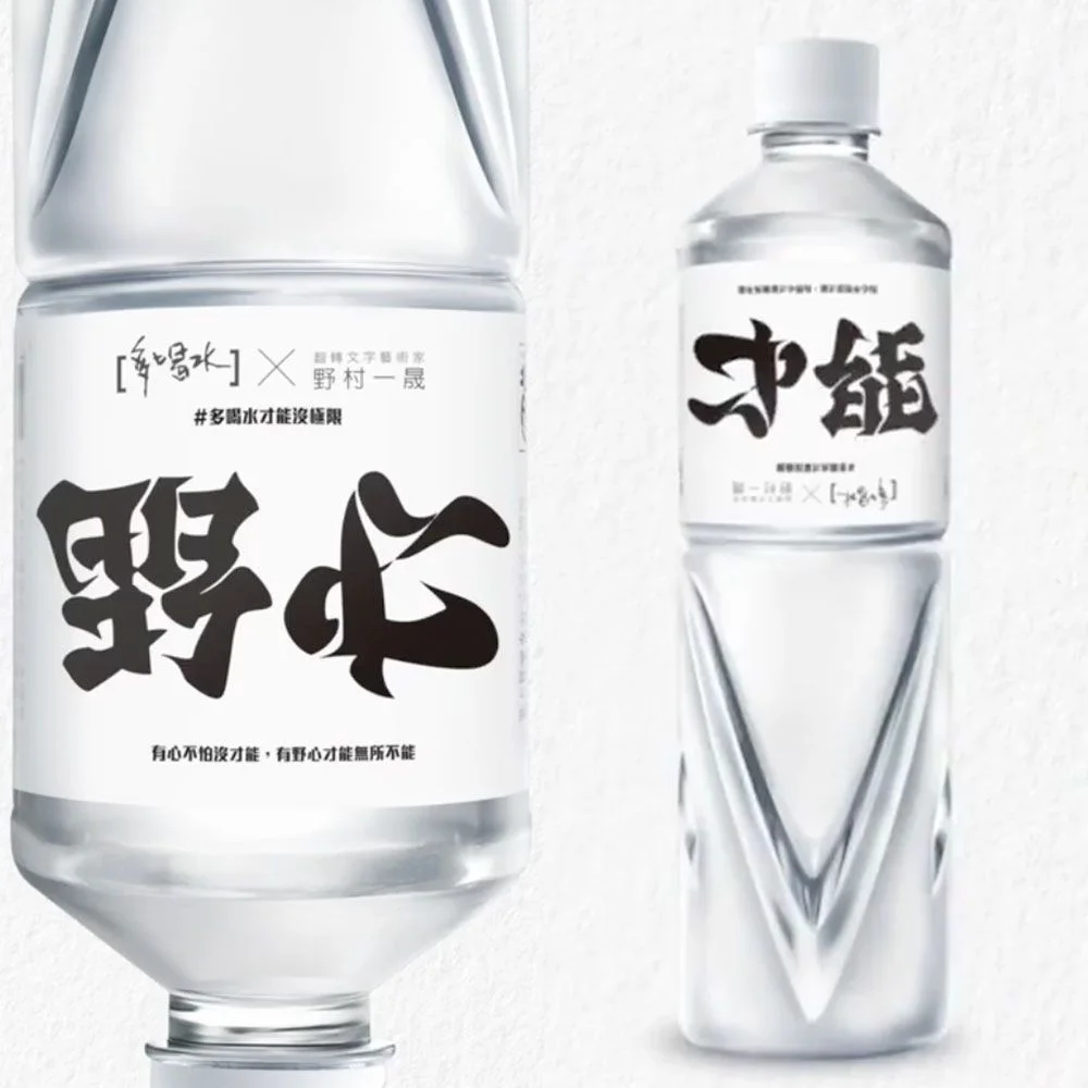
Brand designers developing artisanal food products might study this composition to understand how traditional materials can convey premium quality without excessive ornamentation. Photographers working on still-life assignments could reference the lighting setup and depth-of-field choices when shooting similar packaged goods. Anyone crafting packaging for small-batch condiments or spirits would benefit from analyzing how typography scale and cord placement guide the viewer's attention across a three-dimensional form.