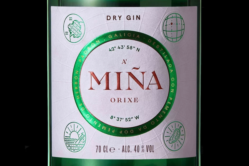
‘MINA’ Dry Gin Bottle
Topics
Details
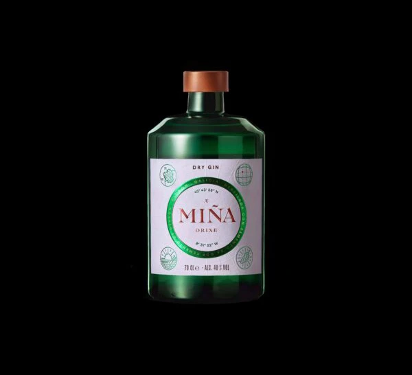
A crisp white label with a subtle grid texture dominates the center of the green glass bottle, featuring a bold green circular border that frames the brand name 'A MINA' in elegant copper-red serif typography. The composition is anchored by geographic coordinates—42° 43' 58" N and 8° 37' 52" W—printed in black above and below the central text, while four delicate green line-art icons depicting a map, globe, sunrise, and botanical element occupy the corners. Soft, even lighting illuminates the textured paper surface, highlighting the metallic sheen of the copper lettering and the clean contrast between the white background and emerald accents.
Visual distinction arises from the sophisticated interplay between the textured, paper-like surface of the label and the metallic sheen of the copper-toned typography. The use of exact geographical coordinates lends an air of scientific authenticity and terroir-specific craftsmanship to the branding. Furthermore, the subtle radial grid pattern embossed across the white background adds a layer of tactile depth that elevates the packaging beyond standard liquor labeling into the realm of modern cartographic art.
Packaging designers examining this reference will find valuable insights into balancing typographic hierarchy with illustrative elements. Art directors tasked with creating premium spirit identities can analyze how color theory—specifically the contrast between cool greens and warm reds—evokes a sense of natural luxury. Additionally, illustrators looking to develop icon systems for artisanal products can study the consistent line weight and symbolic clarity of the four corner motifs.