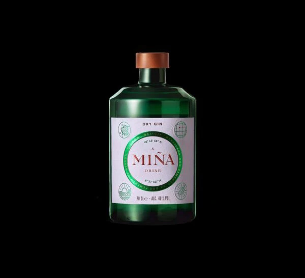
MINA Dry Gin Bottle
Topics
Details
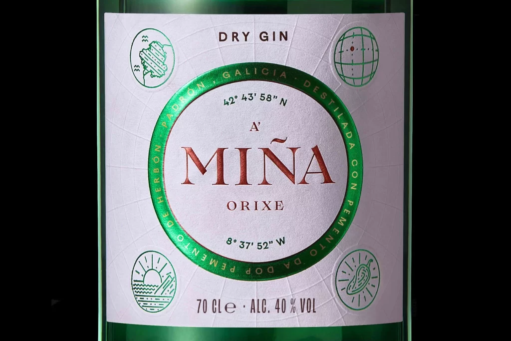
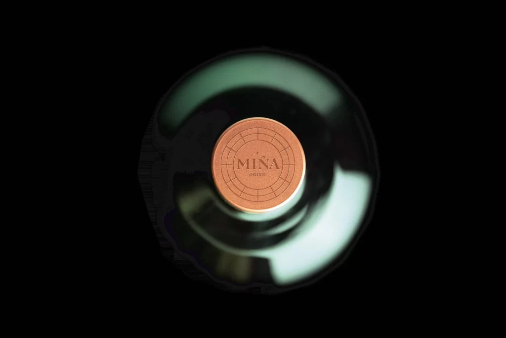
An emerald glass bottle with a copper-toned cap stands as the focal point, its surface reflecting light with a subtle sheen. The white label features the brand name 'MINA' in bold burgundy letters within a green circular border, surrounded by delicate line-art illustrations of botanical and navigational symbols. Soft directional lighting accentuates the bottle's curved silhouette while the surrounding darkness creates dramatic contrast.
Visual distinction emerges from the strategic interplay between the bottle’s saturated color and the label’s restrained typographic hierarchy. The copper closure introduces a warm metallic accent that balances the cool green glass, creating a sophisticated material dialogue. Circular framing around the primary logotype establishes a focal point that draws the eye inward, while the peripheral iconography adds narrative depth without cluttering the overall minimalist aesthetic. Such deliberate spatial organization demonstrates how negative space can amplify brand identity within premium spirit packaging.
Packaging designers analyzing contemporary gin branding would examine this specimen to study color theory applications in luxury beverage contexts. Art directors developing artisanal liquor identities might reference the label’s geometric balance when structuring their own grid systems. Students of industrial design could deconstruct the relationship between vessel silhouette and closure mechanics to understand tactile user experience considerations. Marketing teams positioning heritage spirits would benefit from observing how coordinate data and regional indicators communicate provenance through subtle graphic cues.