Sabor da Serra Ice Cream Box
Topics
Details
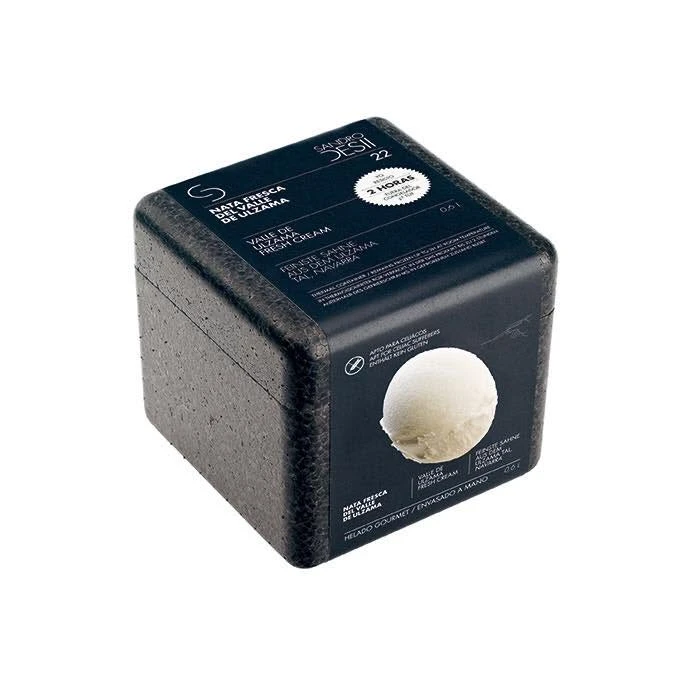
Sabor da Serra 22 is printed in white across the top of a dark navy label wrapped around a charcoal foam container, with 'Mata Tresca do Vale de Uzuma' arched above and a circular badge announcing '2 Horas' to the right, while a photorealistic scoop of pale cream ice cream dominates the lower right quadrant against the matte black background.
What distinguishes this particular design is the sophisticated juxtaposition of utilitarian insulation foam with high-end gourmet branding elements. The deep charcoal hue of the container creates a dramatic backdrop for the minimalist white text and the creamy visual of the product itself, suggesting a premium unboxing experience despite the humble nature of the protective material. This contrast between the rough, functional exterior and the delicate, artisanal contents communicates both practicality and luxury in a single object.
Product photographers studying how to style temperature-sensitive goods will find this composition particularly instructive for balancing text legibility with three-dimensional form. Packaging designers tasked with creating thermal containers for food delivery can analyze how dark backgrounds enhance the perception of freshness and quality. Furthermore, art directors working on editorial spreads for culinary magazines might utilize this aesthetic to explore themes of preservation and modern gastronomy.