Biscuit Packaging Colorful Geometric Patterns
Topics
Details
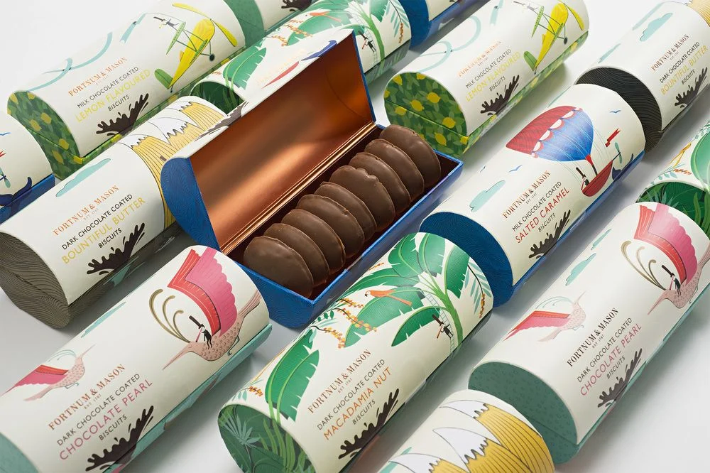
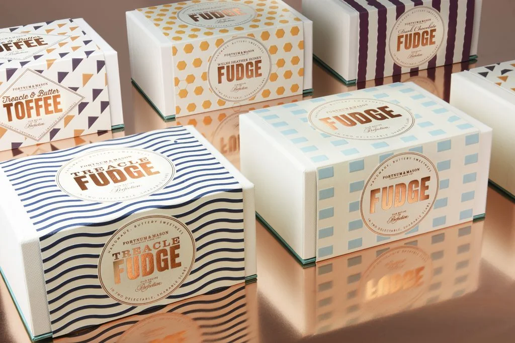
Nine rectangular biscuit boxes from Fortnum & Mason scatter across a neutral gray surface, each featuring a circular die-cut window revealing stacked Florentines within. The packaging palette spans electric yellow, hot pink, cobalt blue, and tangerine orange, decorated with bold geometric motifs including wavy lines, polka dots, chevrons, and diagonal stripes in contrasting secondary hues. Serif typography identifies flavors such as Cold Dusted Dark Chocolate and Orange Lemon Pine Nut, while soft overhead lighting casts subtle shadows beneath each carton.
Vibrant color blocking transforms traditional luxury confectionery packaging into contemporary graphic art, where playful Memphis-style patterns disrupt the expected elegance of heritage branding. Each box employs a distinct pattern-color combination that creates visual rhythm across the composition while maintaining brand cohesion through consistent typography and structural form. The transparent windows serve dual purposes: they showcase the textural layers of the biscuits while breaking up the flat graphic surfaces with organic depth.
Brand strategists developing premium FMCG ranges might study this example to understand how heritage labels can adopt modernist aesthetics without losing perceived value. Packaging designers working on limited-edition food products could reference these pattern applications when balancing whimsy with sophistication. Color theorists analyzing consumer psychology in retail environments would find useful data in how saturated backgrounds influence appetite appeal for baked goods.