Gillette Foamy Sensitive Shave Foam Packaging
Topics
Details
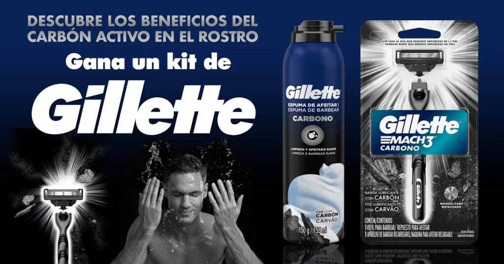
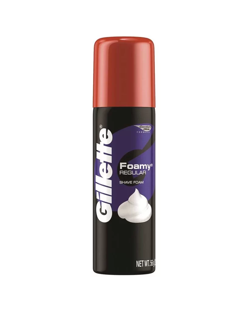
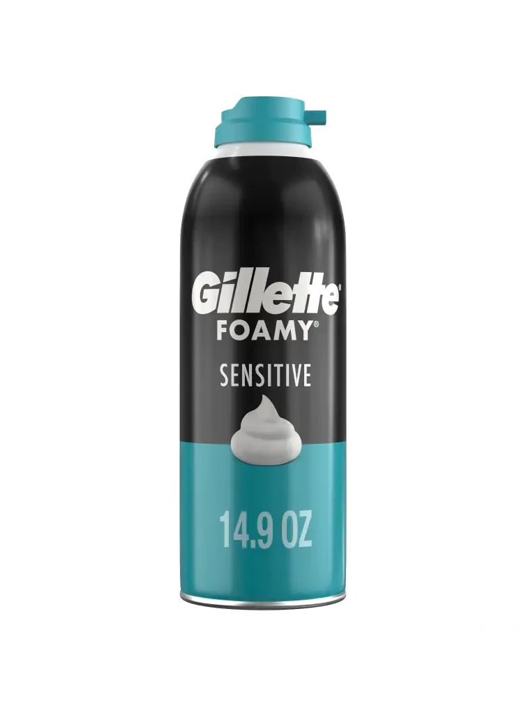
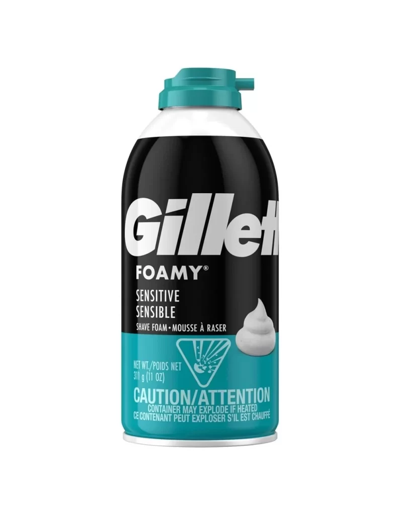
The Gillette Foamy Sensitive Shave Foam aerosol can presents a clean and practical look. Its cylindrical body features a striking blend of black, teal, and white. A prominent foam graphic sits near the bottom, emphasizing the rich lather inside. As a bilingual pack, the layout displays text in two languages, ensuring clear communication and broad accessibility for diverse retail markets.
Color psychology plays a key role in this packaging. The soothing teal conveys gentleness and calm, ideal for sensitive skin. Crisp white offers a sense of hygiene and purity, while bold black provides strong contrast for the logo and text. The foam graphic visually reinforces the product promise, creating a cohesive design that balances clinical trust with everyday approachability.
This packaging reference is perfect for graphic designers and branding students. Those working on personal care or cosmetic aerosol lines will find it highly useful. It serves as a great guide for managing bilingual layouts without clutter. Additionally, product managers seeking inspiration for color blocking and visual hierarchy in mass market consumer goods will benefit from studying this design.