Gillette Labs Hydrating Face Wash Packaging
Topics
Details
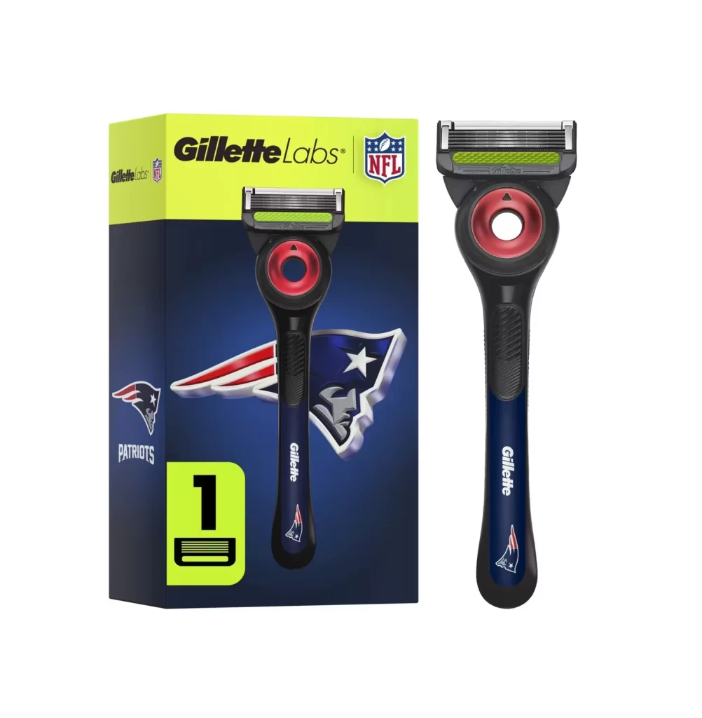
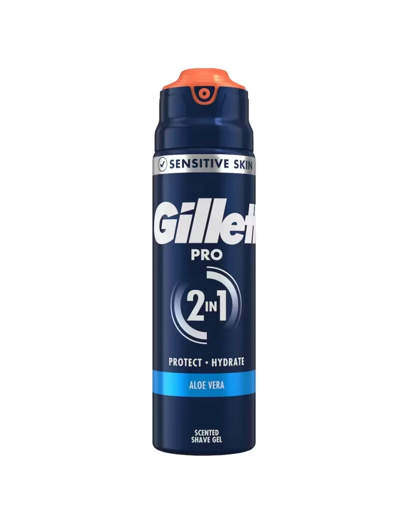
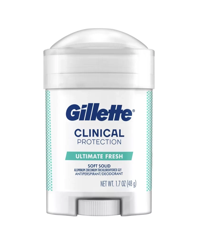
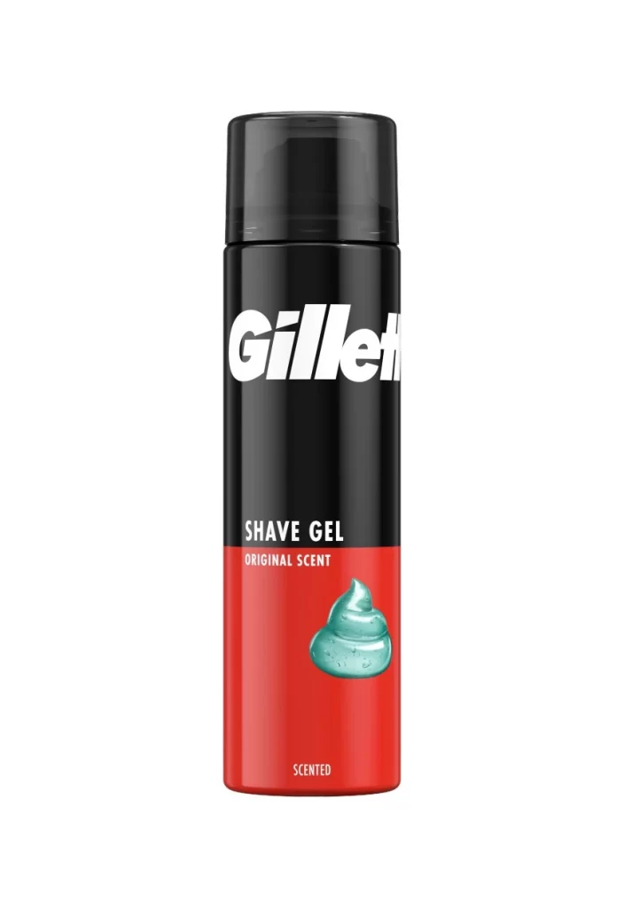
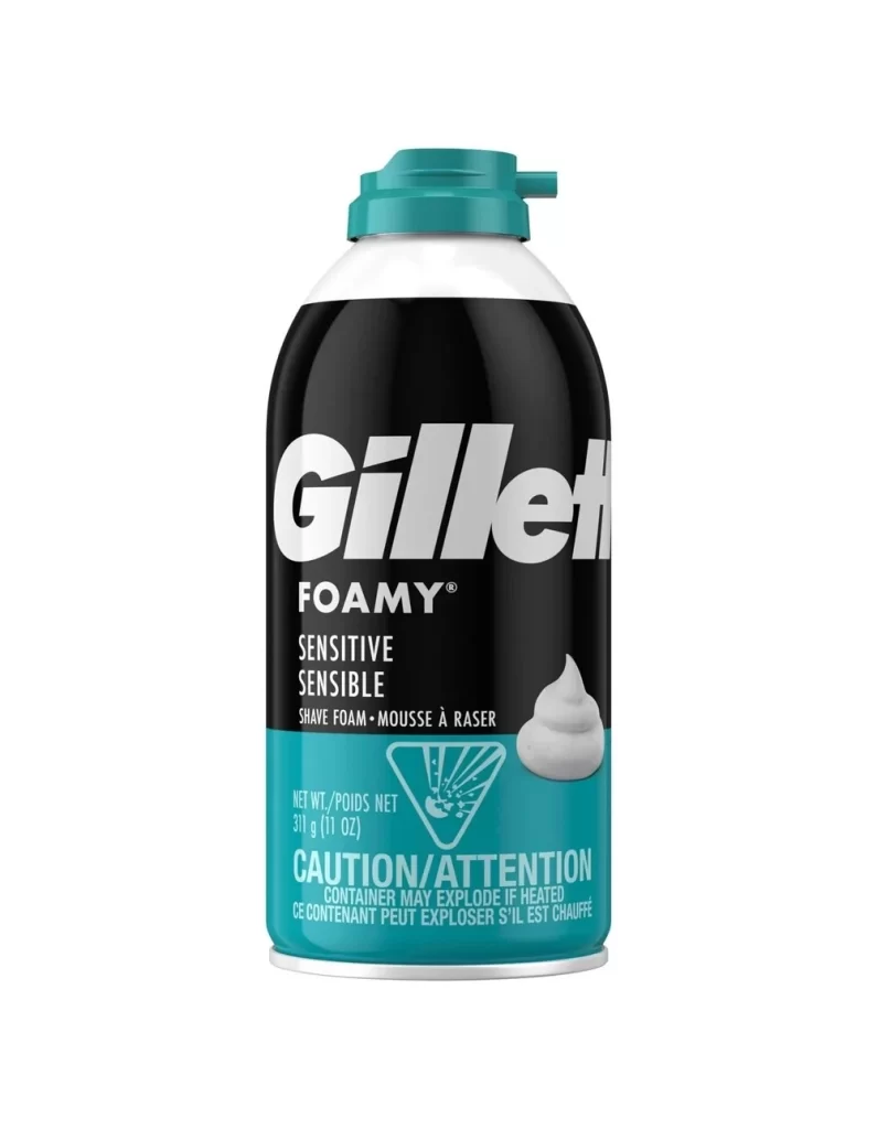
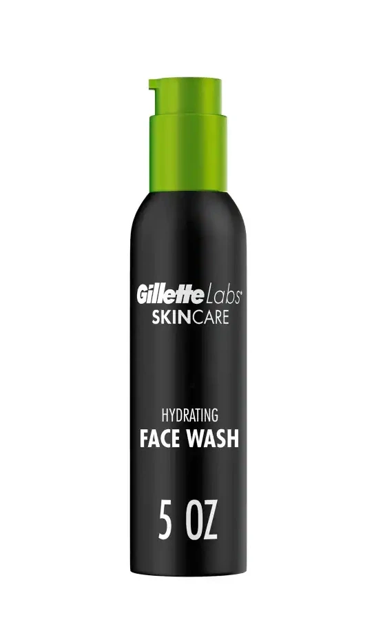
The Gillette Labs hydrating face wash is presented in a sleek pump bottle against a pure white studio backdrop. The packaging features a matte black bottle paired with a vibrant green pump cap. Crisp white text provides branding and product information, creating a clean visual contrast. This minimalist setup highlights the contours and functional design of the container.
This packaging design leverages high contrast to communicate premium quality and modern efficacy. The dominant black bottle conveys sophistication, while the unexpected green pump cap adds a fresh, botanical cue that hints at the hydrating formula inside. White typography ensures optimal legibility and balances the dark silhouette, resulting in a bold yet refined aesthetic.
Graphic designers and packaging specialists will find this reference invaluable for projects involving cosmetic or grooming products. It is particularly useful for those exploring high contrast color blocking, sustainable visual cues, and minimalist typography. Brand strategists seeking inspiration for premium men's care lines can also study this imagery to understand how to balance clinical clarity with modern appeal.