Harland Brewing Door County Cherry Wheat Can Packaging
Topics
Details
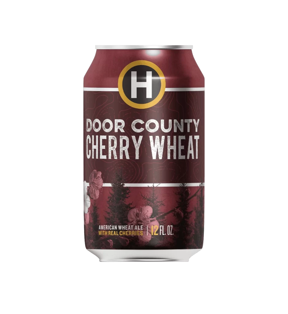
This packaging photo presents a single 12 fl. oz. aluminum beer can photographed straight-on against a pure white studio background. The product shot features the Door County Cherry Wheat American Wheat Ale in a deep maroon, glossy-finish can with a silver top rim. Captured as a straightforward packaging photograph rather than an advertisement, the clean studio presentation highlights the label's intricate details.
The design language establishes a rich maroon ground, anchored by a circular yellow-and-black brewery badge containing a white capital H monogram at the top. A clear typographic hierarchy uses white and yellow caps to distinguish Door County, the larger bold Cherry Wheat name, and the American Wheat Ale style. In the lower third, pinkish-red cherry blossom illustrations are layered over dark evergreen tree silhouettes, while subtle lighter-maroon topographic contour lines add texture across the label. This visual approach effectively ties the fruit to the Door County region, a Wisconsin peninsula famous for its cherry orchards.
Designers can study how to execute dark-ground color pairing by balancing a deep burgundy base with bright yellow and pinkish-red accents. The label demonstrates effective illustration layering, showing how delicate cherry blossoms can interact with dark evergreen silhouettes without losing visual clarity. Creators can also examine the badge-plus-wordmark lockup to see how a circular emblem sits above a structured, multi-line typographic block. Finally, the artwork provides a strong example of regional narrative in beverage branding, directly connecting a product to its geographic origin.