Nissin Instant Noodle Box Design
Topics
Details
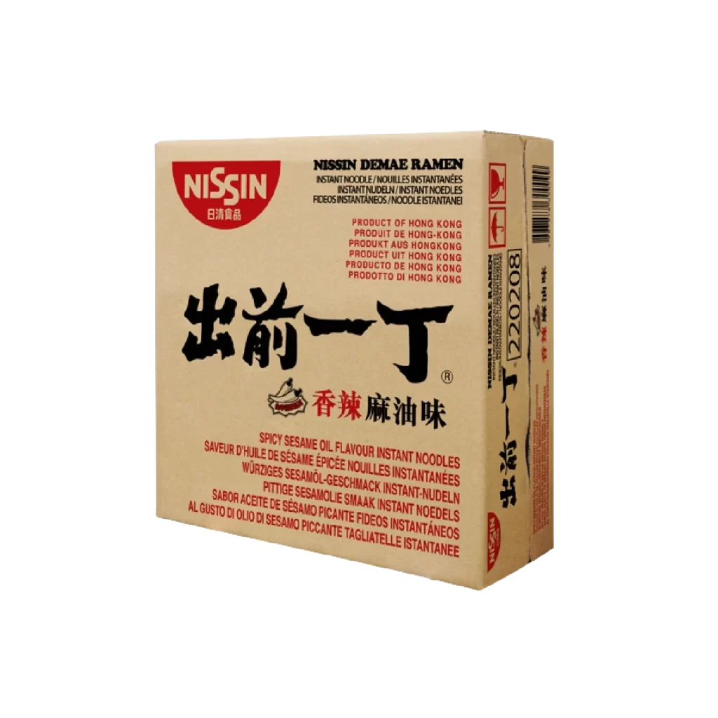
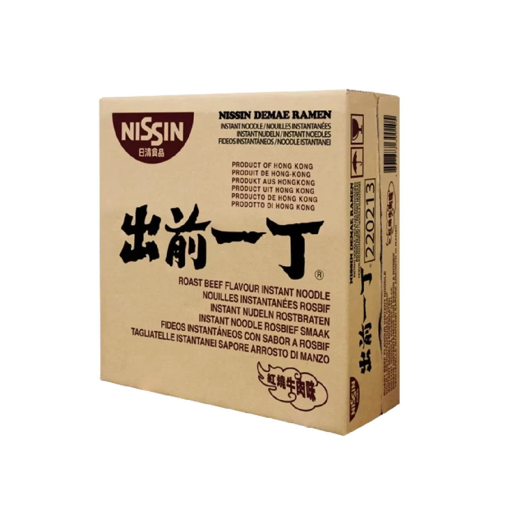
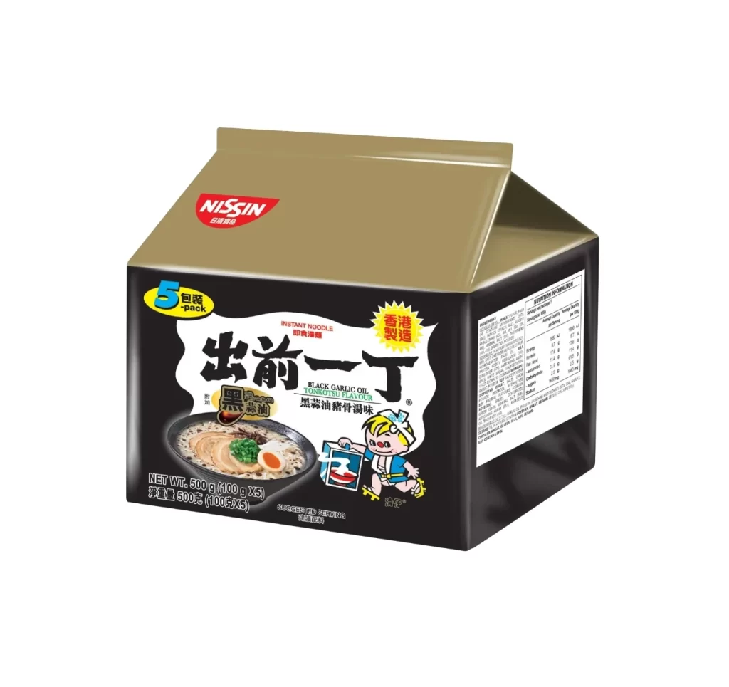
A matte gold carton top meets a deep black base in this studio photograph of the Nissin Demae Iccho multipack. The composition centers the box against a stark white void, utilizing soft, even lighting that eliminates harsh shadows while highlighting the glossy finish of the packaging materials. Bold white calligraphy for '出前一丁' dominates the front panel, flanked by a red Nissin logo at the upper left and a yellow oval indicating five individual servings.
Visual hierarchy is established through the dramatic contrast between the metallic lid and the ink-black body, creating a premium aesthetic that deviates from standard grocery-store noodle packaging. The inclusion of the Hong Kong manufacturing badge and the specific 'Black Garlic Oil Tonkotsu' flavor designation adds regional specificity that appeals to collectors and culinary enthusiasts. A playful cartoon mascot holding a blue package introduces a human element that balances the otherwise sophisticated, dark color palette.
Brand strategists might analyze this layout to understand how color blocking can elevate commodity products into premium market segments. Packaging engineers could study the structural geometry of the gabled top to assess shelf stability and material efficiency in retail environments. Food photographers often utilize such clean product shots to benchmark lighting setups for reflective surfaces and complex typographic arrangements on curved substrates.