Nissin Rao Ramen Rich Flavor Brown Traditional Japanese
Topics
Details
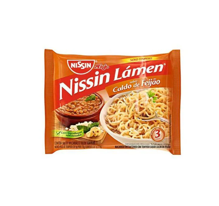
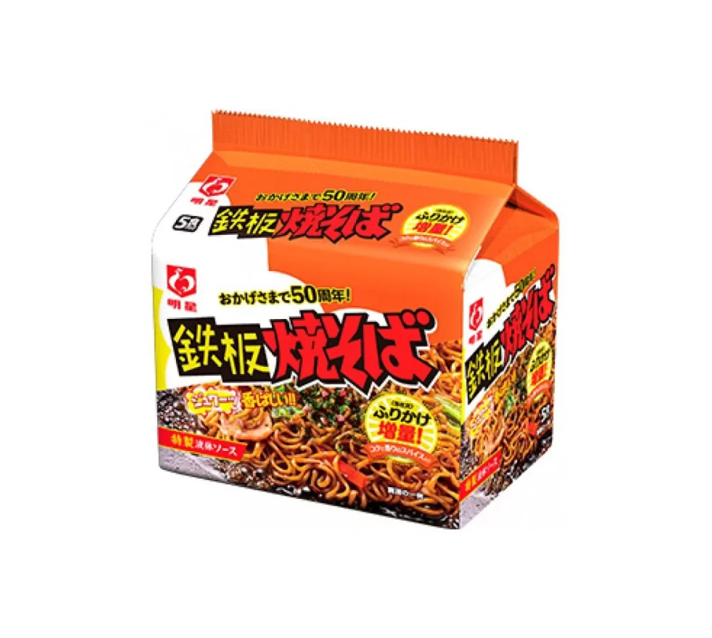
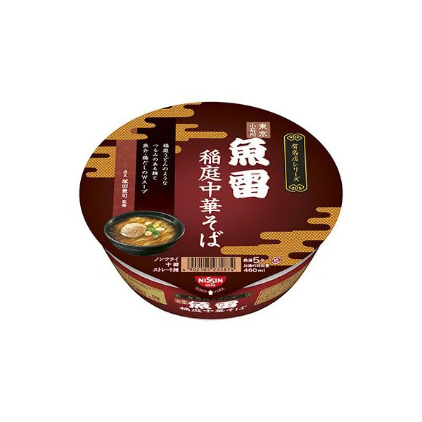
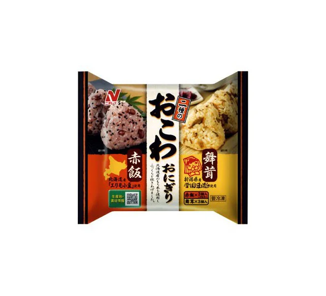
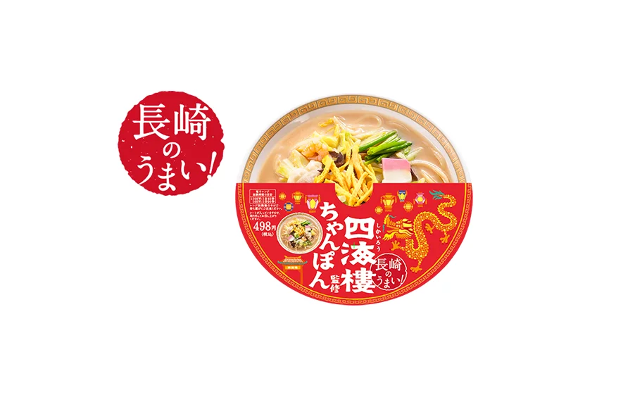
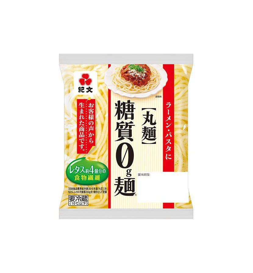
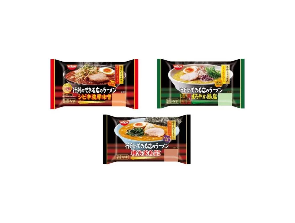
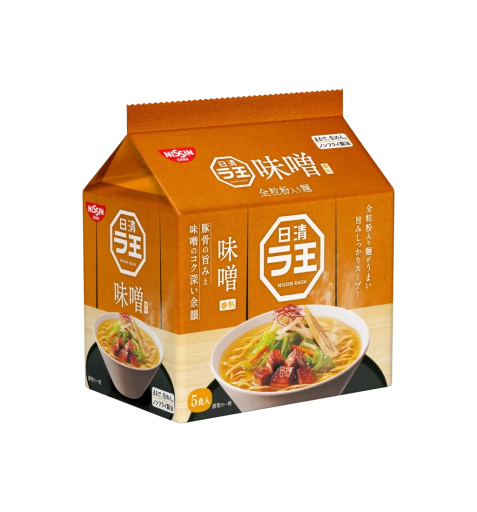
A vibrant orange carton with a gabled top and serrated seal dominates the frame, its surface covered in bold white Japanese typography and the red Nissin logo. The packaging features two photographic insets of ramen bowls filled with golden broth, green vegetables, and reddish-brown meat cubes, all set against a clean white backdrop that makes the warm tones of the box pop. Vertical text runs along the right edge while a yellow circle near the bottom indicates a five-pack quantity, and the camera captures the subject from a slight three-quarter angle to reveal both the front and left side panels.
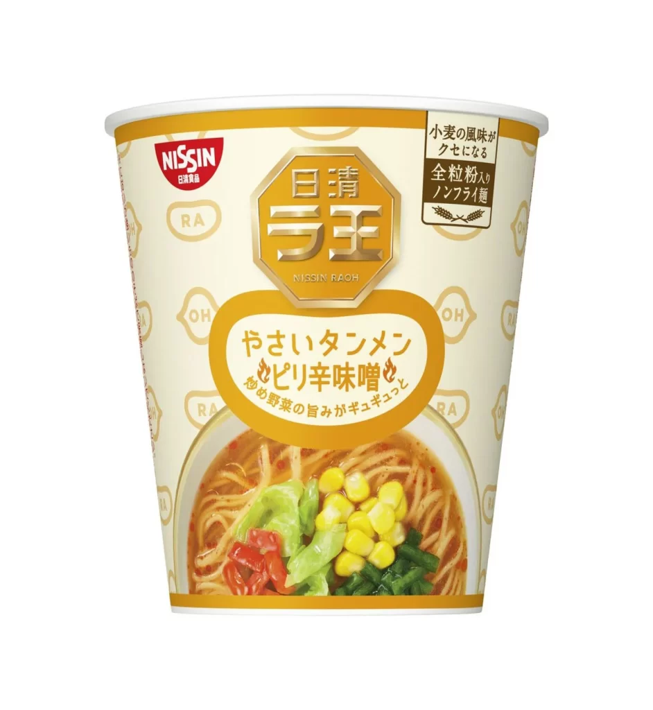
Visual hierarchy on this package relies heavily on the octagonal 'Nissin Raoh' emblem that repeats across multiple faces, creating immediate brand recognition through geometric consistency. The contrast between the saturated orange field and crisp white lettering ensures legibility from a distance, while the realistic food photography anchors the graphic elements in appetizing reality. Subtle textural details like the ribbed top edge and the matte finish of the cardboard add tactile depth that distinguishes this from flat digital renderings.
Packaging designers studying Japanese convenience goods would examine this composition to understand how color psychology and typographic density work together in retail environments. Marketing teams could reference the layout when developing campaigns for Asian food products, noting how the dual-bowl presentation suggests both individual serving and shared meal contexts. Illustrators requiring accurate depictions of contemporary Japanese grocery items for editorial or commercial artwork would find the specific font choices and spatial arrangements particularly valuable for authentic representation.