HiPP Bio Combiotik PRE Baby Food Packaging
Topics
Details
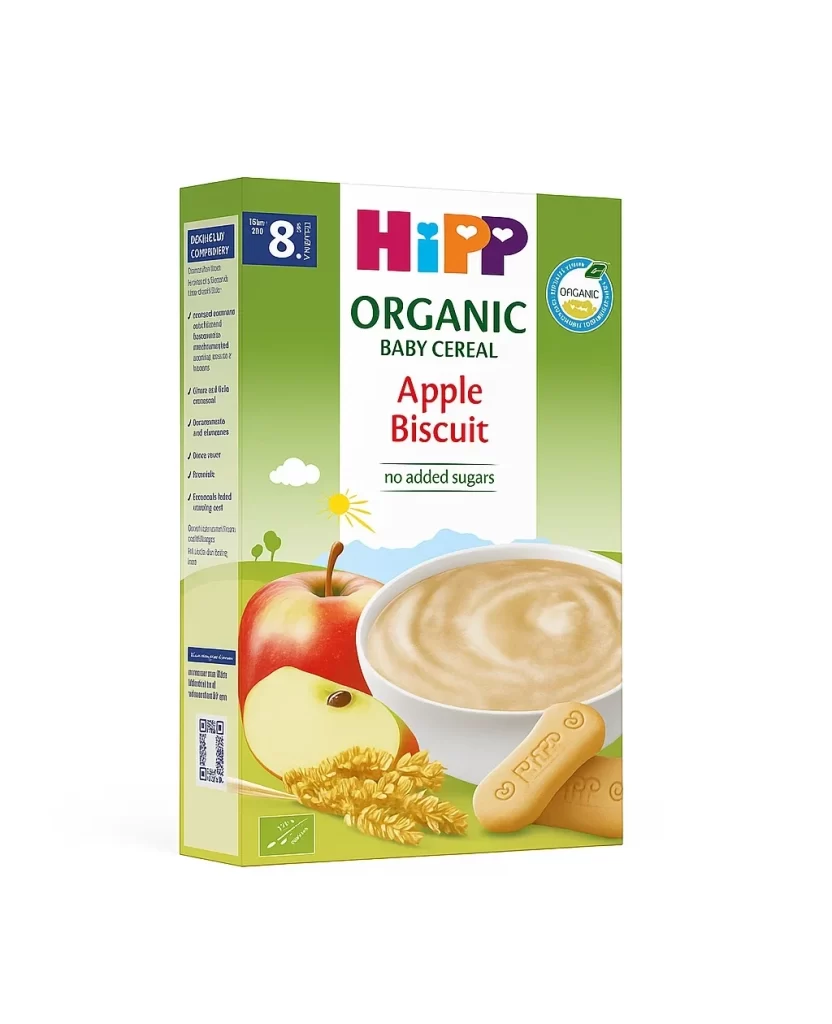
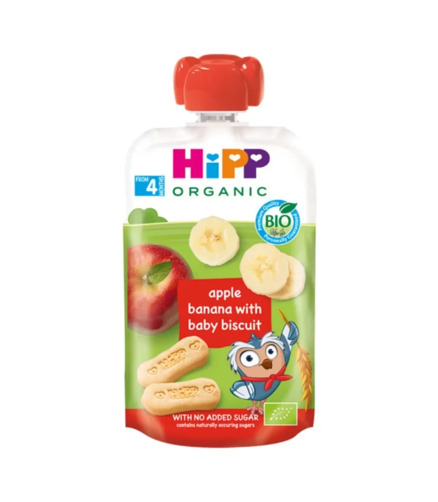
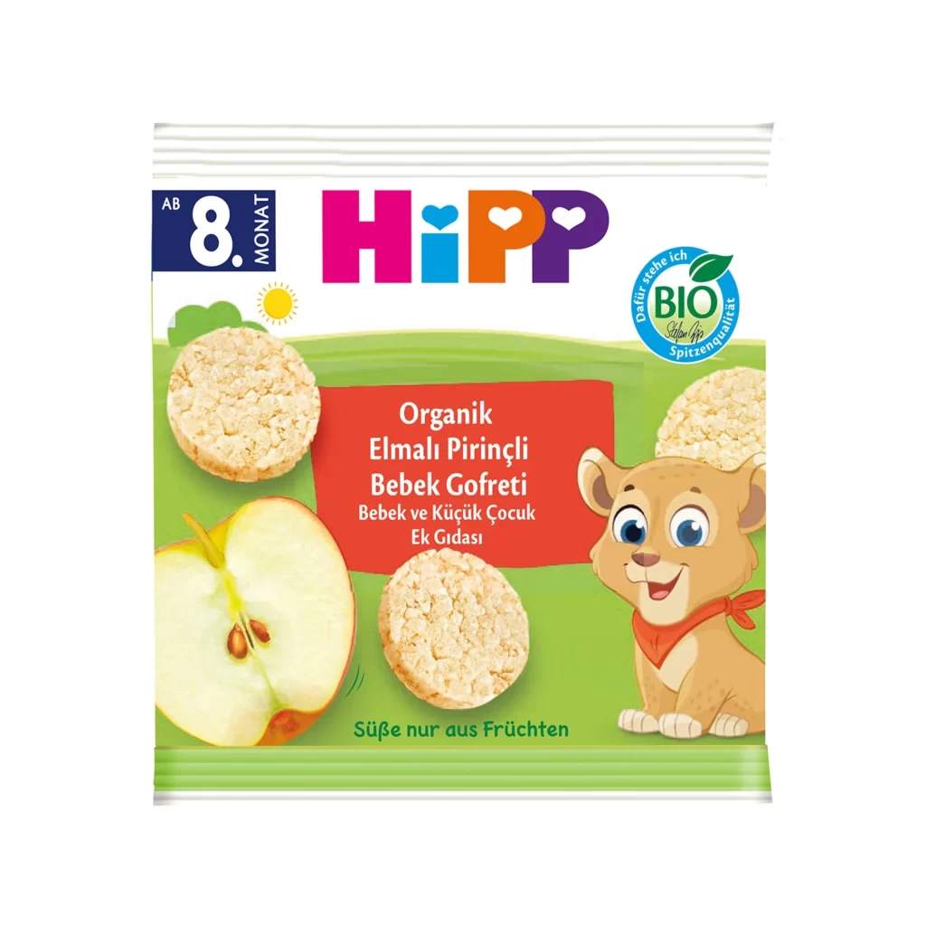
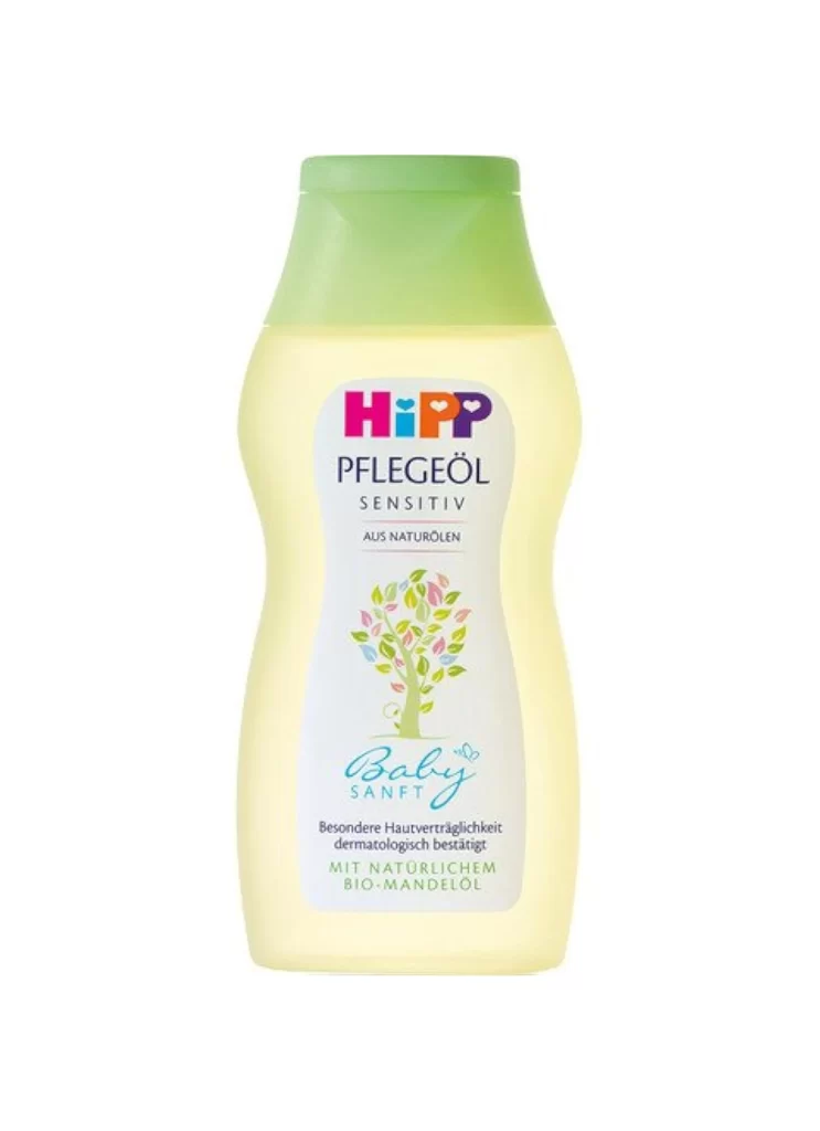
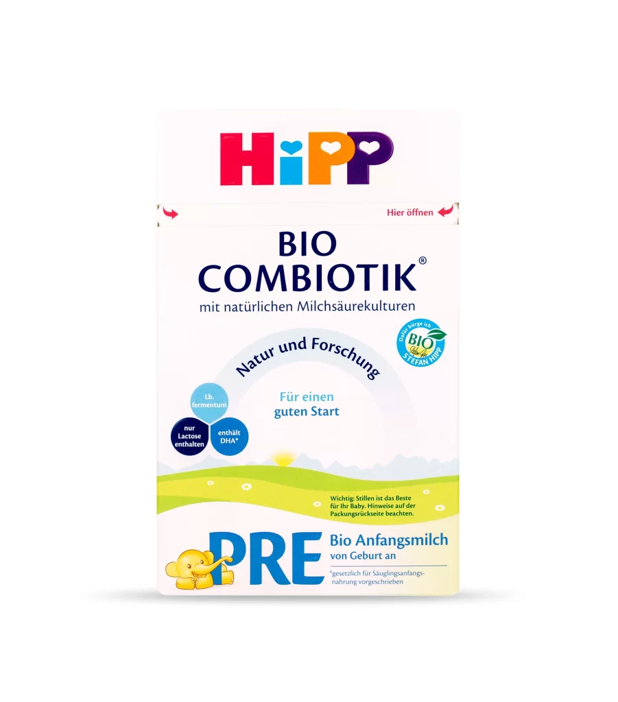
The rectangular HiPP Bio Combiotik PRE carton stands in a clean, frontal view with soft, even lighting that minimizes shadows. A vibrant logo composed of red, cyan, orange, and purple letters—each with a heart-shaped cutout—crowns the upper section above the bold, dark blue 'BIO COMBIOTIK' typography and the smaller German subtitle about natural lactic acid cultures. The lower portion transitions into a pastoral scene of rolling green hills dotted with small white flowers beneath a pale sky.
Visual hierarchy is established through the strategic use of circular badges highlighting specific nutritional benefits like ‘Lb. fermentum’ and ‘nur Lactose’, which break up the vertical flow of text. The integration of the official organic seal on the right side balances the asymmetrical placement of the product claims, creating a sense of trusted authority. Soft gradients in the background illustration provide depth without distracting from the essential information required for infant nutrition labeling.
Brand strategists analyzing European market packaging trends will find the color-coded logo system particularly useful for understanding family brand architecture. Packaging engineers can study the ‘Hier Öffnen’ directional cues to evaluate user experience design for resealable containers. Furthermore, illustrators seeking to replicate the specific aesthetic of organic food marketing can utilize the color palette and typographic weight distribution as a foundational guide.