HiPP Kindermilch Combiotik Baby Food Packaging
Topics
Details
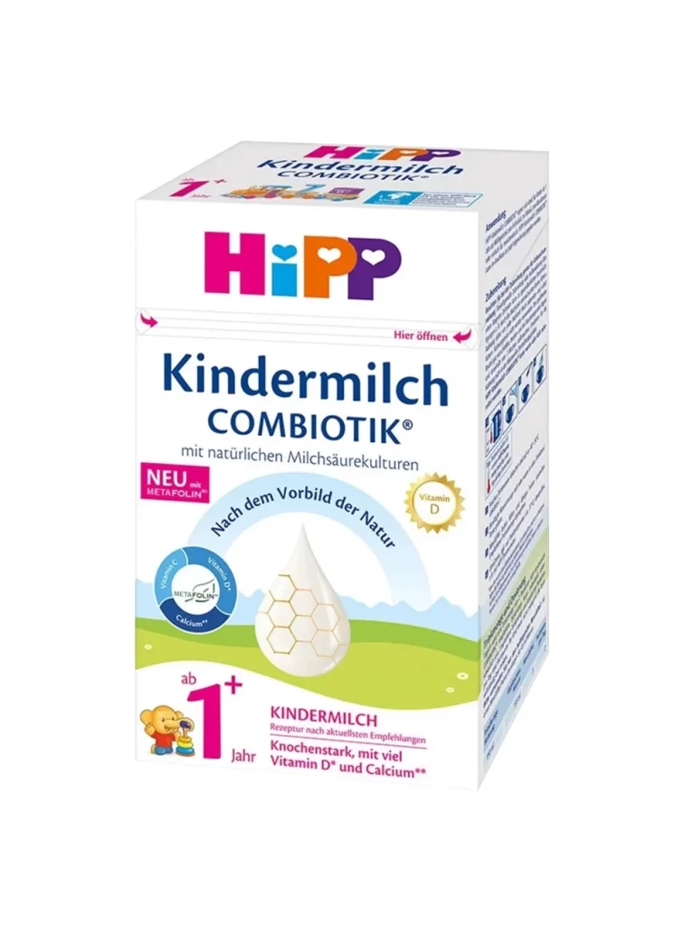
A crisp white carton of HiPP Kindermilch Combiotik displays a clean, orthogonal composition from a slight three-quarter perspective, featuring the brand's signature magenta, cyan, and orange logotype at the top. Deep navy blue typography spells out 'Kindermilch COMBIOTIK' below the logo, while the packaging highlights natural lactic acid cultures and Vitamin D on a white surface.
Visual hierarchy is established through a sophisticated interplay of rounded sans-serif fonts and circular seal motifs that denote specific nutritional benefits like Vitamin D and Calcium. The inclusion of the ‘1+’ age marker in bold pink, alongside a small illustrative character, creates an immediate focal point for parents seeking toddler-specific nutrition. Such a layout effectively balances dense informational text on the side panel with an open, breathable front face that feels both medical and approachable.
Brand strategists and packaging engineers might utilize this specific layout to study how to organize complex nutritional data without overwhelming the consumer. Illustrators could examine the integration of organic shapes, such as the honeycomb droplet, within a rigid grid system. Furthermore, color theorists will find value in analyzing how the limited palette of primary and secondary colors maintains high visibility while adhering to strict food-safety aesthetic standards.