Deep-Mat Premium Paper Colorful Elegant Packaging Design
Topics
Details
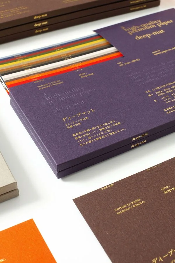
Rich purple cardboard boxes embossed with gold foil text dominate the composition, stacked at a slight angle to reveal the layered edges of multicolored paper samples fanning out from beneath. The packaging features bilingual typography, displaying English phrases like 'High-quality Premium Paper' and 'deep-mat' alongside Japanese characters that identify the product as 'Deep Mat.' A soft, diffused light source from the upper left casts gentle shadows across the matte surfaces, while additional brown and grey boxes appear in the periphery, suggesting a comprehensive color range.
Visual distinction emerges from the tactile contrast between the coarse, fibrous texture of the deep-matte paper stock and the crisp, reflective quality of the metallic gold lettering. The deliberate arrangement of the sample swipes—transitioning through red, orange, yellow, green, blue, and neutral tones—demonstrates the material's opacity and color saturation capabilities. This specific presentation emphasizes the product's dual identity as both a functional substrate and a luxury object, where the packaging itself serves as a testament to the paper's premium finish.
Art directors developing identity systems for boutique stationery brands might study this arrangement to understand how material swatches can be integrated into promotional collateral. Print production specialists could reference the image when specifying foil stamping techniques on textured substrates to ensure legibility against dark backgrounds. Packaging engineers designing limited-edition product launches would find value in analyzing how the fanned layout creates visual depth without obscuring essential technical specifications printed on the box surface.